Telsón Tequila
Telsón Tequila Brand Identity and Packaging Design
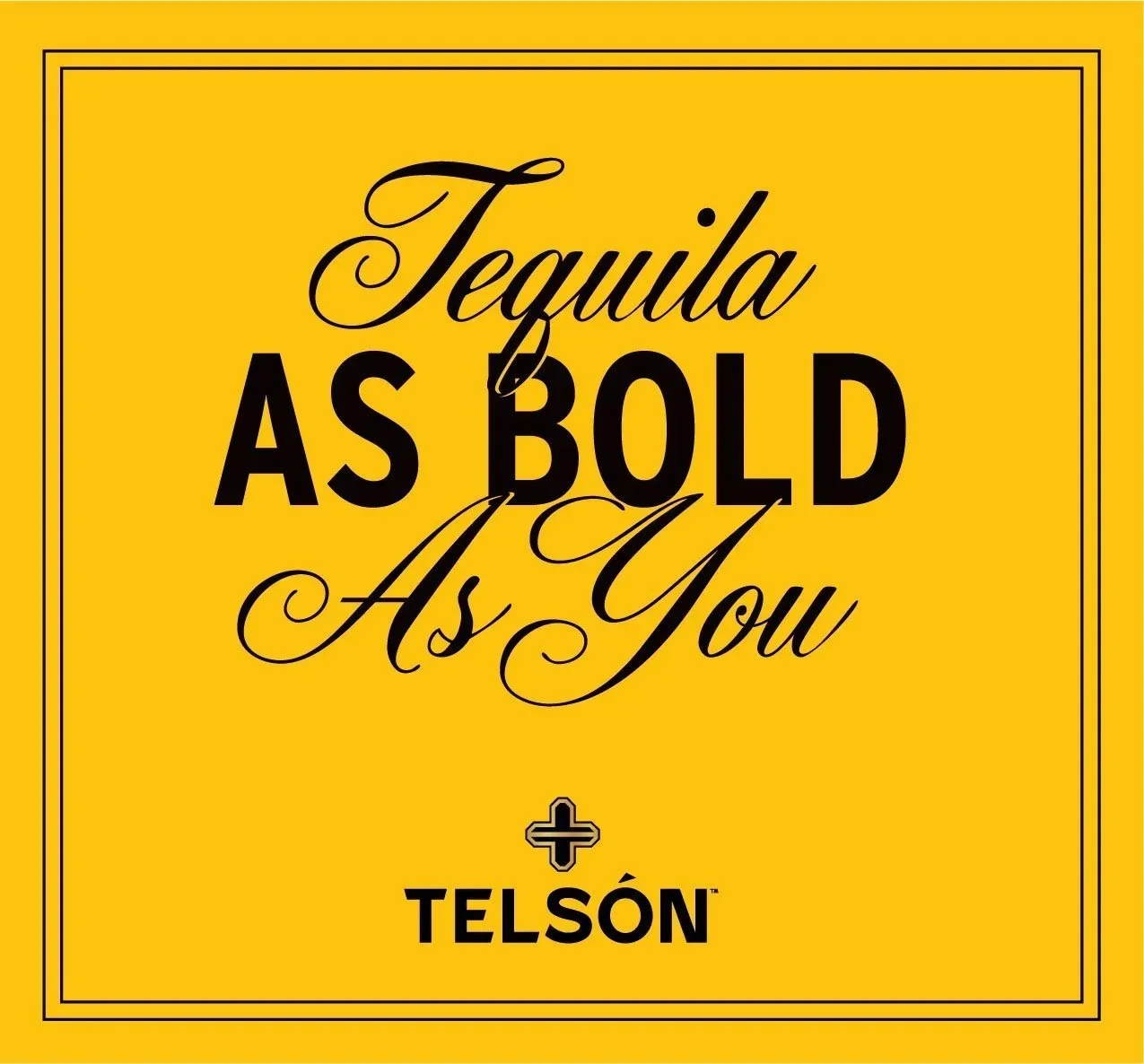
A bold tequila brand with aspirational swagger.
Client
Romero Brands
Services
Art Direction, Visual Identity Design, Logo Design, Packaging Design, Collateral Design
Credits
Creative Direction & Principle Designer: Adam Vicarel
Brand & Packaging Designer: Carly Salzman
Product Photos: Joe Friend
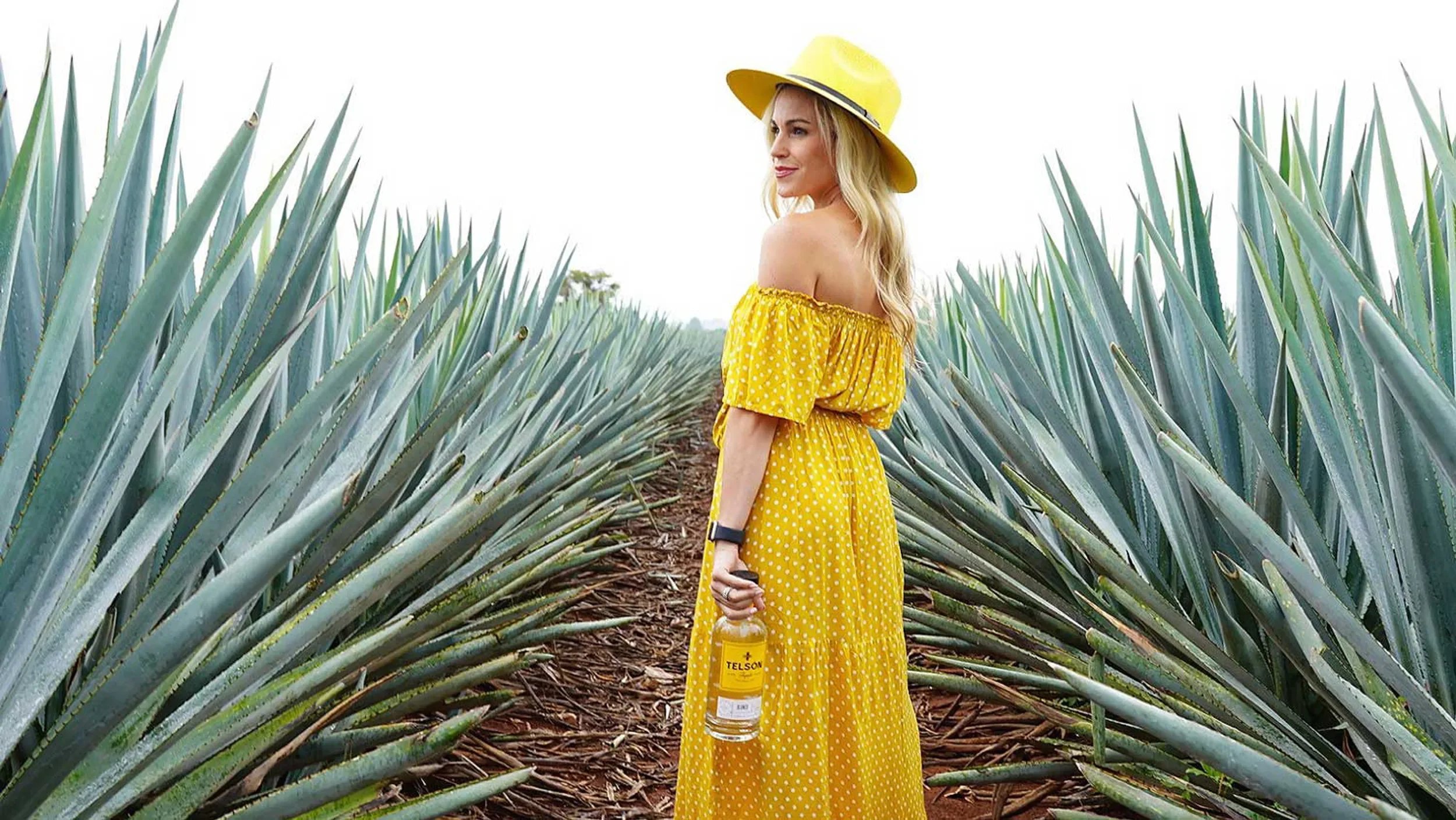
Lifestyle Photos: Telsón Tequila
Featured: The Dieline, Abduzeedo
The Opportunity
Tequila is one of the fastest growing spirit categories in the market. With countless options and a huge price spectrum, we needed to develop an immediately-identifiable brand that stands out on shelf and inspires an elevated consumer experience.
The Solution
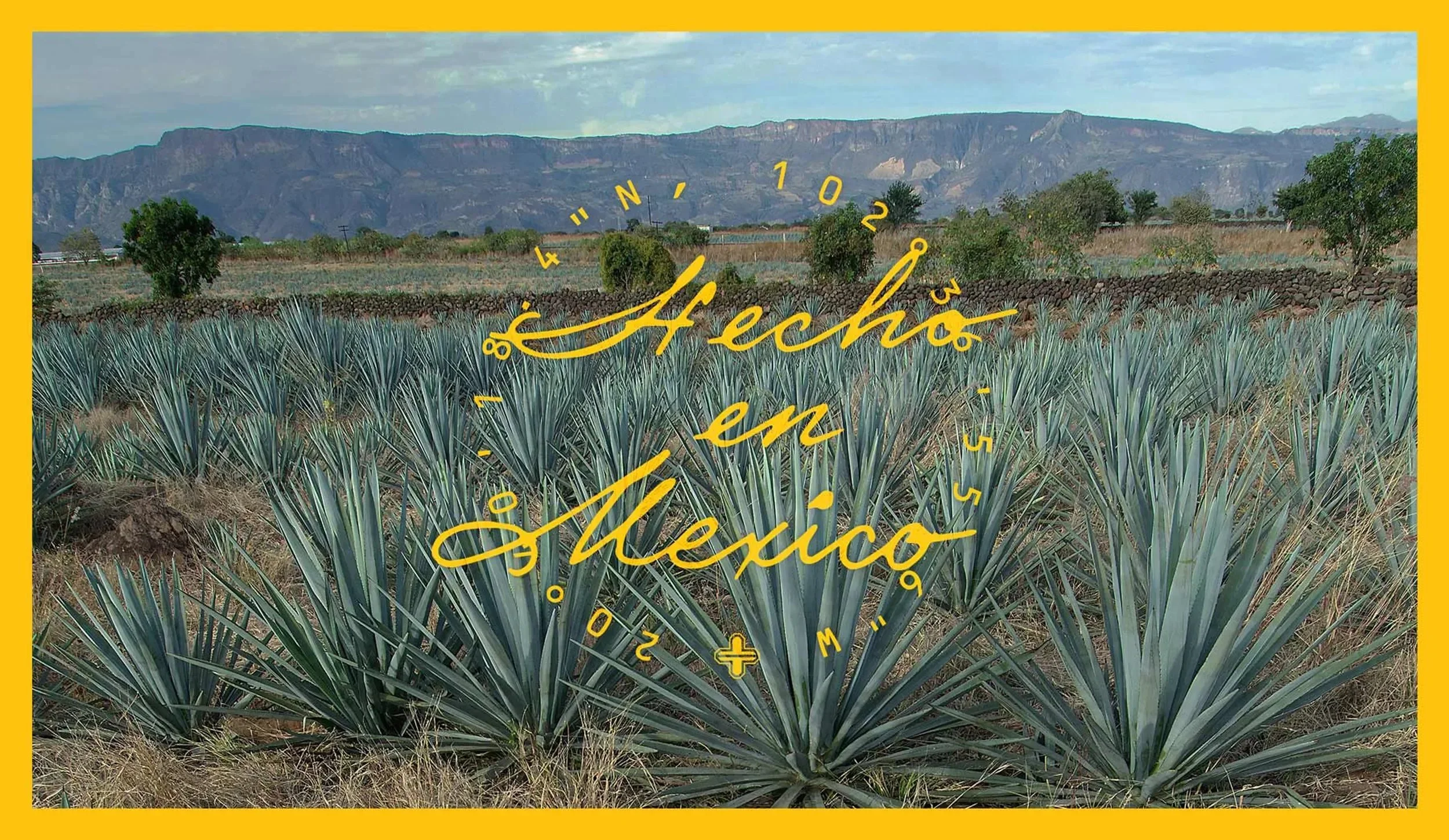
We developed a boldly simple brand through floods of color and minimal design elements paired with a type system that balances masculinity and approachability. A subtle sense of craft is conveyed through hand lettering and illustration, and travel coordinates evoke curiosity and a connection to where the spirits are produced.
Strategy
We started by immersing ourselves in research on both Mexico and tequila. The dichotomy of ornate architecture found in larger Mexican cities was contrasted by a more casual, hand-crafted aesthetic found in rural areas. Harnessing this tension between "premium" and "authentic Mexico" supported Telsón's desire to appeal to both well-informed spirit drinkers and those who simply want to enjoy a great tequila with friends.
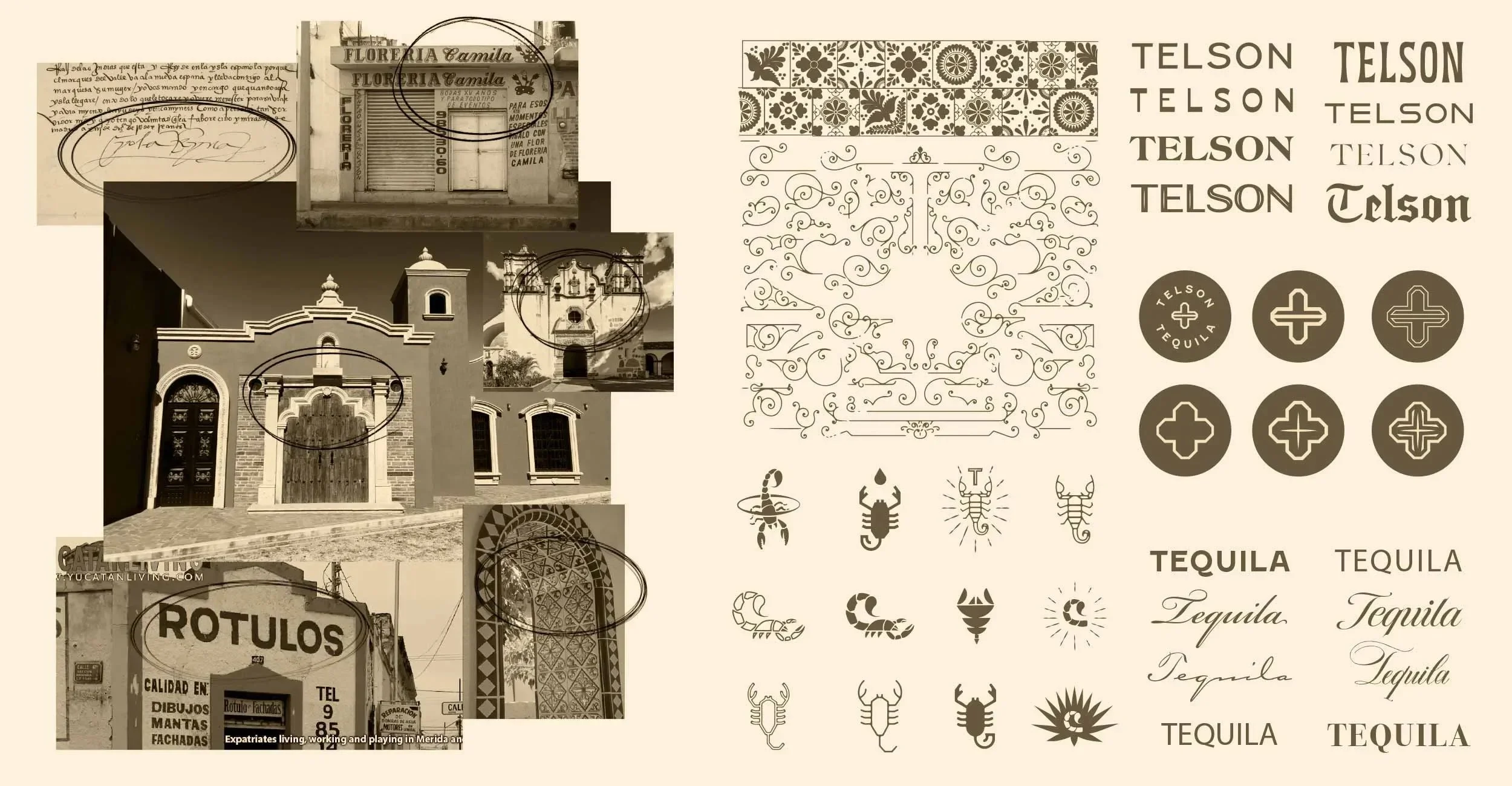
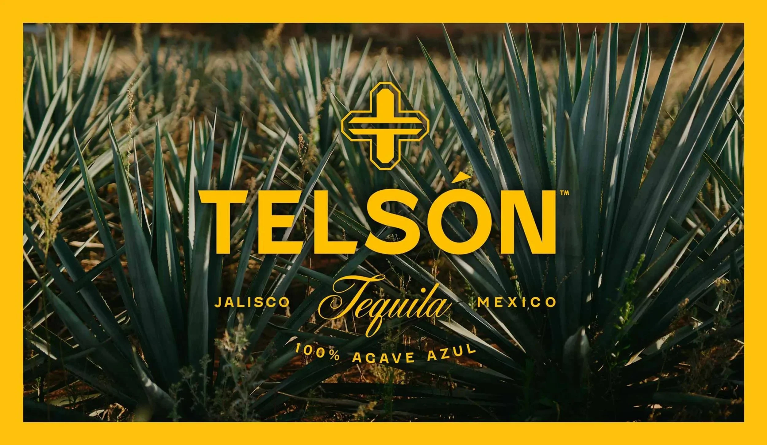
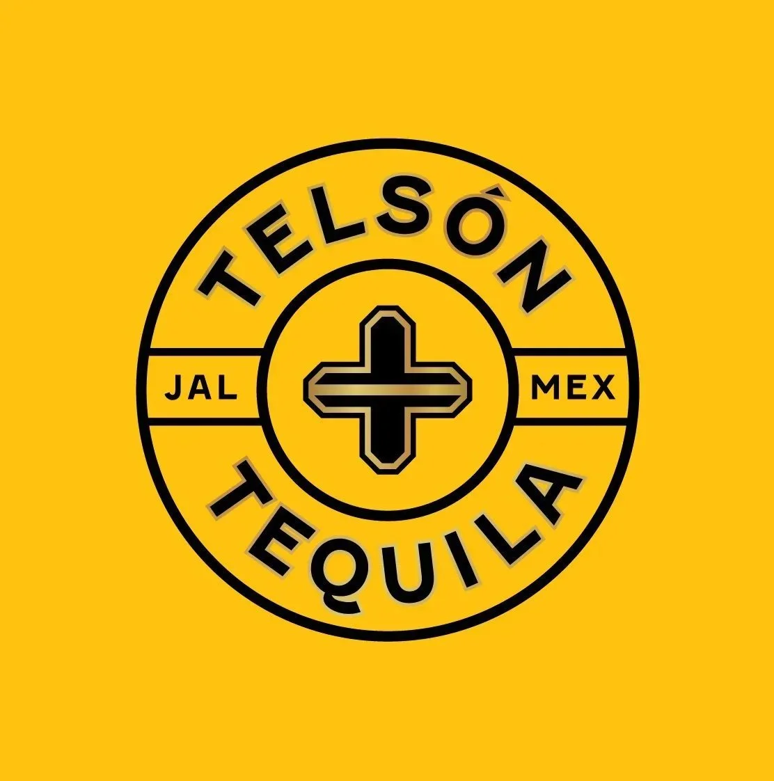
Logo Design
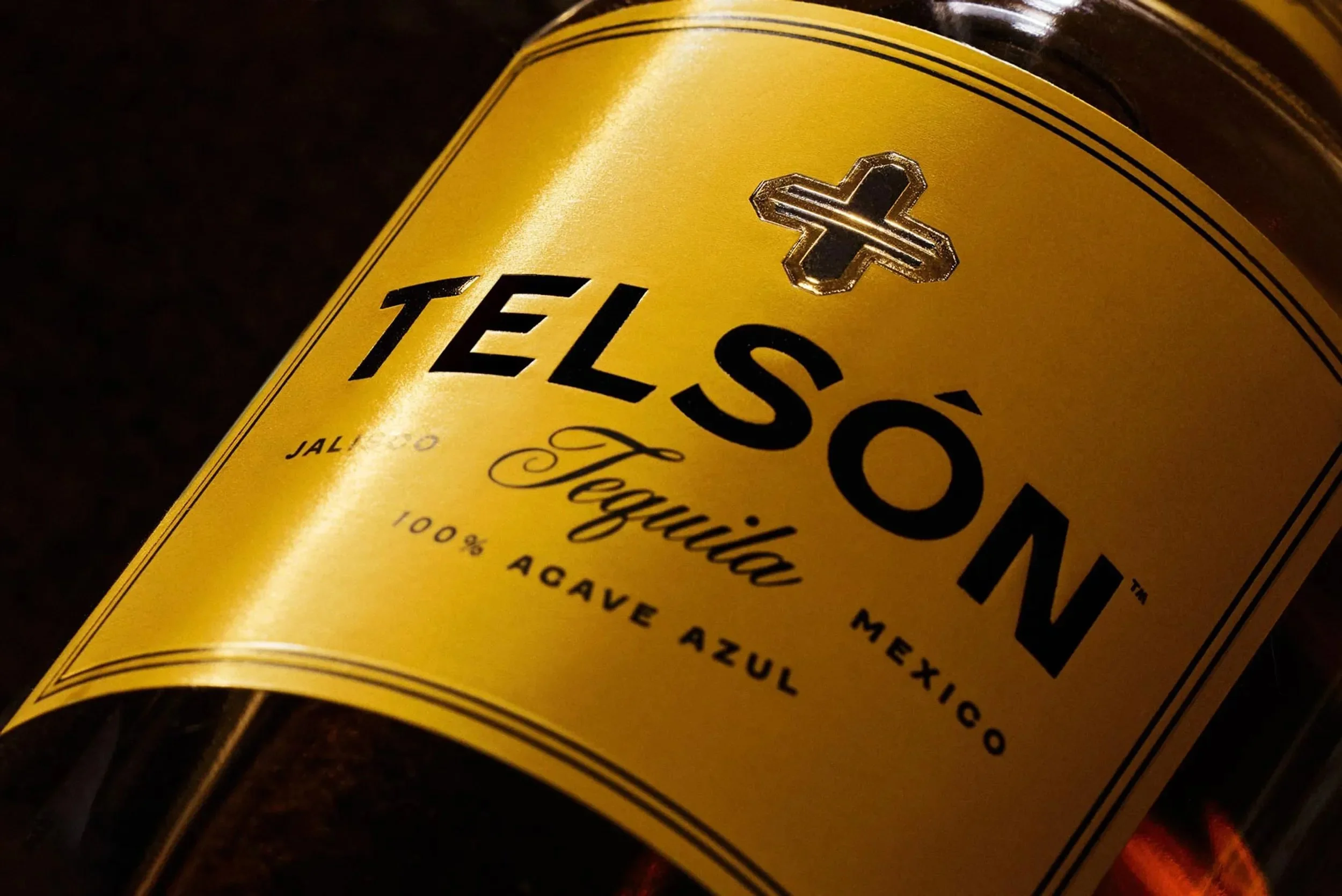
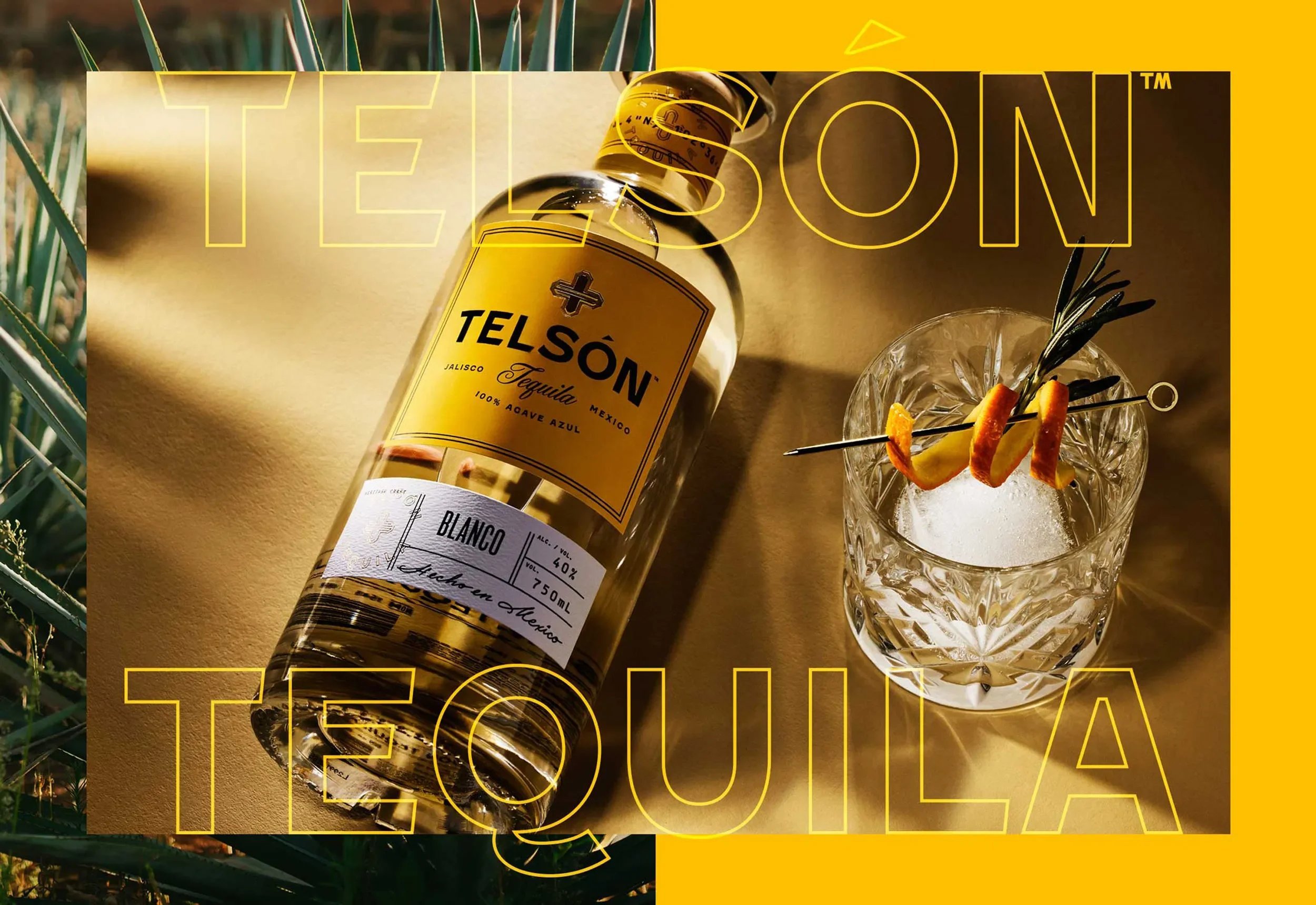
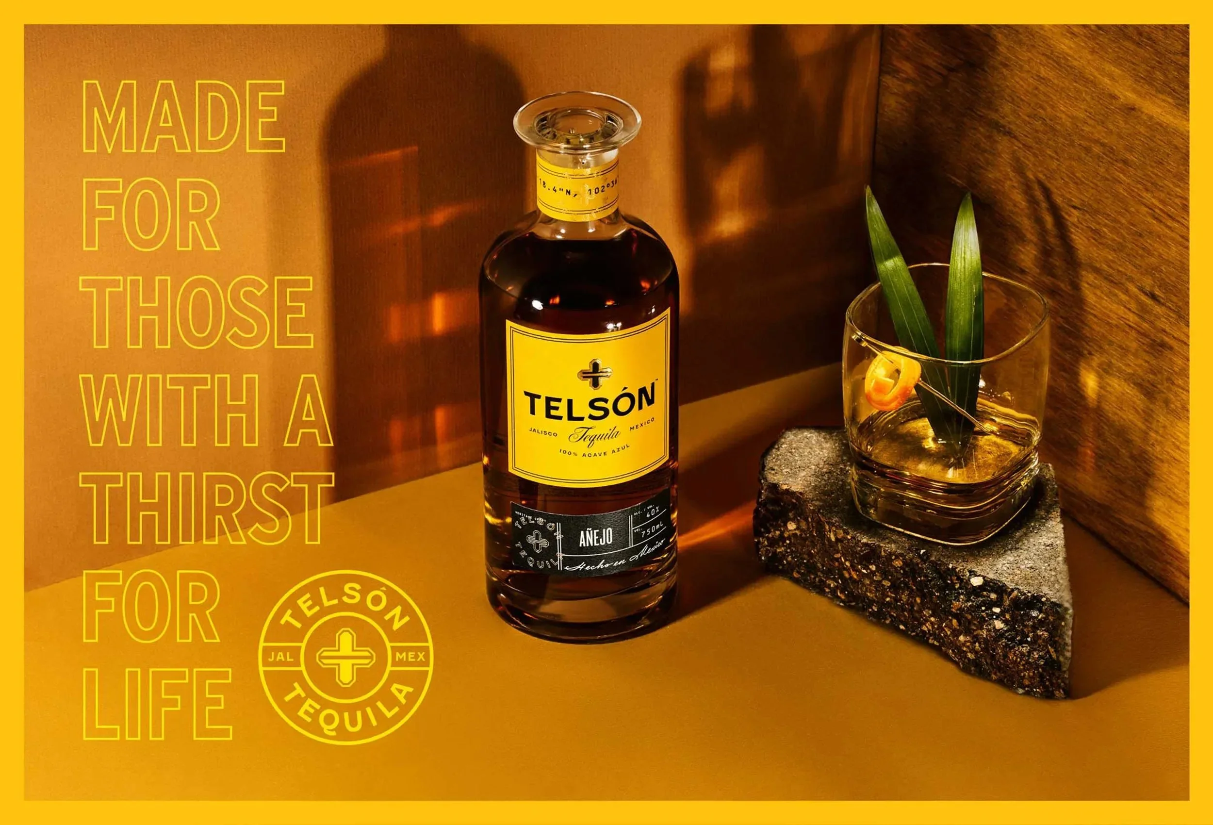
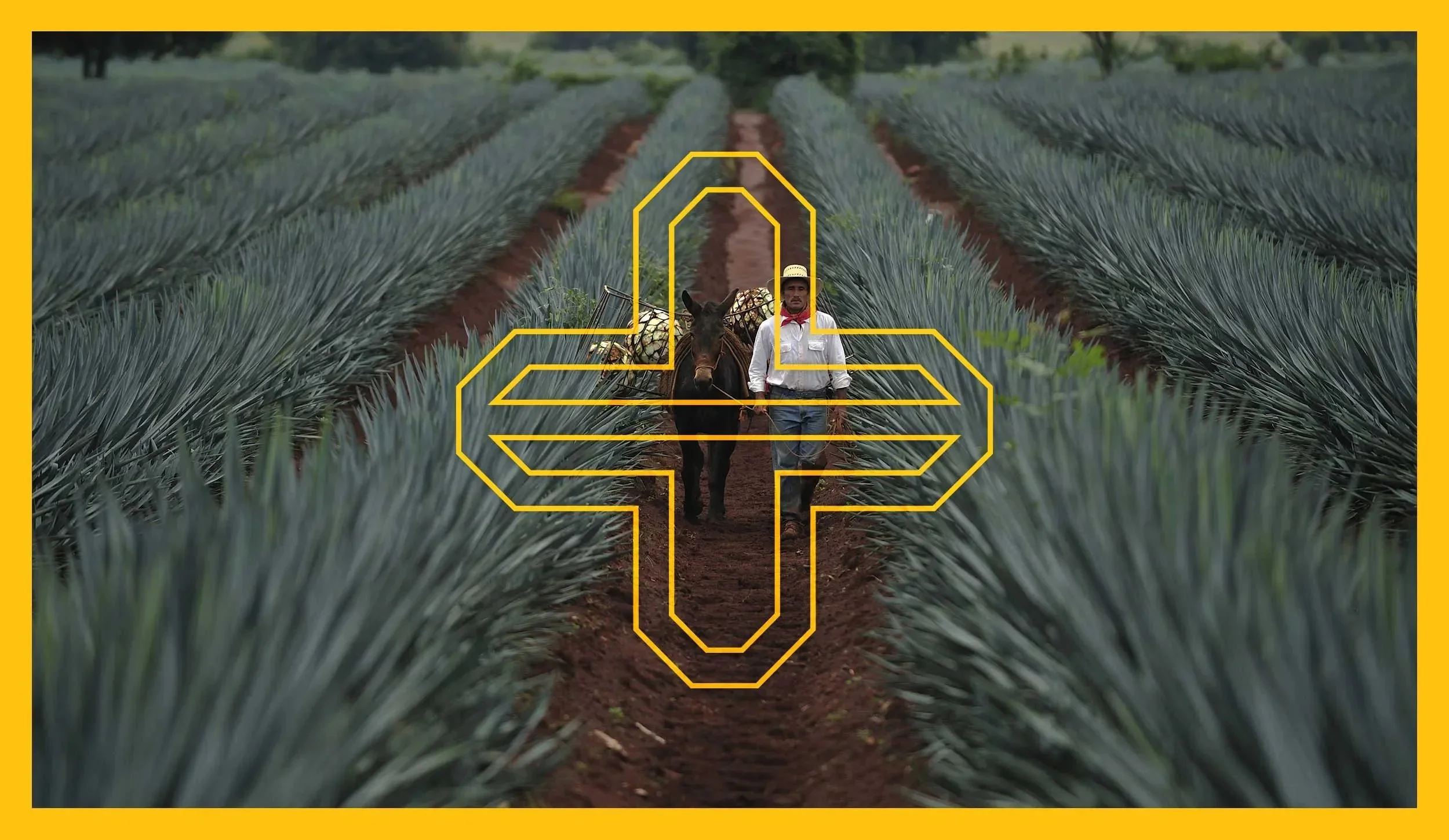
Hand painted street signage was the strategic impetus for Telson's logotype, complemented by an elegant script. The mark draws inspiration from the decorative doorways and ornamentation found in Mexican architecture, and is comprised of two letter "T's" mirroring each other. The resulting mark is a + sign, representing this spirit's ability to elevate and enhance any occasion.


Visual Language
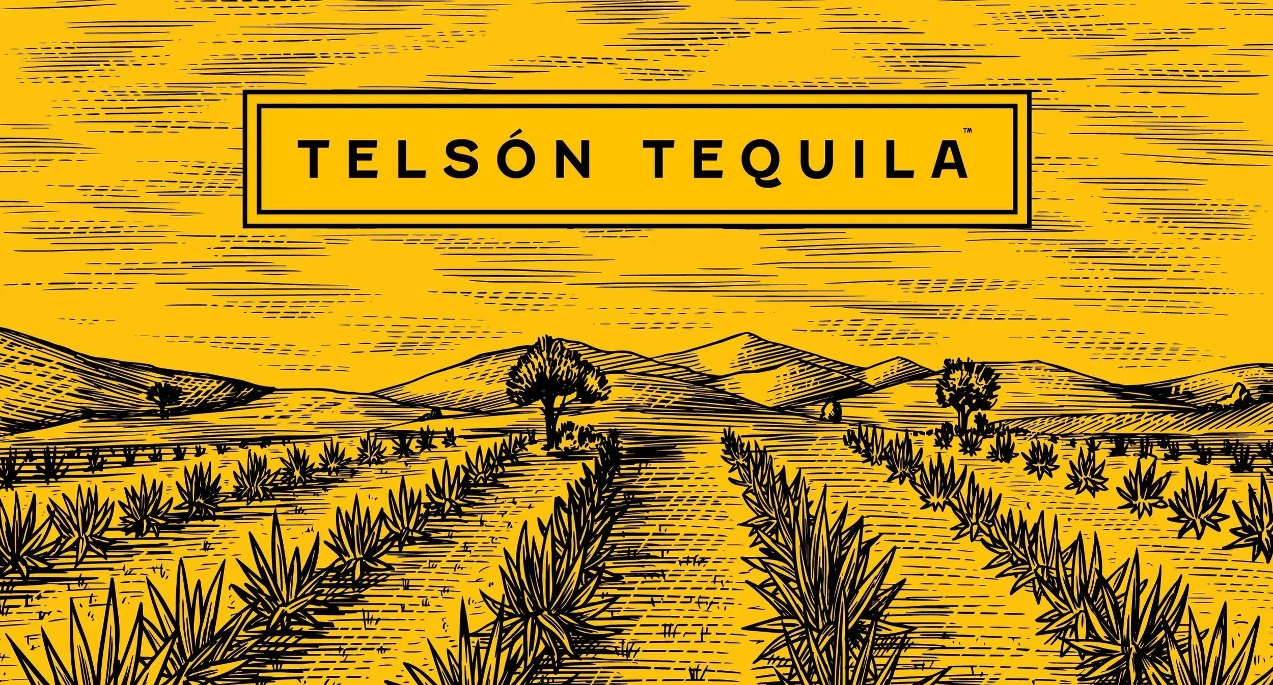
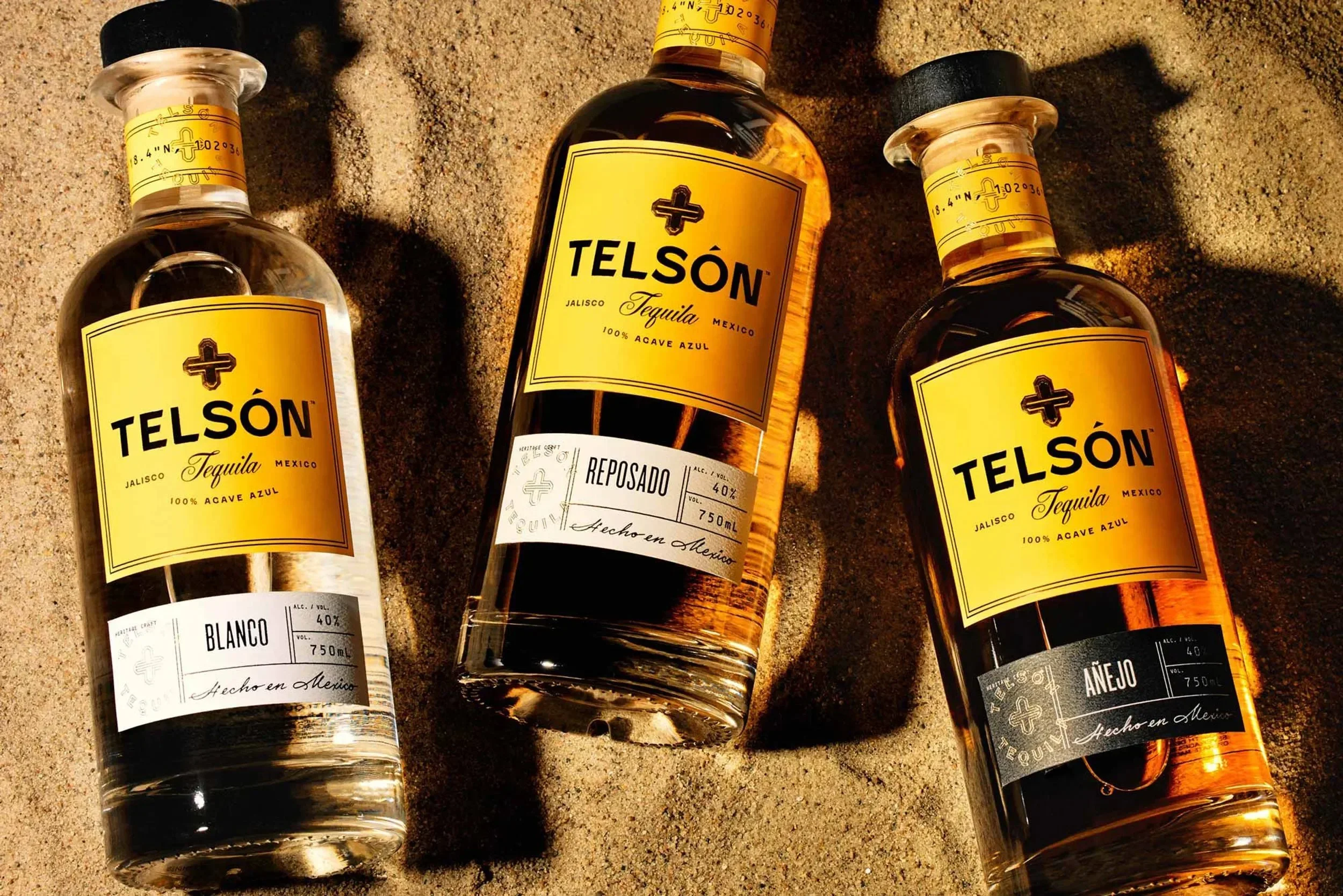
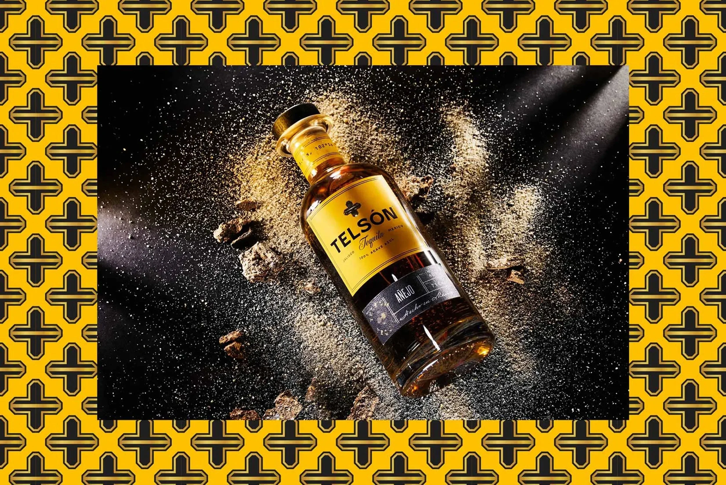
Balancing the tension between "premium" and "authentic Mexico" was achieved through contrasting the boldly simple design aesthetic with elements rooted in craft and place. Illustration styles, hand drawn elements, and design elements such as GPS coordinates all nod to the careful craftsmanship of Telsón. The brand's heavy use of yellow is inspired by Mexican sunshine, symbolic of happiness, wealth and prosperity.

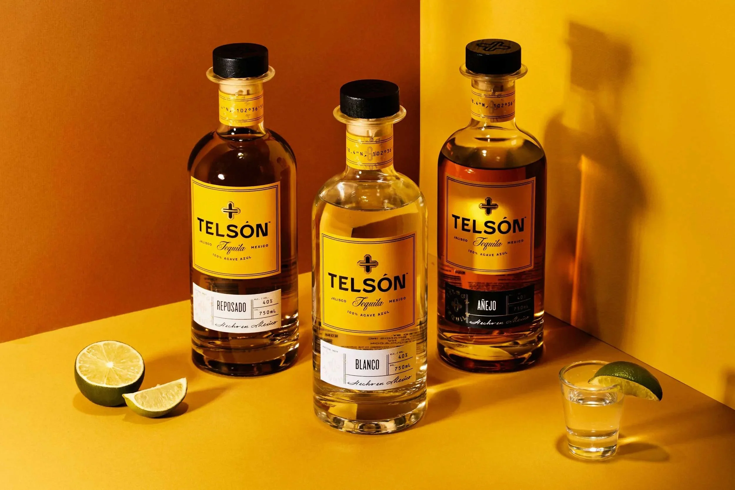
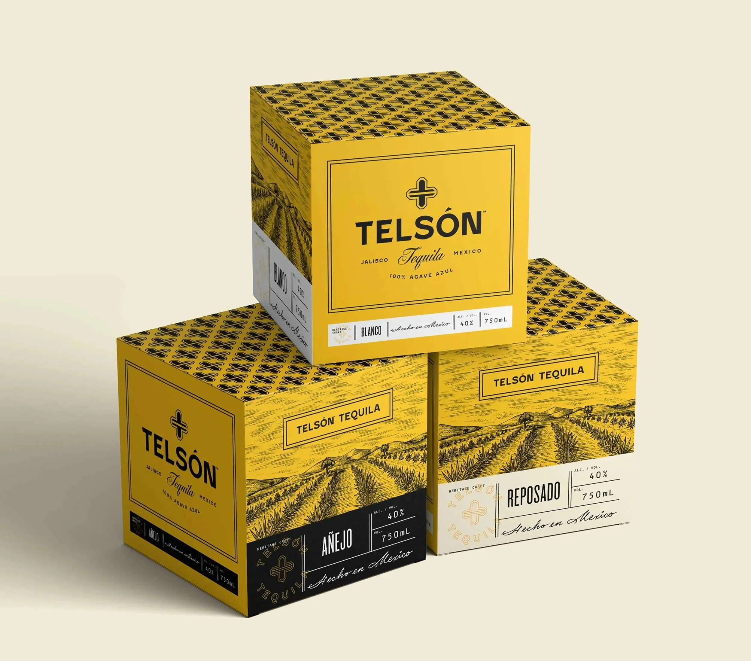
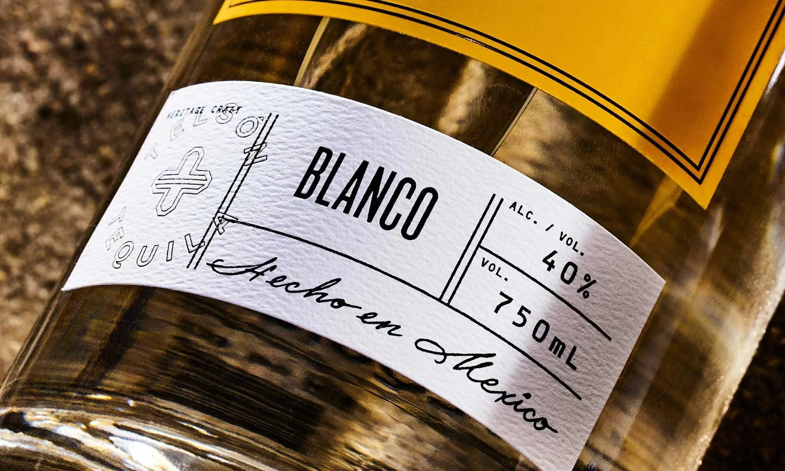
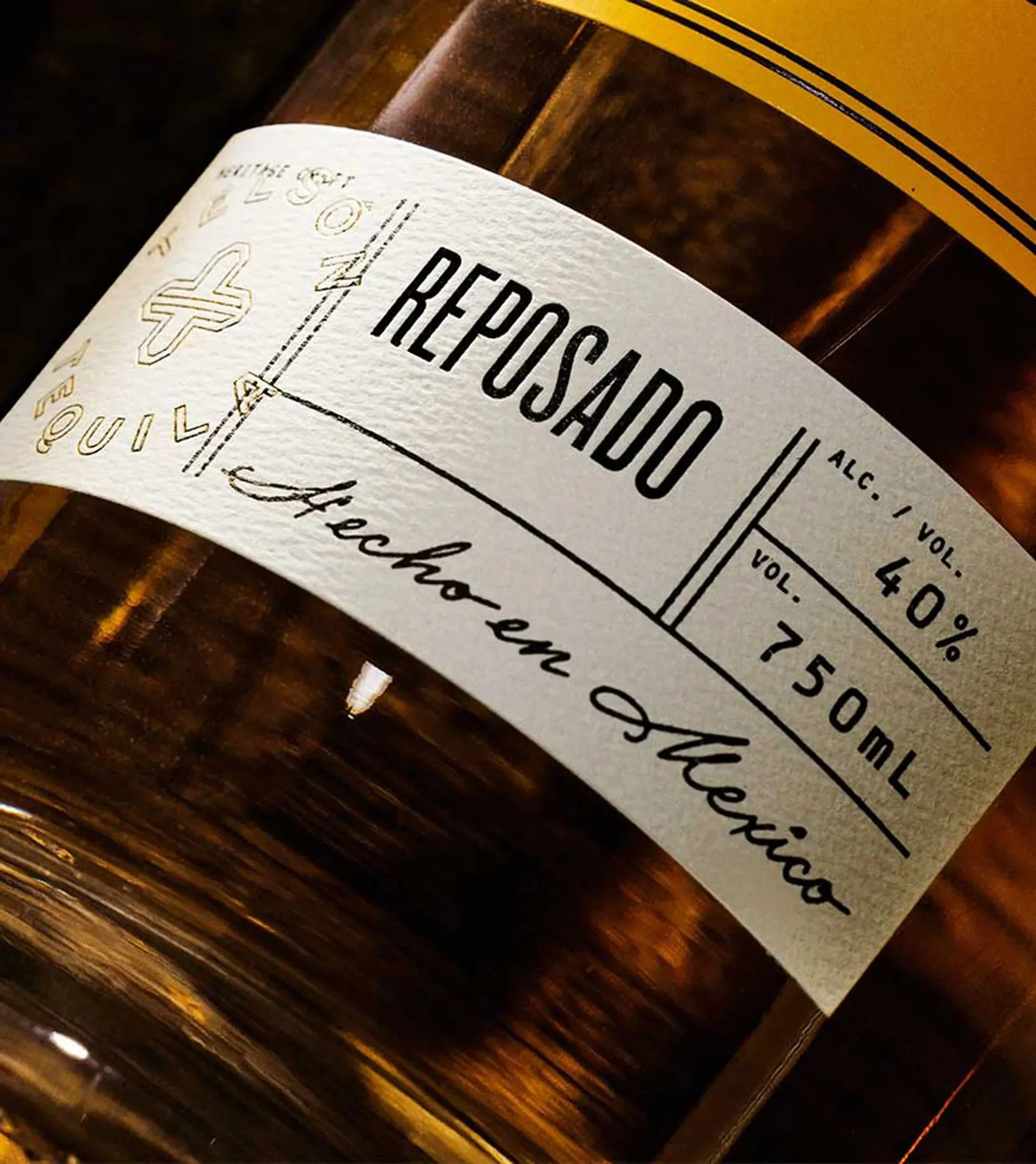
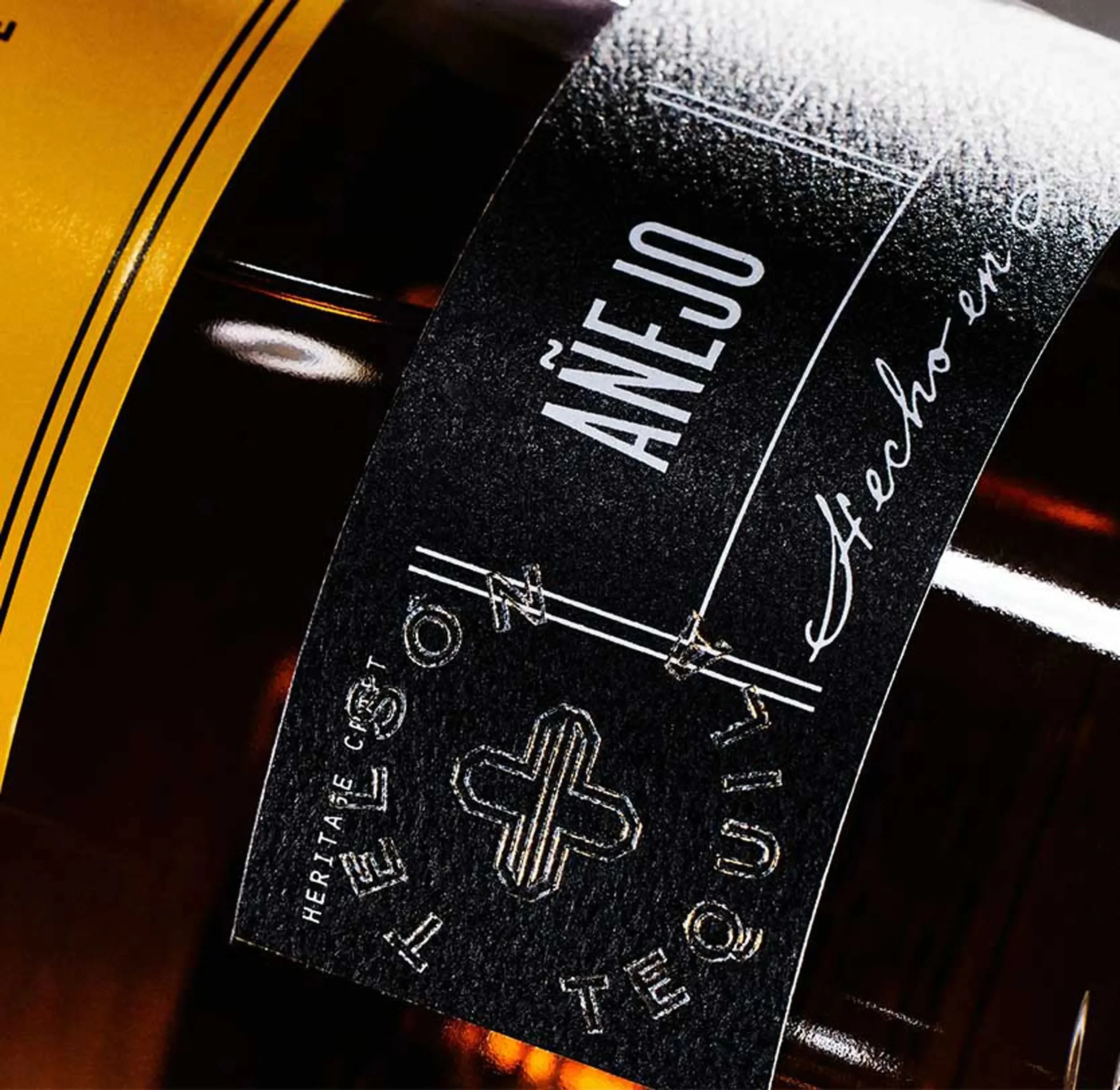
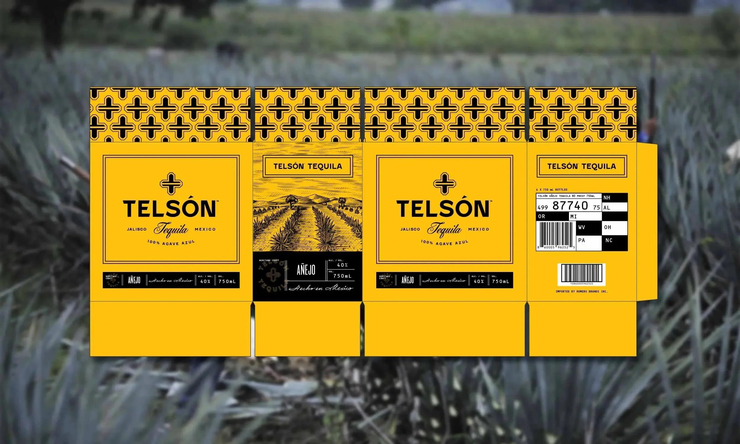
Packaging Design
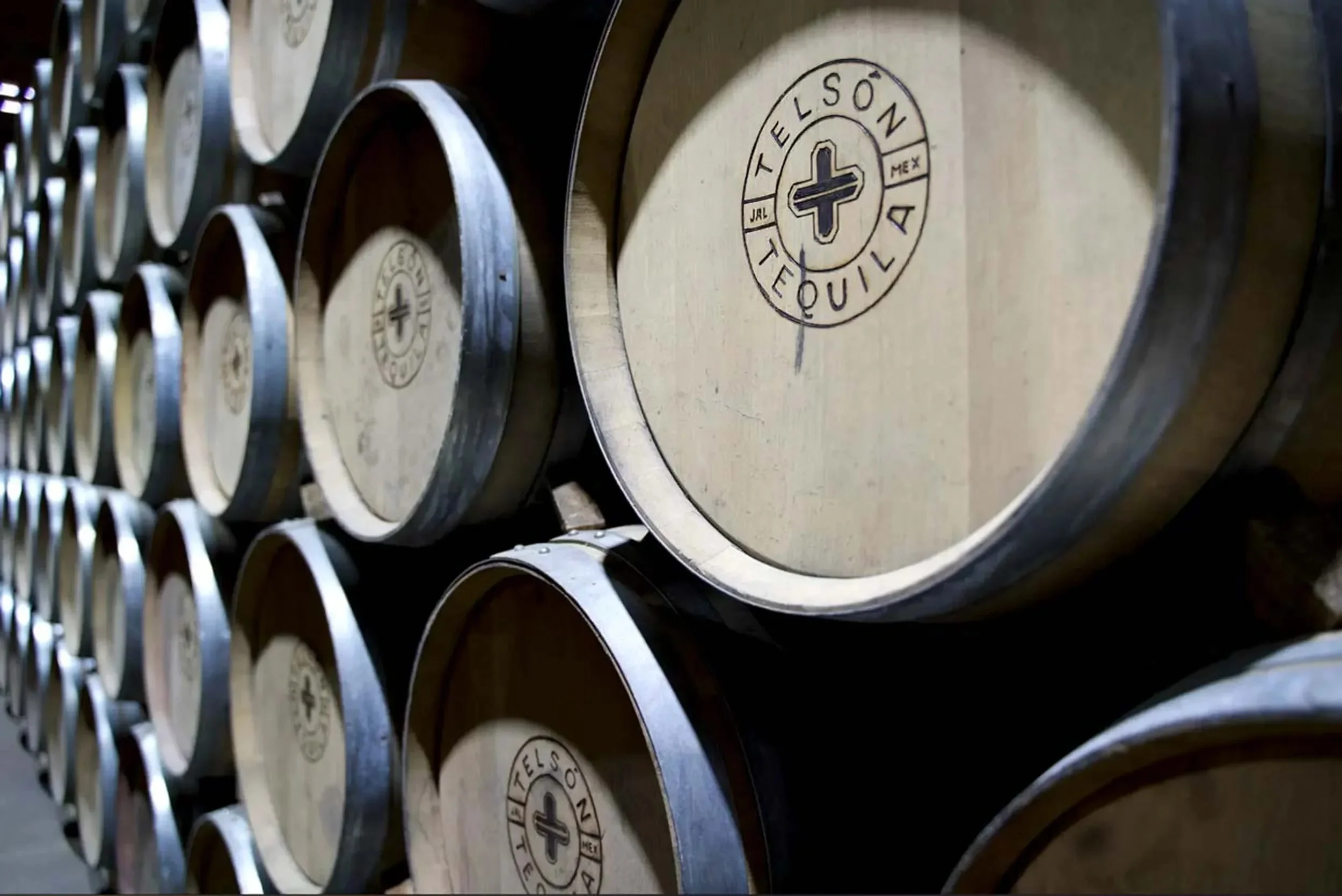
The labels and shipper boxes communicate Telsón's connection to the heritage craft of harvesting agaves. We focused on establishing a connection to the distillery's physical location in Jalisco, Mexico through GPS coordinates on the neck of the bottle and an illustration of rolling agave fields. Layout was inspired by travel documents such as passports and luggage tags.


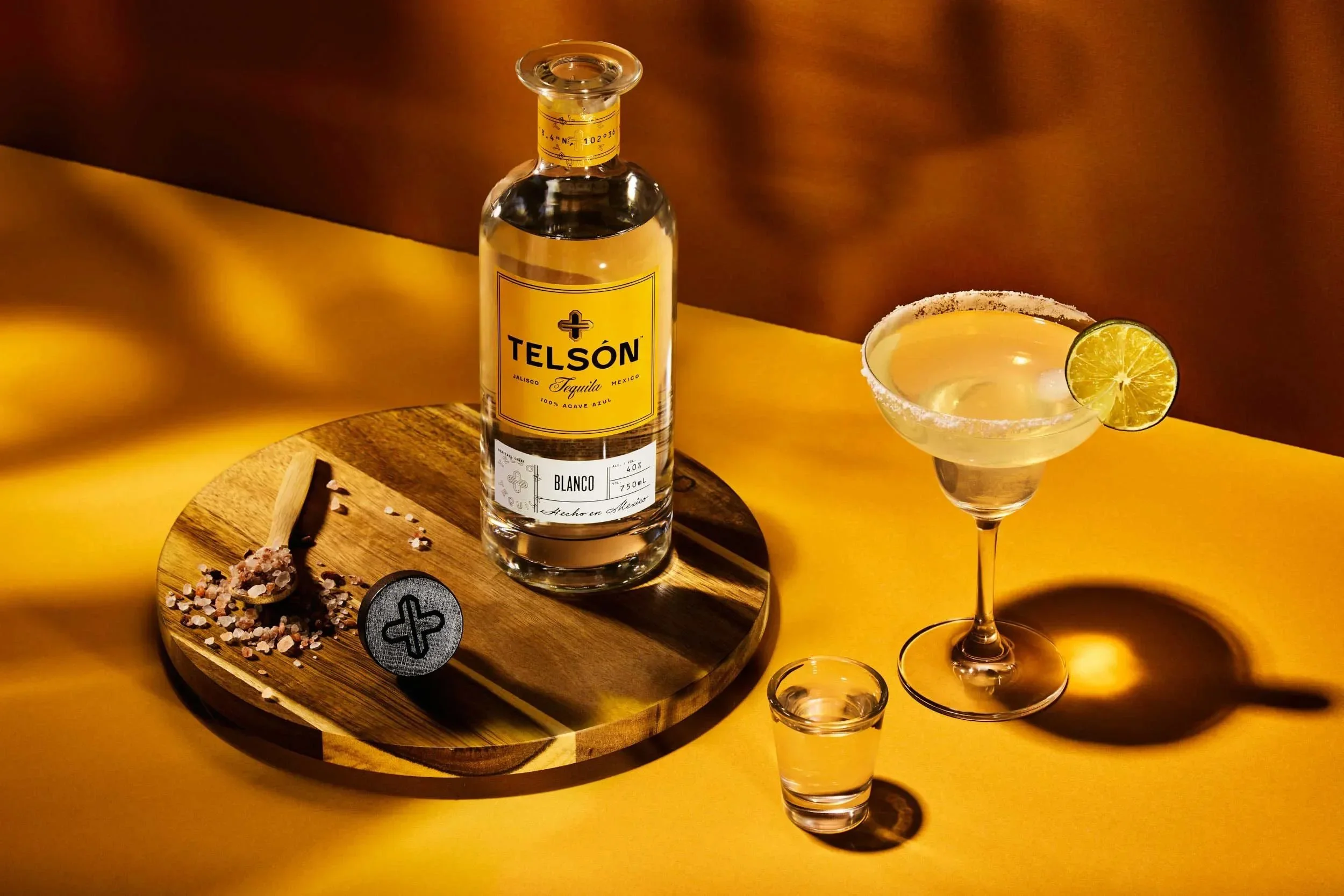
Photography
With the support of Joe Friend, we set up an environment that was minimal and rustic. Small pieces of wood, plants, sand, glass, and light cast as if through agave plants help the brand photography feel premium, experiential and ripe for enjoying with one's friends.
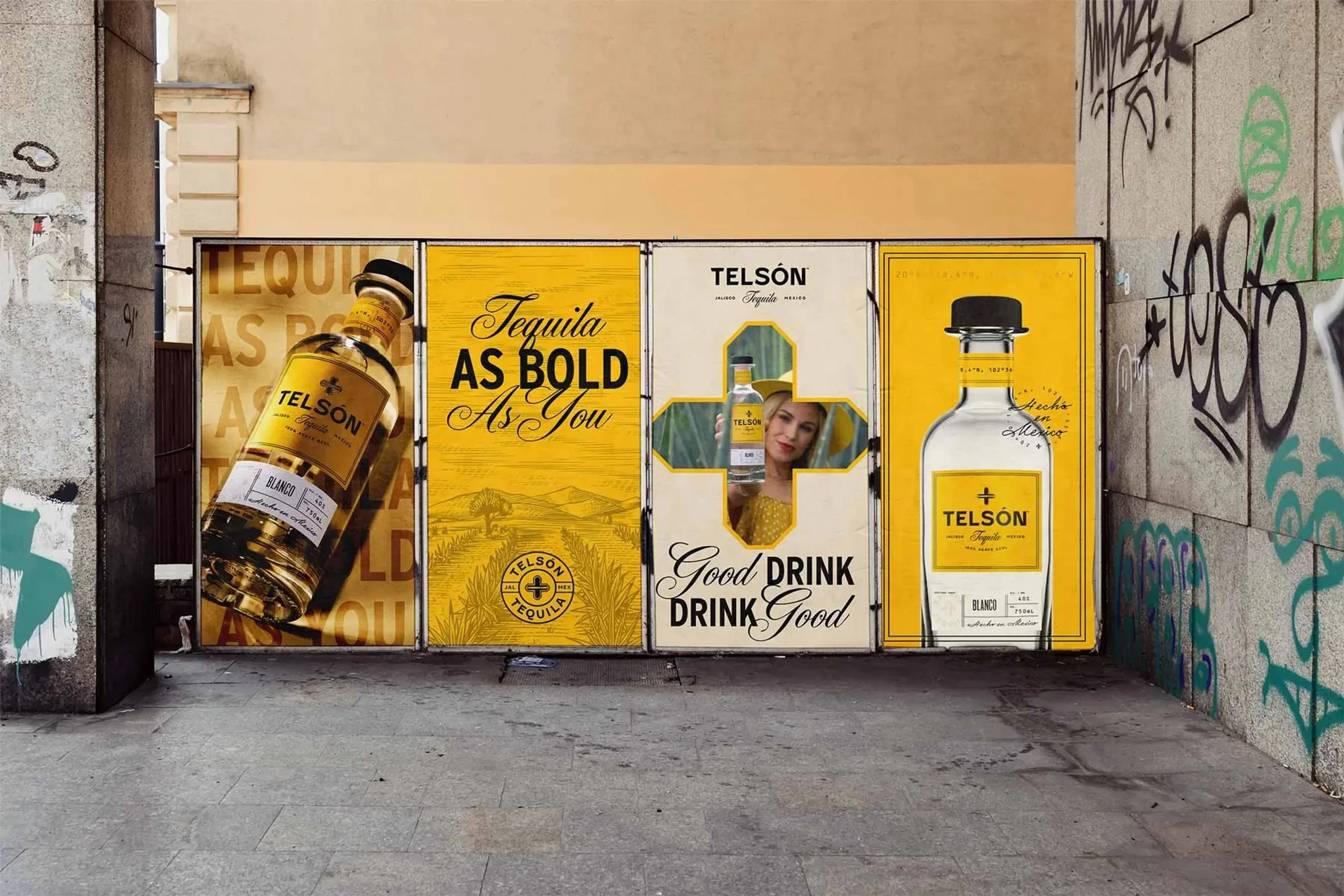
Art Direction
As a grassroots brand with an aspirational positioning, we worked to balance the feelings of "premium" and "authentic Mexico" whenever possible. The collateral embraces the tension between high end and casual fun: swaggy and party, Mexico and modern. Telsón produces seriously quality tequila without taking themselves too seriously.


Want to see more?