Nurture
Nurture Wellcare Marketplace Brand Identity and Environmental Design
Establishing the visual language for the nation's first wellcare marketplace.
Client
Nurture
Services
Visual Identity Design, Signage and Way Finding, Collateral Design, Illustration, Mural
Credits
Creative Direction, Principle Designer: Adam Vicarel, in Collaboration with Rebecca Reitz
Plants: Rooney Bloom
Photos: Luke Gottlieb & Nurture
The Opportunity
Nurture is a community-based wellcare marketplace focused on self care. With over 60 vetted, independent businesses, Nurture needed a brand that feels as human-centric as it does connected to nature.
The Solution
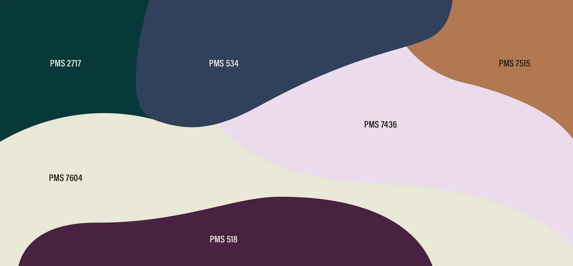
The colors, typography, layouts, and brand elements were selected to help convey Nurture's holistic and service-oriented offerings for all. With a largely female audience positioned around wellness of all kinds, Nurture's branding was rooted in themes of support, sacred geometry, golden ratios, and the coalescence of nature and humanity.
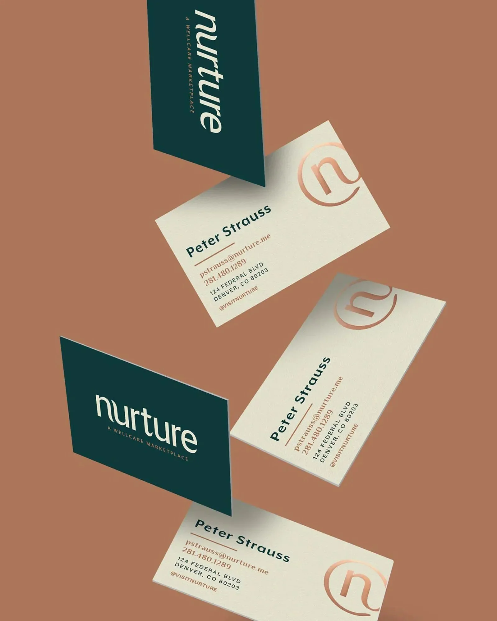
The Visual Identity
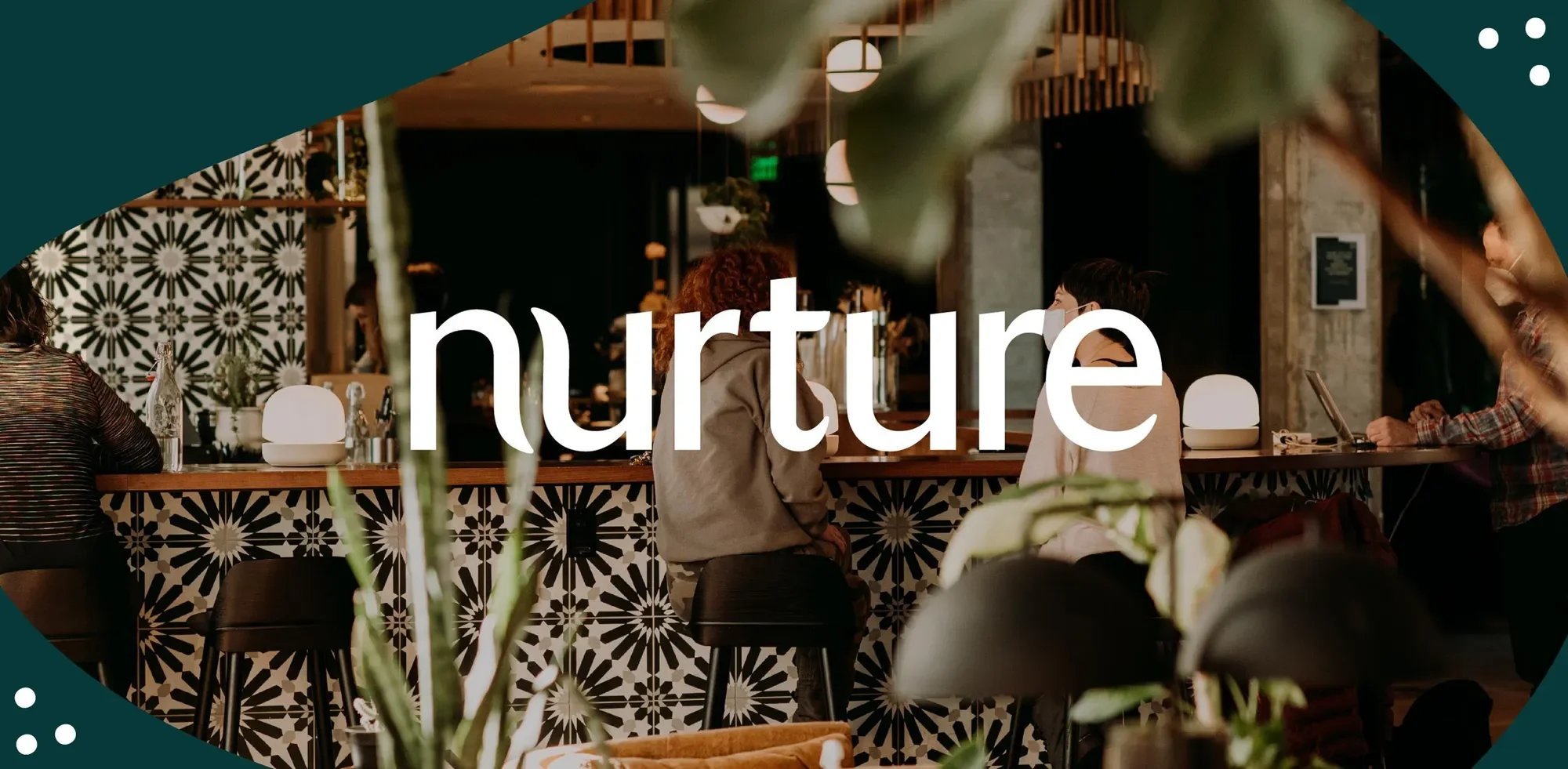
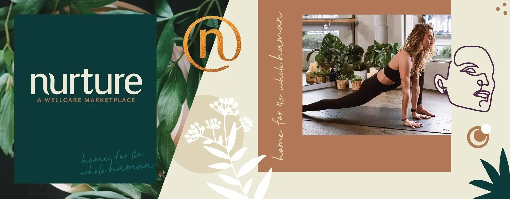
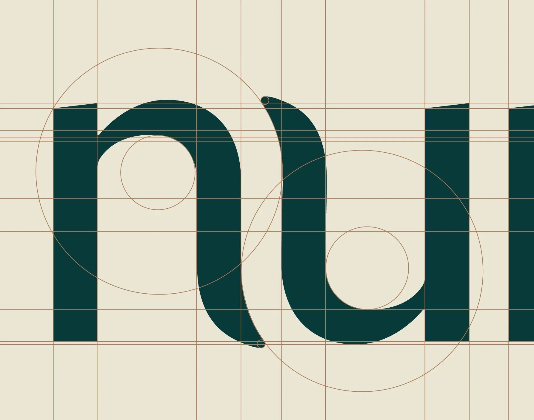
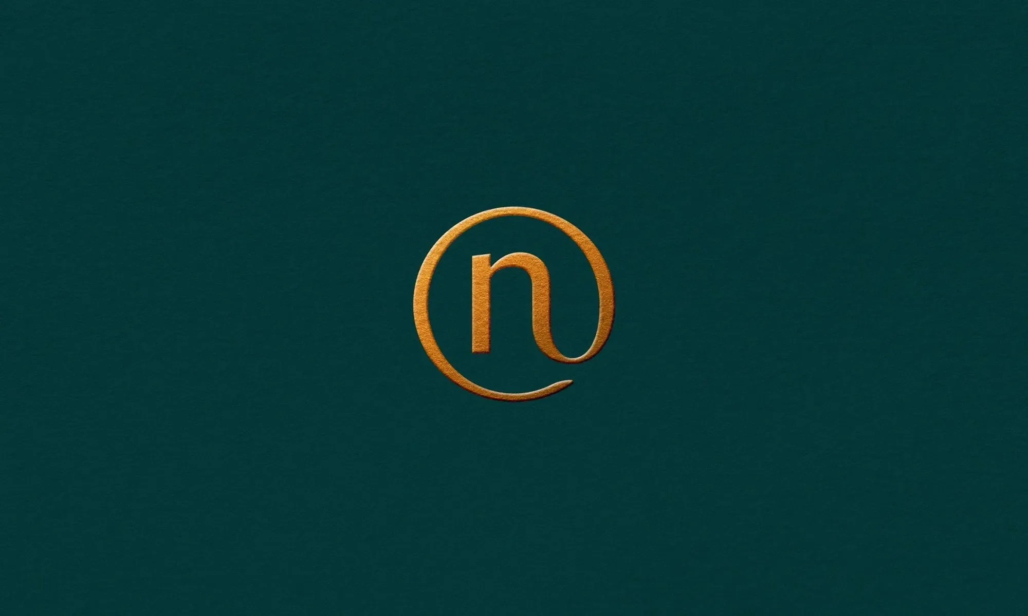
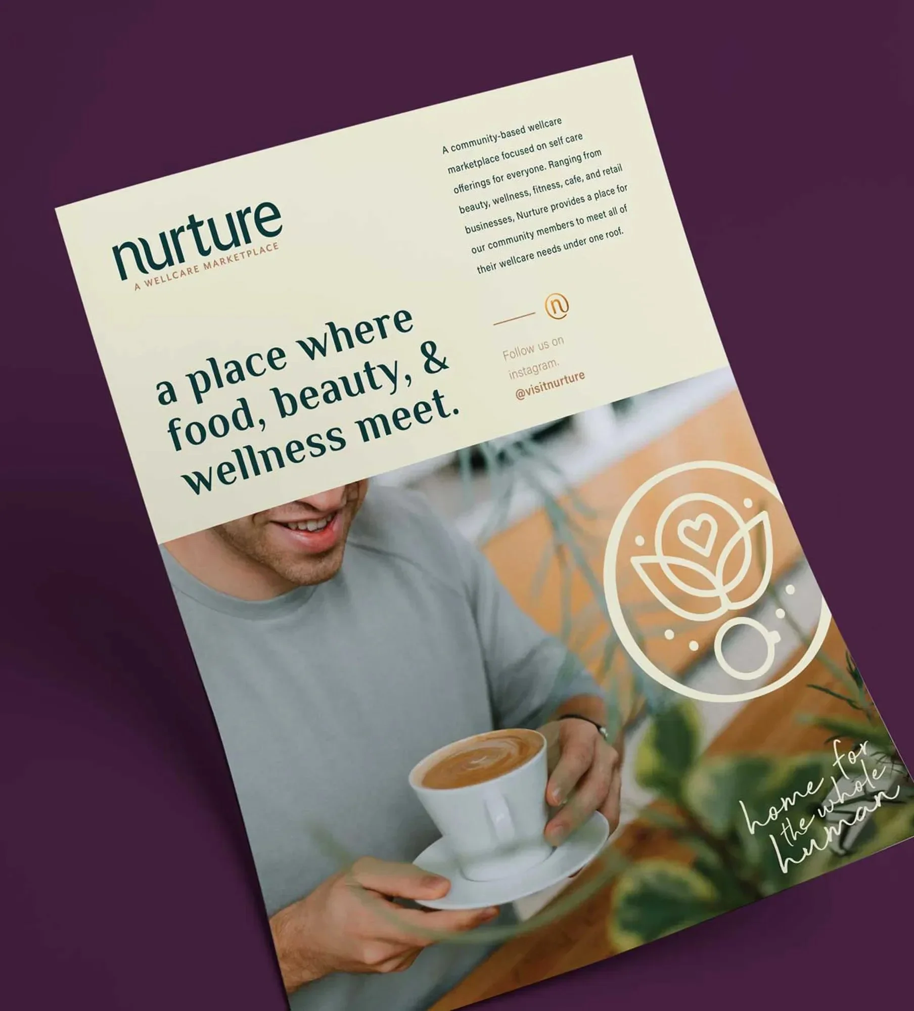
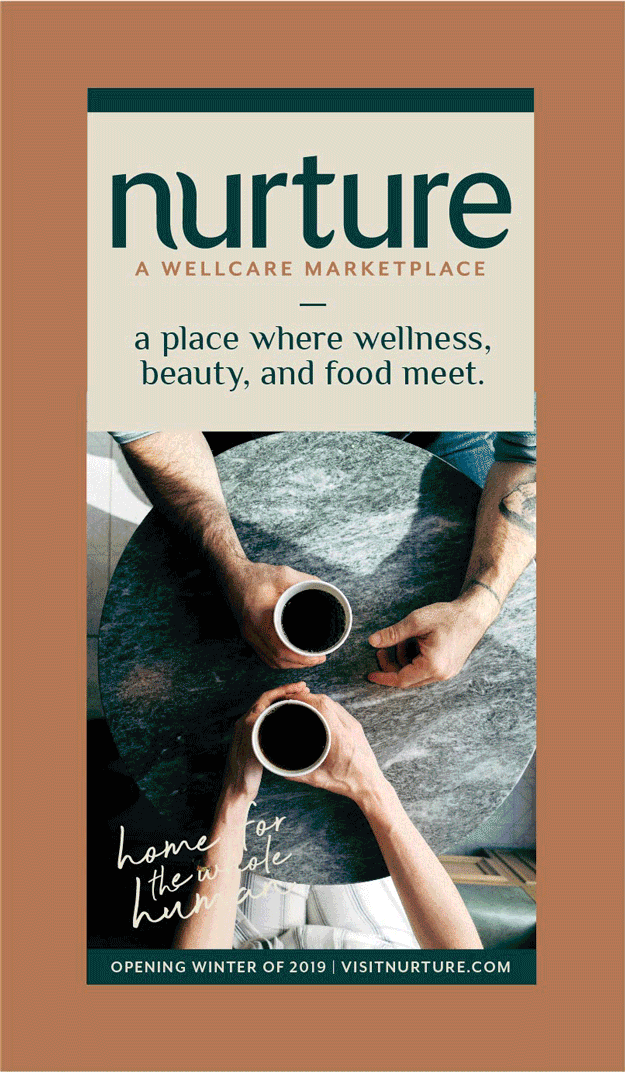
The strategy for the wordmark was rooted in the definition of the word nurture: "to care for and encourage the growth or development of." We represented the "care and encouragement" through soft, approachable and nested letterforms. The logo represents a central community where all are welcome: modern, comforting, and memorable.
Typography
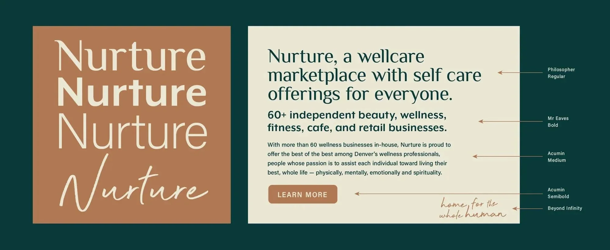
Nurture's brand typography utilizes Philosopher, Mr. Eaves, Acumin, and Beyond Infinity for expressive accents. Philosopher's letterforms matched some of the nurturing qualities of our wordmark while also having a plant-like quality. When set with the brand's iconic emerald green, the style is instantly recognizable.
Photography
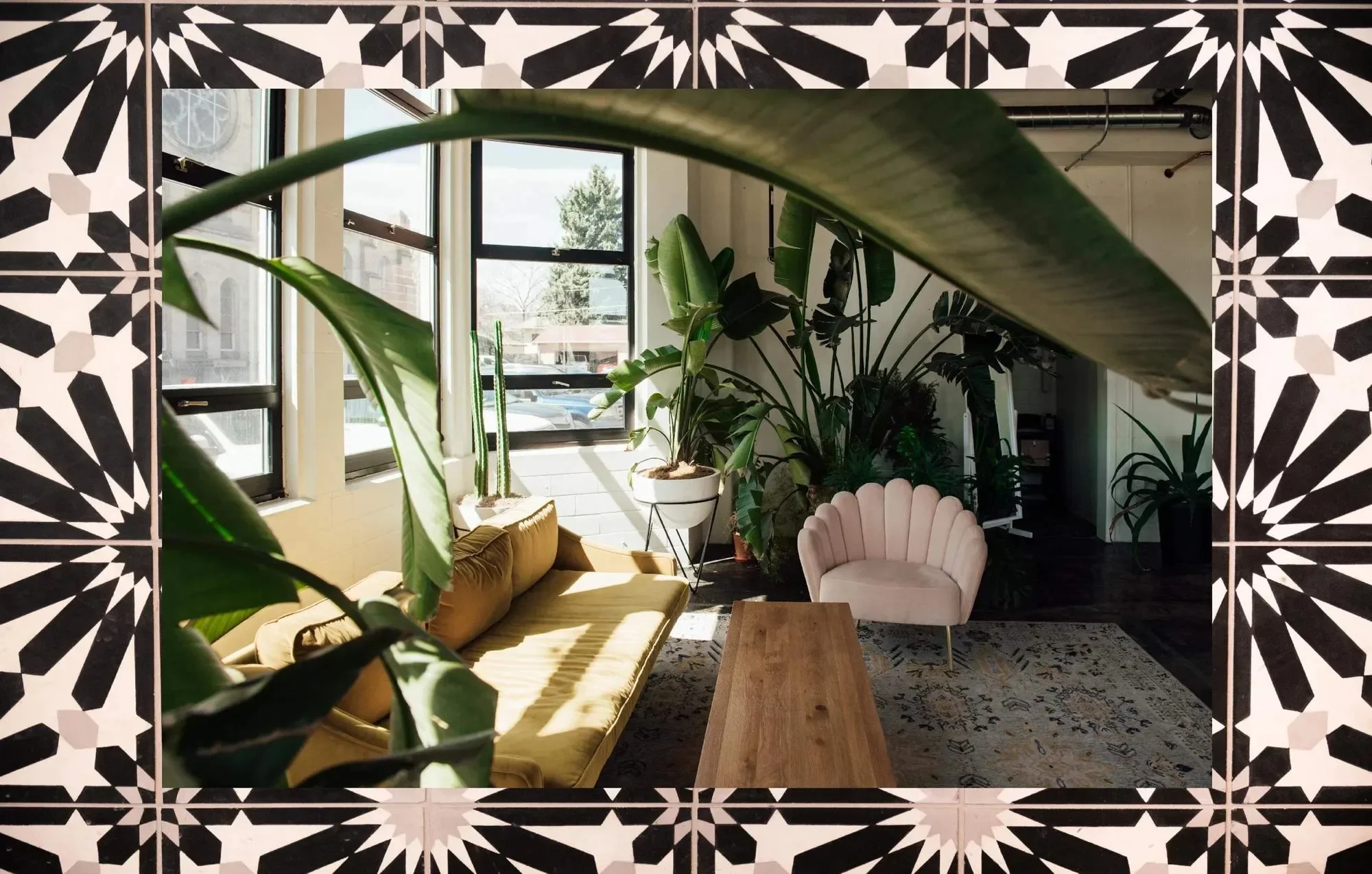
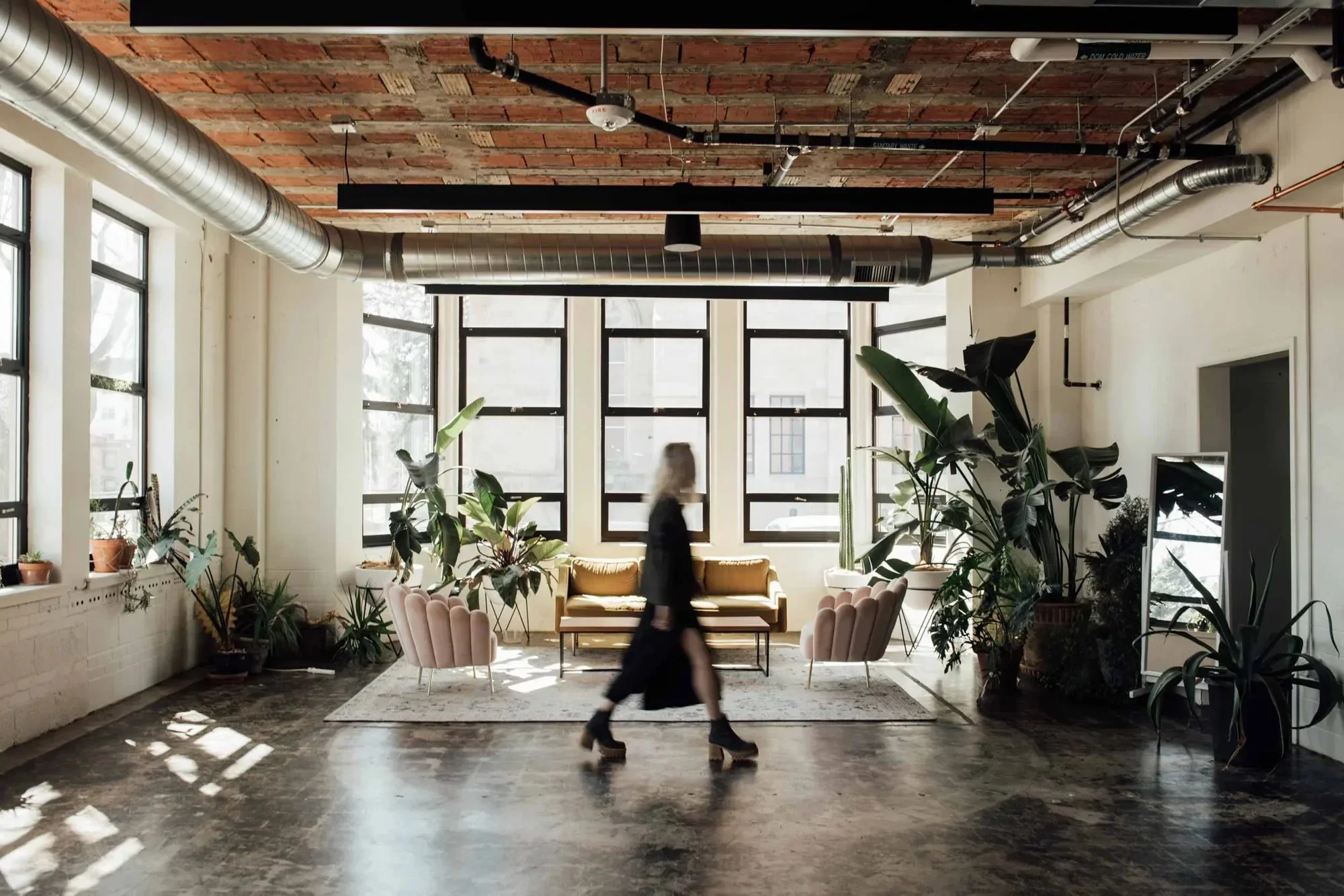
The bulk of Nurture’s photography needs fell into one of three categories: portraiture, food and bev, or environmental. A consistent thread through each of these categories was natural, soft lighting. Embracing the imperfections in us all, we suggested a wide range of natural lighting techniques can be embraced — from high to low contrast — allowing the humanity of the individual moment to inspire the final shot.


The Grid System
We systematized the layouts of marketing collateral with the Golden Ratio to aid in visual hierarchy of information. The Golden Ratio is present in both the human body dimensions and in nature, making it an ideal ratio because of its innate appeal to the human eye.

Collateral Communications
Striking a balance between natural and premium, the design system uses floods of color, the brand typography, and photographic styles to create compelling compositions and easy-to-understand communications.

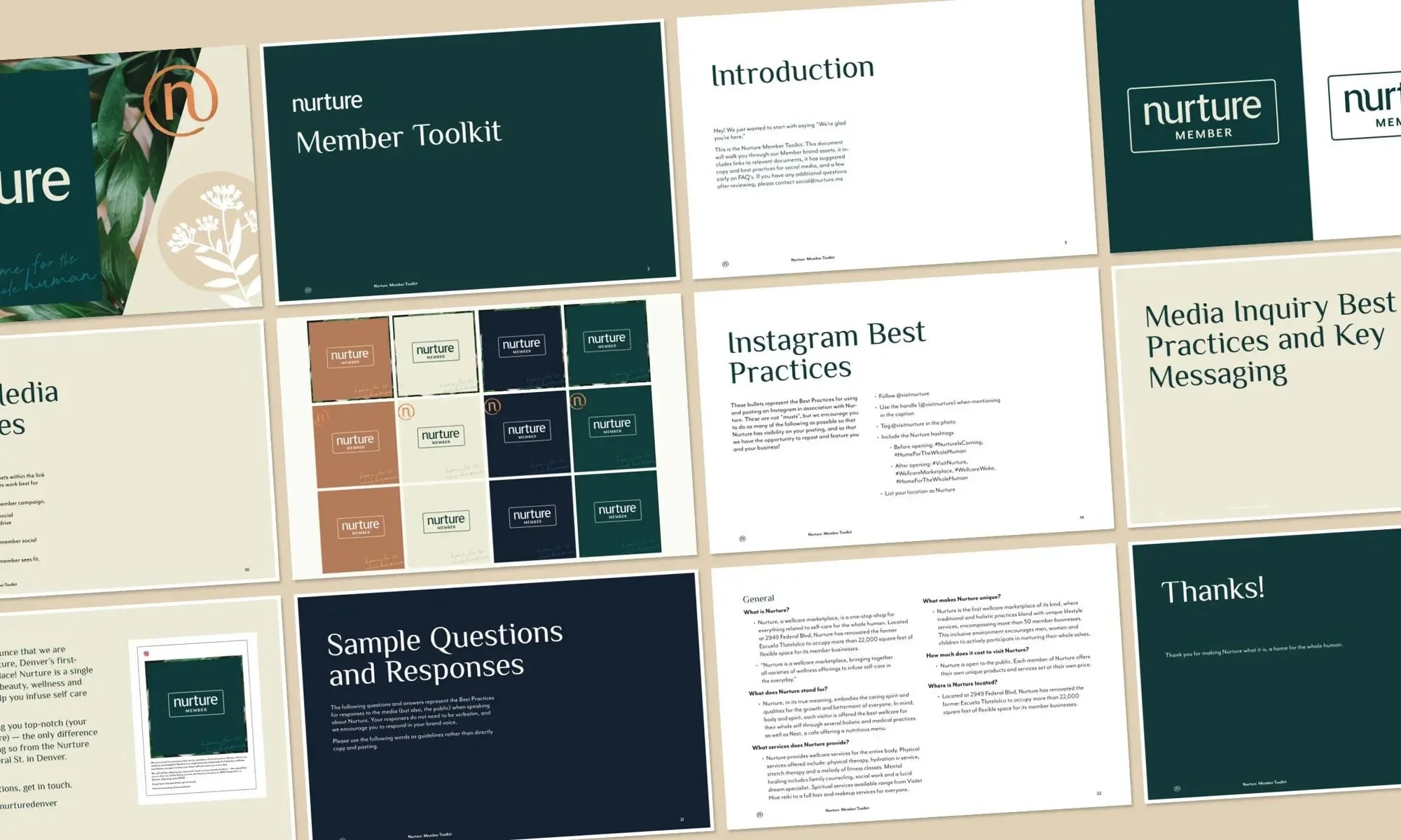
Member Toolkit
With over 60 independent practitioners renting space within Nurture, and knowing that turnover was inevitable, there was a need for a single source of brand truth. The Member Toolkit captured the brand's mission, vision, values, copy examples, links to various social media templates, examples and assets that the businesses could use, or be inspired by. This document not only introduced the Nurture brand to the practitioners, but ensured everyone was presenting and speaking about Nurture correctly.

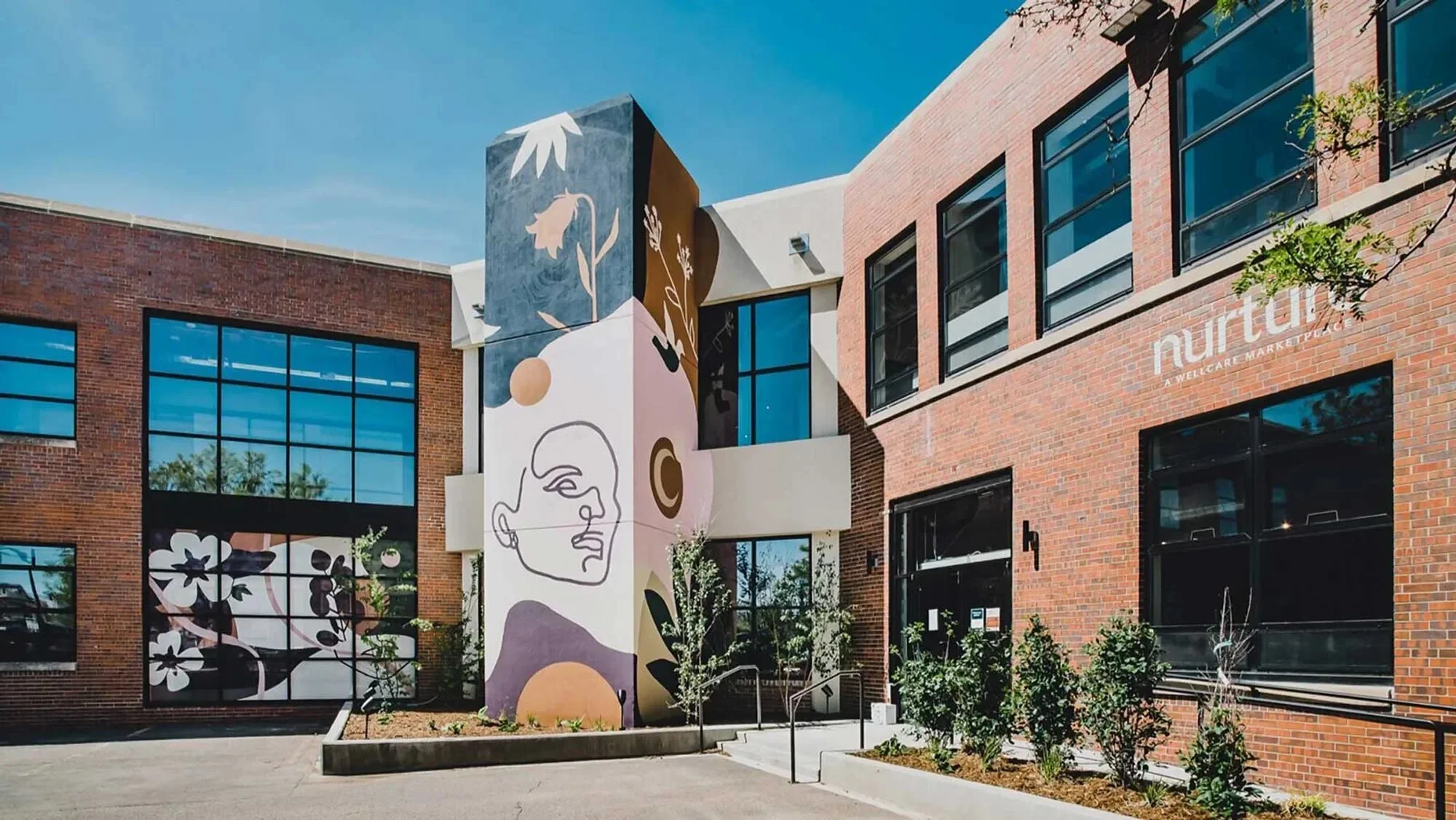
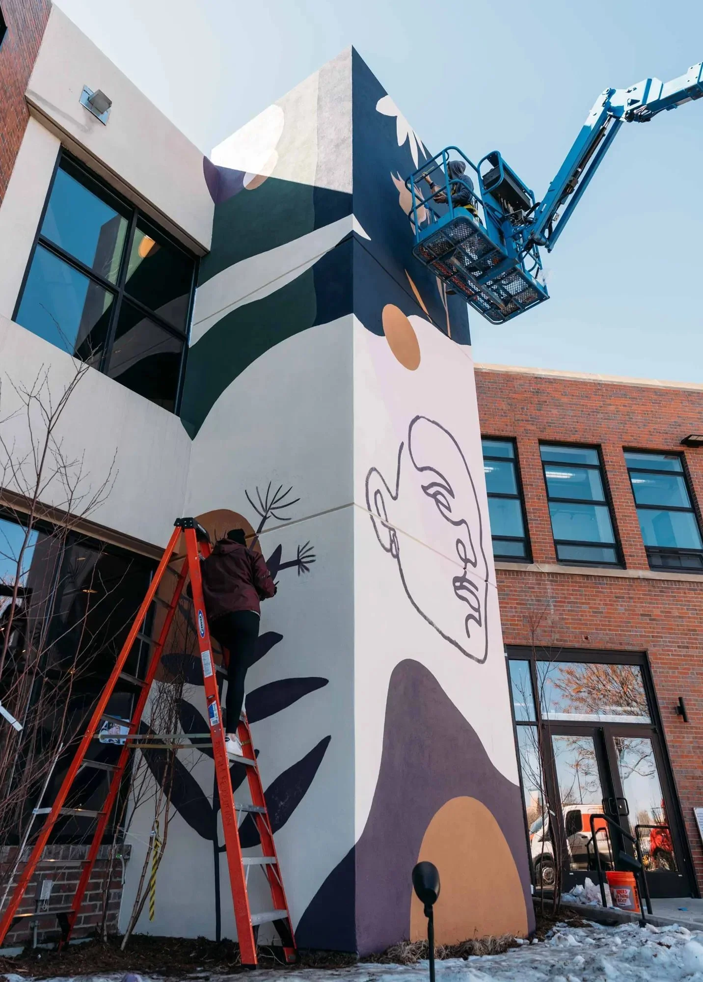
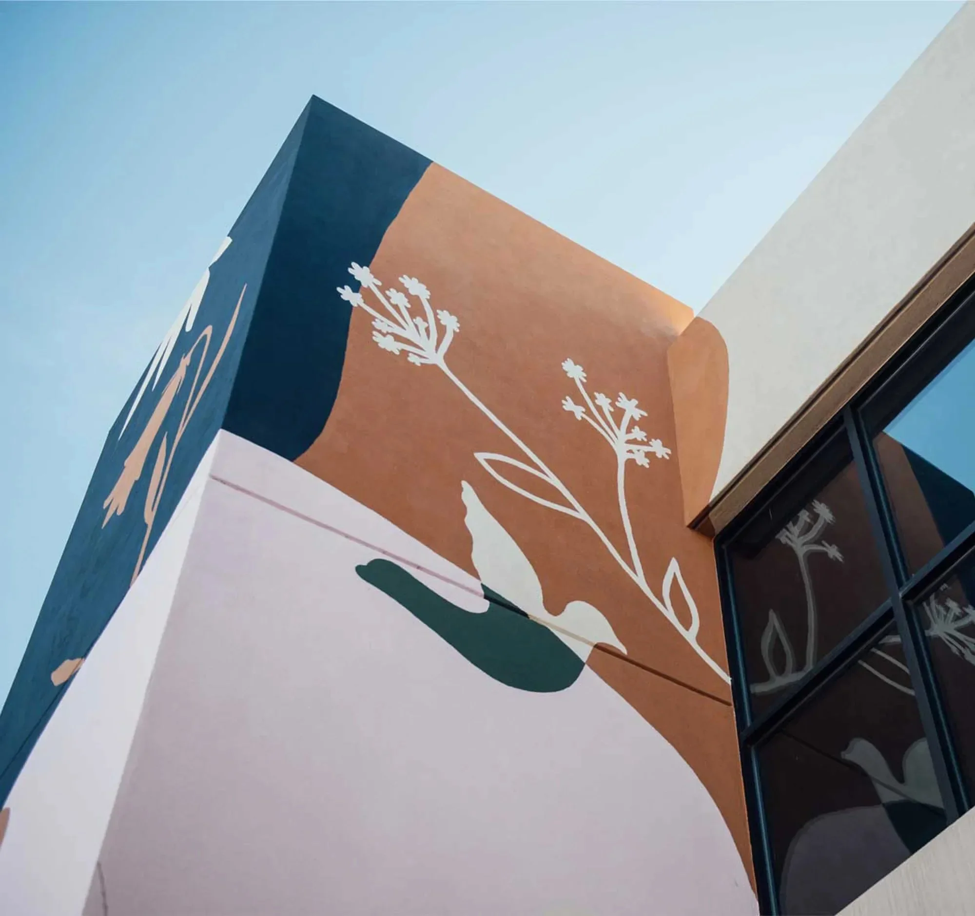
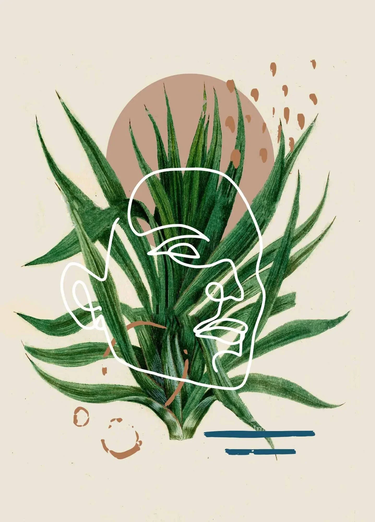
The Mural
We wanted the mural to help convey the Nurture brand to anyone who drives by. Combining simple illustrations that represent humanity and nature, as well as organic shapes, the beautiful jewel tones and face focal point immediately draw attention to the building.


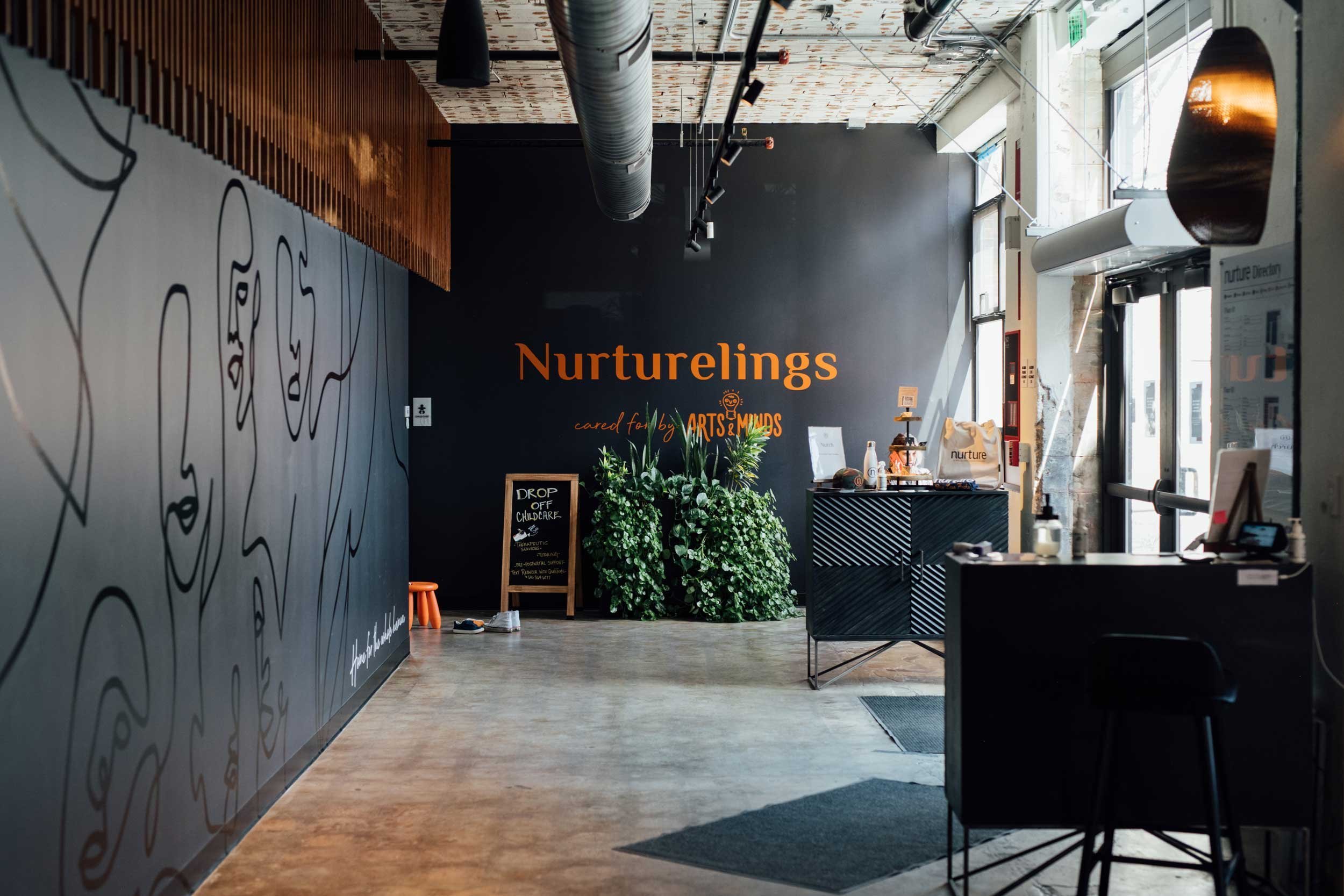
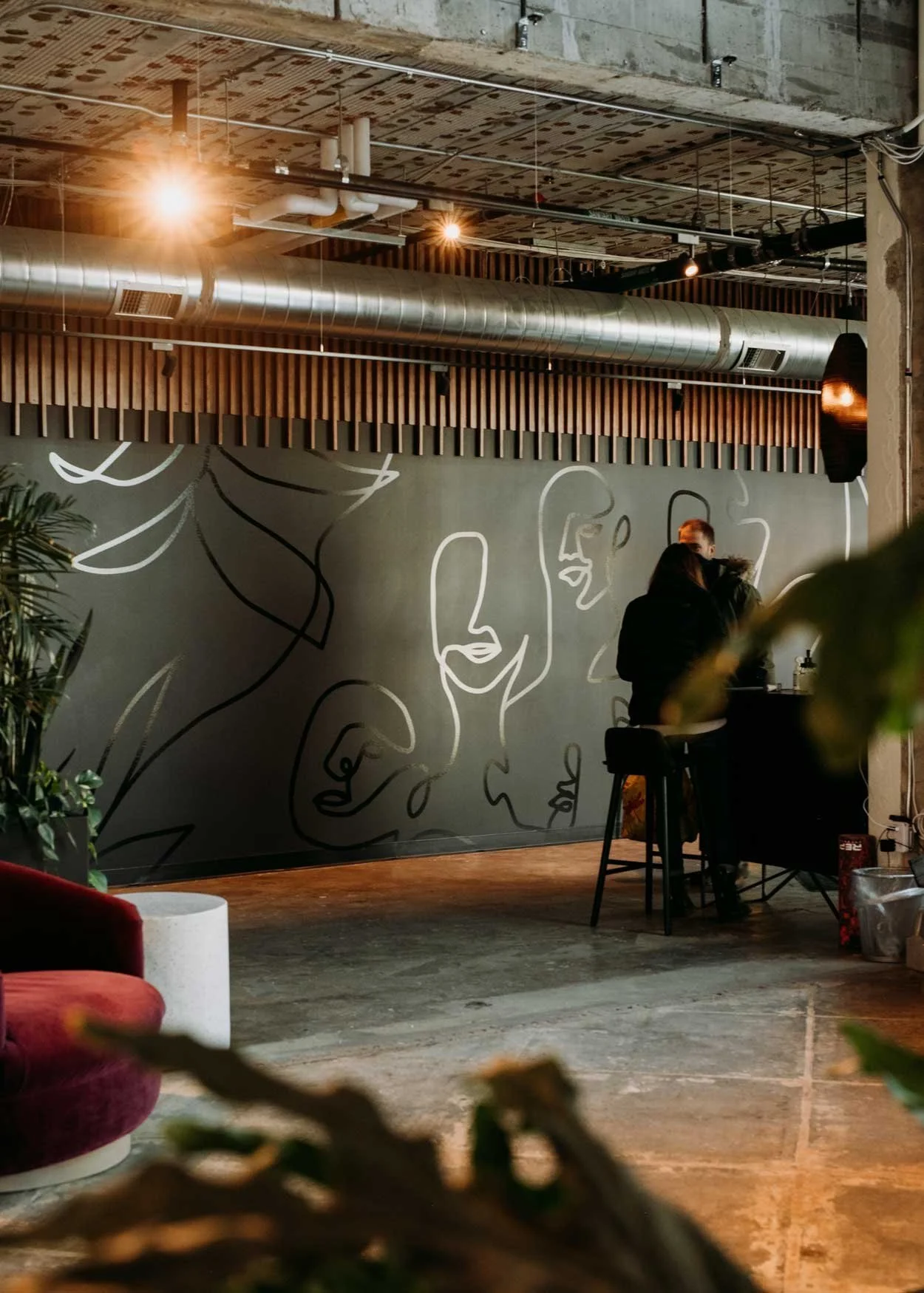
Vinyl Mural and Interior Artwork
Greeting you as you enter the space is a vinyl mural showcasing the unity of humanity and nature. A continuous line illustration of ambiguous human faces and leaves, in a premium black on black color palette, with Nurture's tagline "Home for the Whole Human" as a signoff.


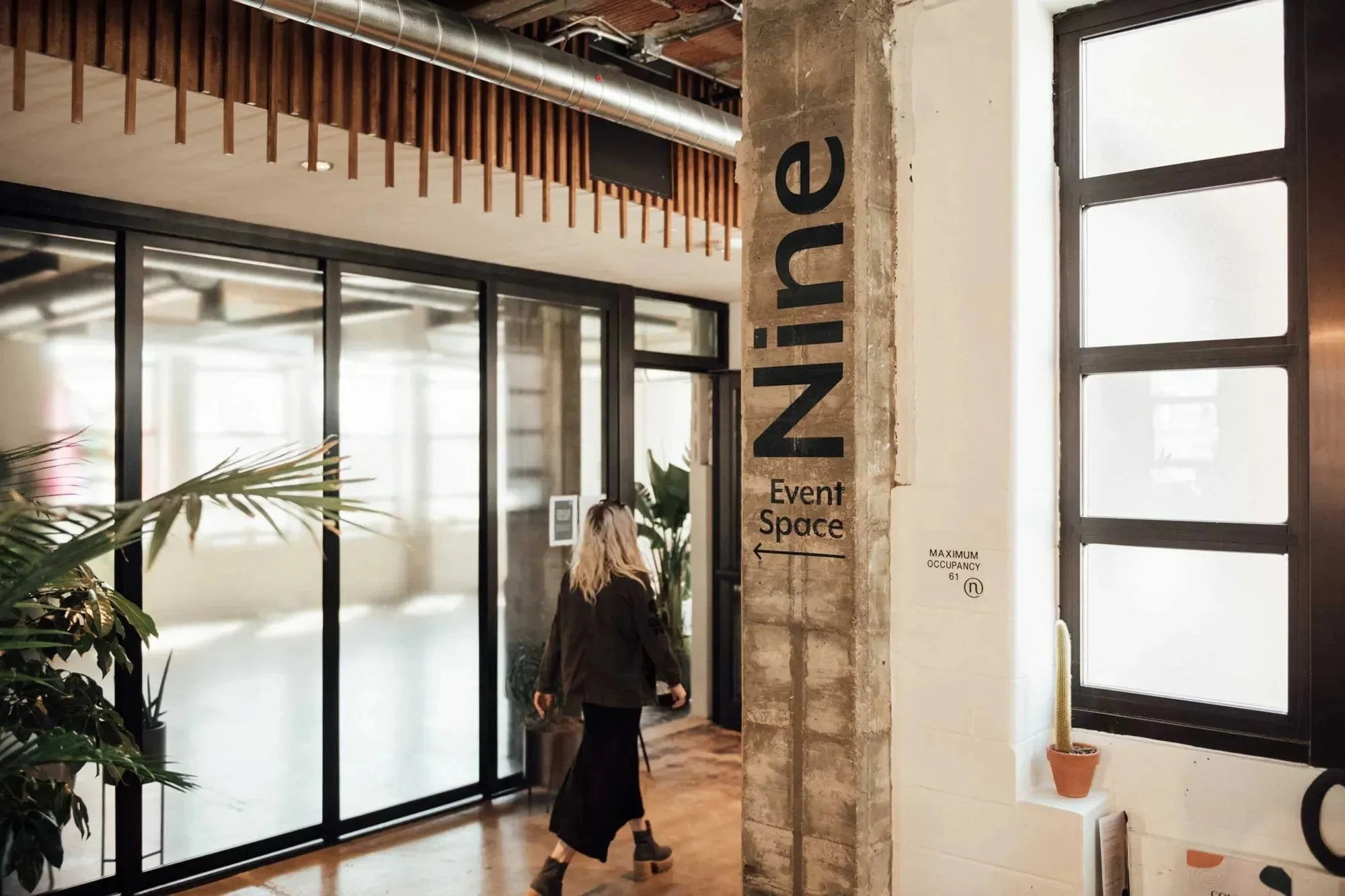
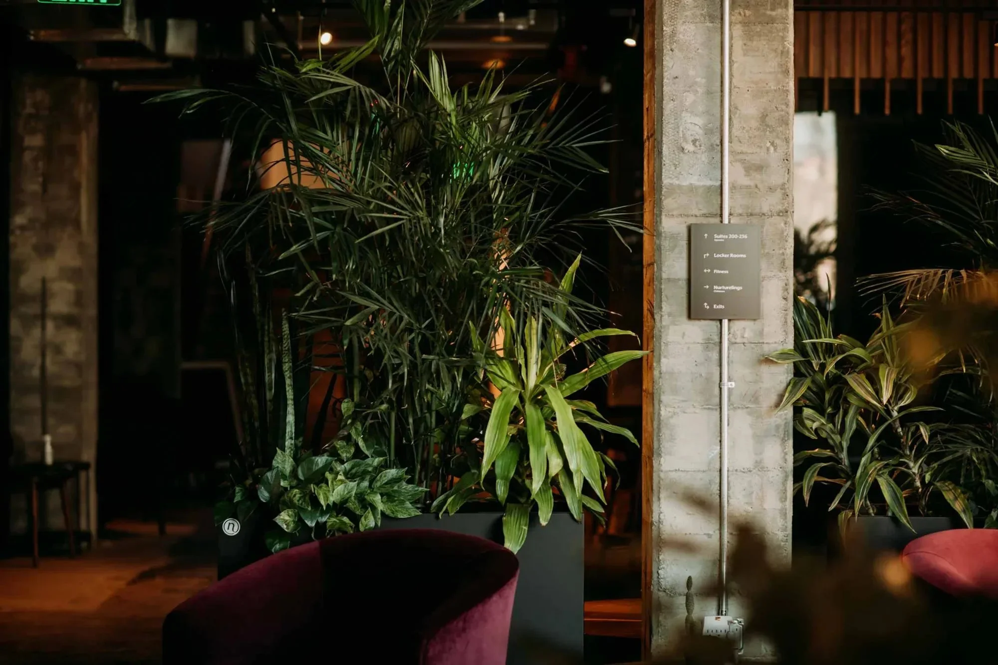
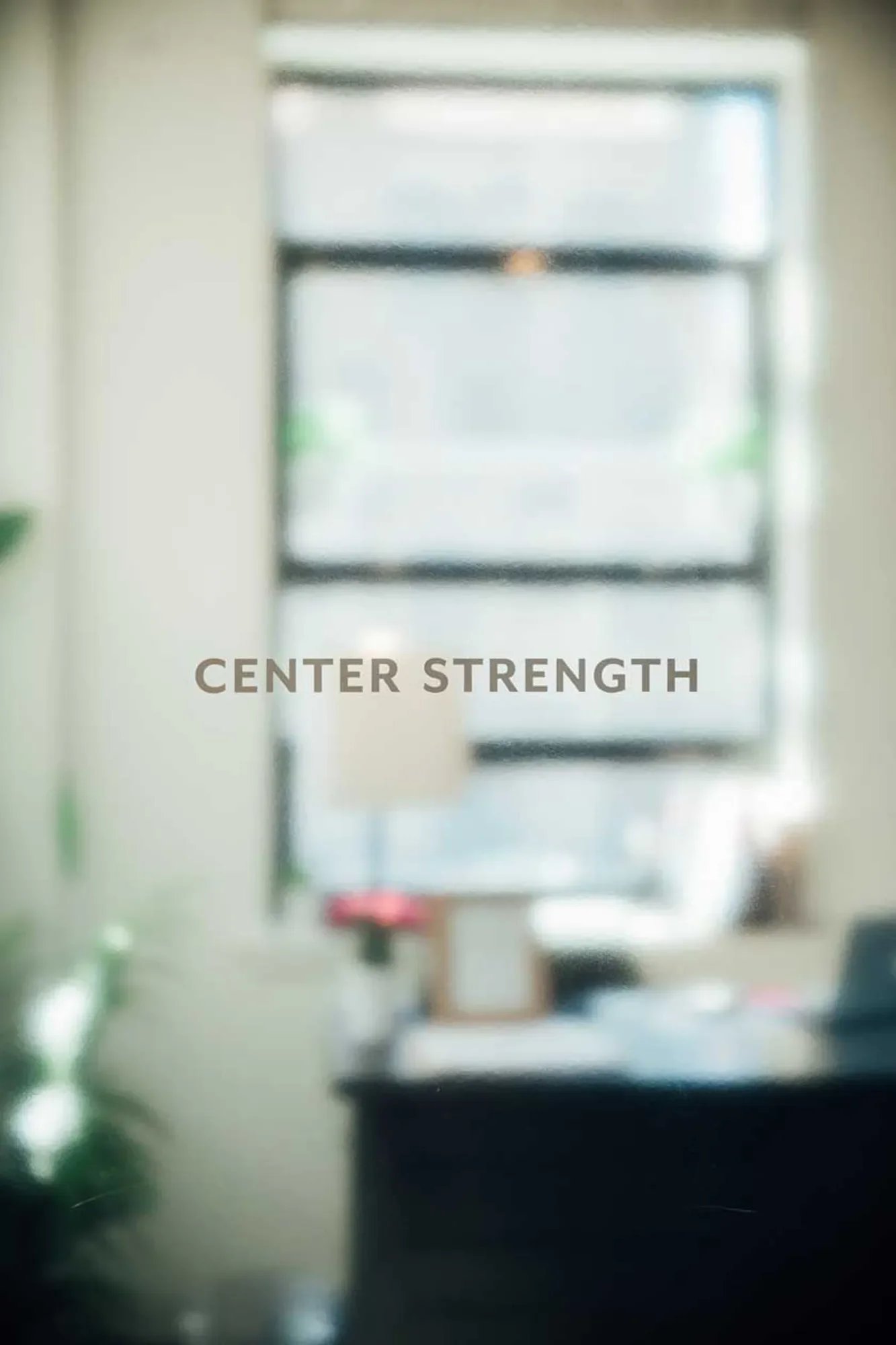
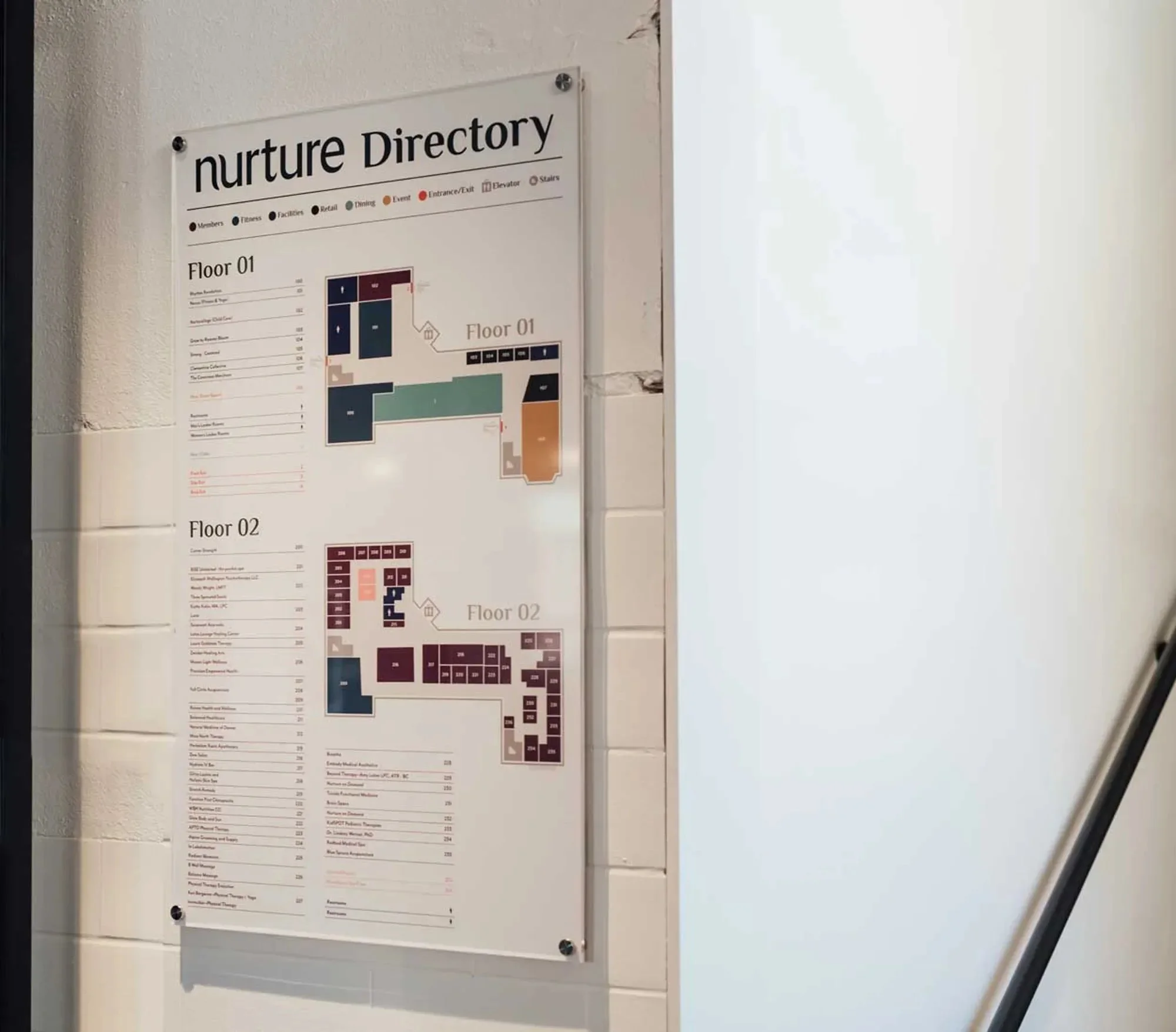
Signage and Way Finding
Nurture is a sprawling two story, 23,000 sq. ft. facility. We created two color-coded maps placed at each entrance plus directional placards at junctures and on pillars. Clean vinyl naming was applied in brand fonts across individual practitioners' doors, and large vinyl sub brand names were applied to pillars to help identify key areas from afar.

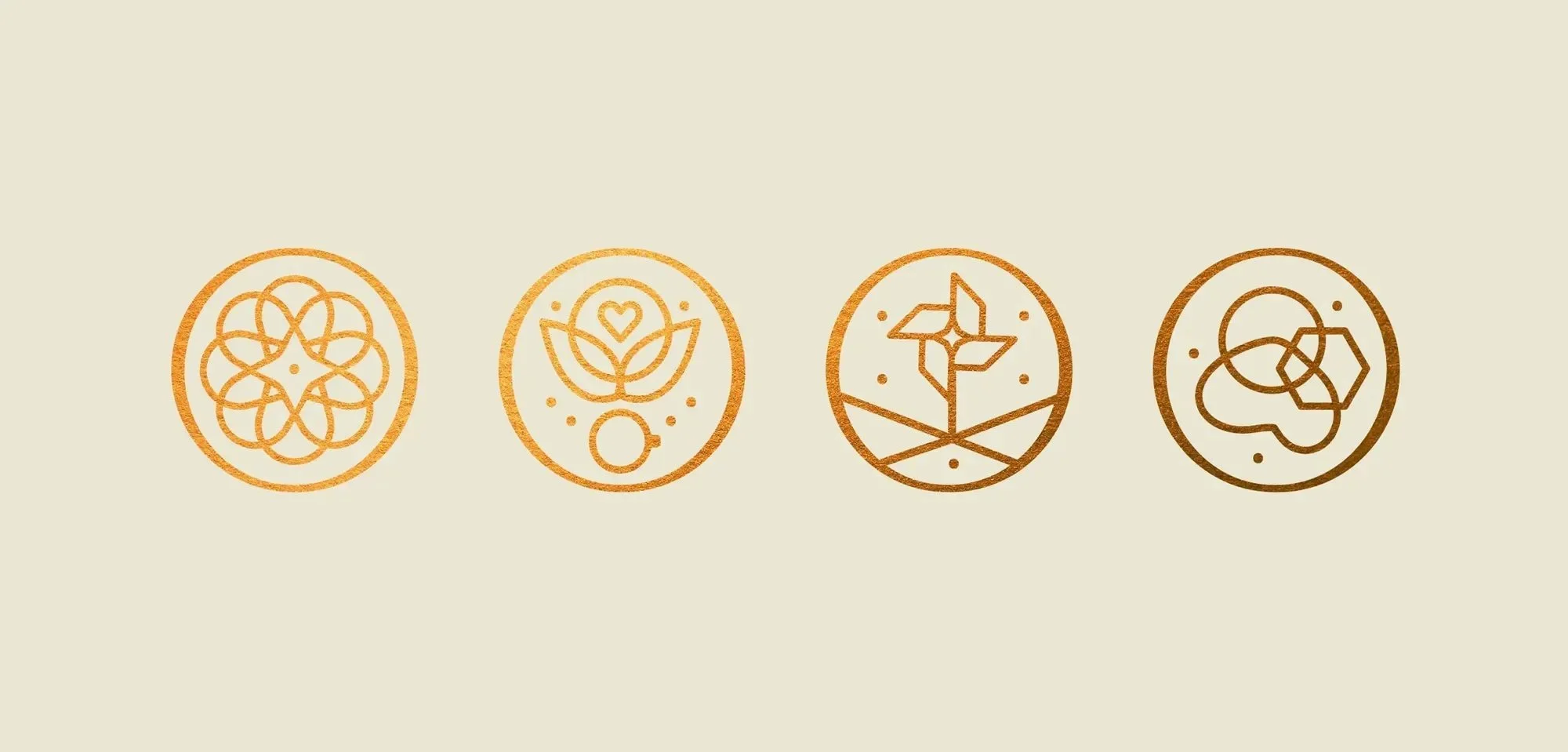
Subbrands
Using sacred geometry as our basis for sub-brands, a series of icons were created. Each symbol's container shape was that of the Nurture "at" symbol, and contained elements that spoke to the sub-brand itself.


Want to see more?