Oikos
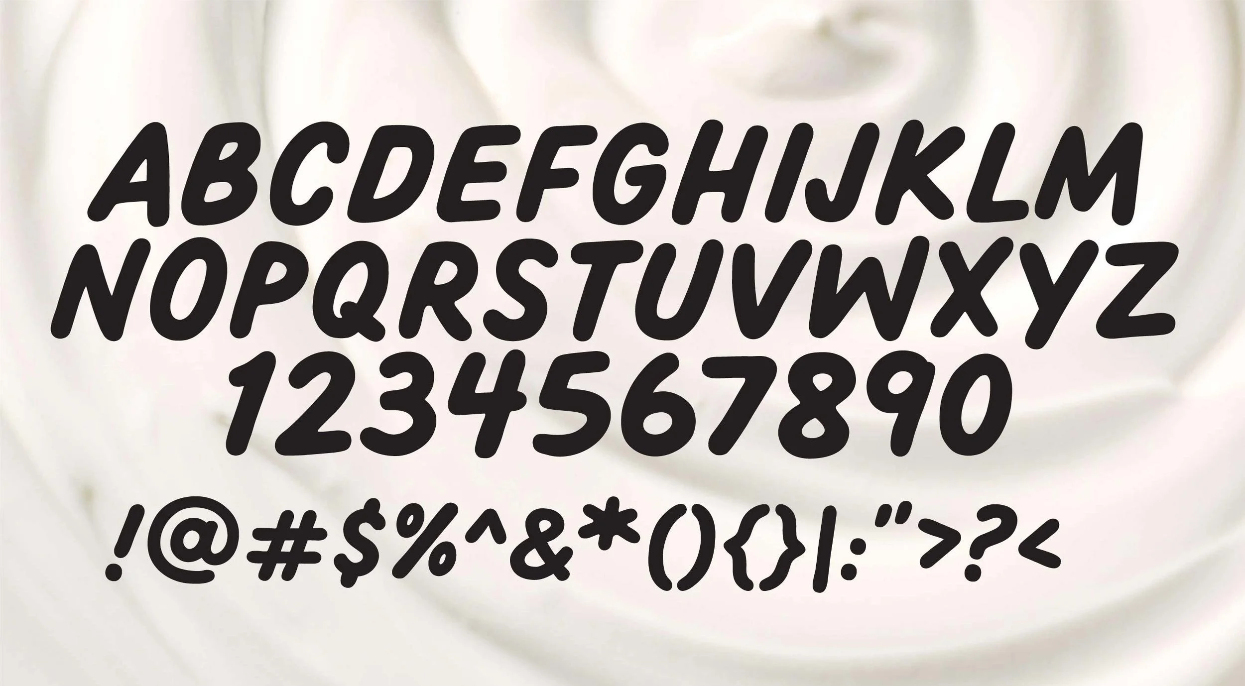
Oikos Custom Typeface
Client
Oikos (Danone Brand Design Studio in collaboration with Beardwood & Co)
Services
Typeface Design and Development
Credits
Agency: Beardwood & Co
Executive Creative Director: Lauren Koprowski Bodner
Principle Type Designer: Adam Vicarel
Type Design: Carly Salzman
Type Production: Brethren Design Co.
All design application, mockups, branding: Beardwood & Co
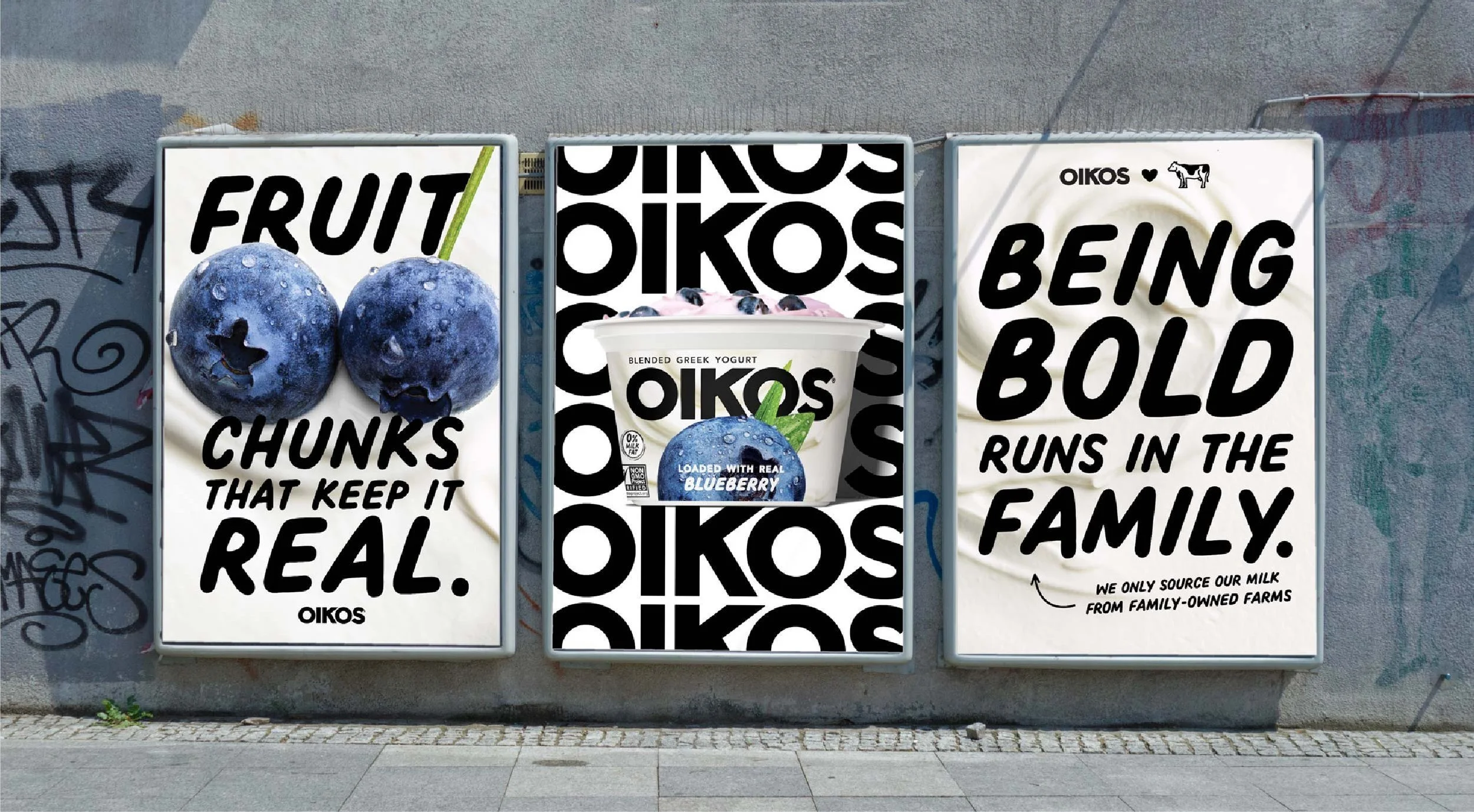
The Opportunity
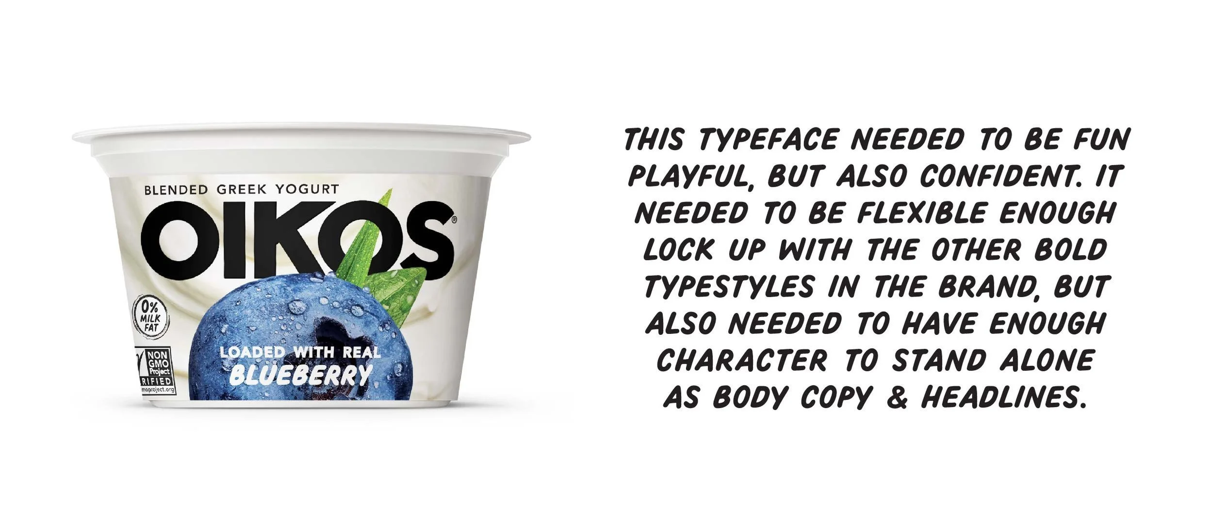
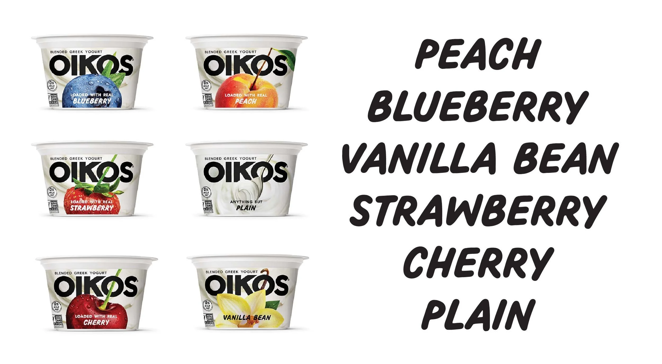
Oikos was going to market with a new package design and the design team couldn't find a typeface that was legible, readable, playful, and confident while maintaining stylistic synergy with their new bold, angular logotype.
The Solution
Focused on legibility and readability, we created a custom typeface that is as playful as it is confident. With use-cases spanning packaging, advertising, and marketing collateral, this typeface needed to be incredibly versatile from headline to body copy.
Process
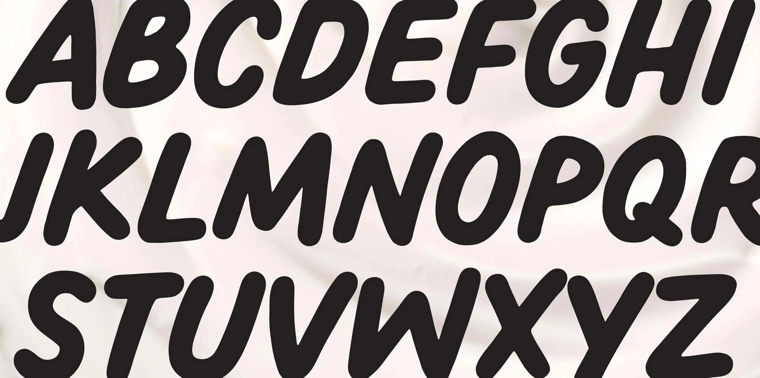
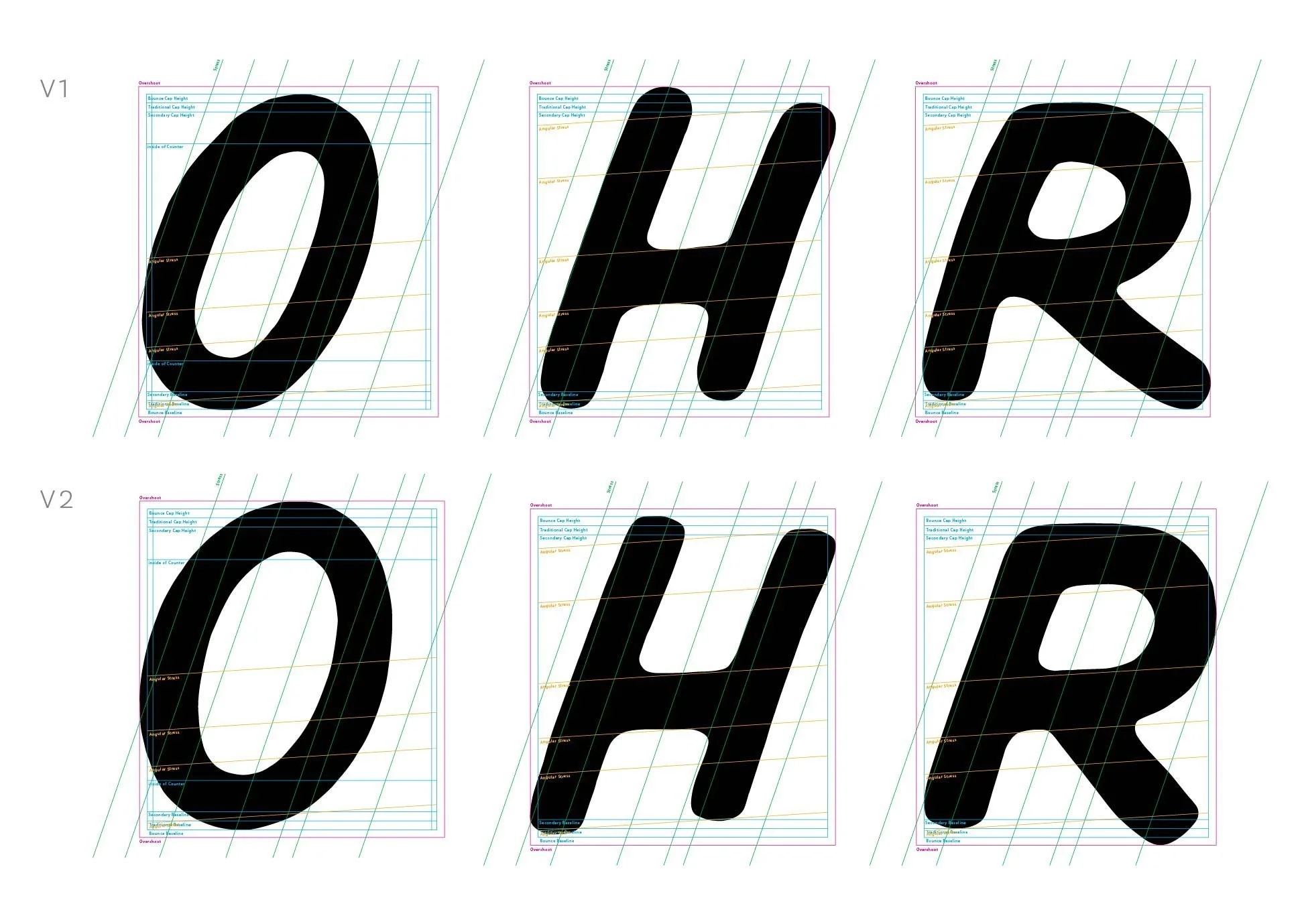
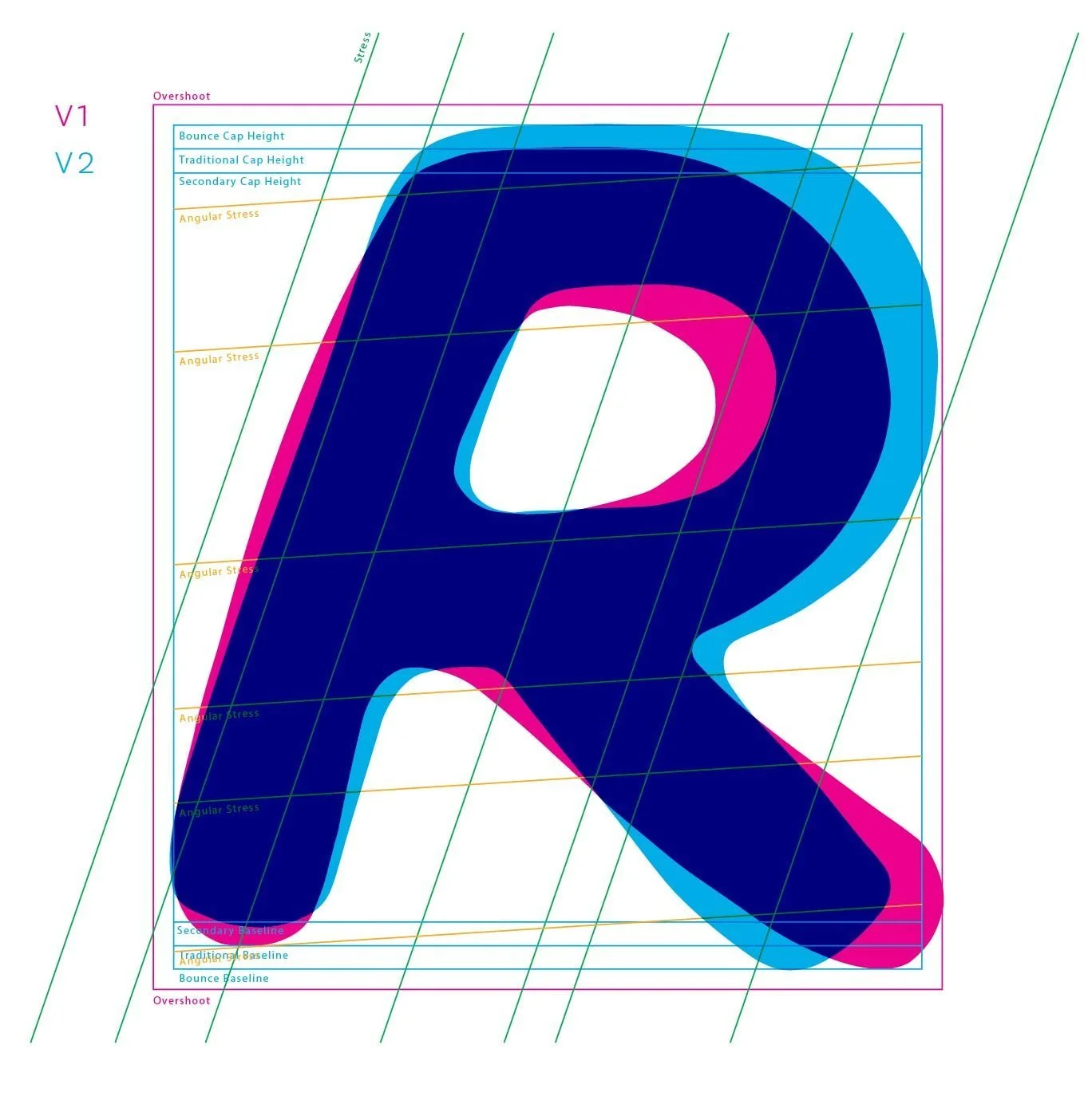
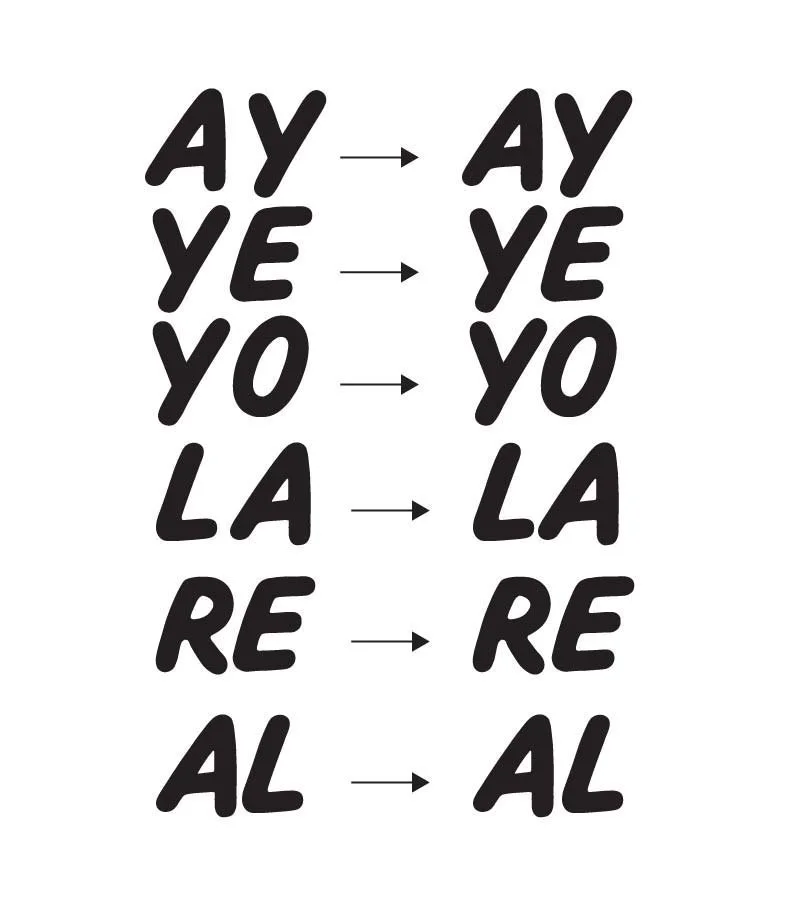
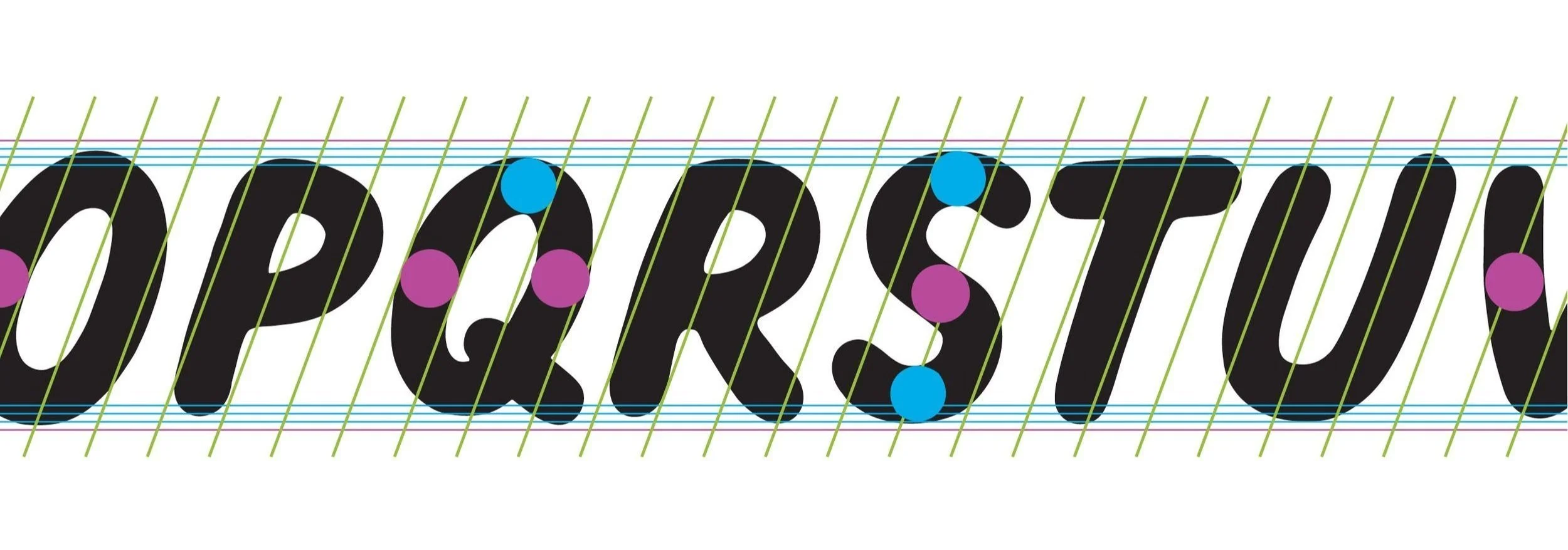
Starting with the classic proportions of byzantine letterforms, we grouped the letters based on classic proportion letter width. We then constructed a flexible grid system allowing for varying widths, baseline, and cap-heights. This allowed us to create a typeface that felt structured and intentional but also bouncy and playful, achieving "hand written" but simultaneously refined.

Character iteration
Kerning adjustments
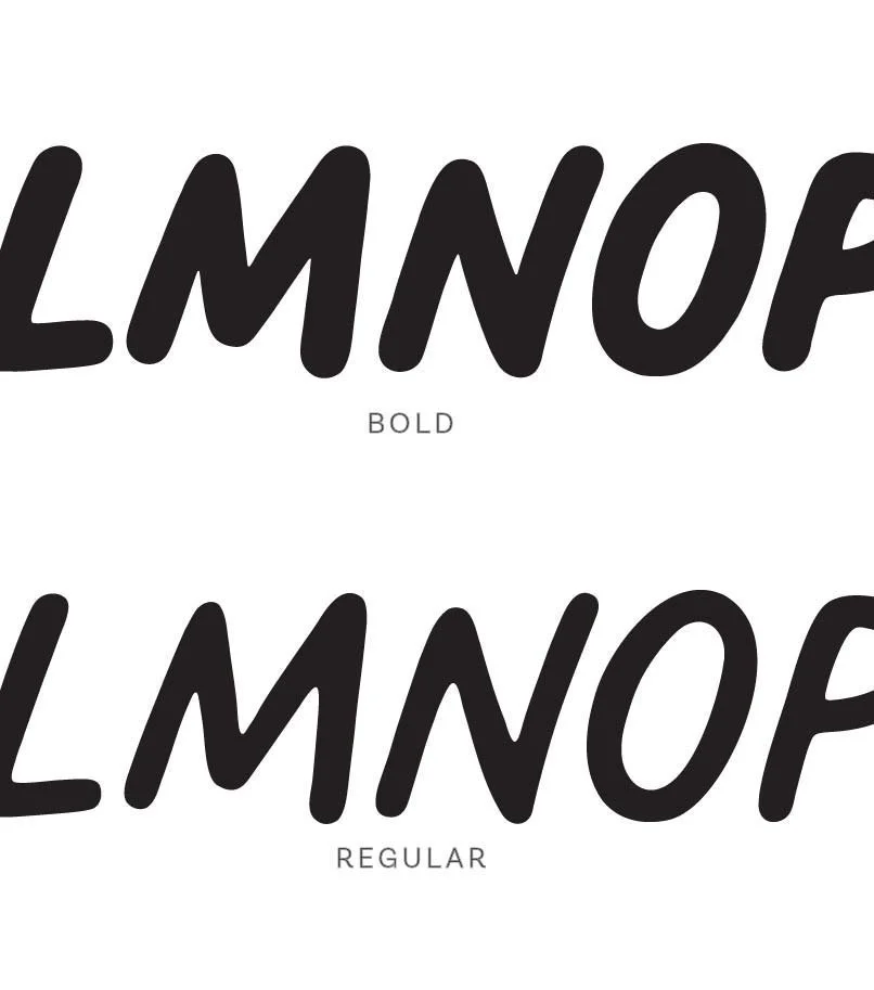
Typeface weights
After a few rounds of character iteration, kerning and weight versioning (ensuring that the bold was bold enough and the regular was light enough) we ran a final series of tests to ensure that the varying baseline and cap heights were not too playful or too serious, and that the deviations in letterform weight were enough to feel natural, but not so much that it felt unconsidered.
Want to see more?