Summer West Bourbon
Summer West Bourbon Brand Identity and Packaging Design
Rebranding a boutique bourbon with contemporary nostalgia.
Client
Summer West
Services
Visual identity refresh, Creative Direction, Packaging Design, Copywriting
Credits
Creative Direction, Brand and Package Design, Production: Adam Vicarel
Brand and Package Design, Production: Carly Salzman
Images: Bahar's Media
The Opportunity
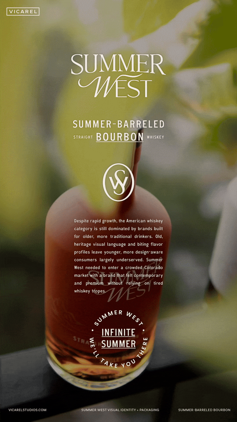
Despite rapid growth, the American whiskey category is dominated by brands built for older, more traditional drinkers. Summer West needed to enter a crowded Colorado market with a brand that felt contemporary and premium without relying on tired whiskey tropes.
The Solution
We partnered with Summer West to create a contemporary whiskey brand that stands out while rooted in category understanding and consumer behavior. By studying shelf presence and competitive norms, we built a visual system that balances classic whiskey cues with a lighter, more approachable aesthetic.
Visual Identity
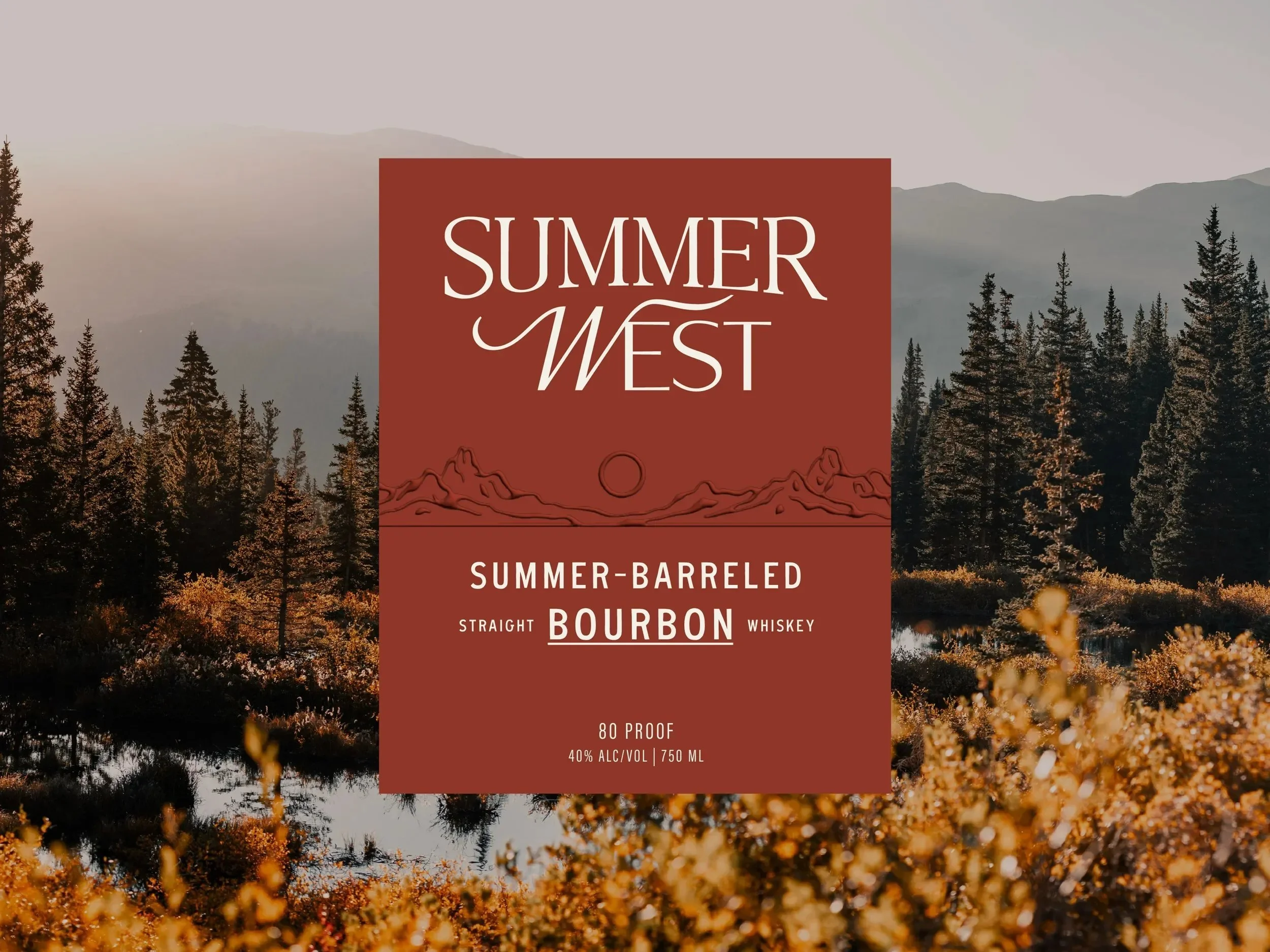
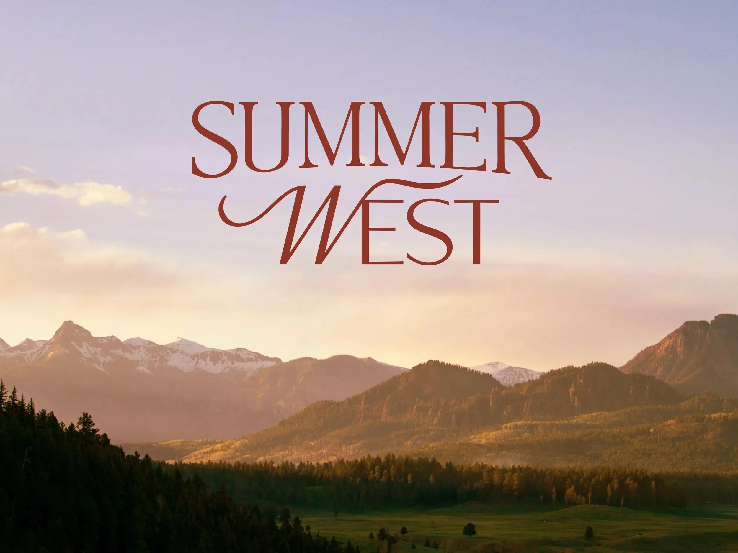
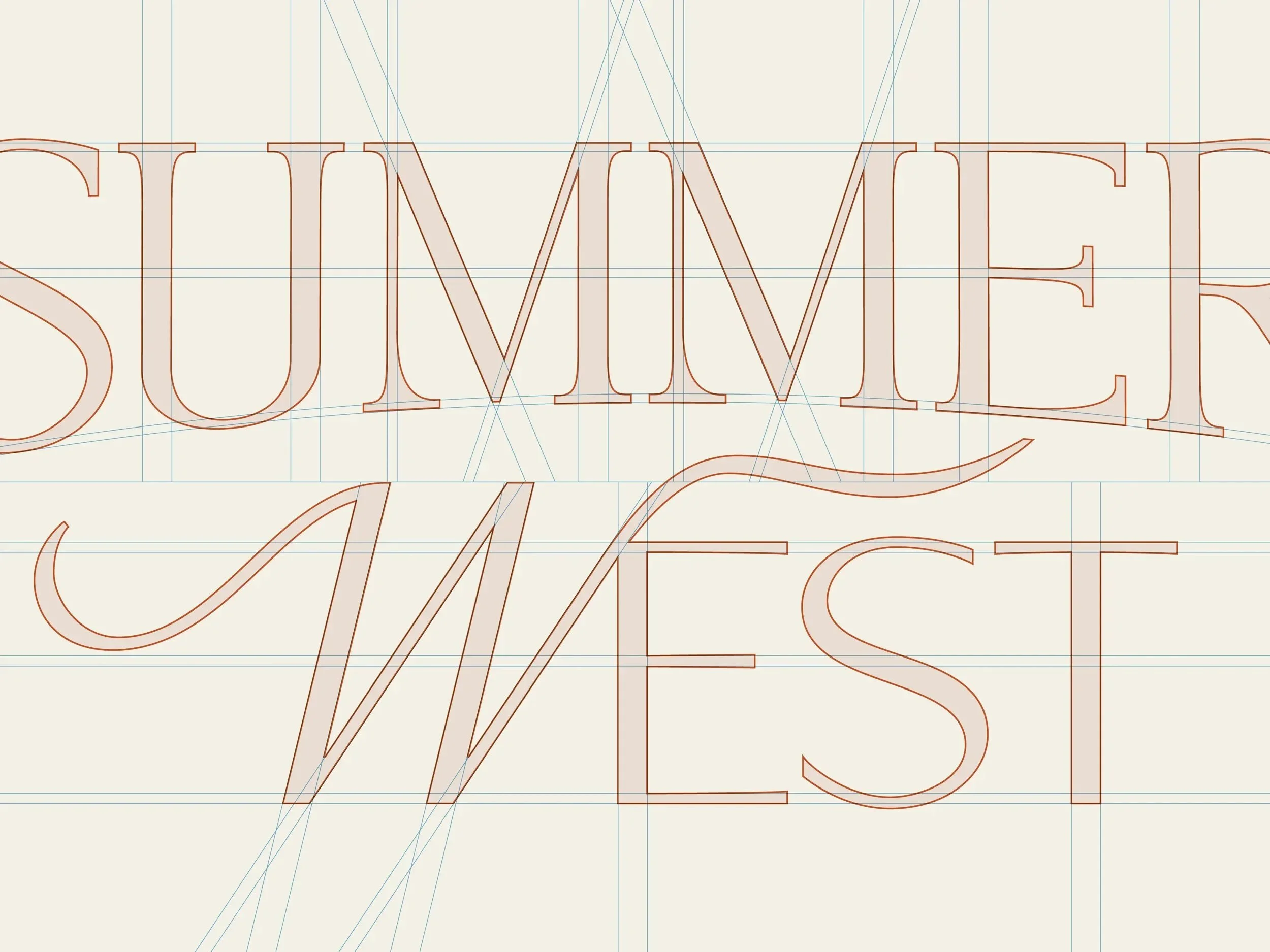
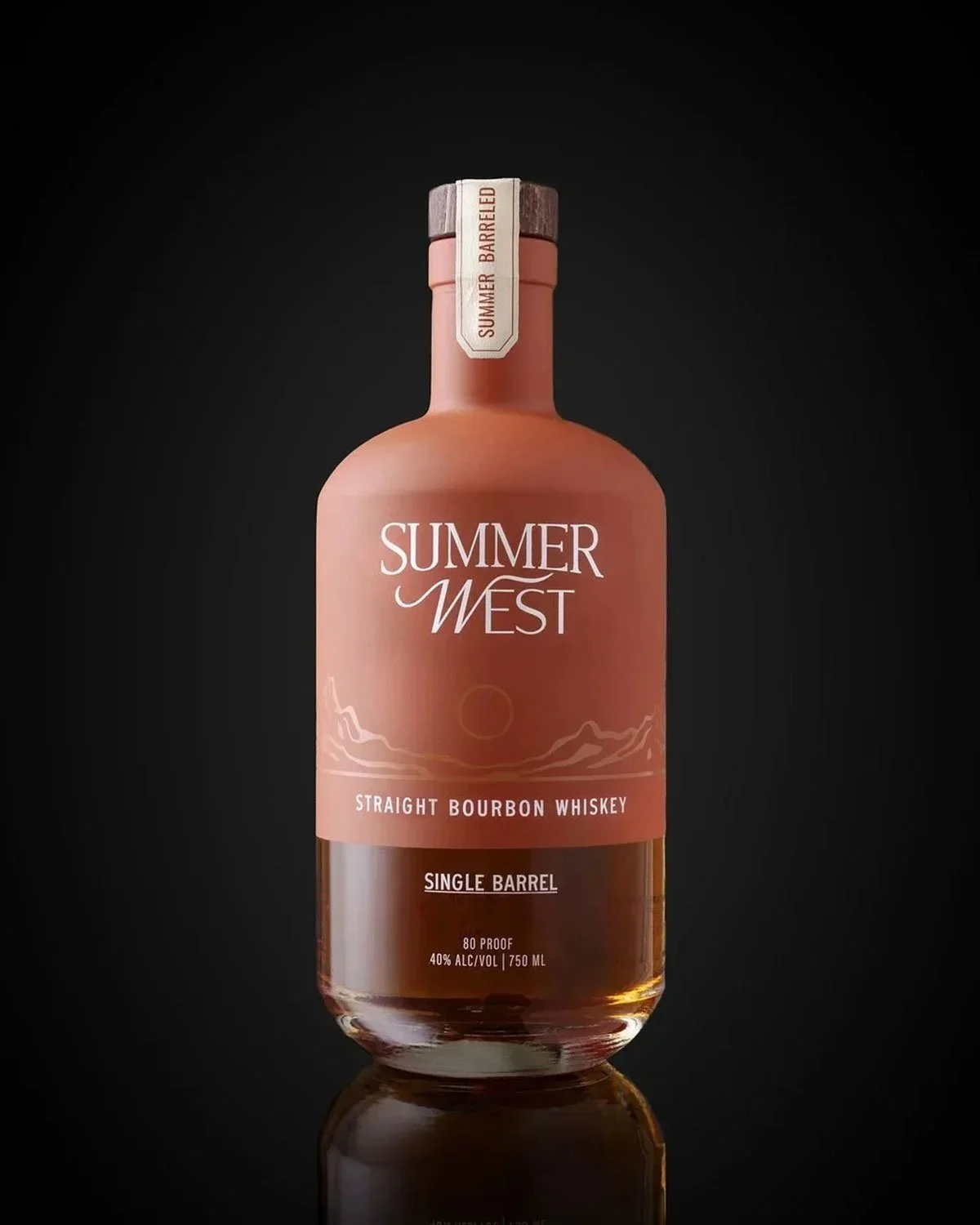
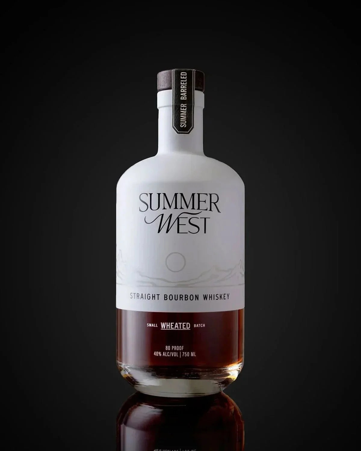
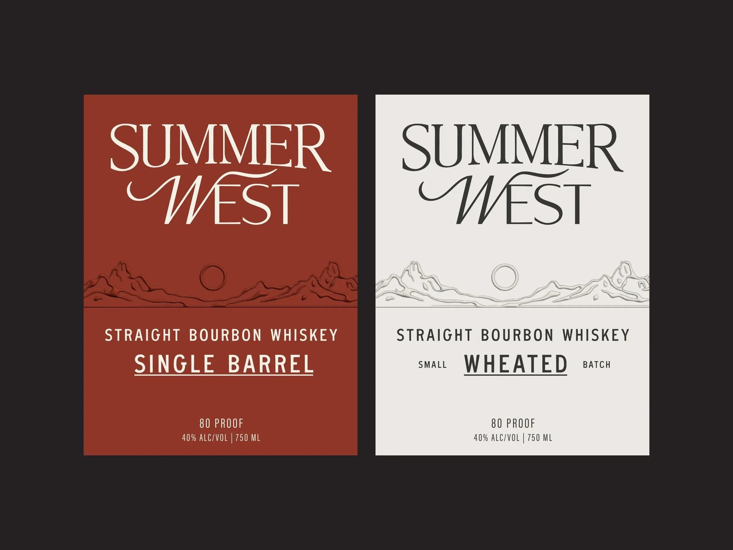
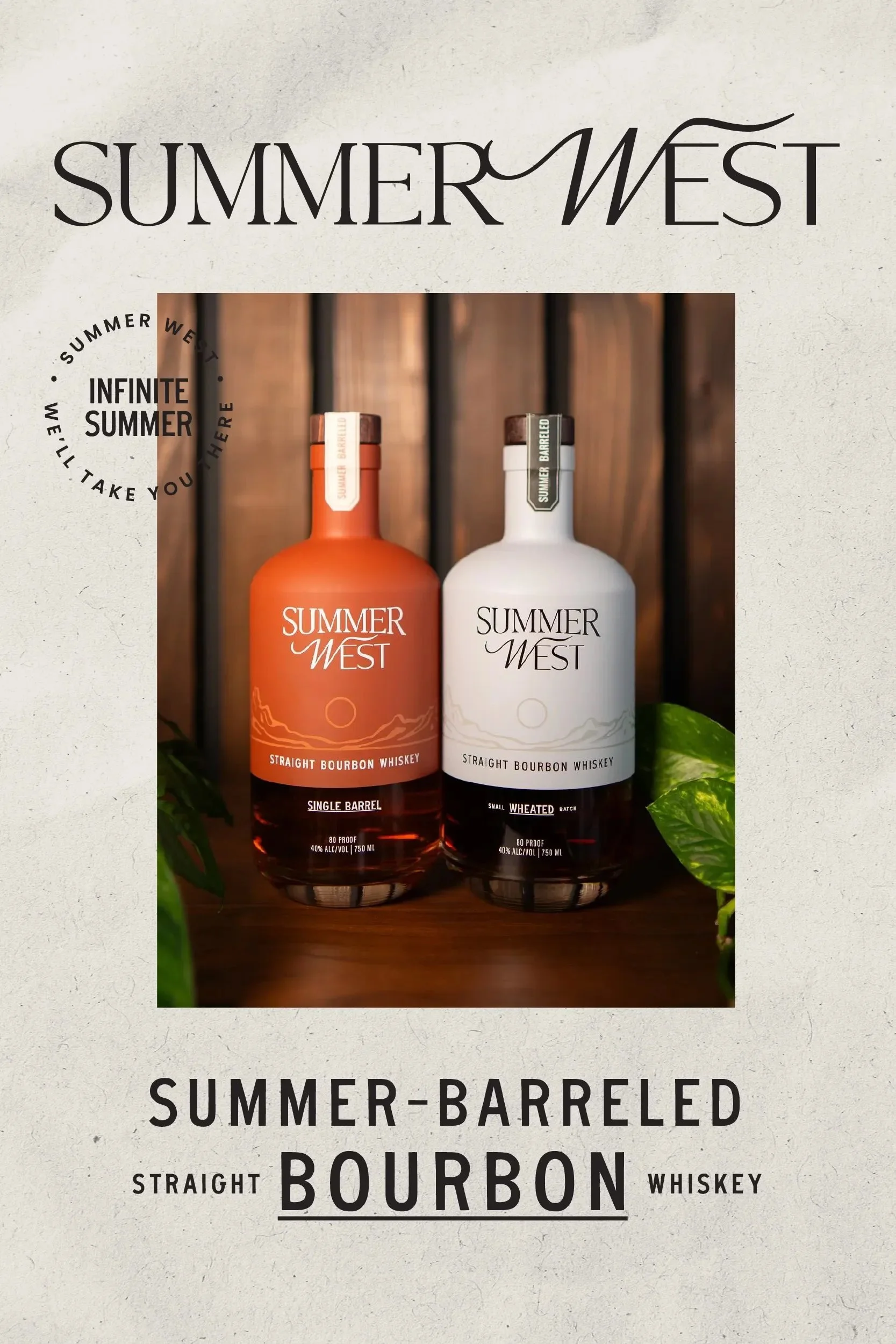
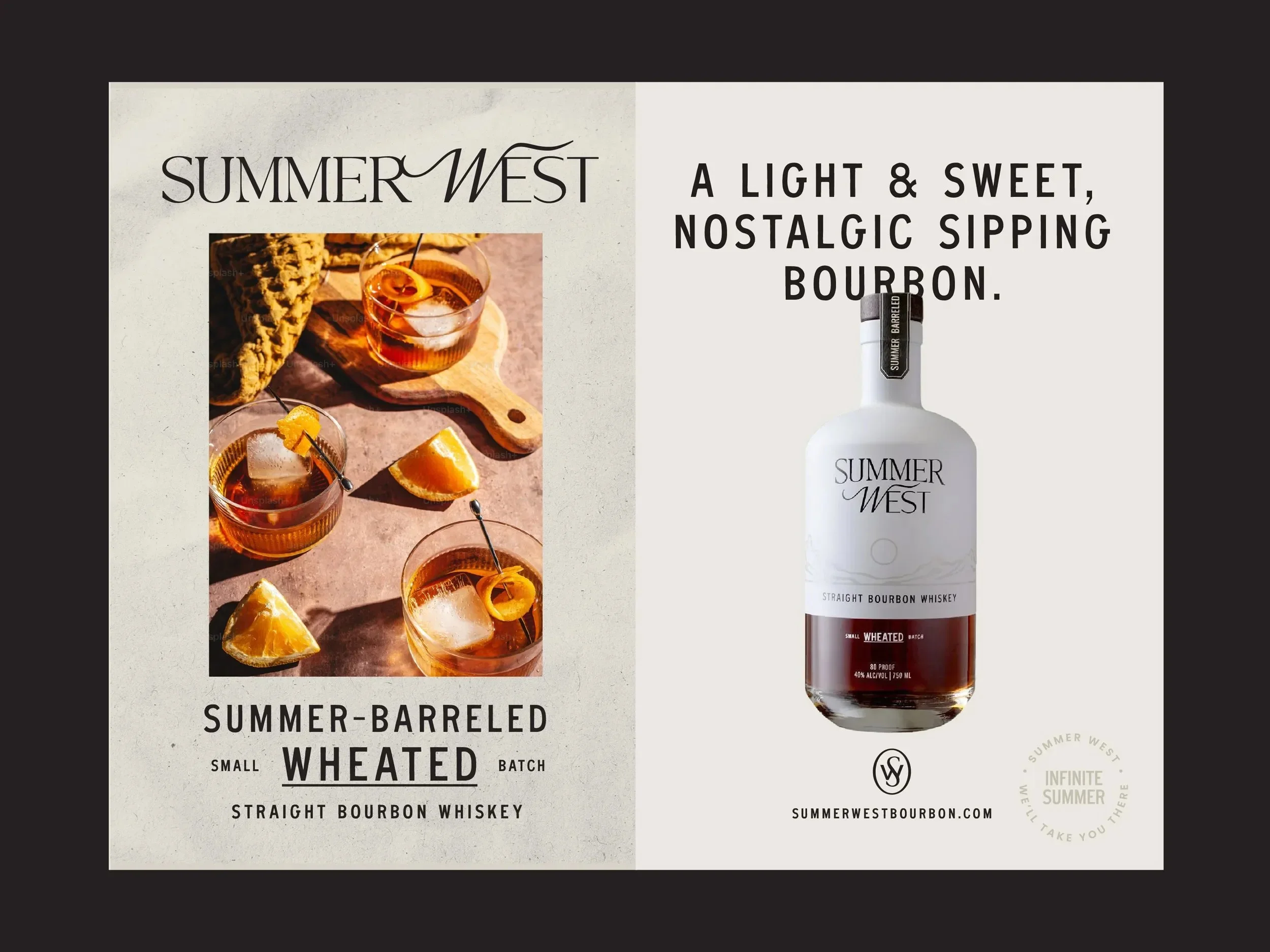
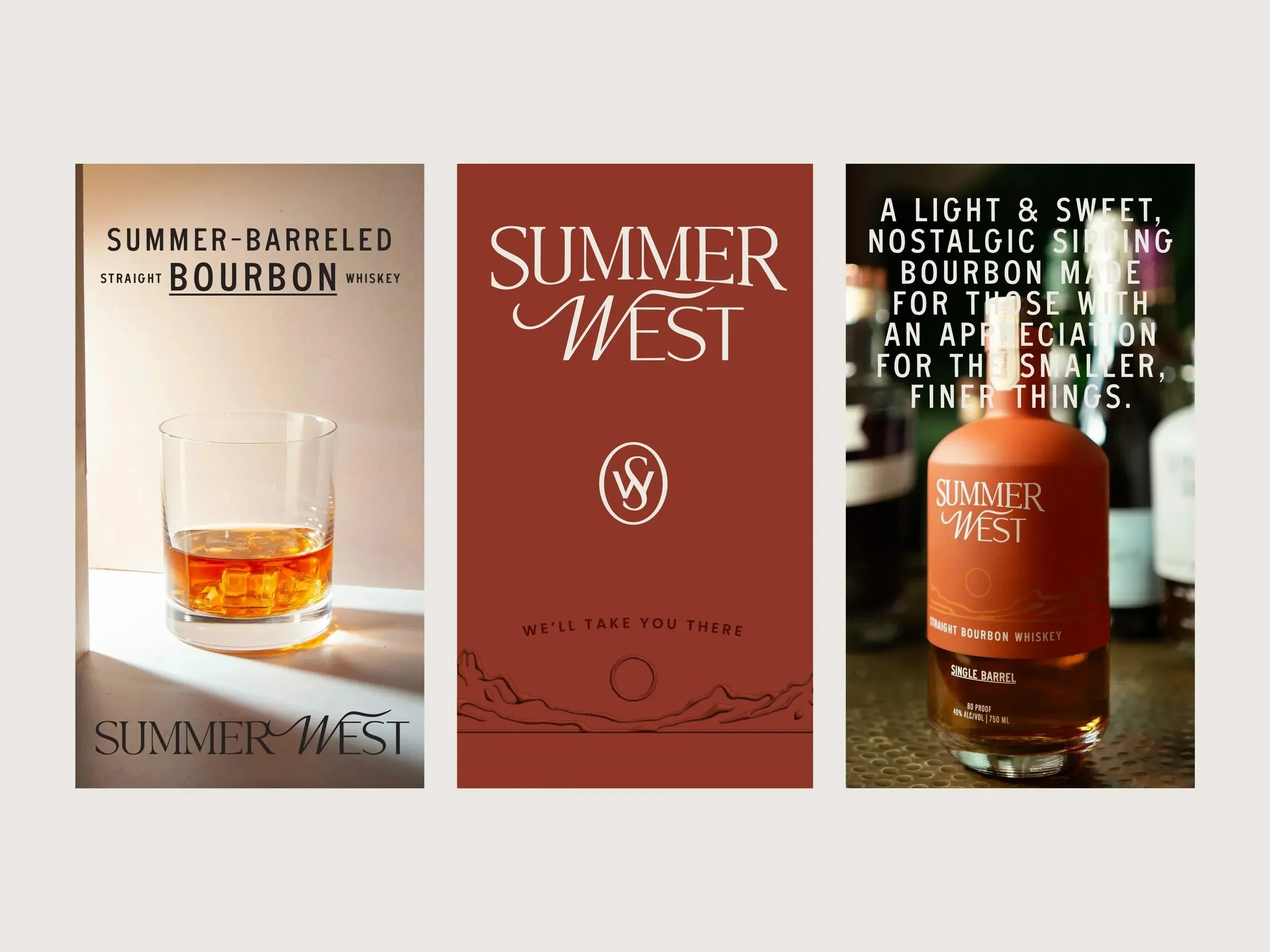
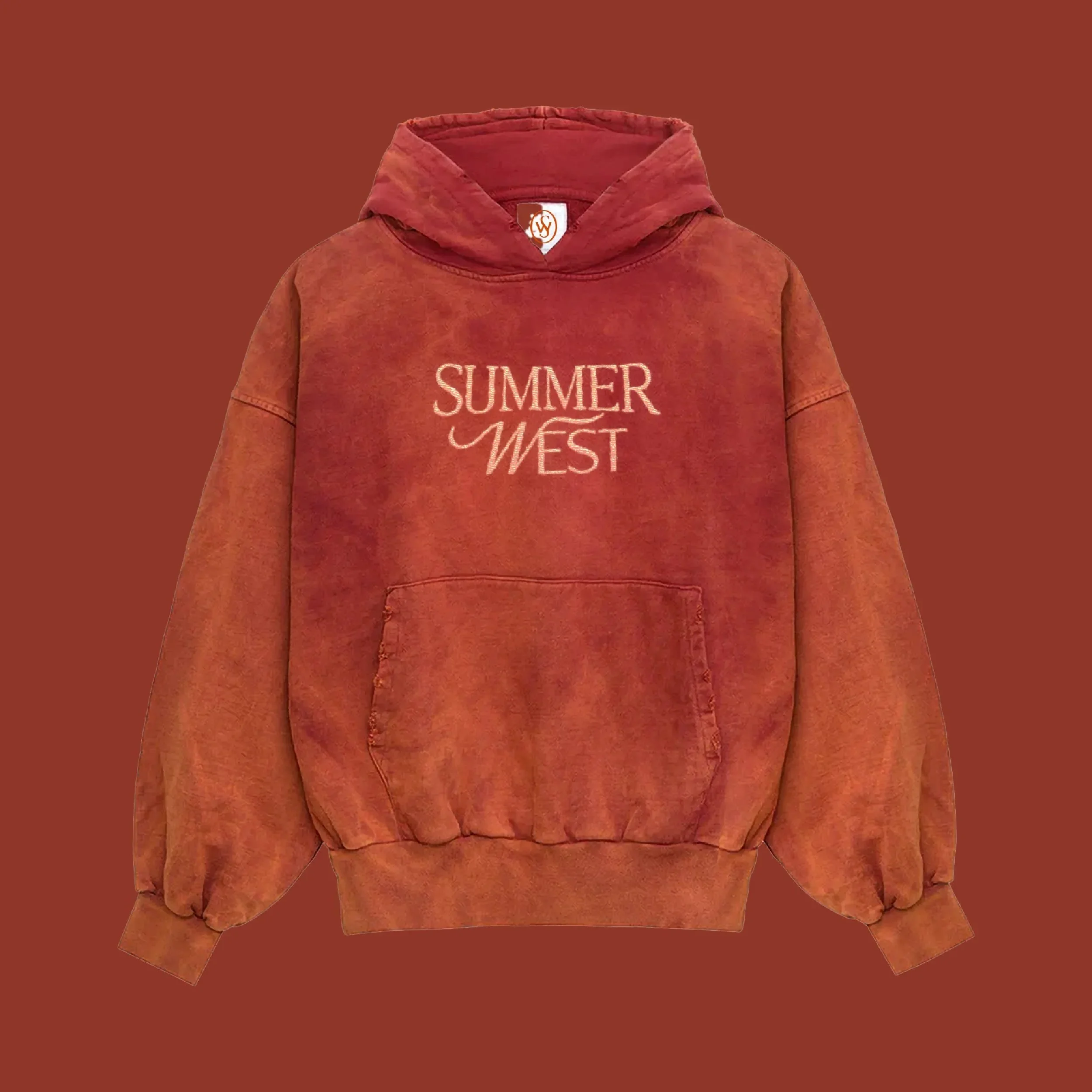
The visual identity for Summer West Bourbon references classic whiskey design language to establish credibility, then pushes select elements to feel more contemporary and create distinction. The logotype nods to traditional bourbon typography with a modern edge. The swashes on the "W" in West introduces a sense of movement, reflecting the fleeting nature of summer itself. A custom mountainscape illustration inspired by Fairplay, Colorado grounds the brand in place.
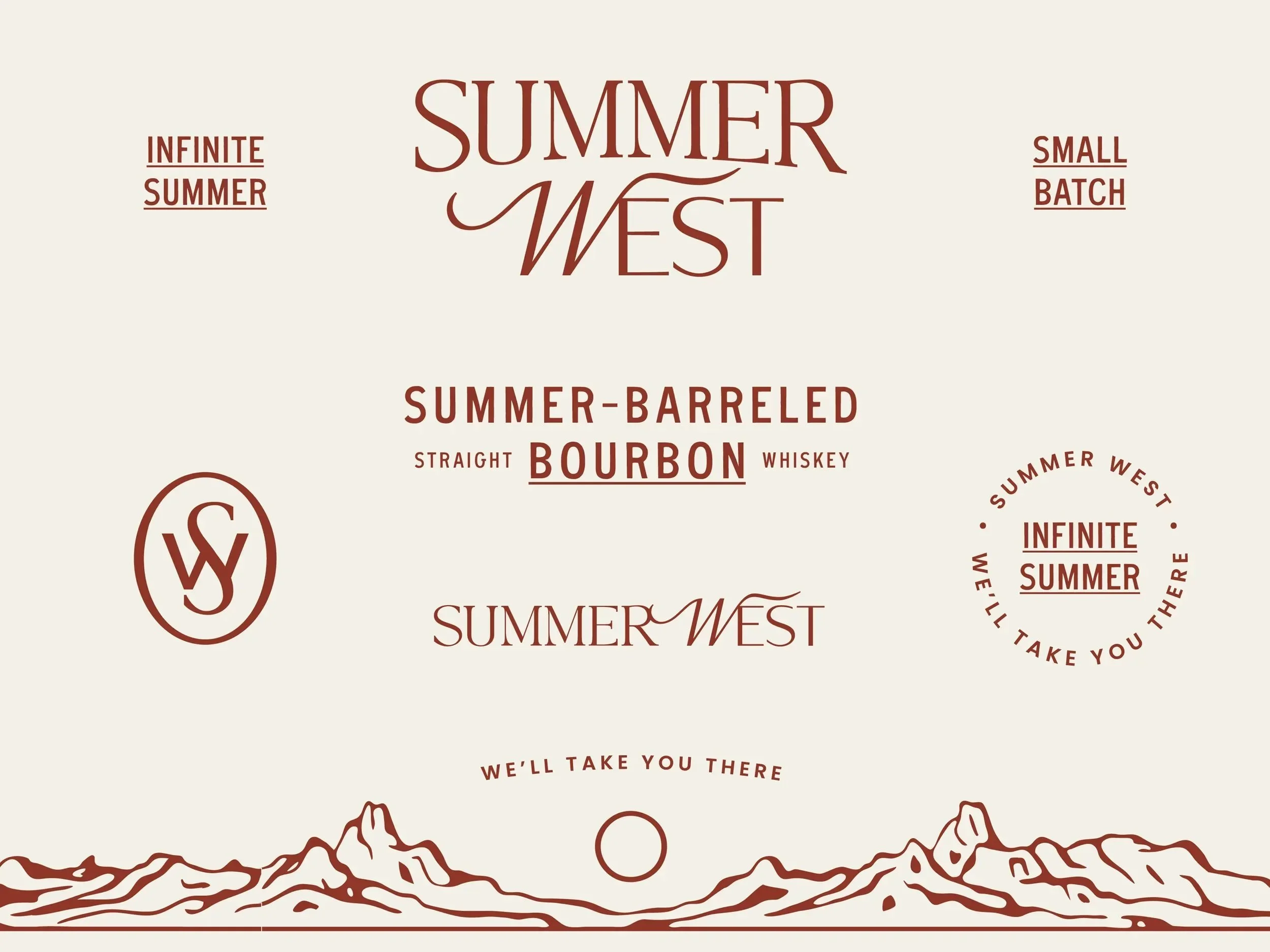
Logotype
The wordmark is a completely customized version of Pearl, by Tan Type Co. The logotype's evolution draws from classic whiskey typography and incorporates a contemporary sensibility, grounding the brand in heritage while positioning it for a new generation of bourbon consumers.
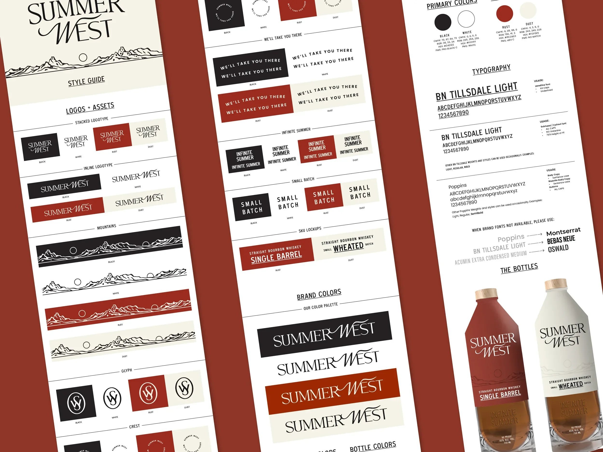
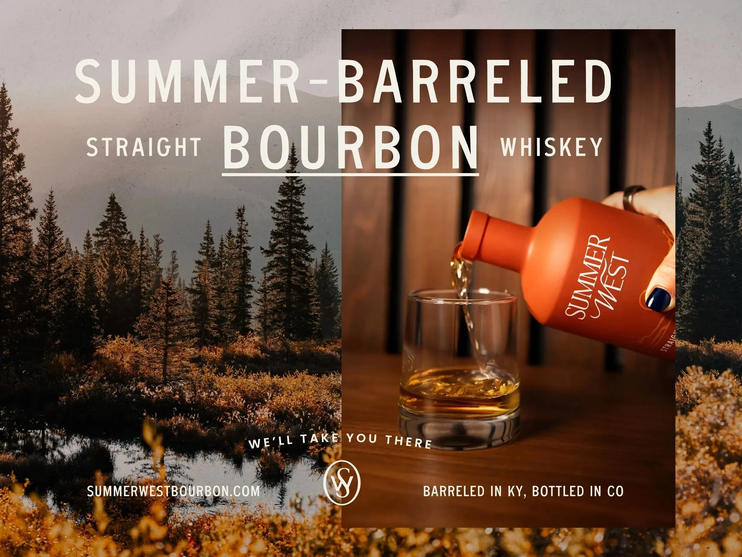
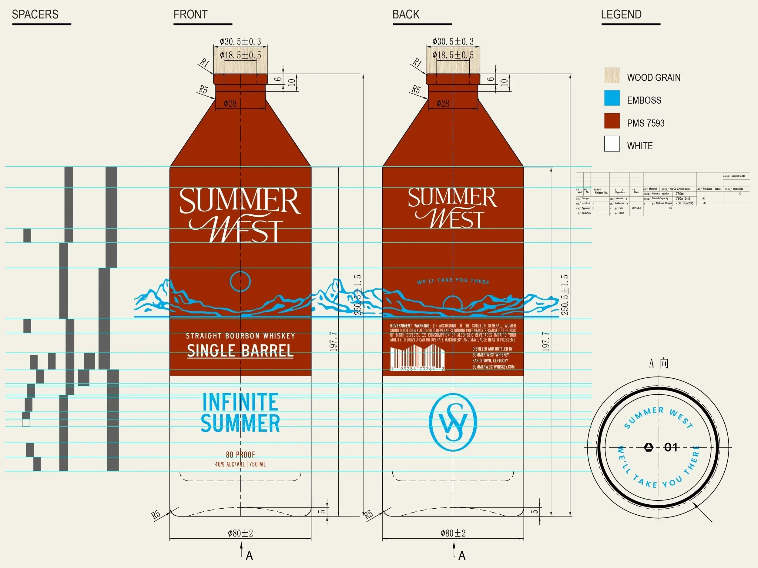
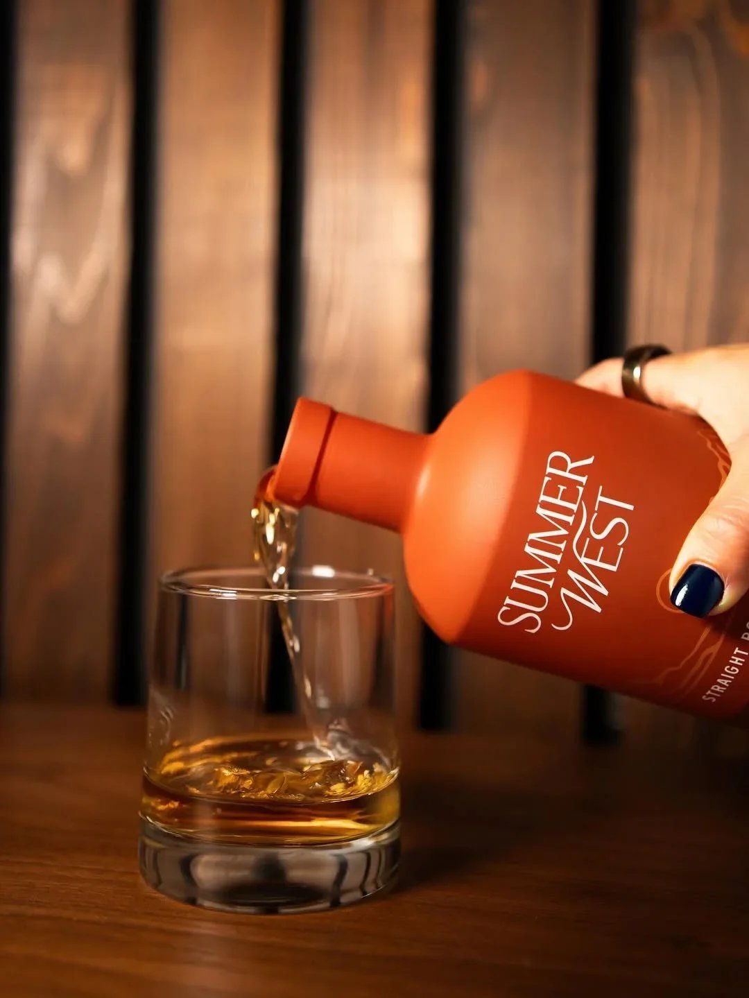
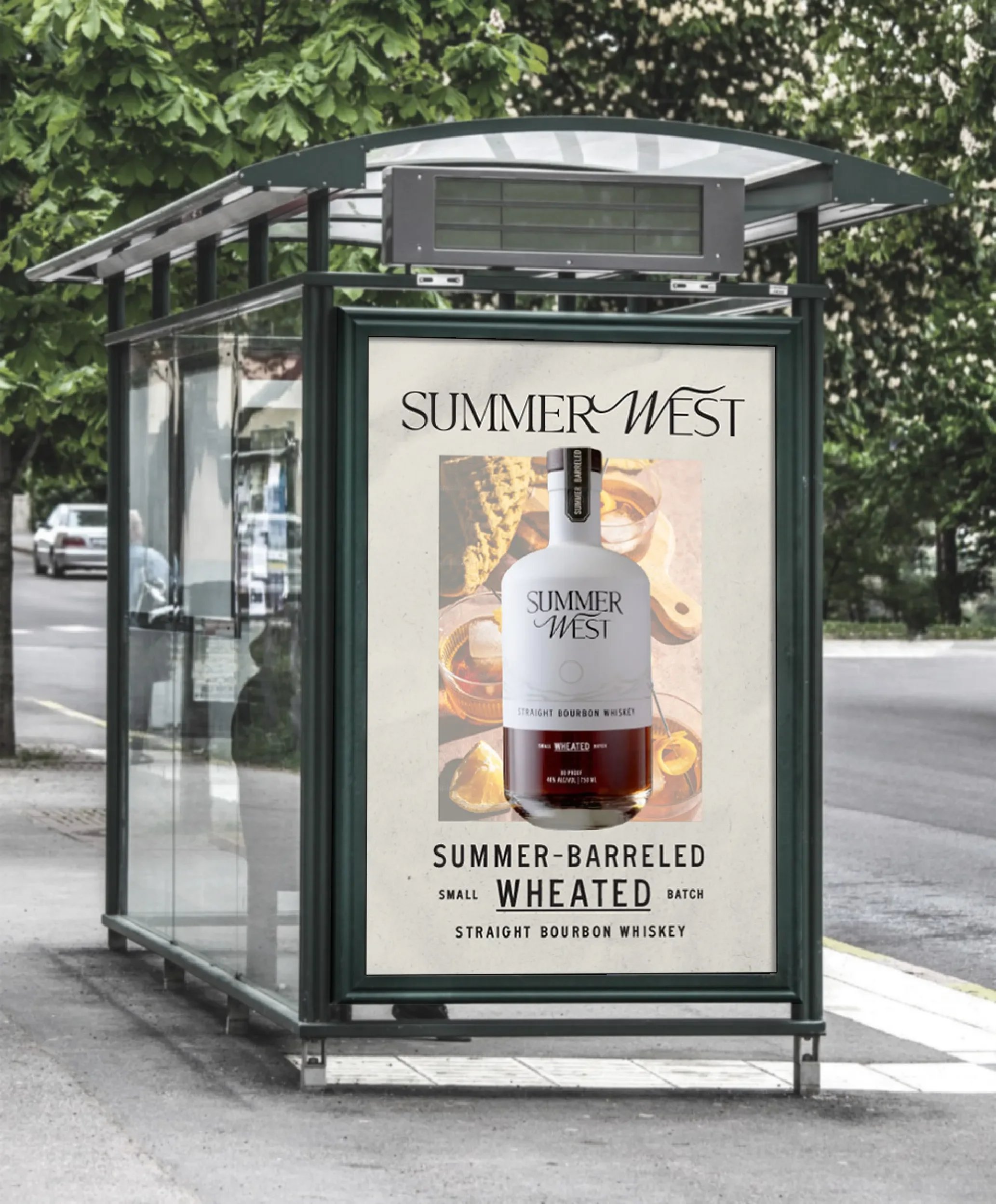
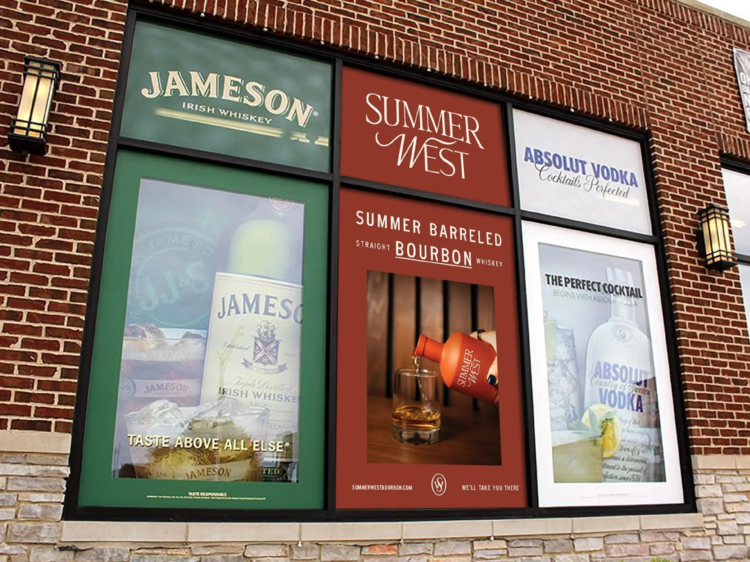
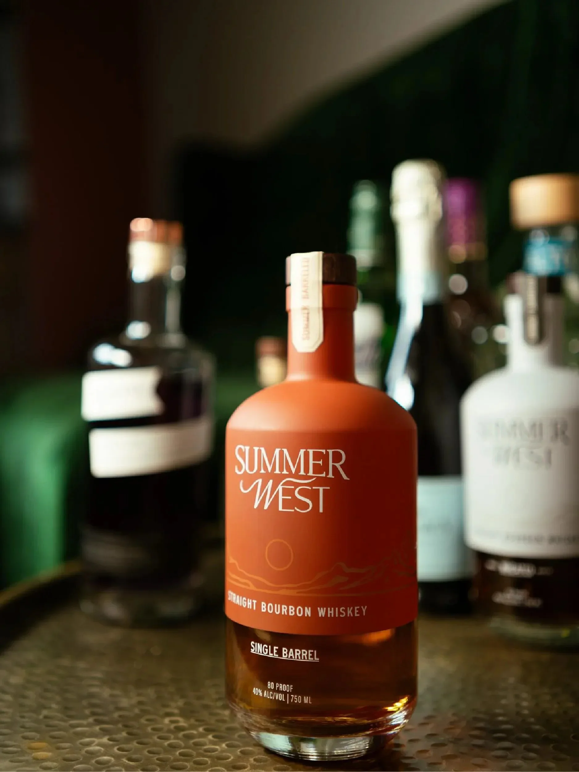
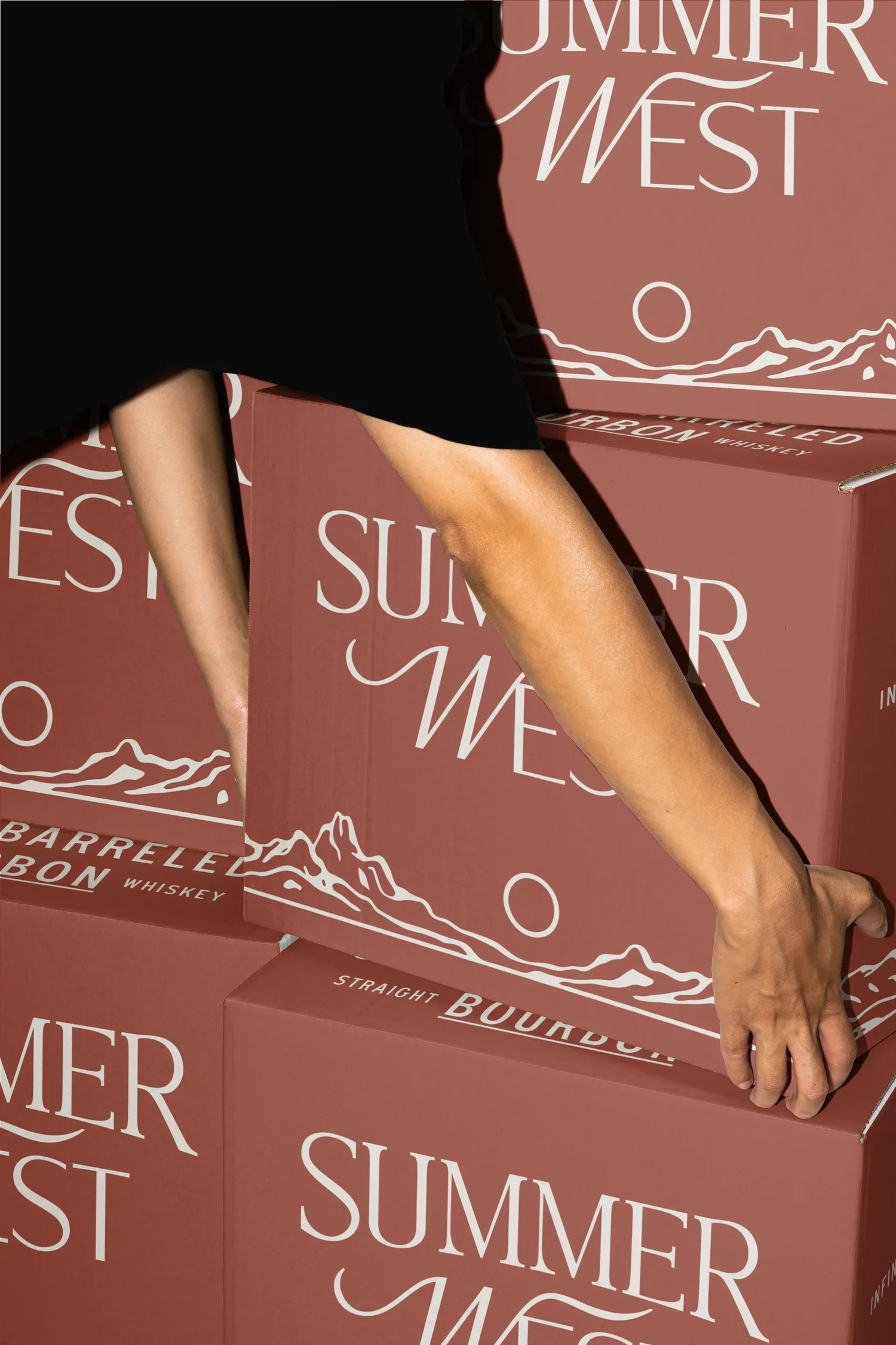
Packaging Design
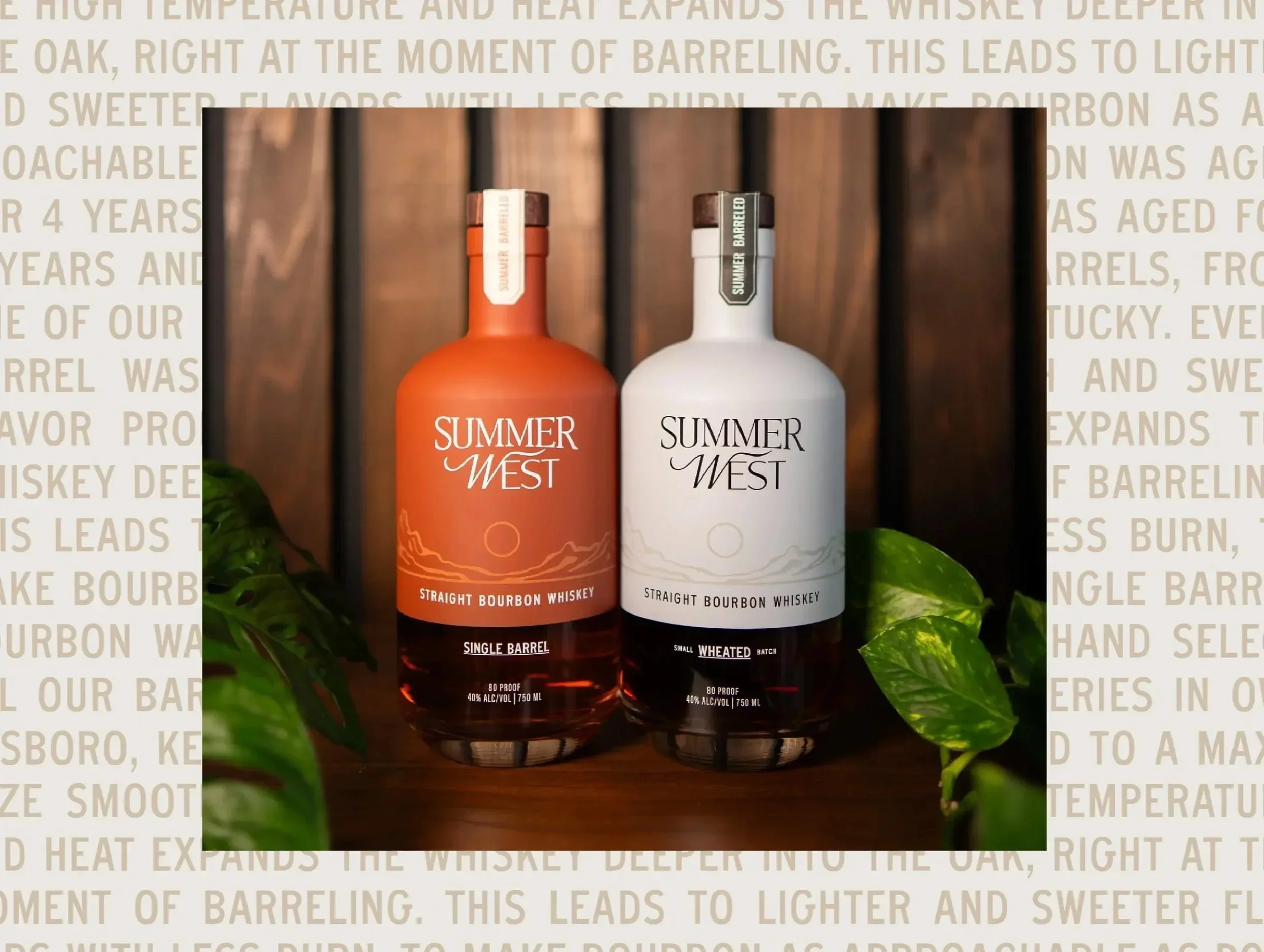
Our packaging exploration initially included a fully custom glass bottle, but shifting tariffs ultimately made that approach unviable. The packaging and identity system was designed to be adaptable, proving strong enough to live confidently on a standard bottle. An opaque color treatment at the top of the bottle creates a visual horizon, reinforcing the setting sun and end-of-day motif.
Art Direction
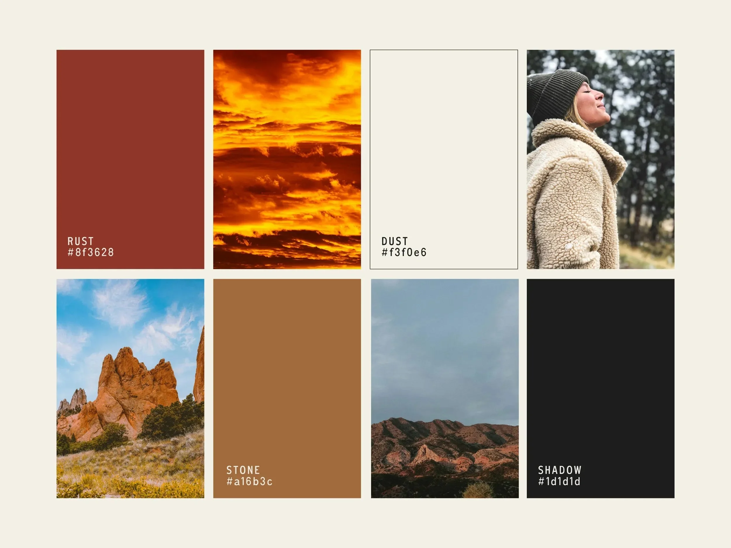
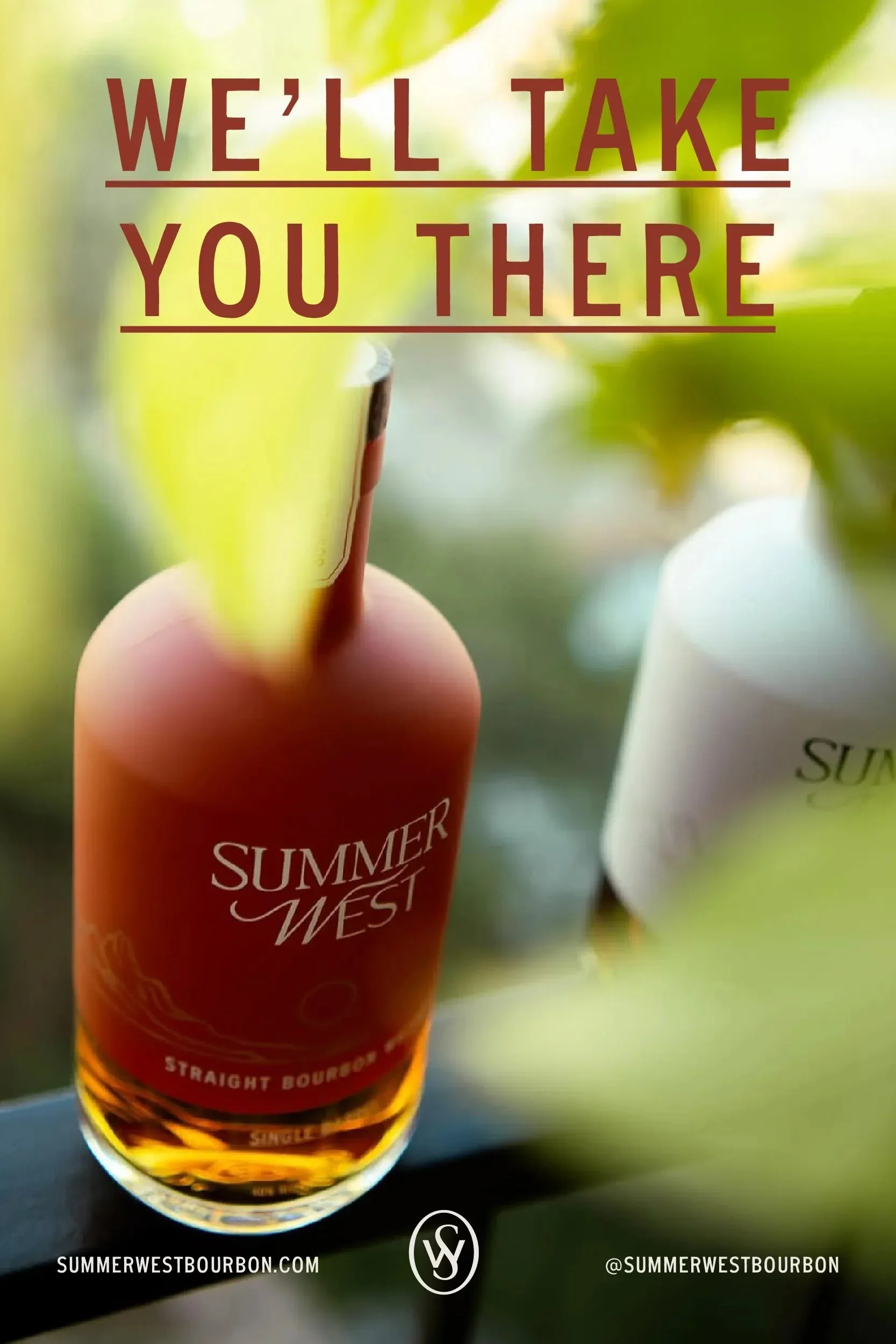
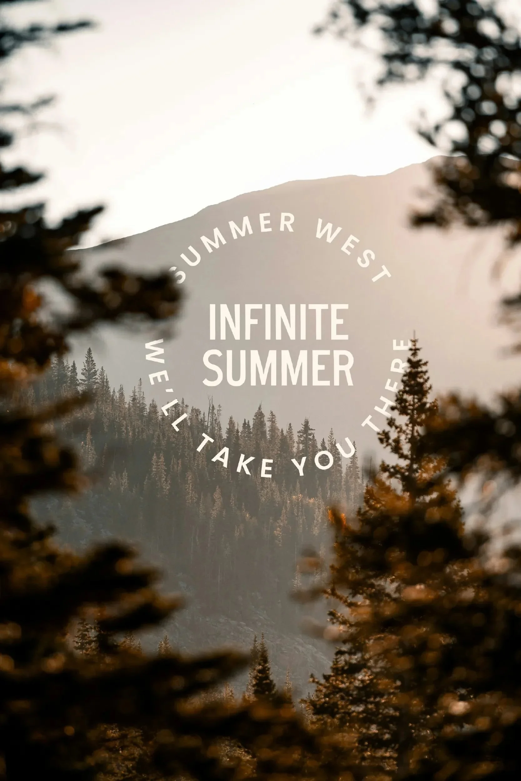
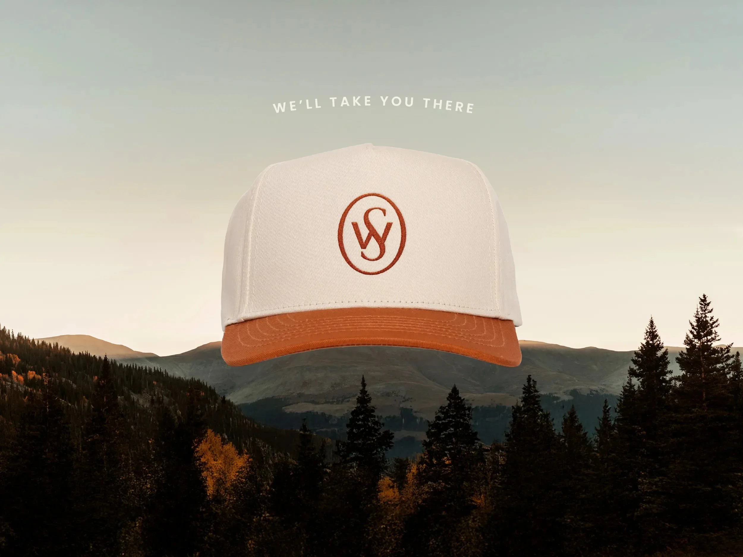
The art direction is centered on the idea that summer holds our most memorable moments: easy days, long evenings, and time well spent with loved ones. The mountainscape imagery establishes a sense of place while tapping into the aspirational pull of the Colorado landscape. The tagline "We'll take you there" is an invitation to return to a better time and place.


Want to see more?