
Devil's Grin Gin Brand Identity and Packaging Design
Building a brand in the white space of the long-established gin category.
Client
Trinity River Distillery
Services
Brand Strategy: Naming, Positioning, Copywriting. Visual Identity Design: Logo System, Visual Identity, Collateral. Label, Bottle and Packaging Design.
Credits
Creative Direction & Principal Designer: Adam Vicarel
Brand Strategy, Naming & Copywriting: Jamie Reedy
Brand and Package Design, Production: Carly Salzman
Structural Design & Engineering: Studio One Eleven, Berlin Packaging
Photography: Ford Media Lab, Bryan Rowe
The Opportunity
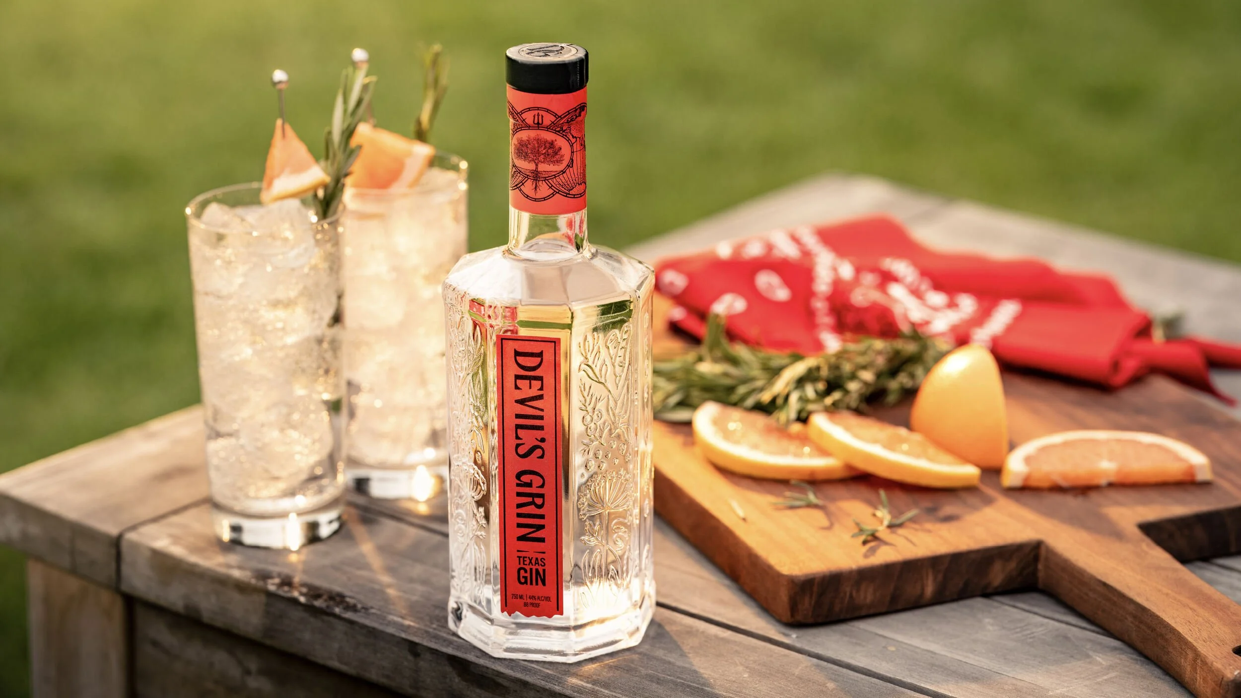
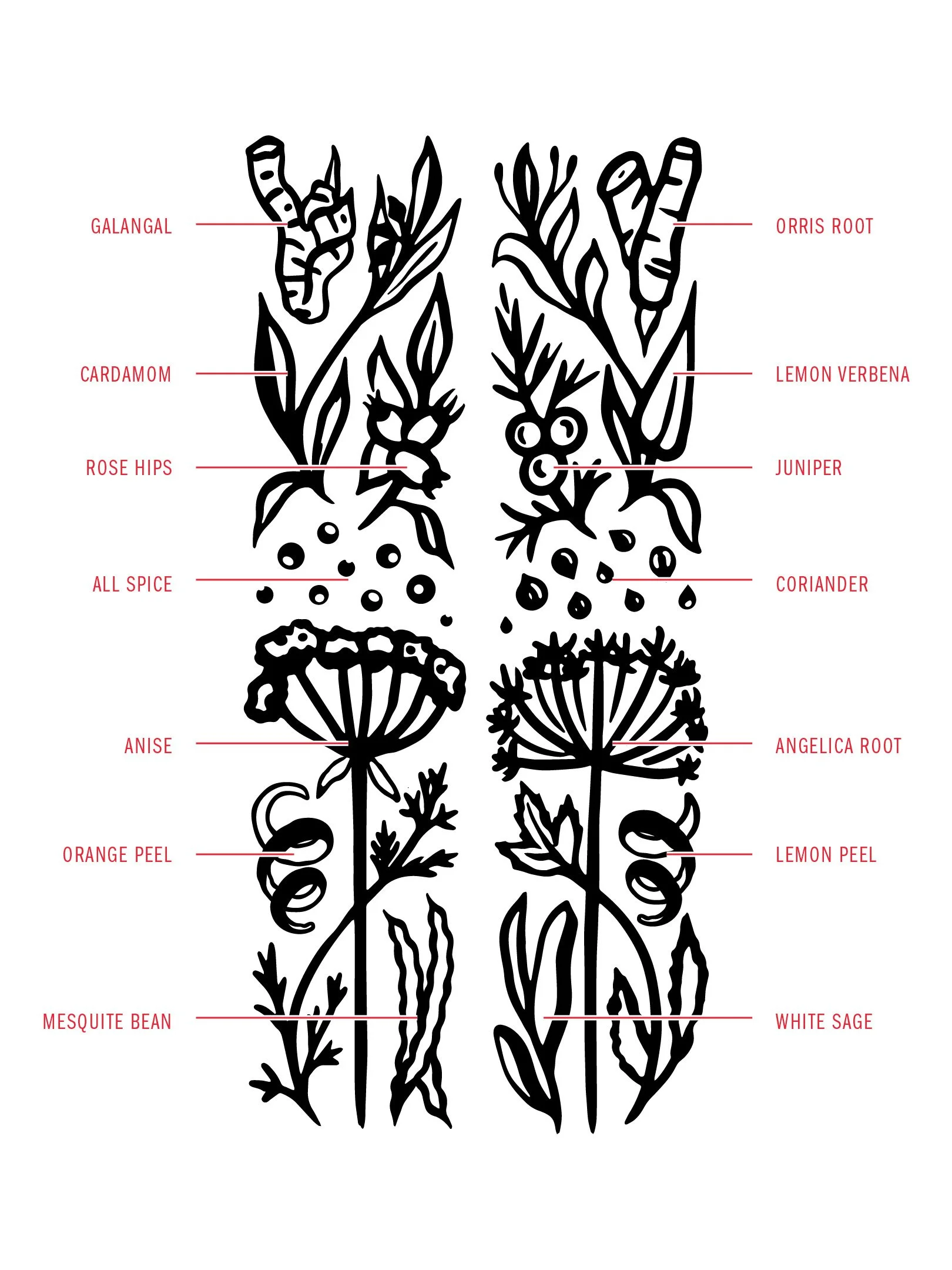
Gin has essentially had the same juniper-forward recipe since the category began in the 1800s, leaving spirit drinkers either loyal to a taste or dismissive of the category altogether. Trinity River Distillery created a new recipe, after 70 iterations, that sourced 14 botanicals from six continents. Juniper was deliberately moved to the back of the palate to make way for mesquite bean, a leading ingredient. They had a strong recipe, but they needed everything else to bring this new product to market: a name, story, voice, visual identity, label and bottle, and a reason for Texans to reach past the competition and to land on Devil’s Grin.
The Solution
A comprehensive category audit highlighted the opportunity: we built the brand around the promise that this gin tastes nothing like the category promises. Devils Grin isn’t a bottle of your grandpa’s dusty old gin. This is a sessionable gin made for non-gin drinkers. “Gin Reborn” became our brand position, and out of that came our tagline, “Delightfully Deceiving,” and the name itself: Devil's Grin. Each of these was rooted in the idea that the brand should look and feel like it fits right in with the gin category while, with a mischievous wink, being completely different.

Brand Strategy
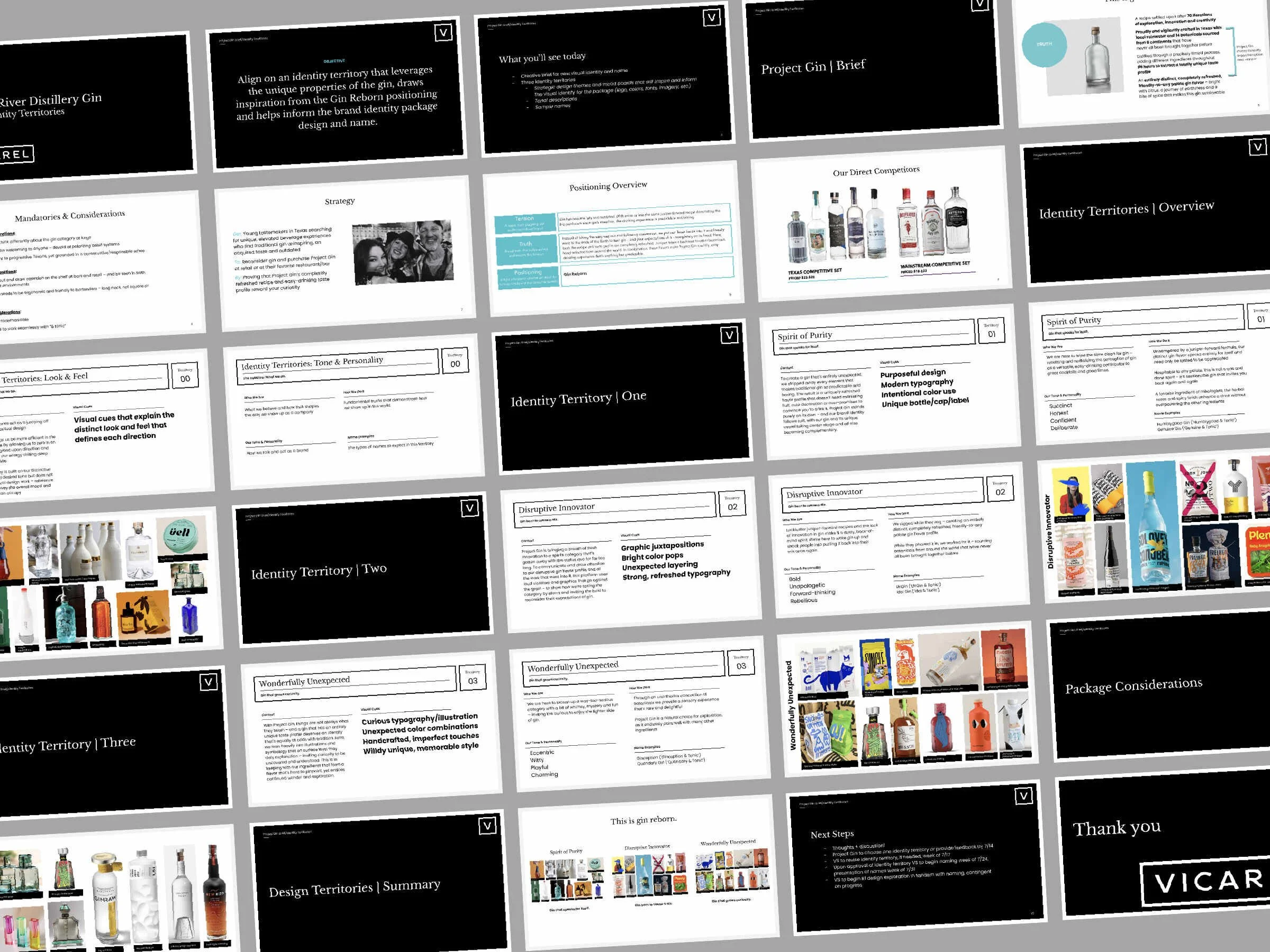
We began with a competitive audit of both Texas gins and category leaders, and we then built the brand's position, tone and design language based on where space actually sat. The audit surfaced that most brands lean hard on tradition-meets-innovation language, which tends to be more industry-insider speak, and it often falls flat on consumers.
From there we developed three positioning territories, and based on conversation with Trinity River Distillery’s stakeholders who have real, valuable experience, Gin Reborn was selected. This brand position captured a tension in the category, and it allowed Devil's Grin to speak to young Texas tastemakers who had written gin off as an outdated legacy spirit. Devil’s Grin, gin reborn, forced them to reconsider.
Naming
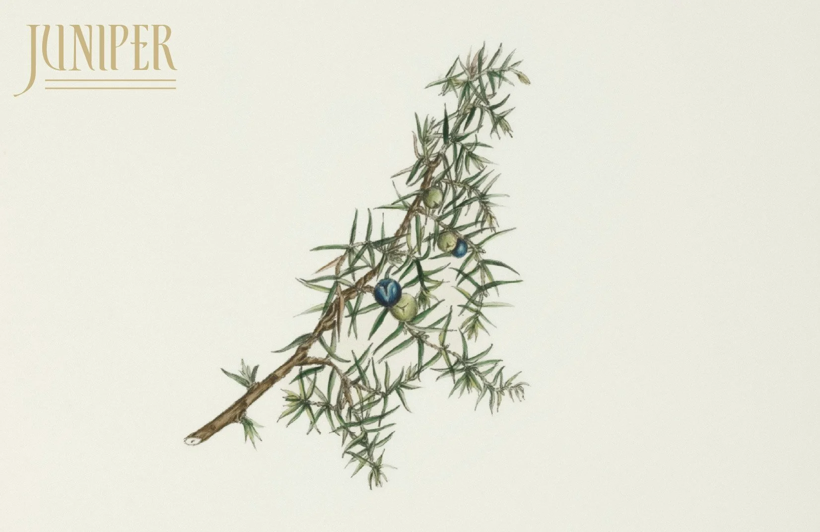
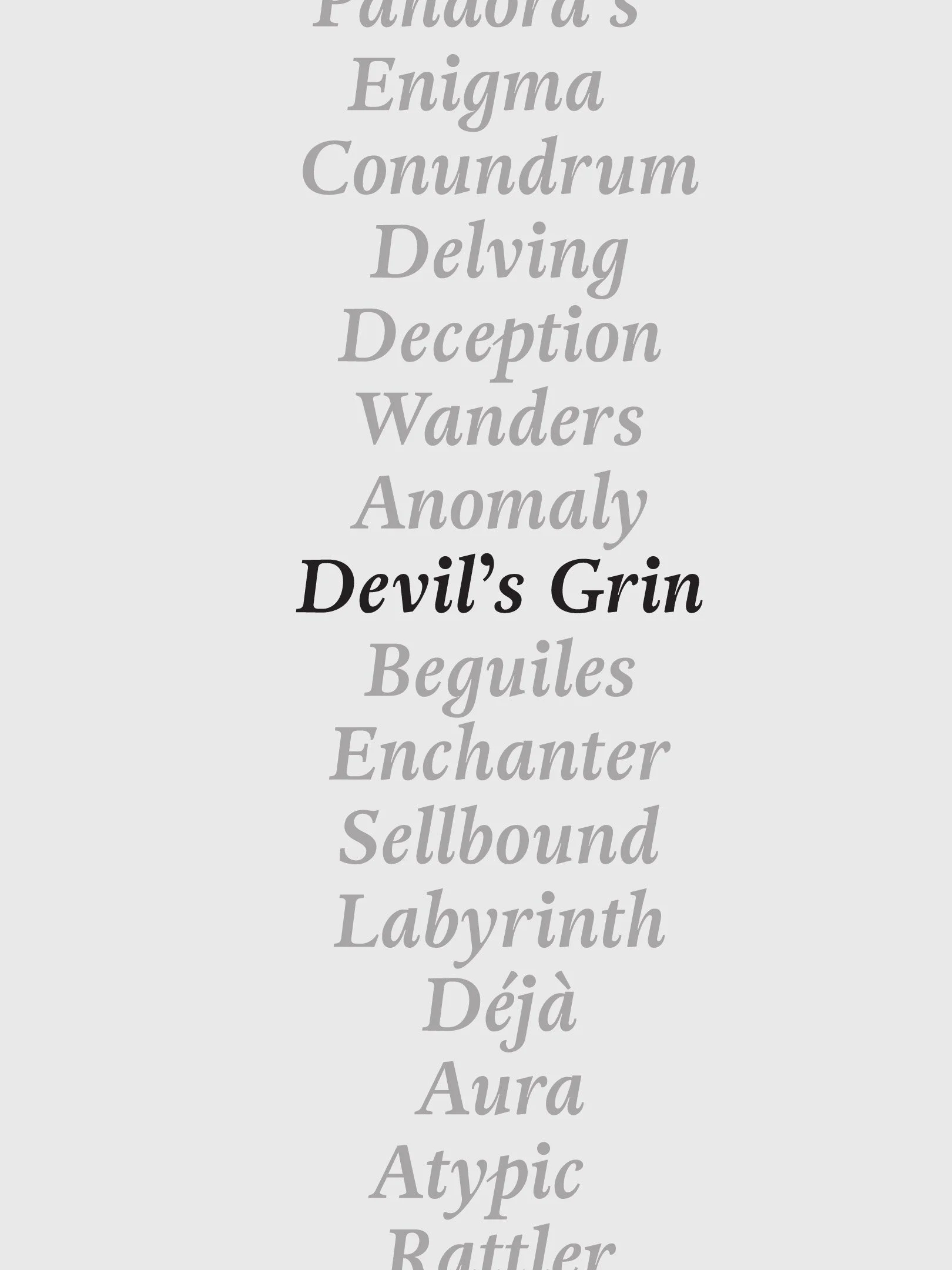
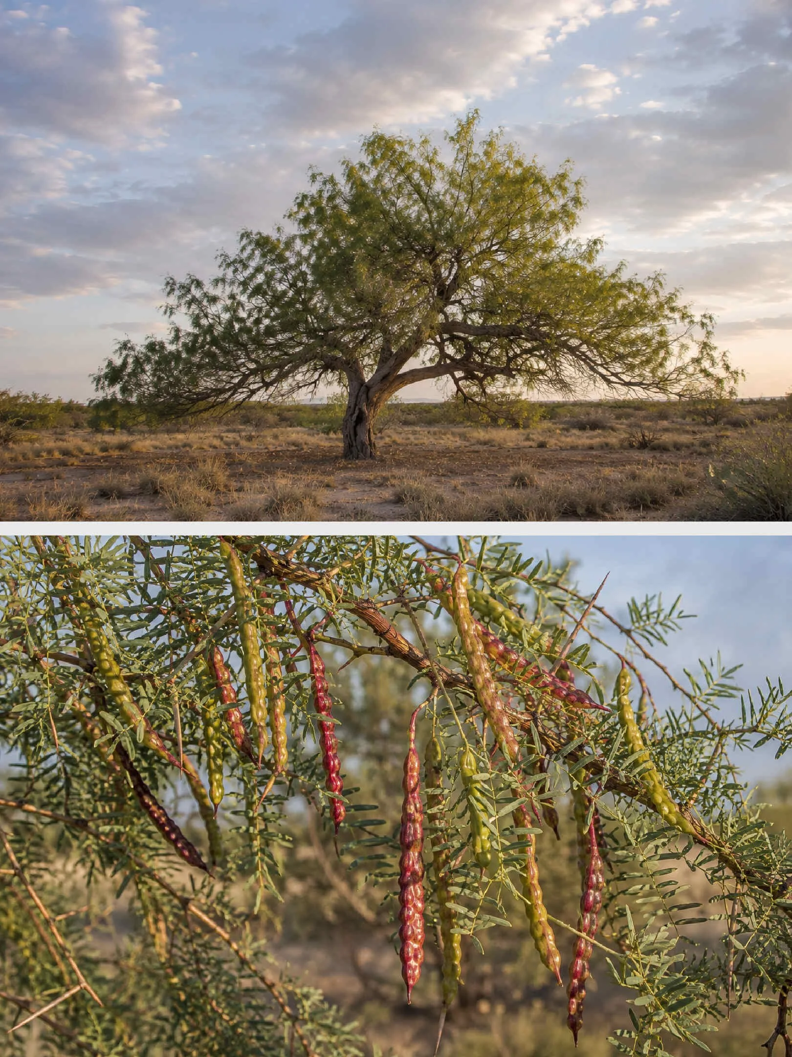
We generated an initial list of roughly forty names, and Devil's Grin ultimately rose to the top. The name is derived from one of the primary ingredients, the mesquite bean, which comes from the mesquite tree, a species Texas farmers call “the devil with roots” for its long thorns and taproots that can find water anywhere, choking out anything growing around them.
The name “Devil’s Grin” not only references this unique ingredient that nobody else uses, but it also captures the knowing smirk of someone holding a secret, which is precisely the experience of handing this gin to someone who’s convinced they already know what gin tastes like.
Visual Identity
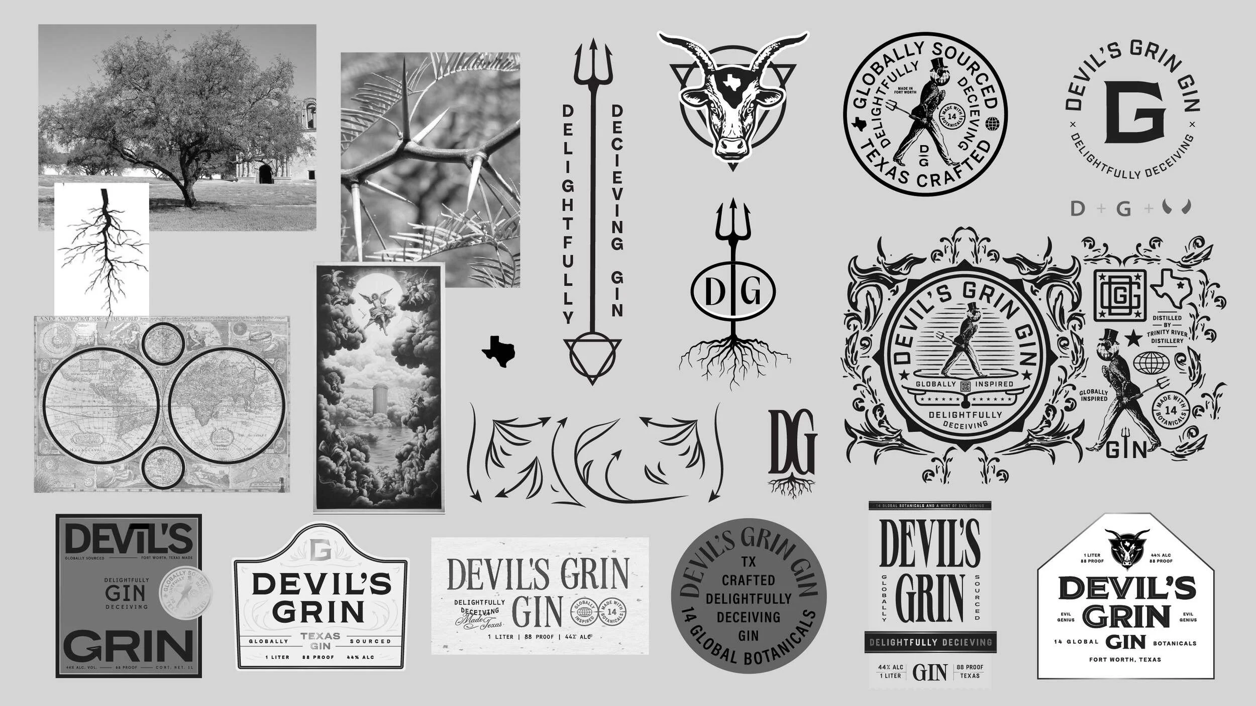
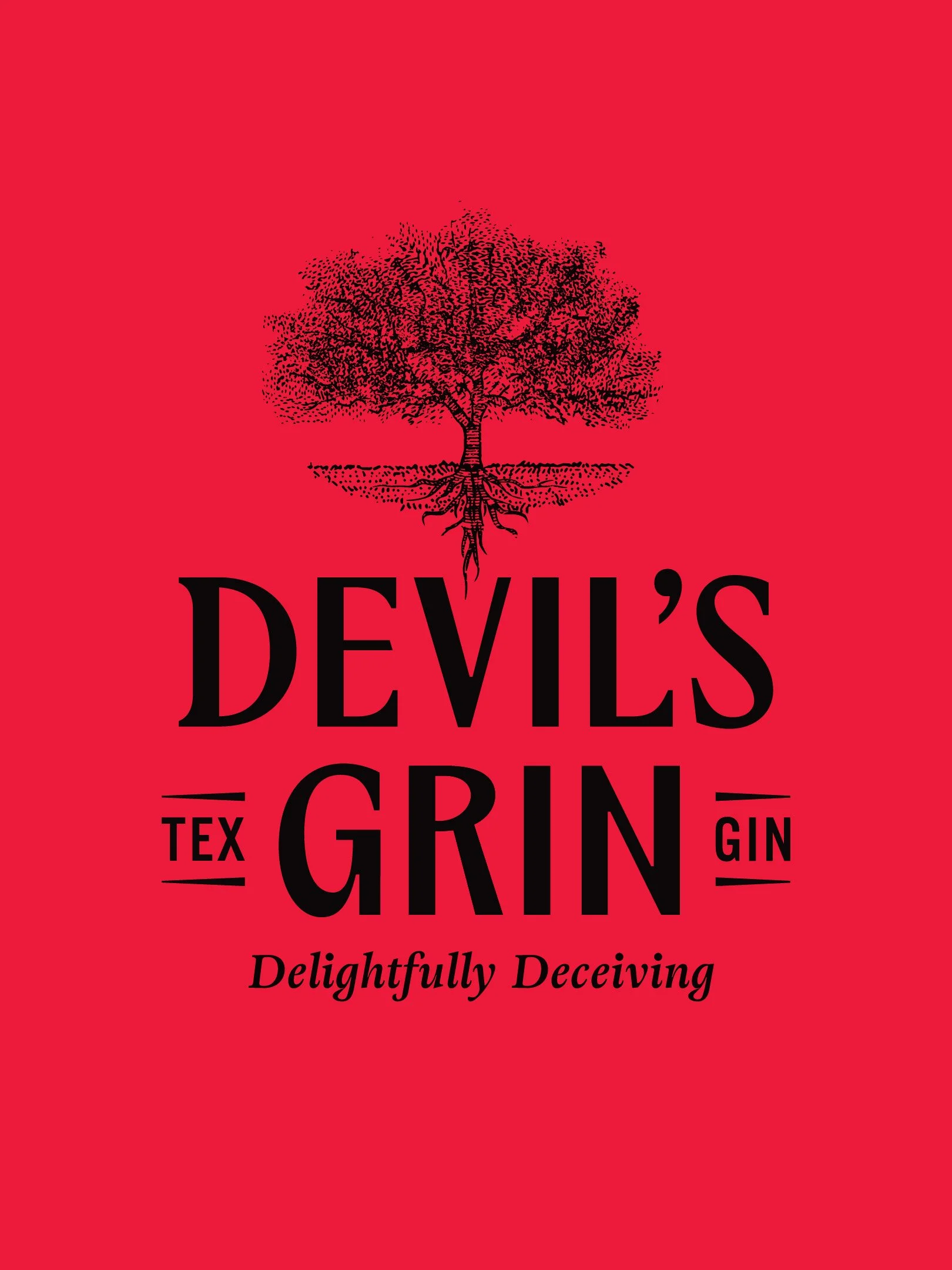
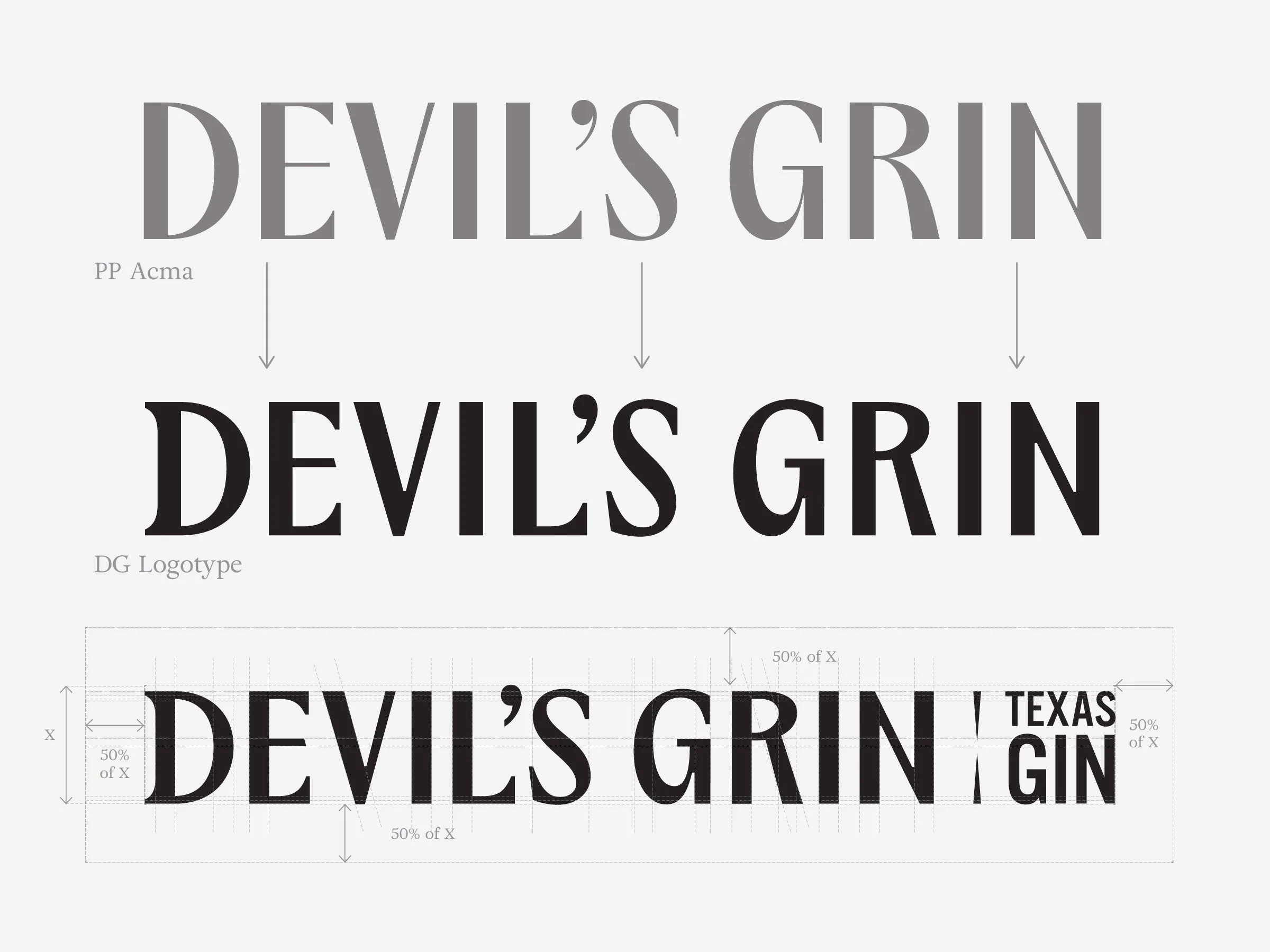
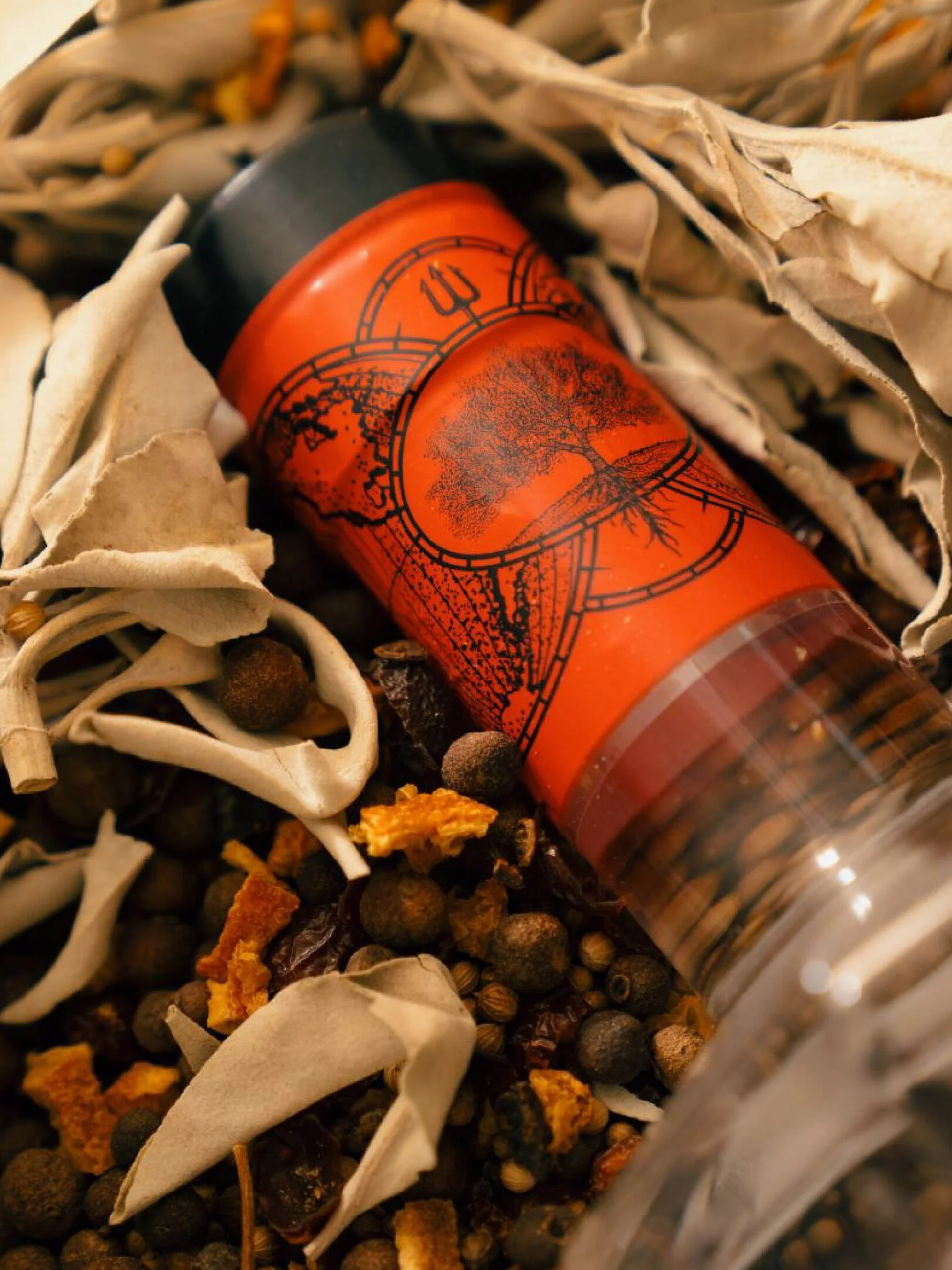
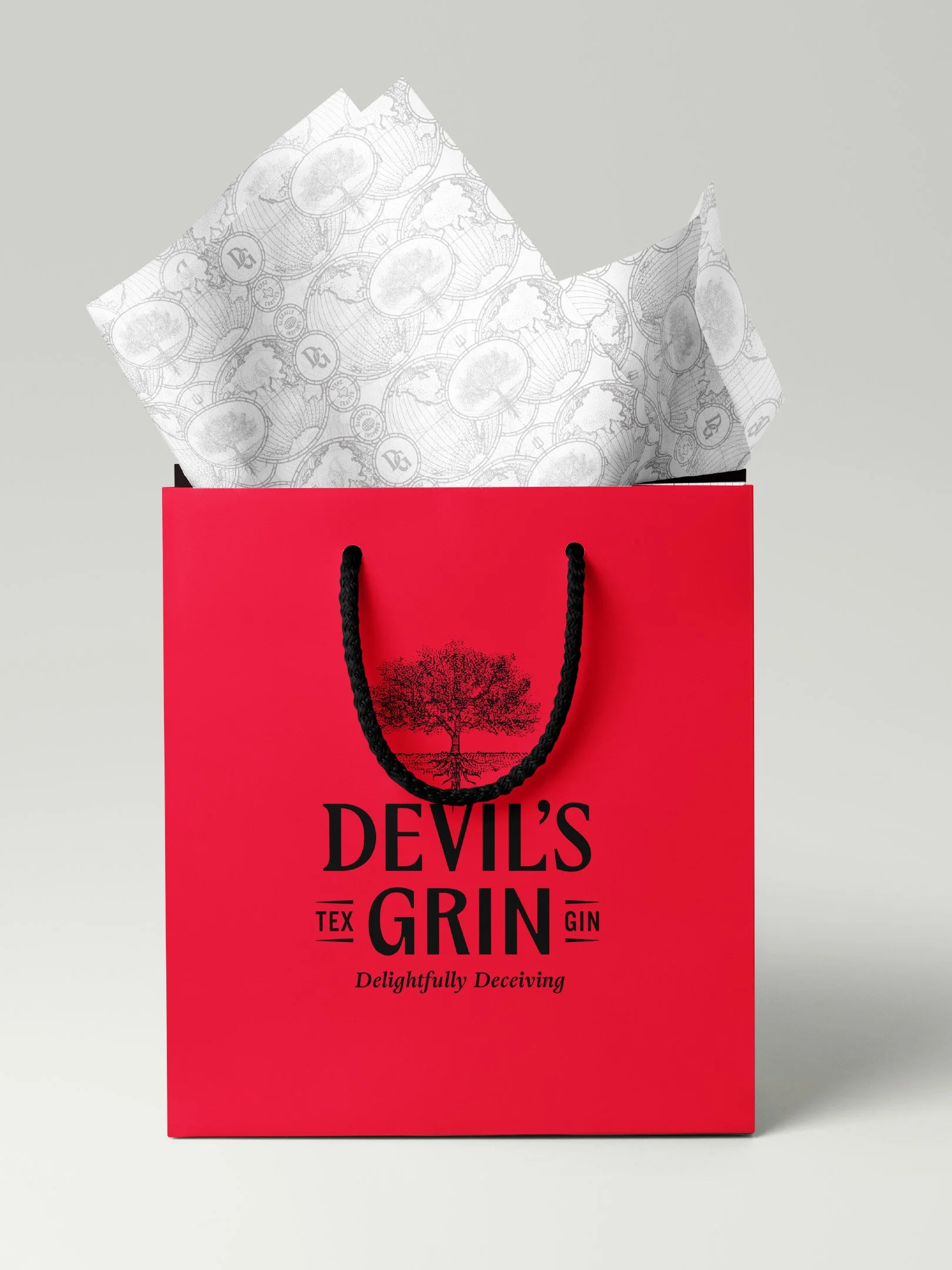
The gin category is dominated by serifs, filigree, and maximalist illustrations. We built the Devil's Grin visual identity to clearly nod at the category norms while still making certain that it was positioned as contemporary and different. The logotype is a heavily customized version of PP Acma Semibold, redrawn with lower contrast, a heavier weight, altered characters. Along with the logotype, we illustrated a mesquite tree, which was rendered in a stippled-engraving style that highlights both the tree canopy and the “devilish” taproot from which the name was derived.
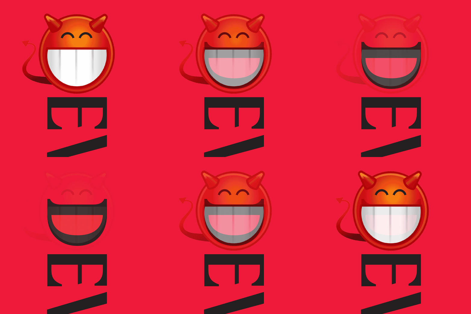
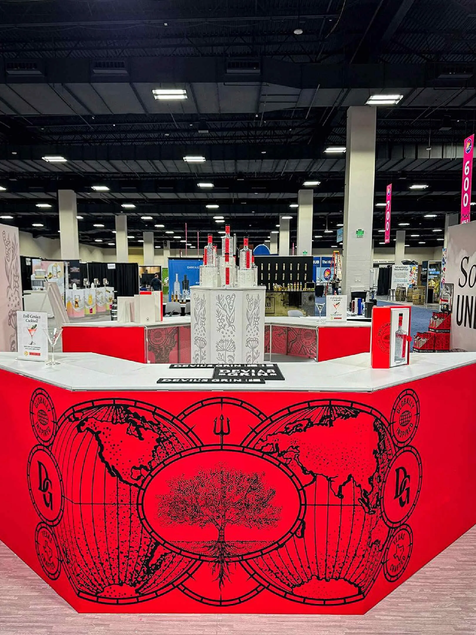
Thorn forms taken from the mesquite tree are found throughout the system, appearing in the labels, layouts, secondary marks and across the collateral. Another system element, the vintage world map, is rooted in the fourteen botanicals pulled from six continents that contribute to the gin’s unique flavor profile. The system has very few direct devil references, an intentional choice so as to not be too on the nose or carry negative connotations.
Primary Label
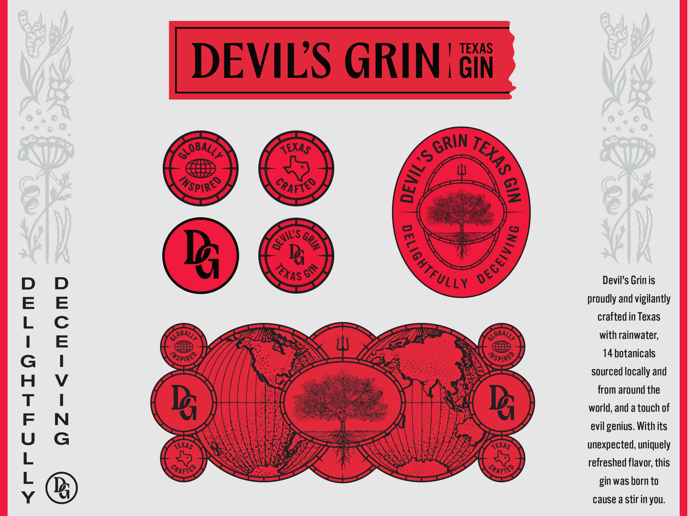
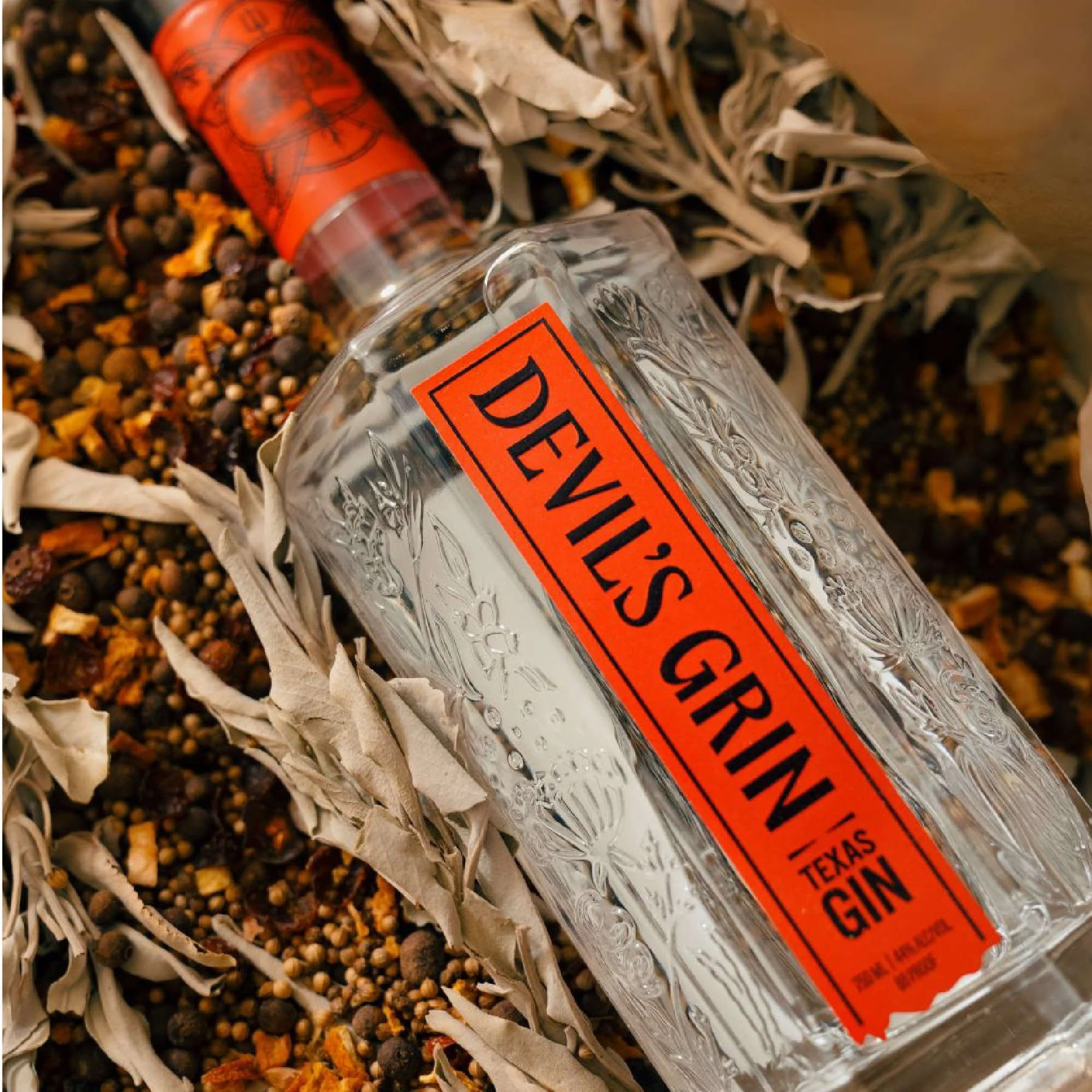
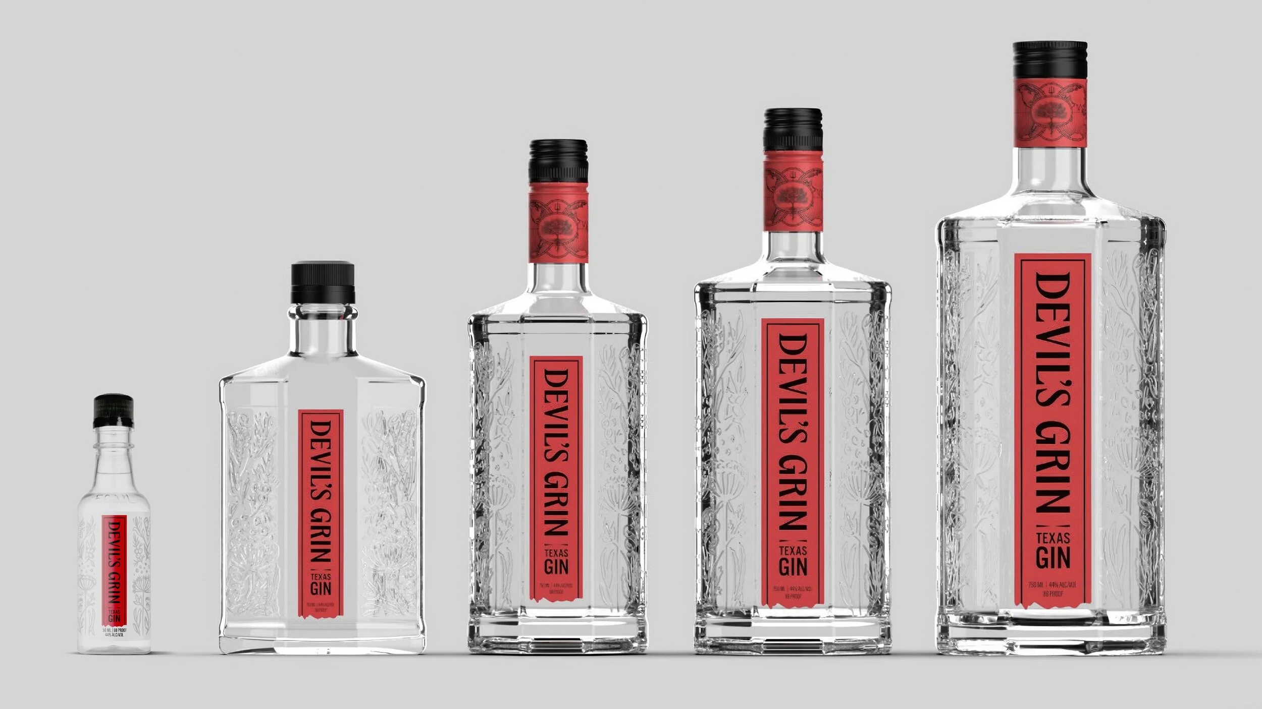
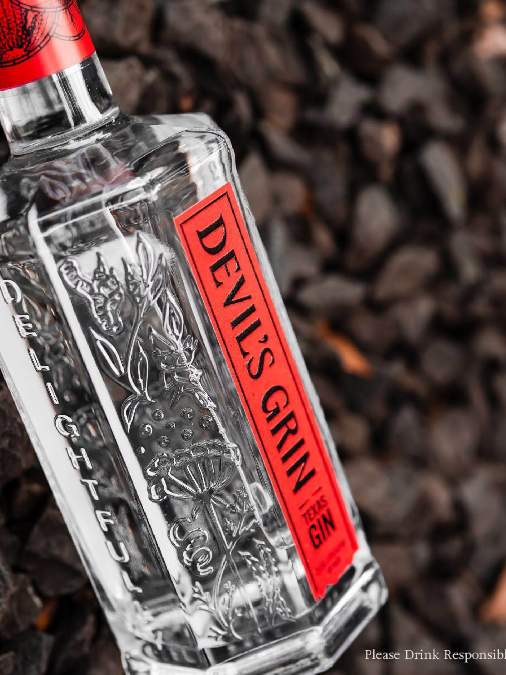
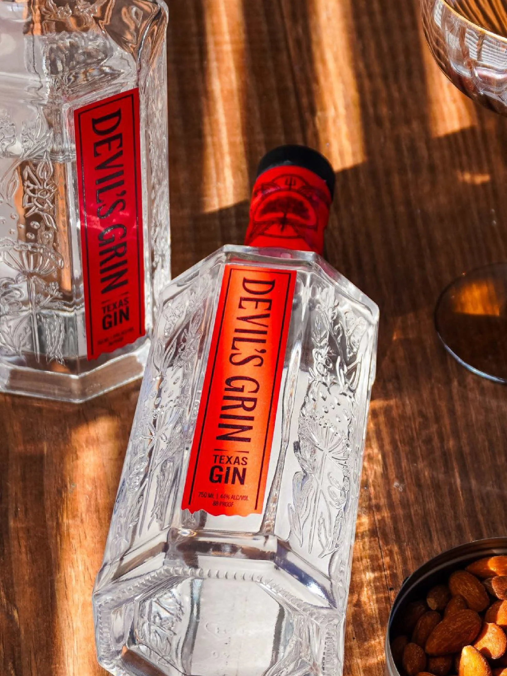
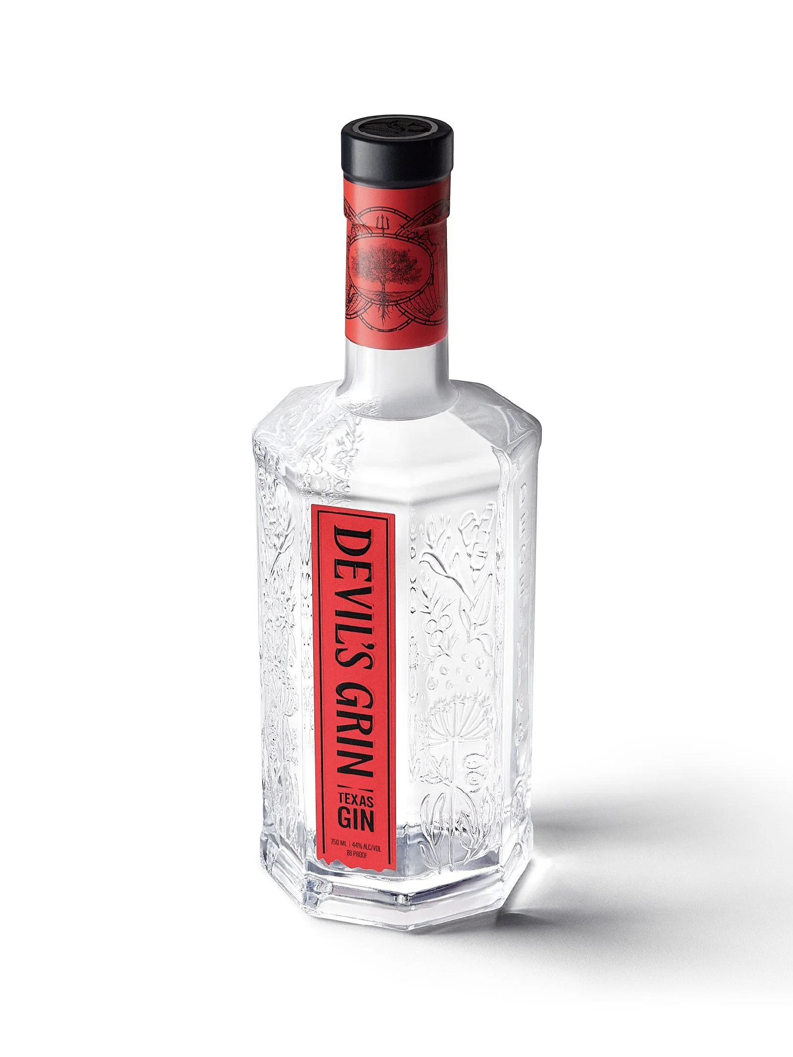
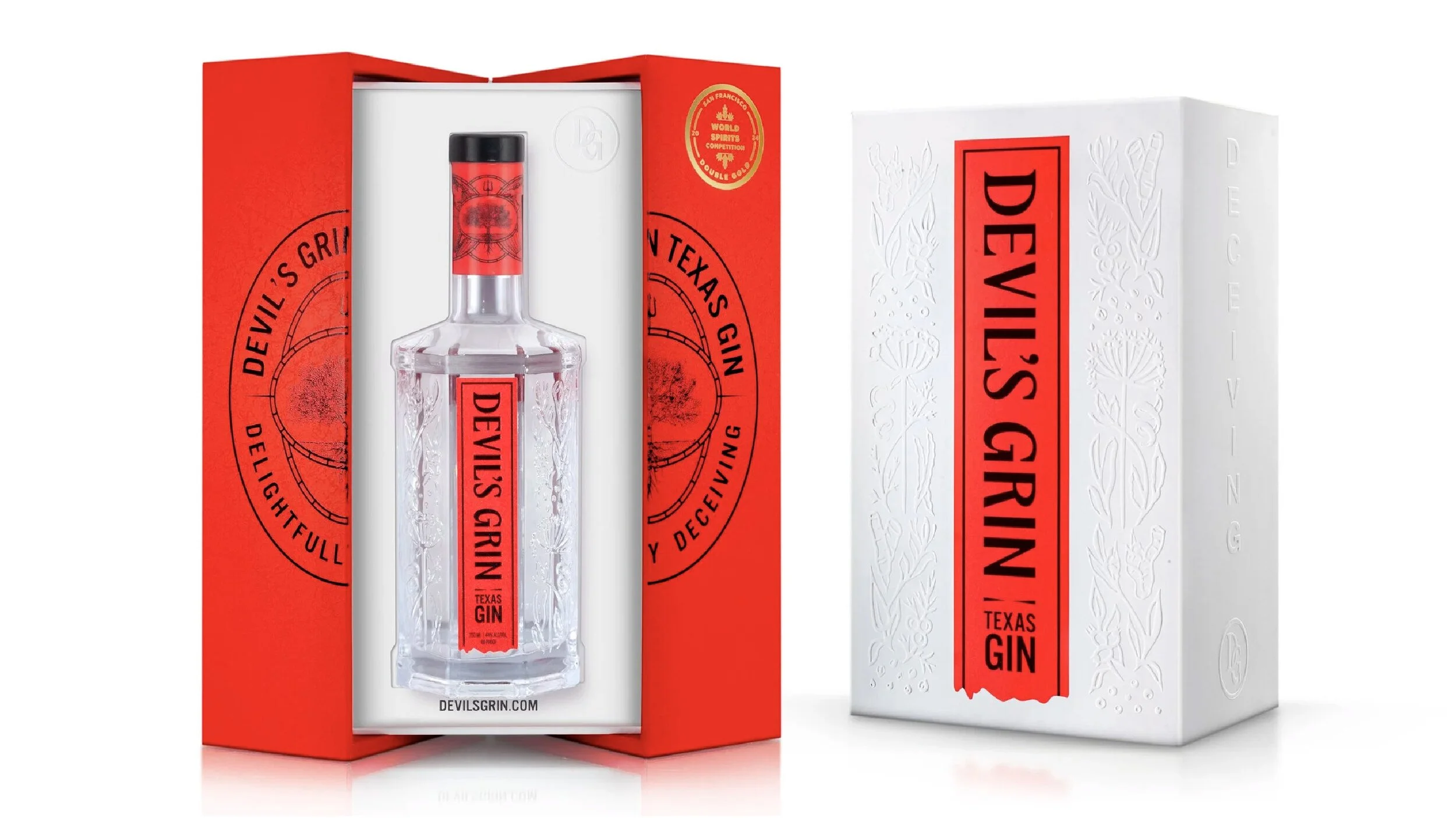
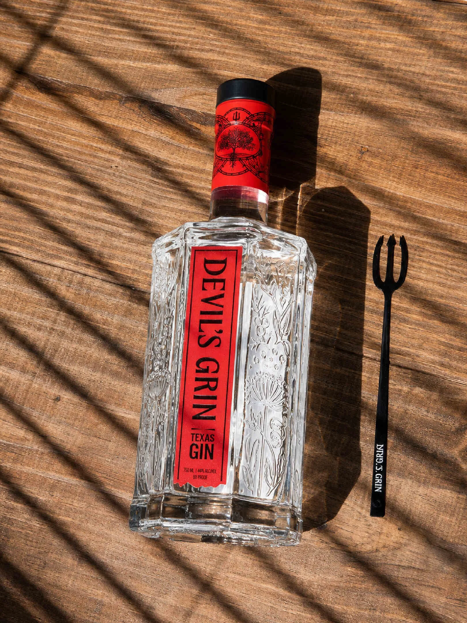
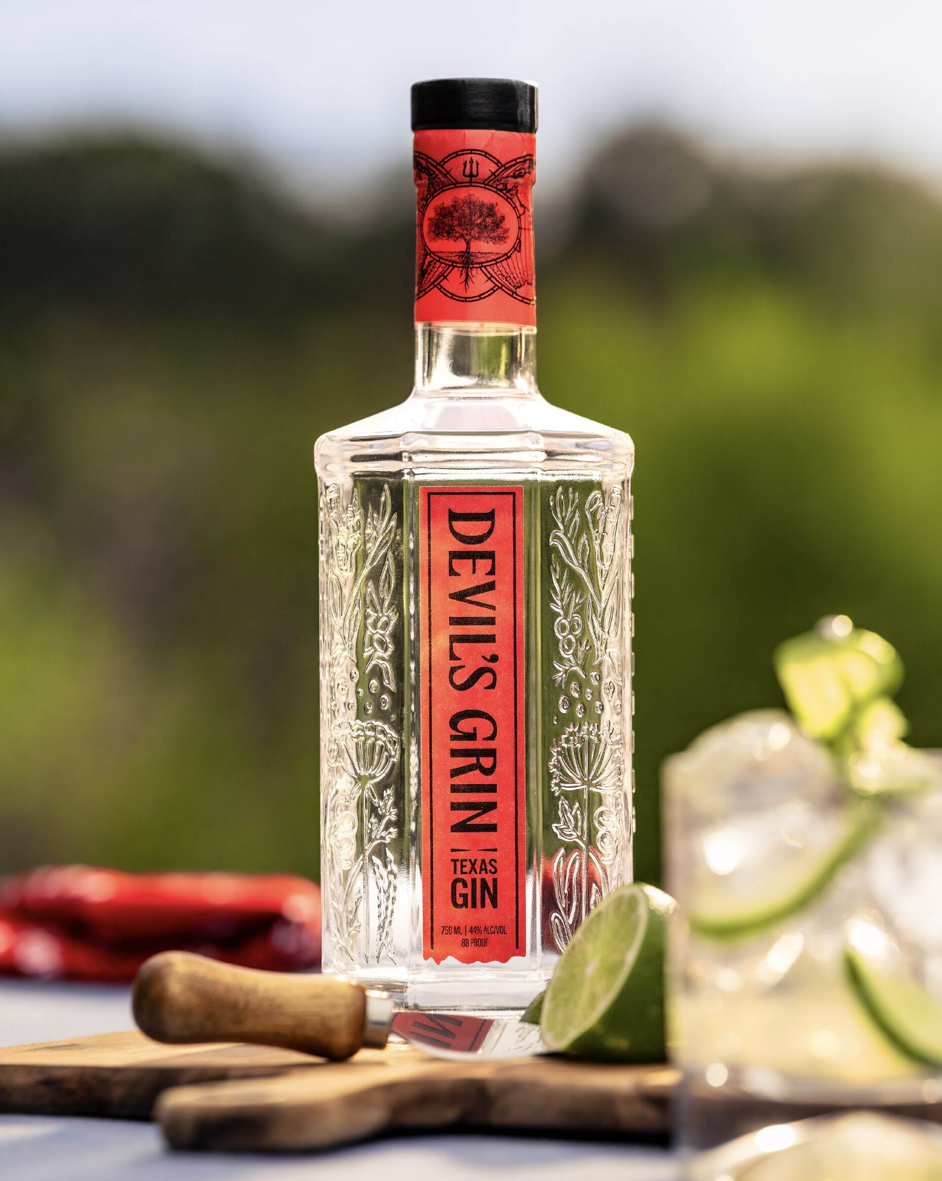
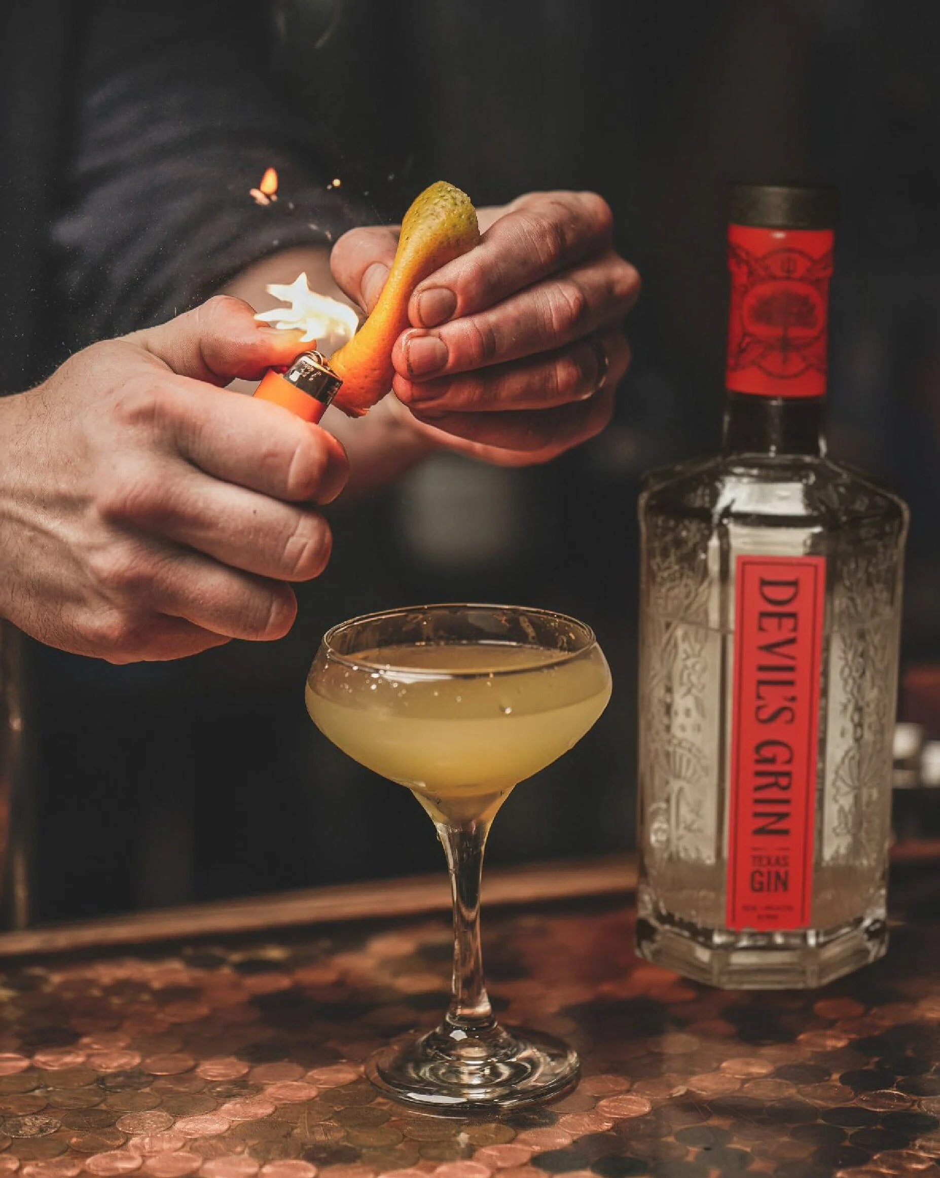
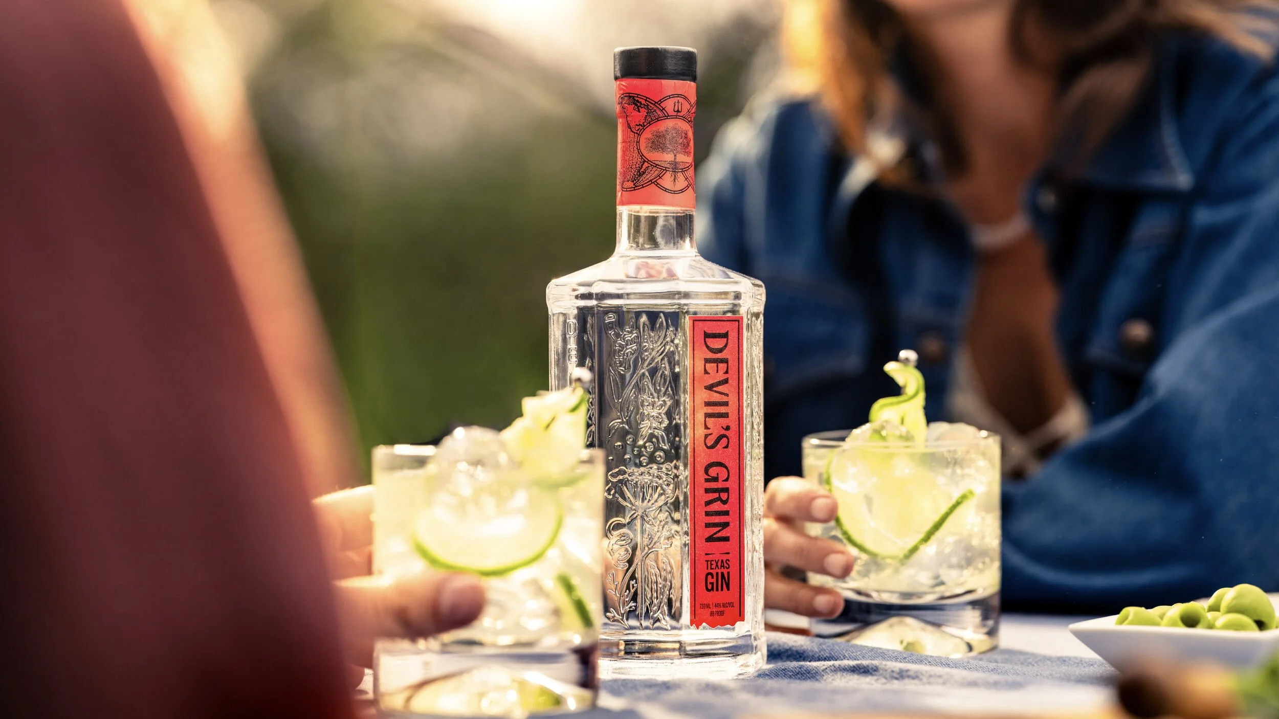
The primary label design is the most restrained element in the brand system. Displaying only the logotype, the Texas Gin modifier, a border element and the required legal language, this restraint was a strategic play. Devil's Grin set out to own “Texas Gin” as a category claim, and the simplicity of this label prevented that claim from being lost in the noise of additional claims and callouts.
Necker Label Design
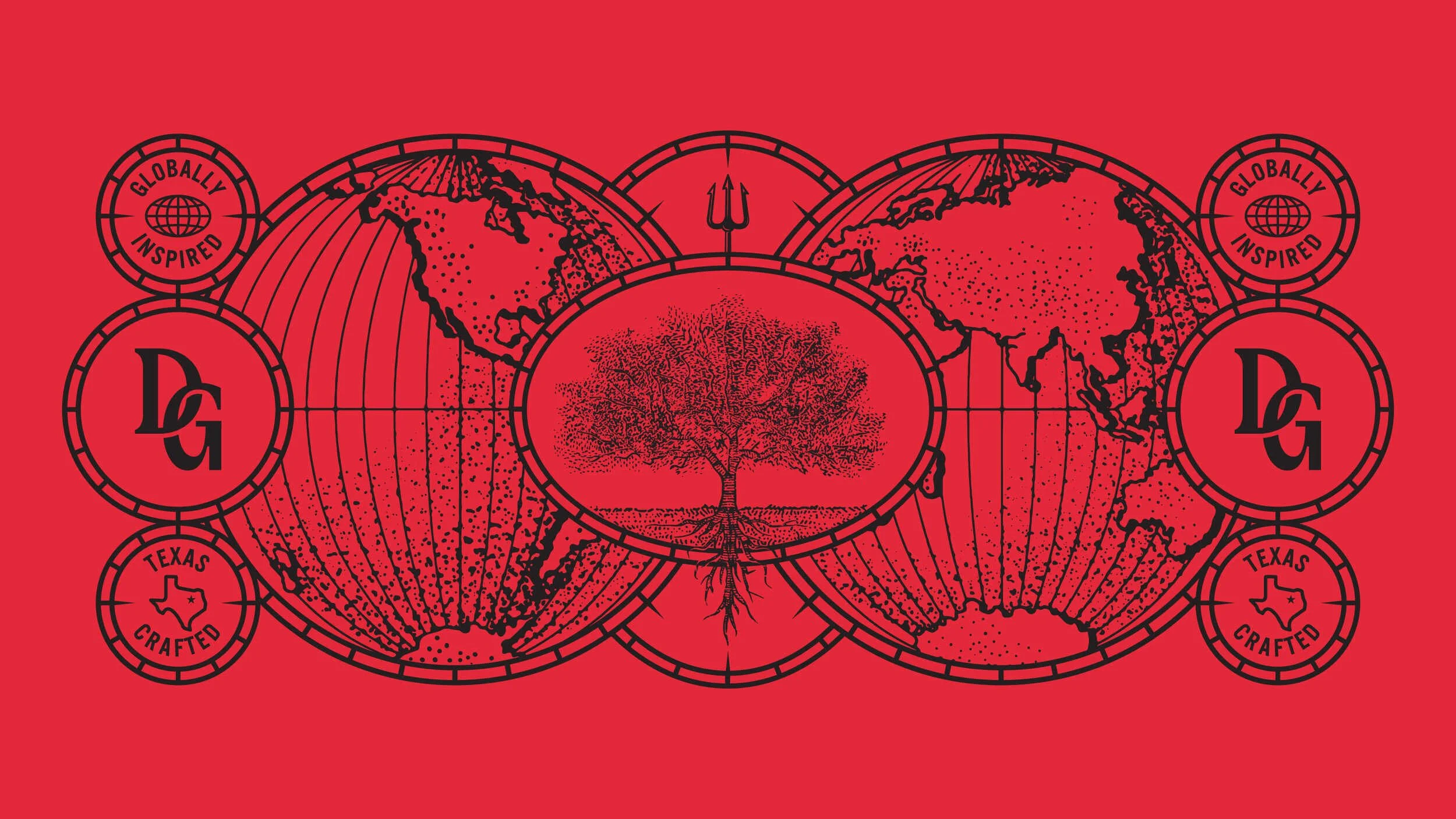
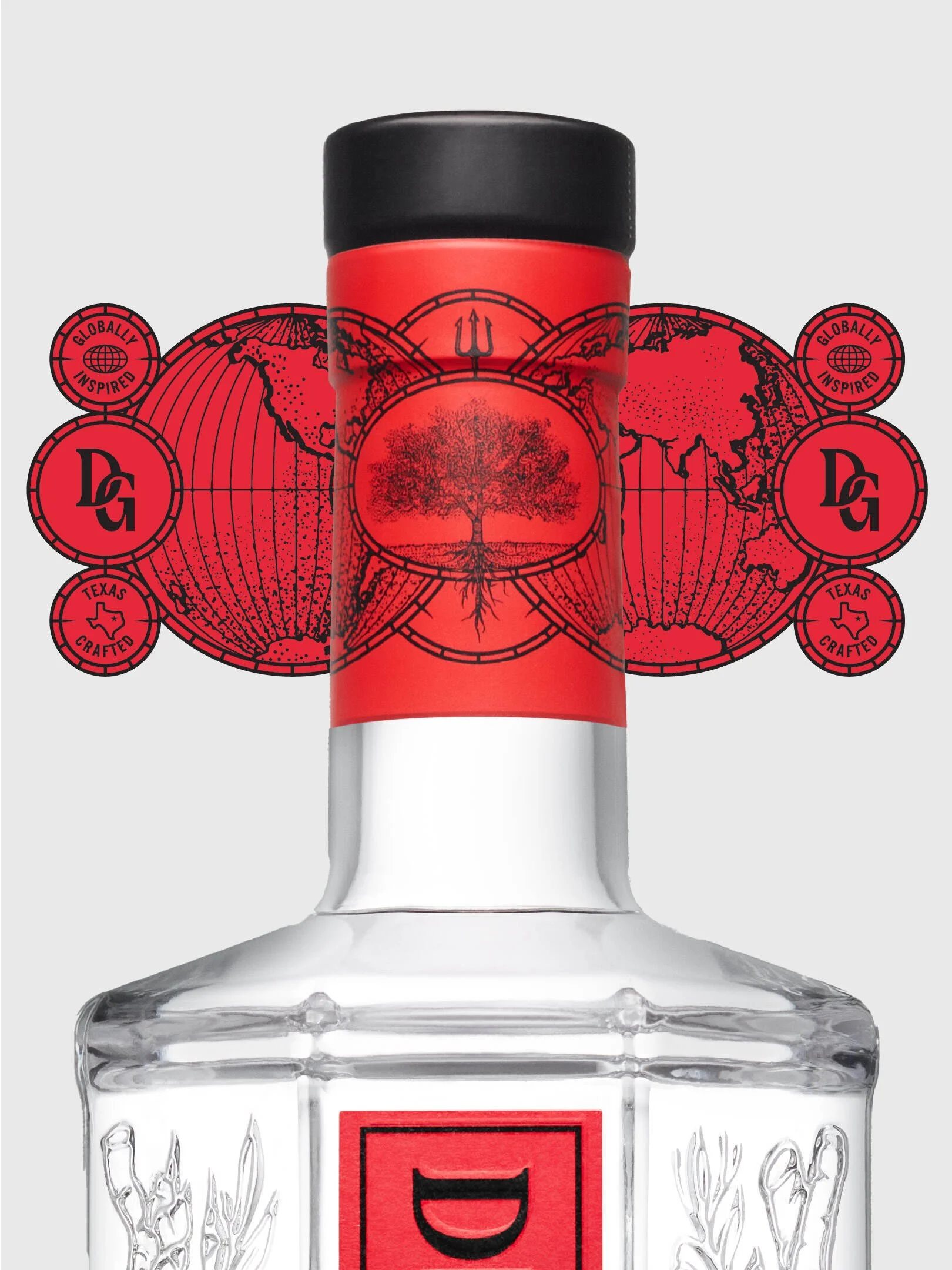
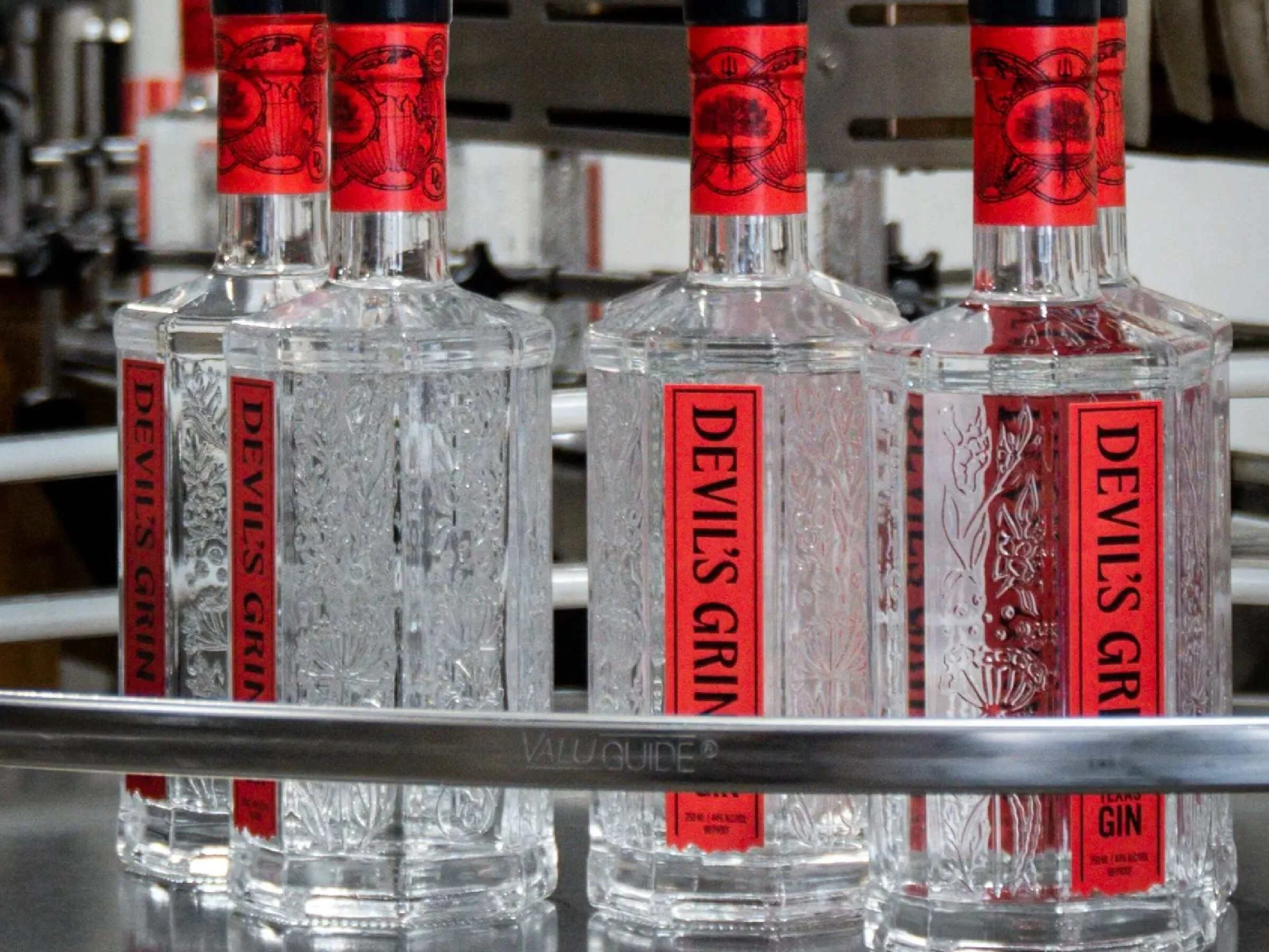
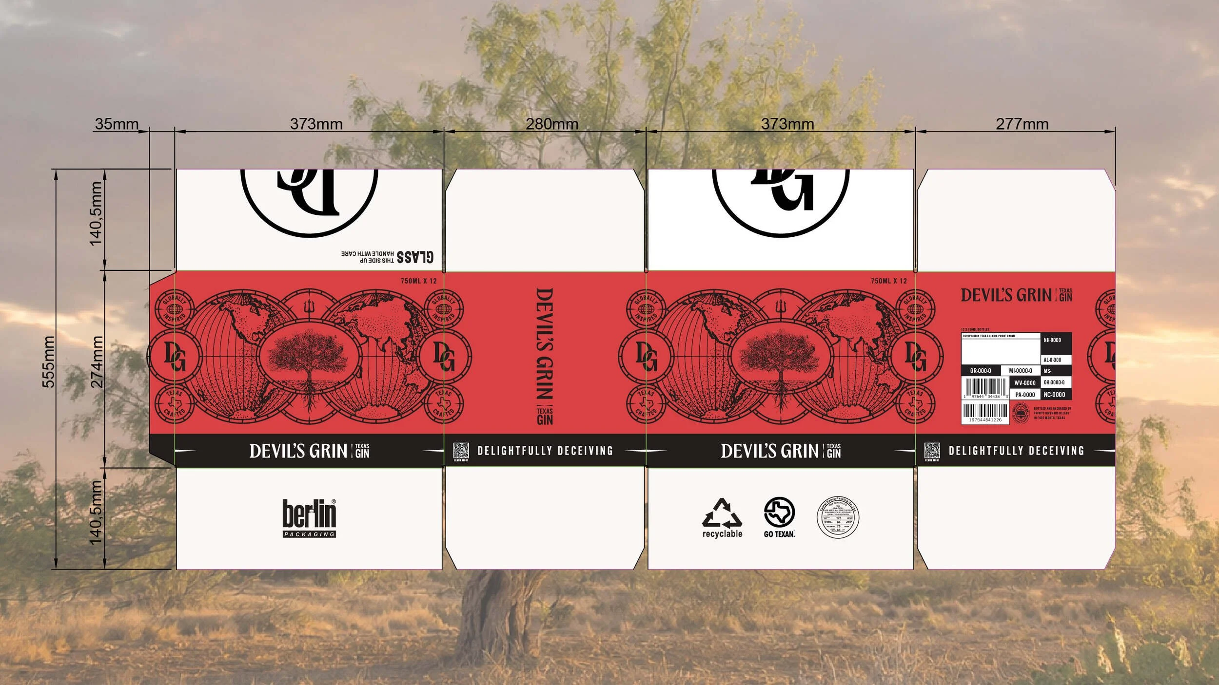
While the primary label exercises restraint, the necker was designed to carry the category-expected maximalism, and to help further tell the brand story. Inspired by vintage world maps, the necker design displays the mesquite tree at the center and surrounds it with globes, thorns, the DG monogram, and a devil's pitchfork, illustrating a search for botanicals that spanned six continents before returning home to Texas for the final one: the mesquite bean. Badges on the necker reinforce the dual claim with “Globally Inspired” and “Texas Crafted”.
Bottle Design & Embossing
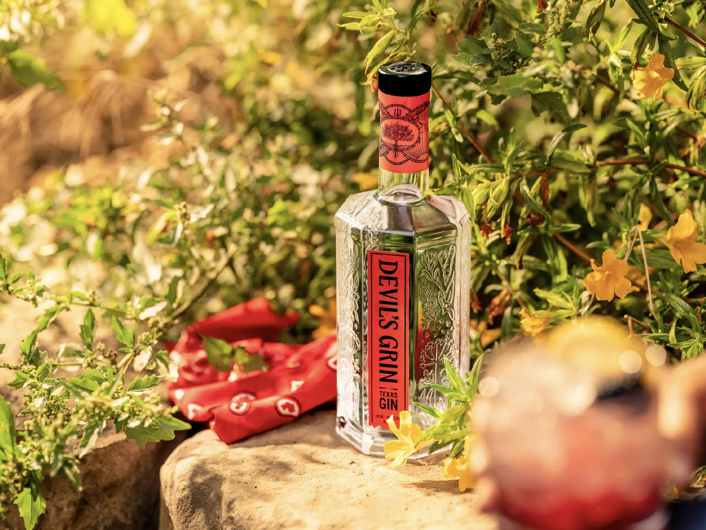
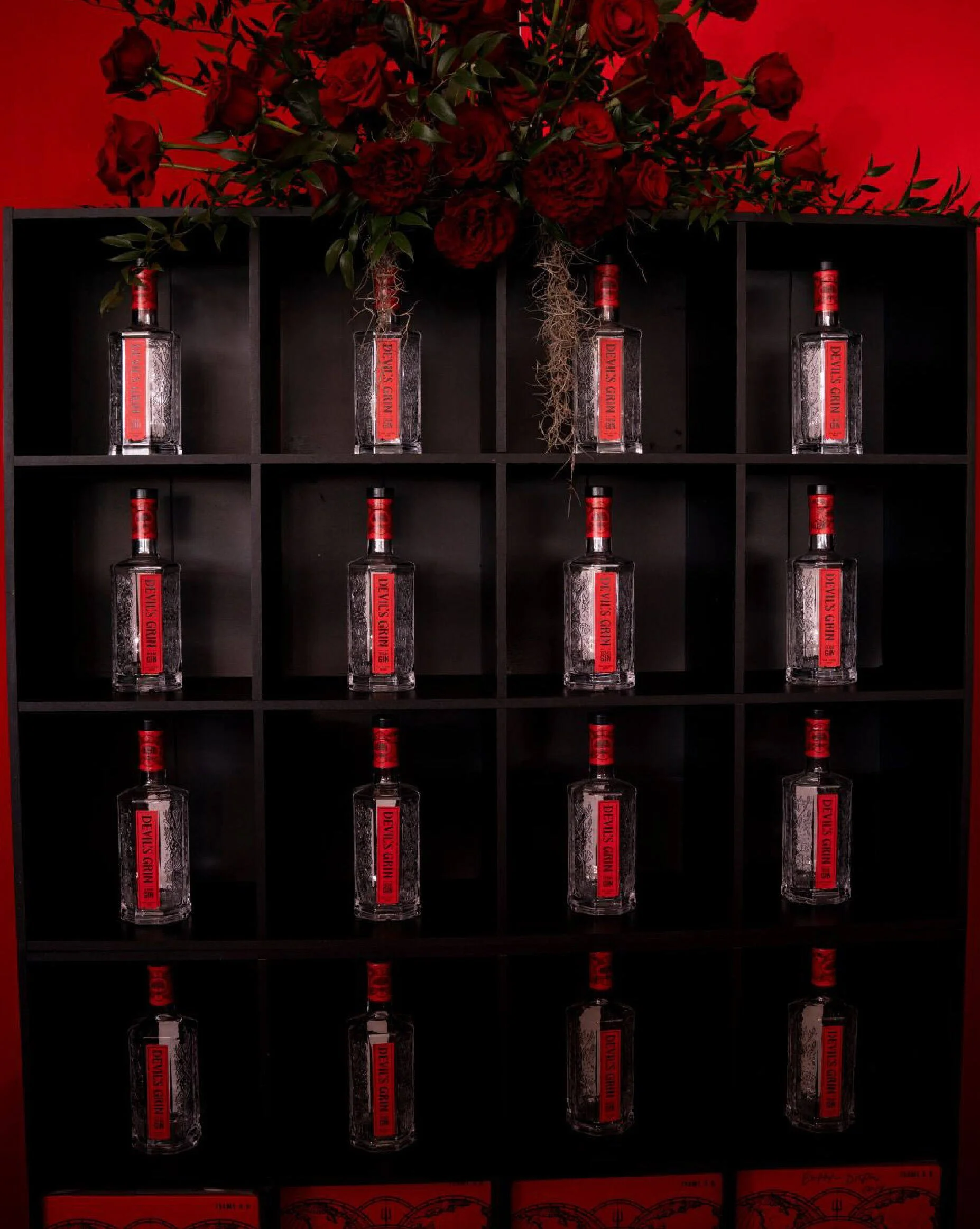
The bottle is a fully custom octagonal shape that was designed with light refraction in mind. The individual facets and the botanical + tagline embossing were created to not only communicate ingredients and brand promises, but to also refract light in a way that round or rectangular glass cannot, giving this clear spirit a genuine presence on a dimly-lit back bar.
The long neck was created to be easily poured and handled by bartenders at a fast-paced bar, and Studio One Eleven, the in-house design studio at Berlin Packaging, took our idea and engineered the bottle structure itself.
Art Direction
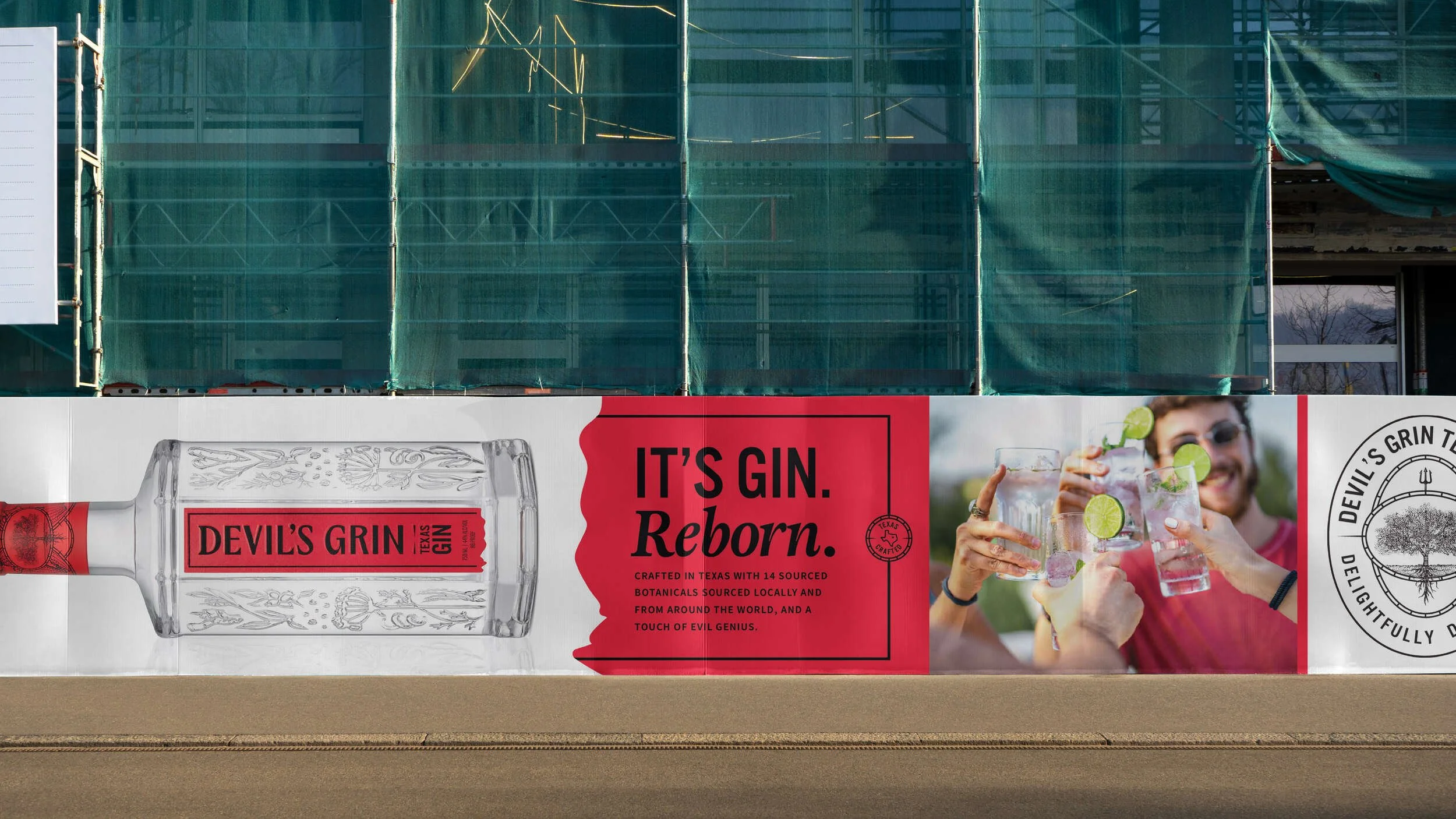
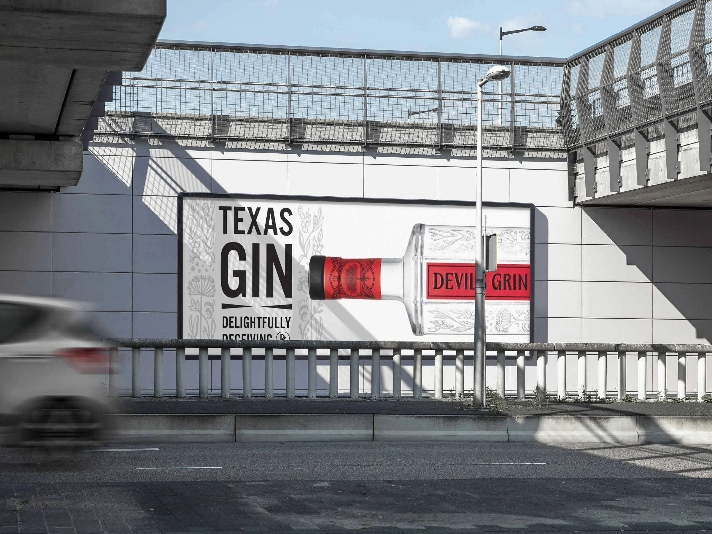
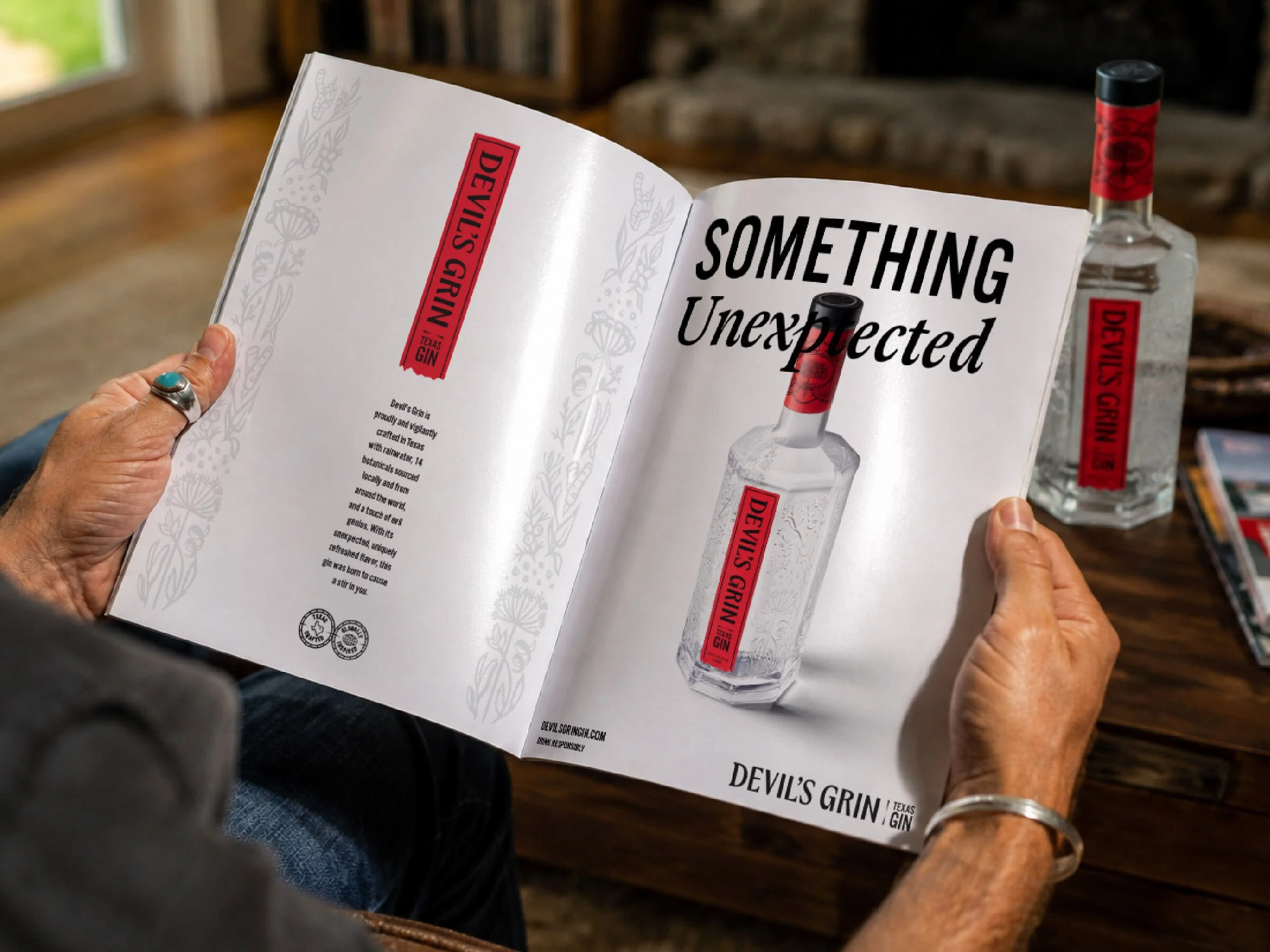
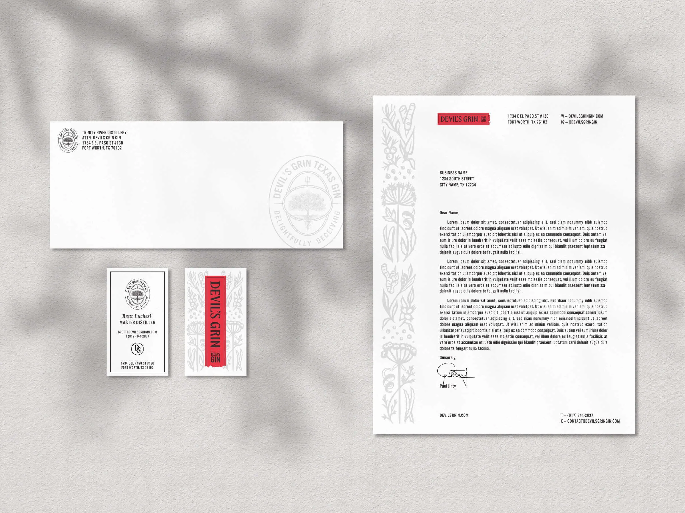
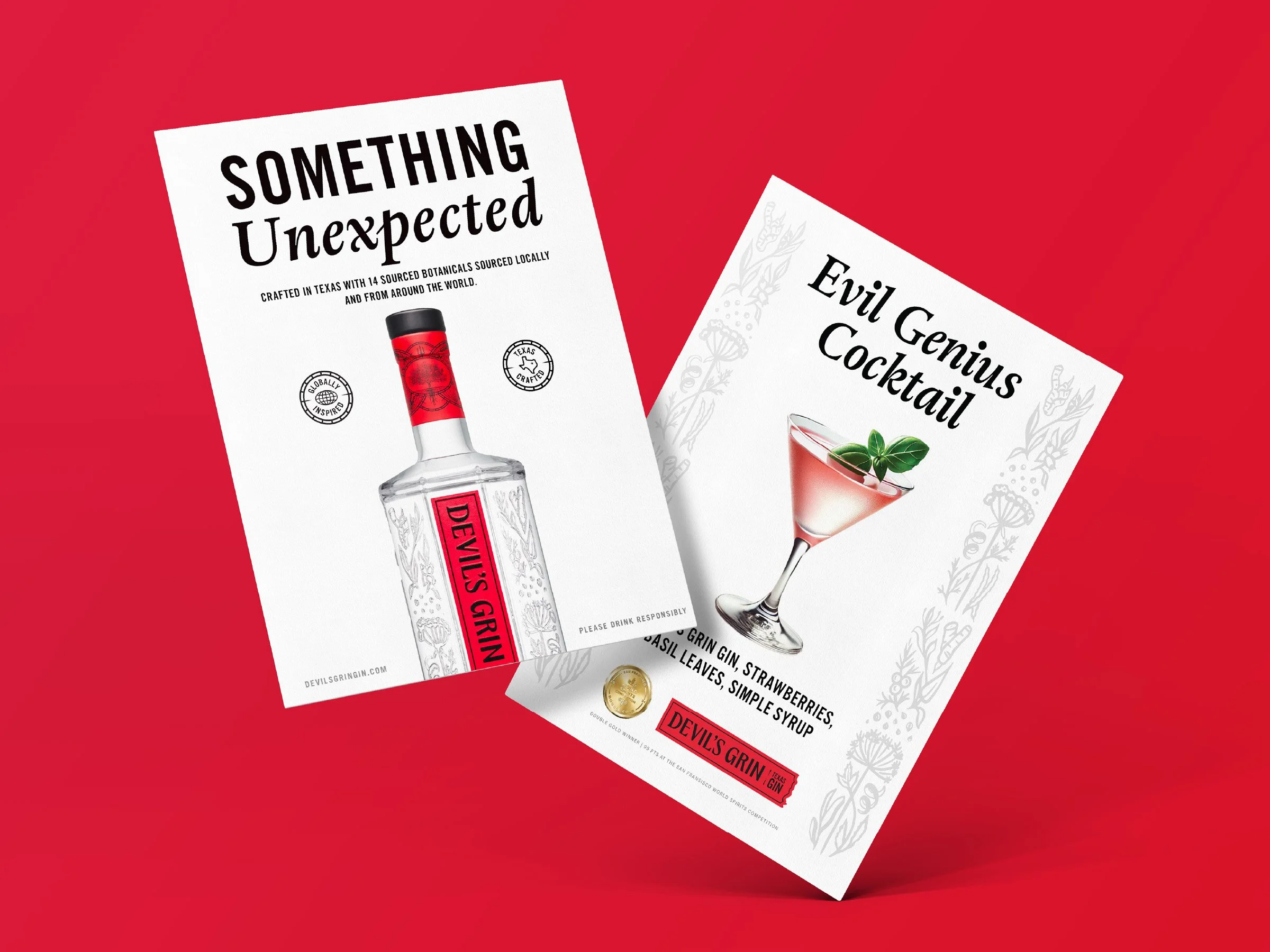
The layout system for Devil’s Grin takes its cues from the visual identity and bottle design, combining the botanical illustrations, generous open white space, bold headlines and a torn paper motif that was pulled from the ragged bottom edge of the primary label and used as a spatial divider. Red remains an accent — rarely a flood — throughout, and pairs typefaces: Adriane Text with Alternate Gothic No3 D to accent headlines with a visual rhythm and clear hierarchy.
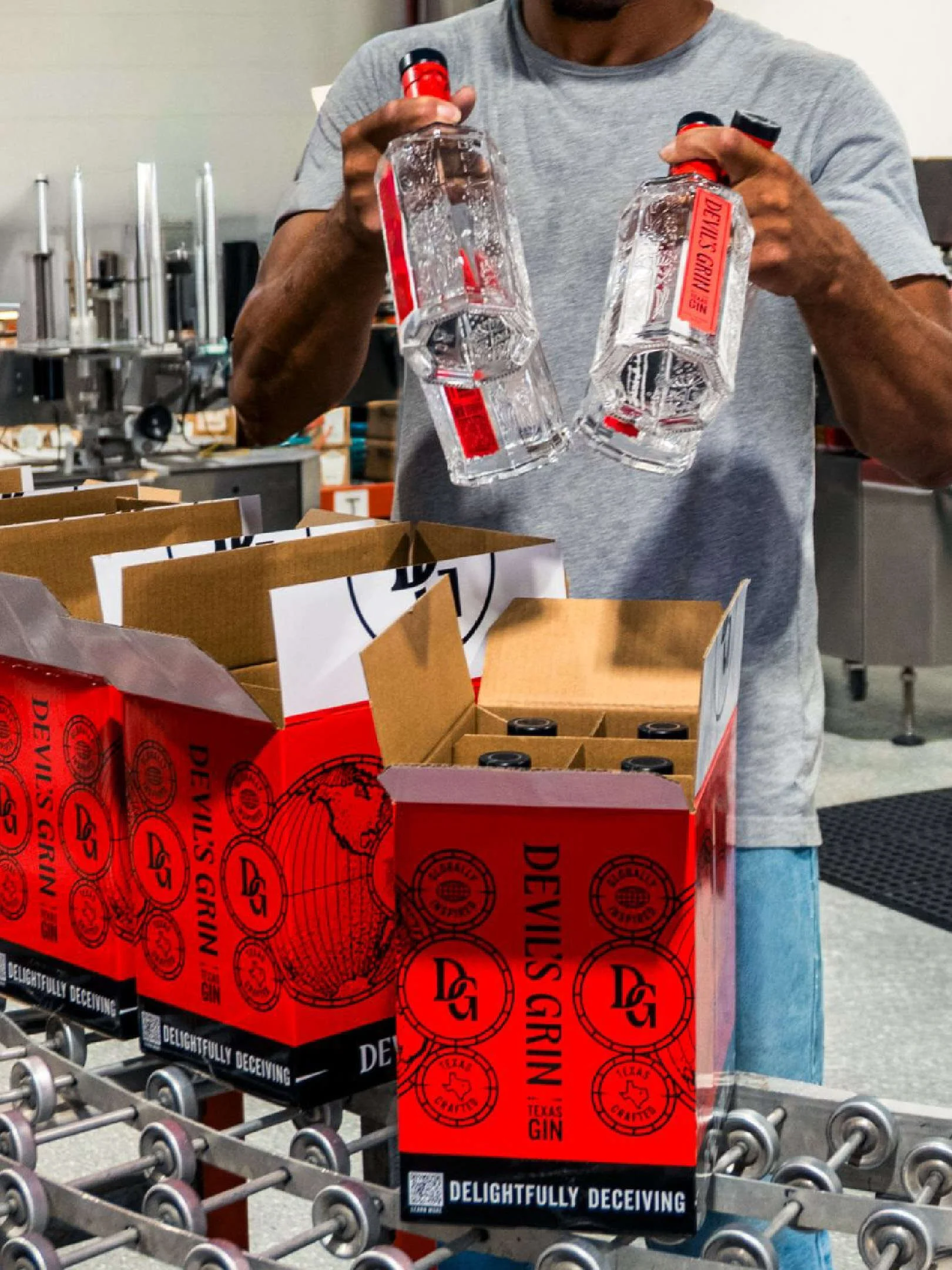
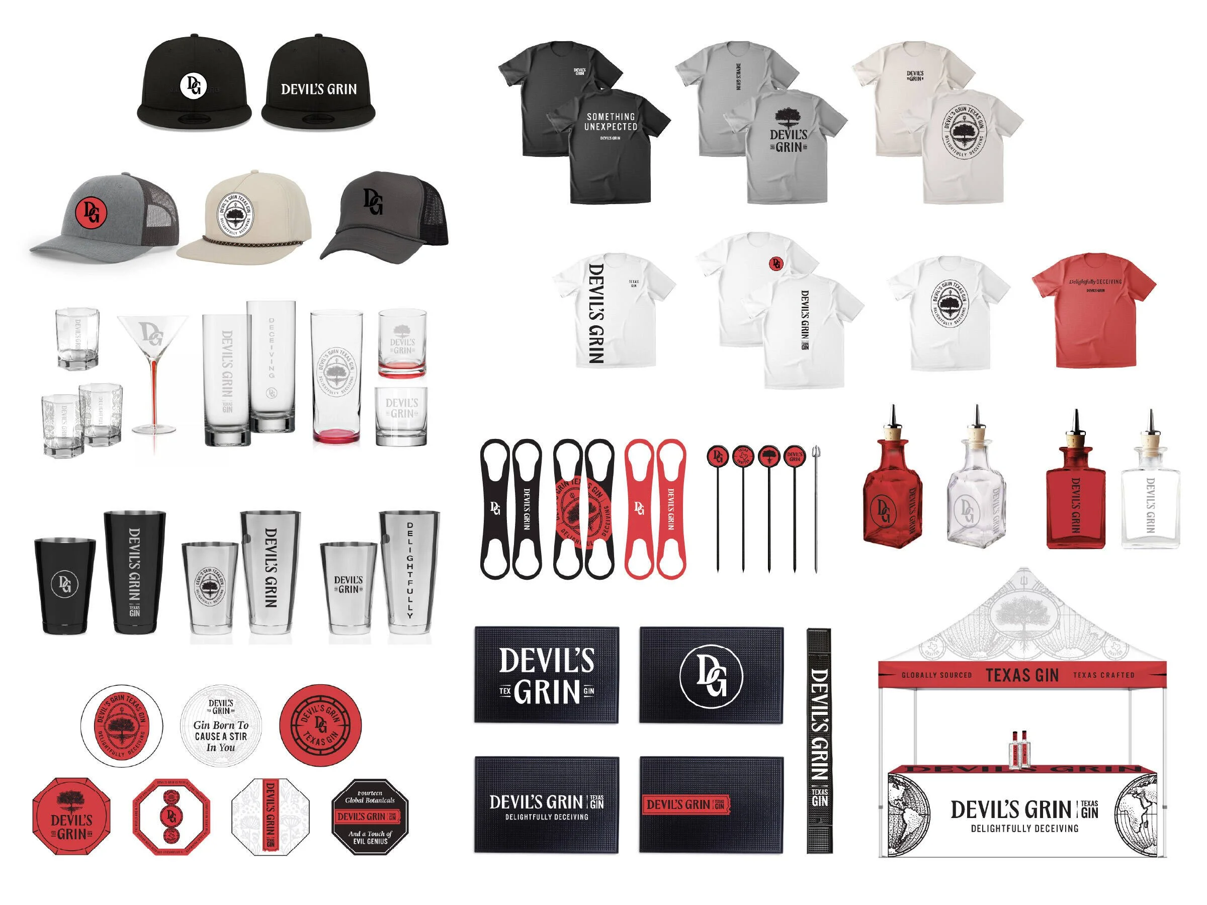
This system extends across case racks, shippers, spec sheets, barware and coasters, event tents, merchandise and out of home, all of which is documented in a 78-page set of brand guidelines that codifies all that was created.
Want to see more?