DRCOG
DRCOG Hand Lettering and Advertising Campaign
Using bright and approachable lettering to emphasize the importance of public and self-propelled transportation.
Client
The Denver Regional Council of Governments (DRCOG)
Services
Lettering
Credits
Agency: Cactus
Executive Creative Director: Sammie O'Sullivan
Art Direction & Principle Design: Adam Vicarel
Lettering: Carly Salzman

The Opportunity
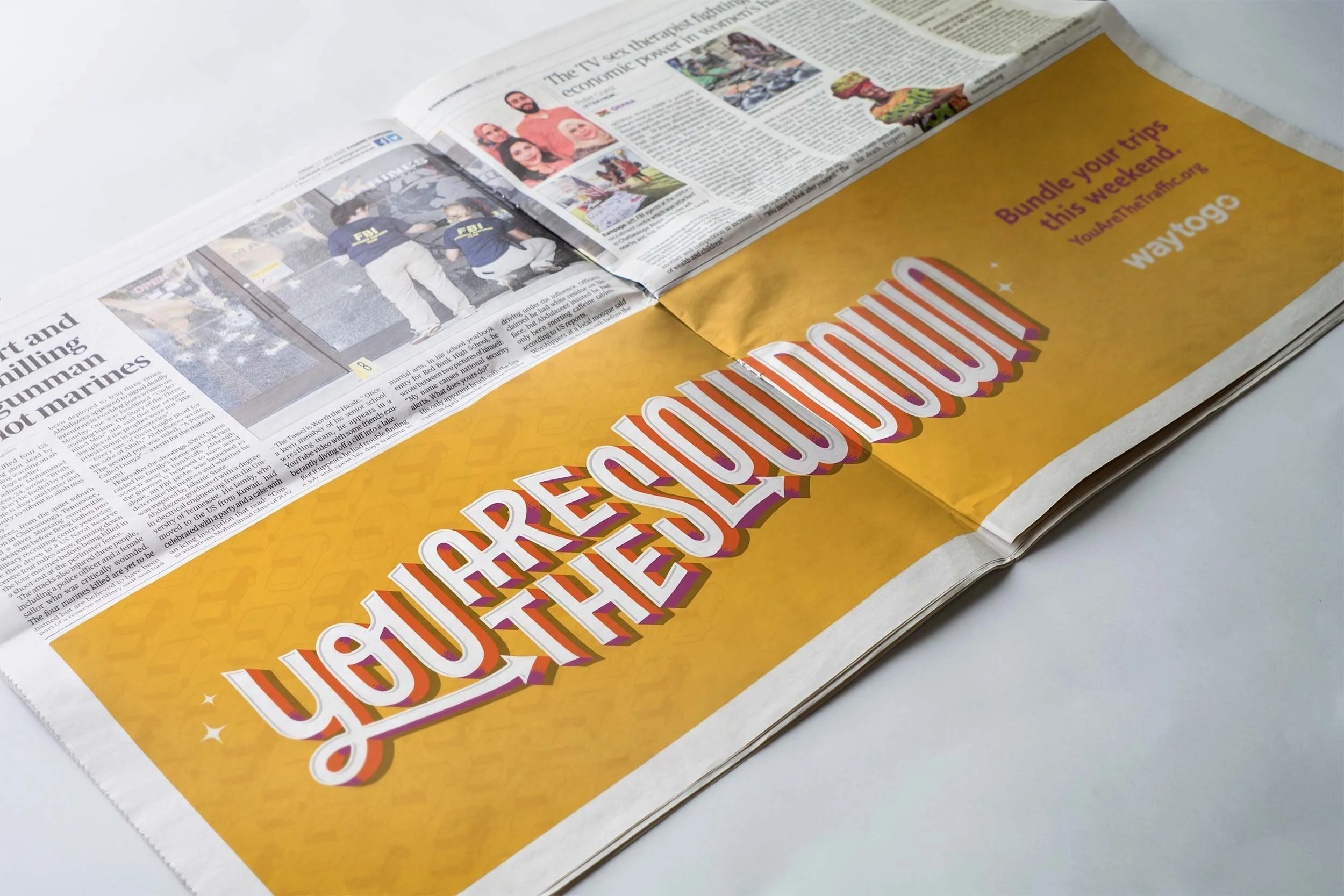
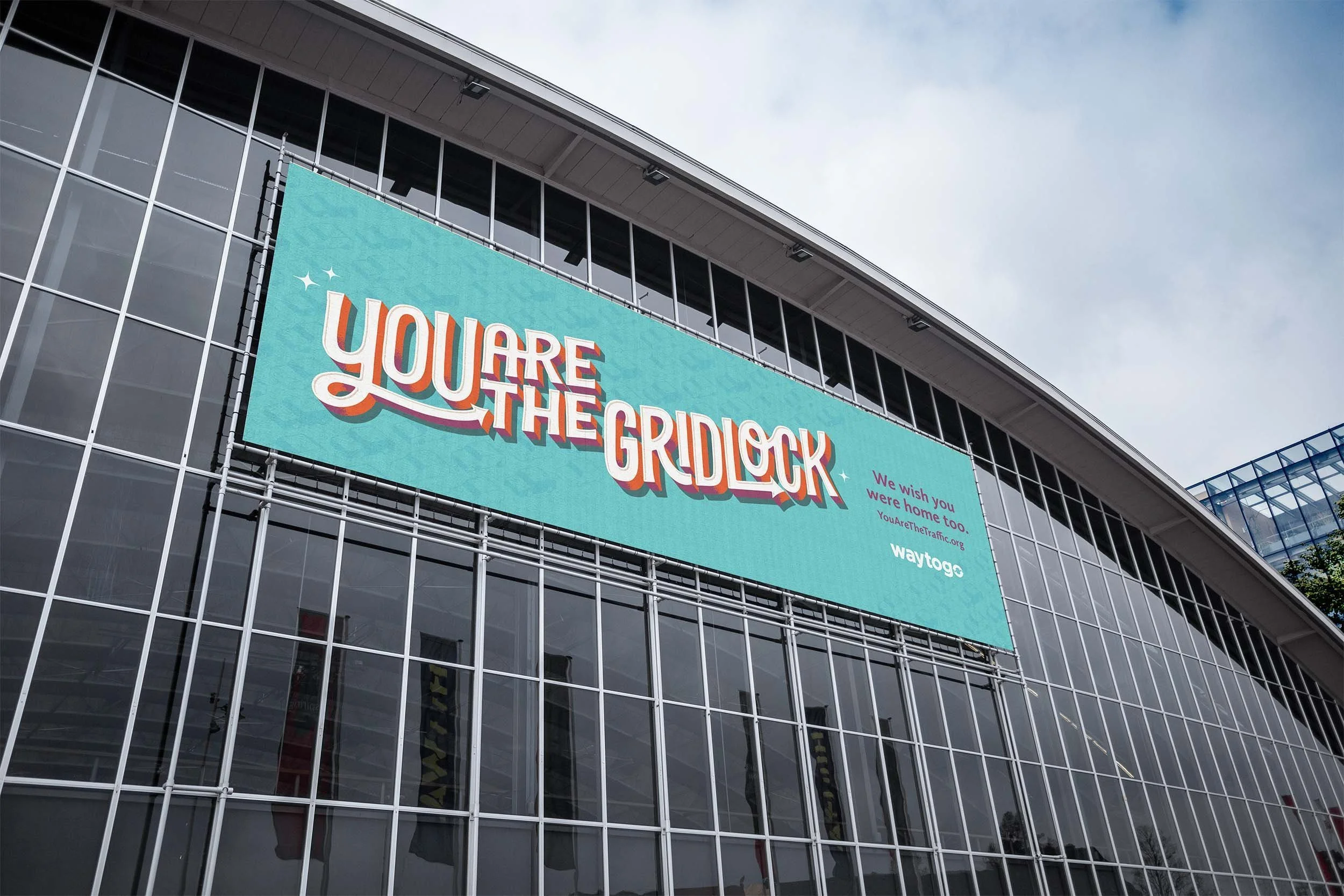
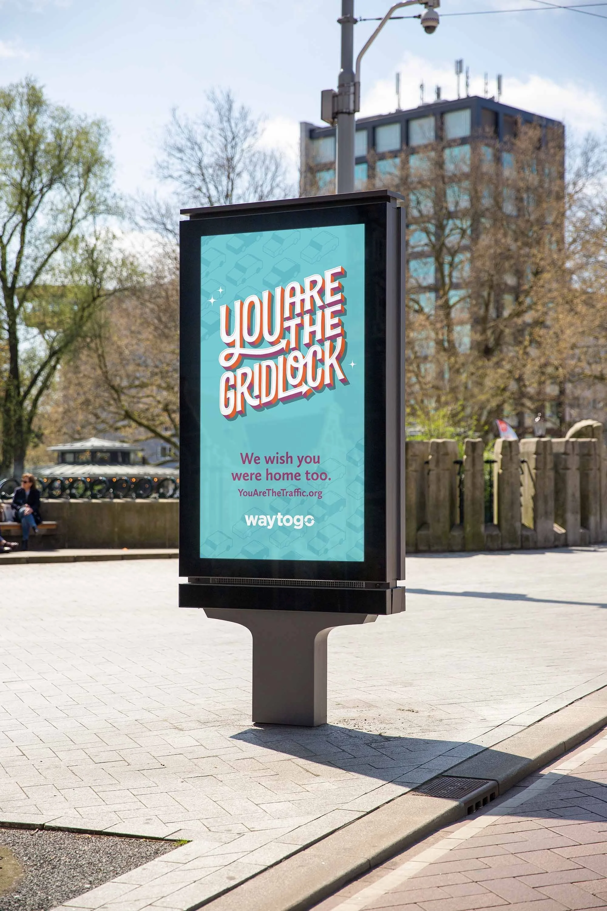
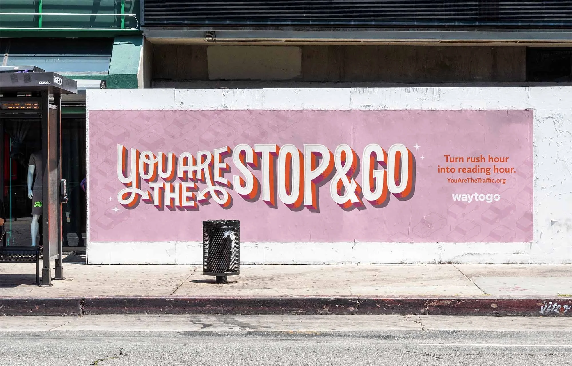
We've all been stuck in soul-sucking, time-wasting traffic. It's hard to admit but we are just as much a part of the problem as the drivers around us. We are the traffic. DRCOG hired Denver-based agency, Cactus, to create a campaign to encourage folks to take public transit. Cactus brought in Vicarel Studios to draw the campaign lettering.
The Solution
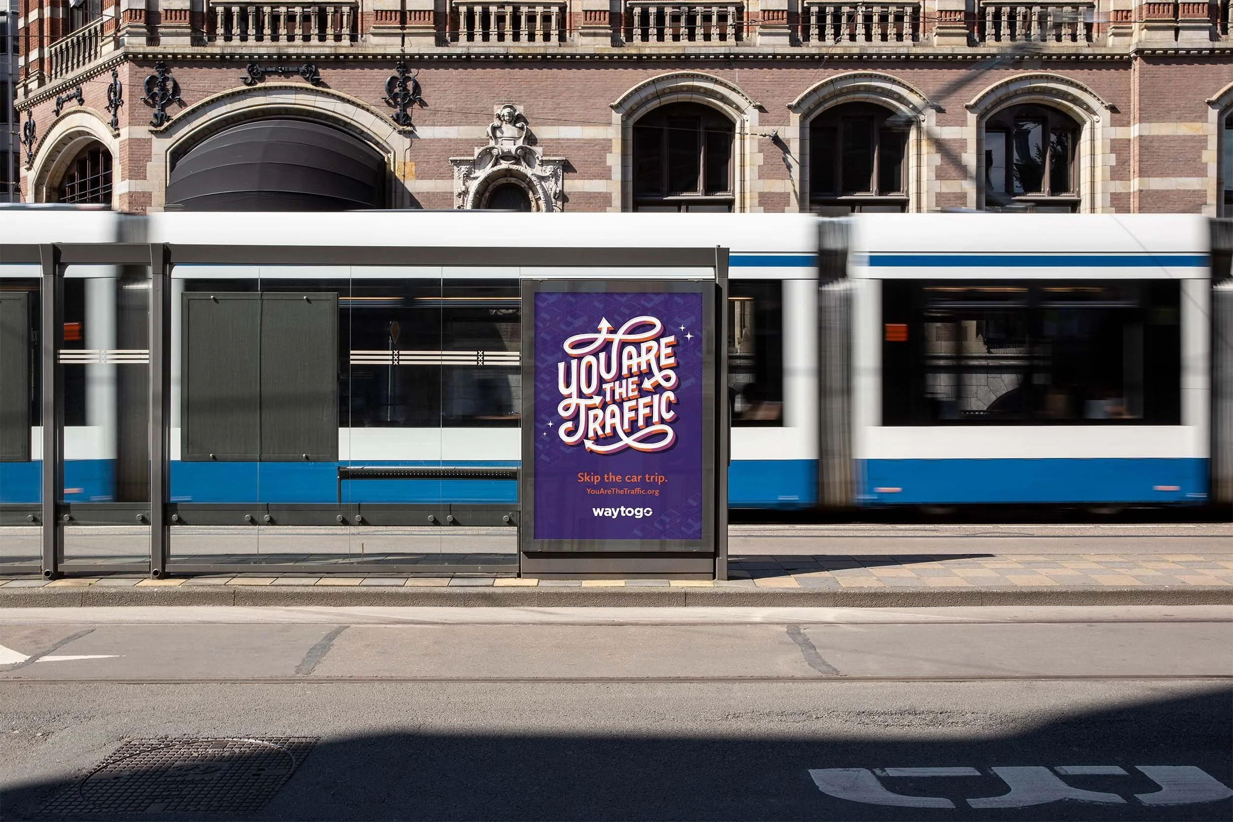
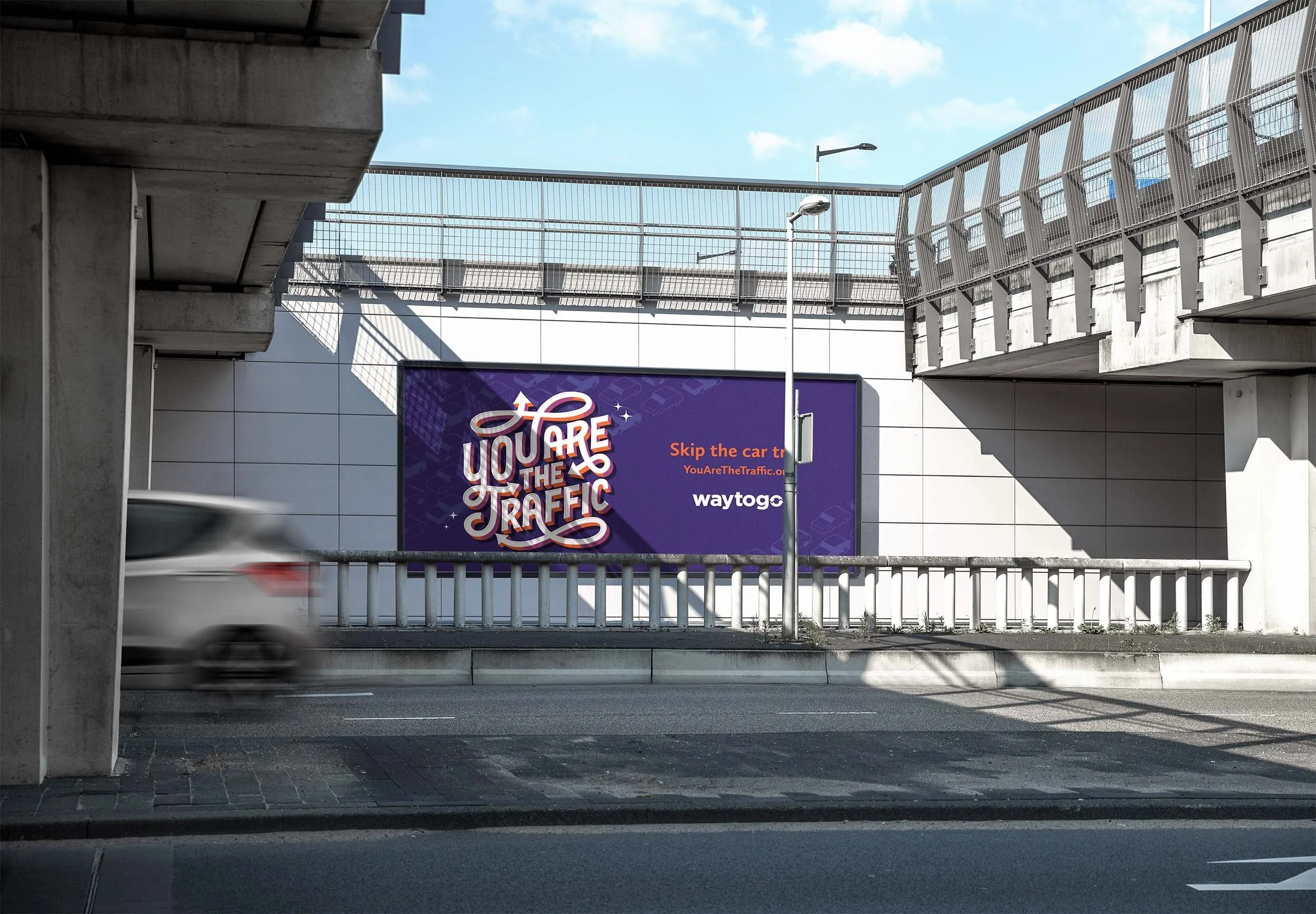
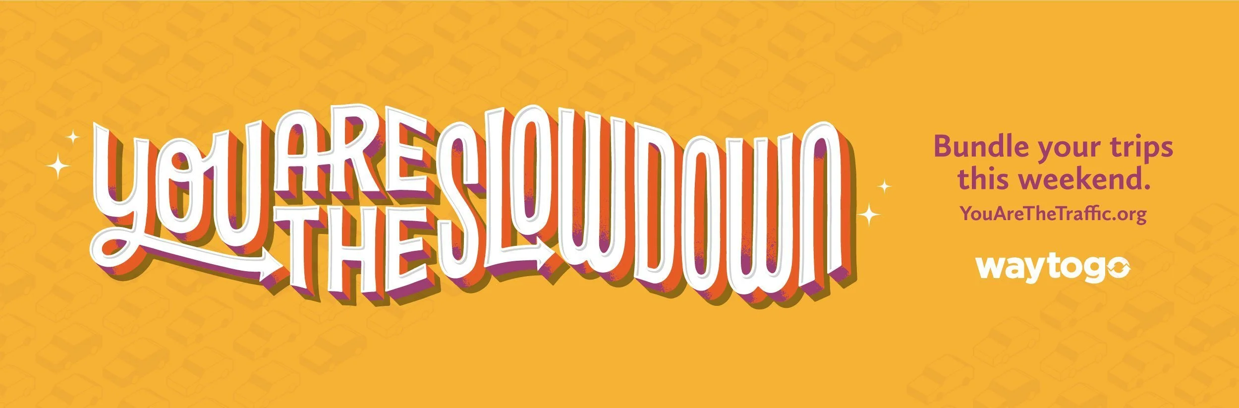
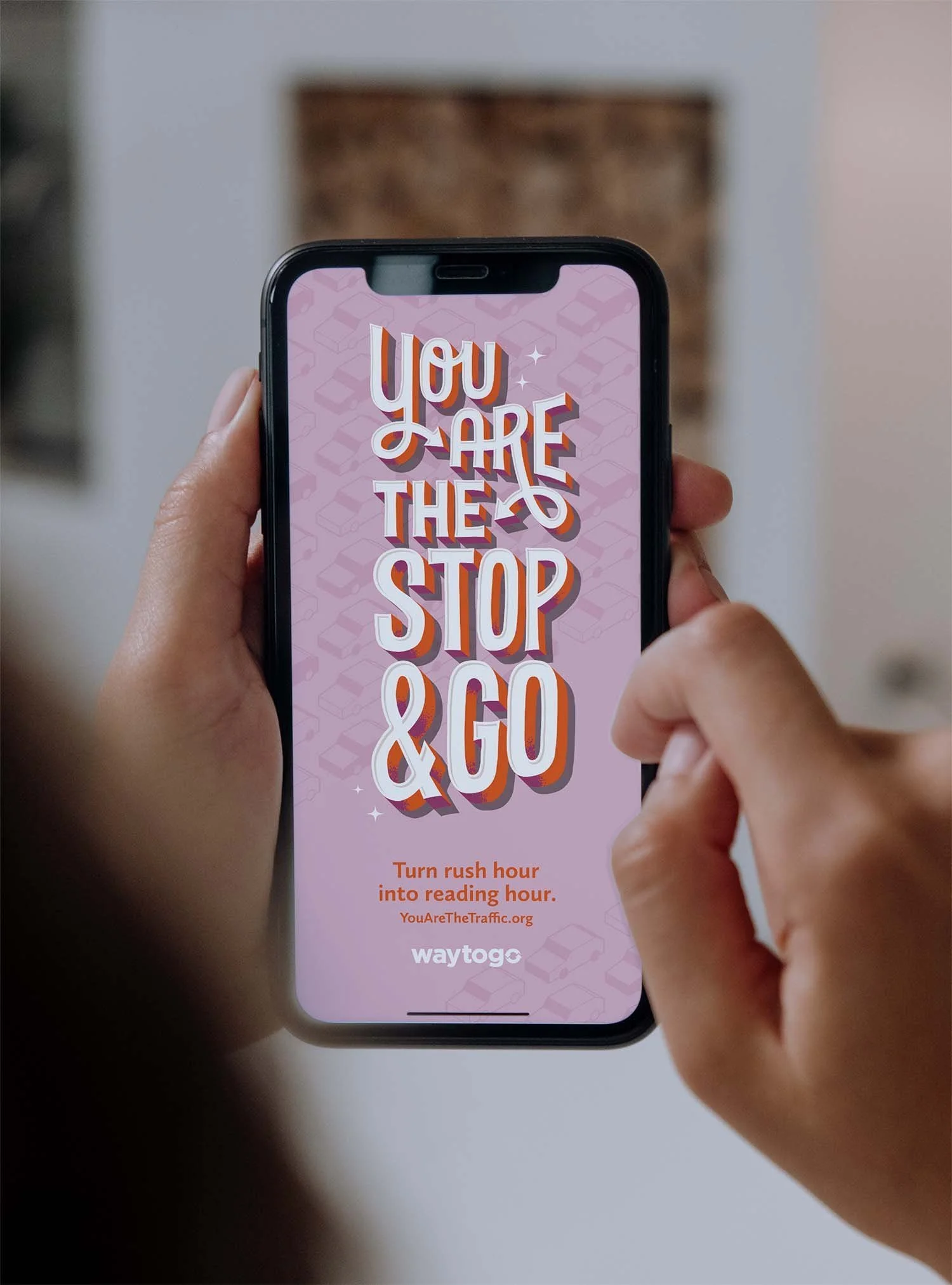
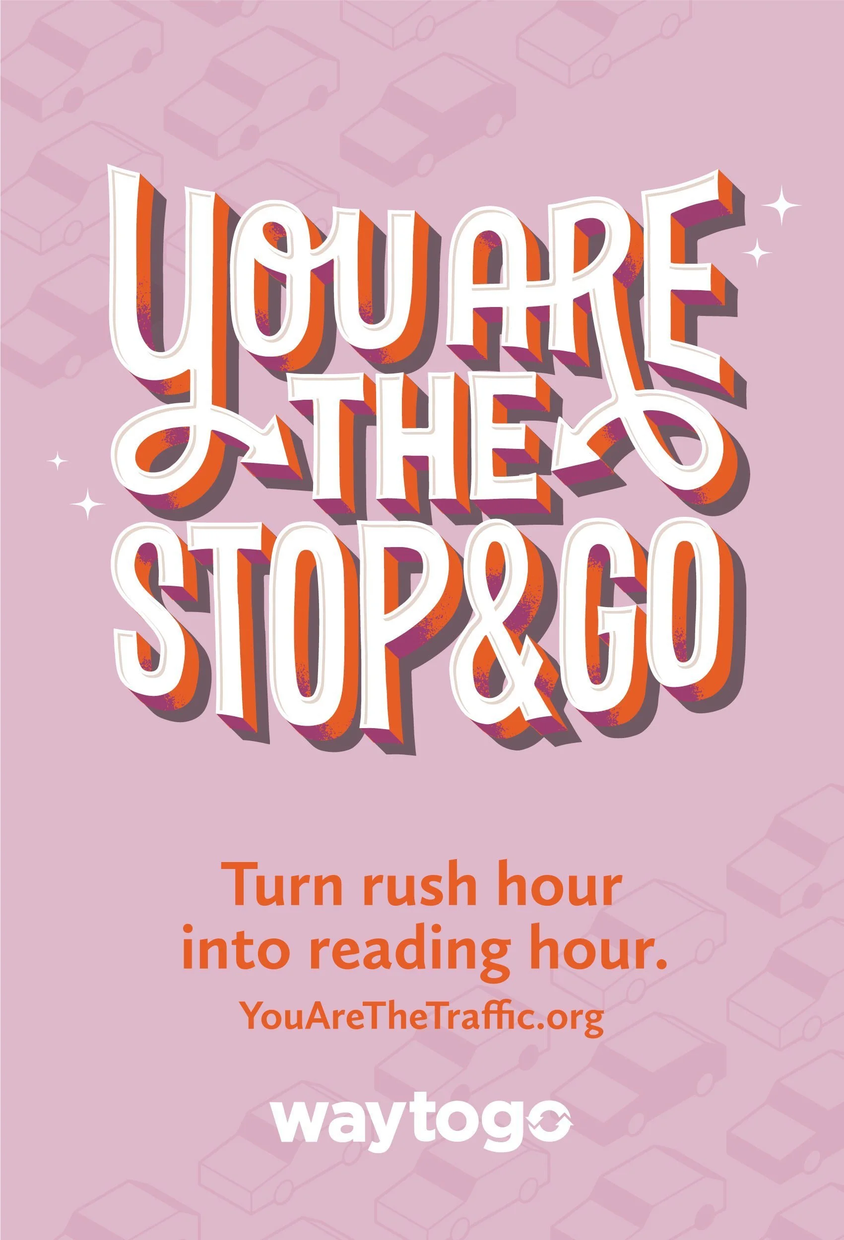
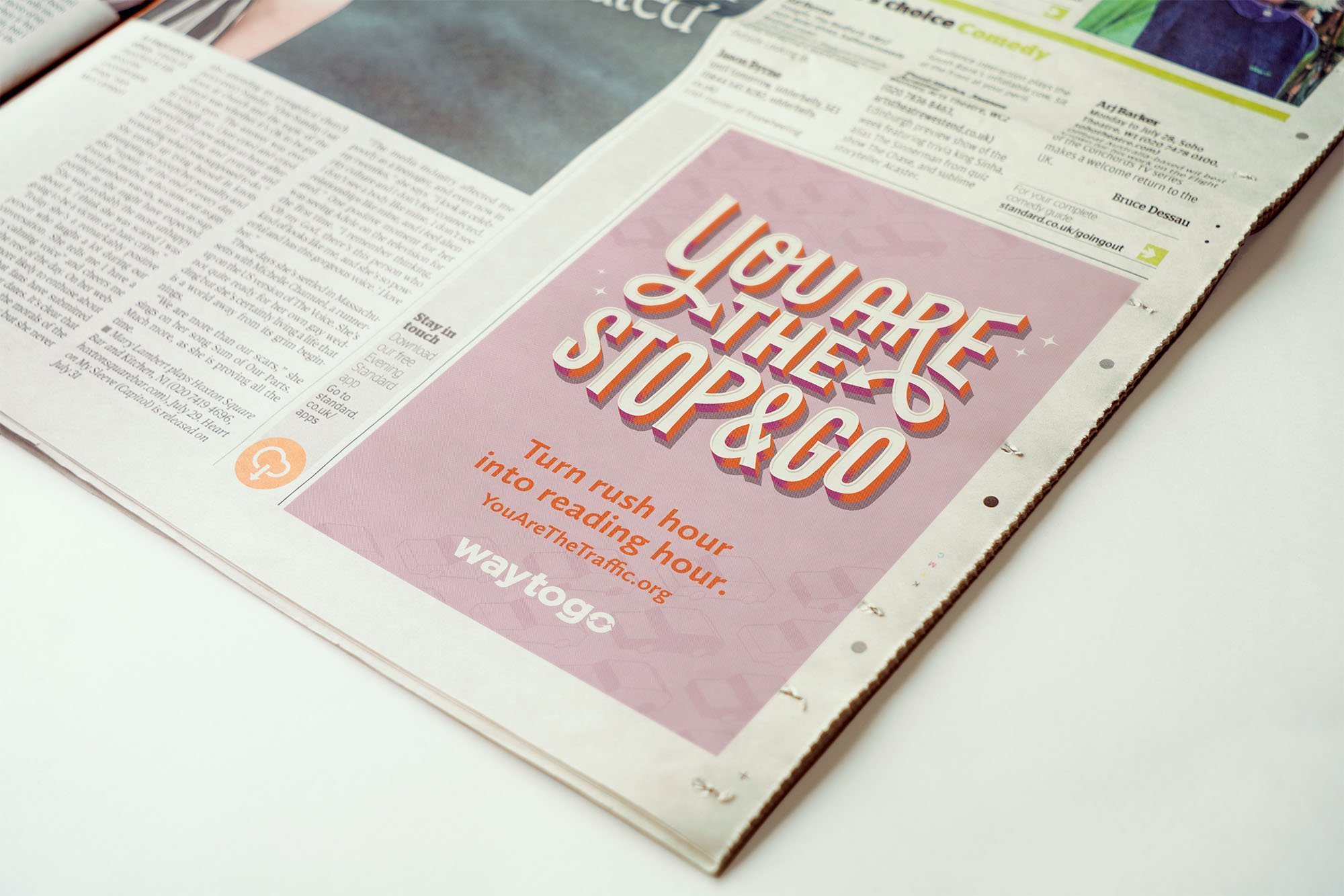
We created a blunt-but-cute lettering series for DRCOG calling for greater use of public transportation, walking, and ride-shares. The lettering lockups are bold, legible, fun, and modular, created to allow easy alteration to meet the many aspect ratio demands of commercial advertising.
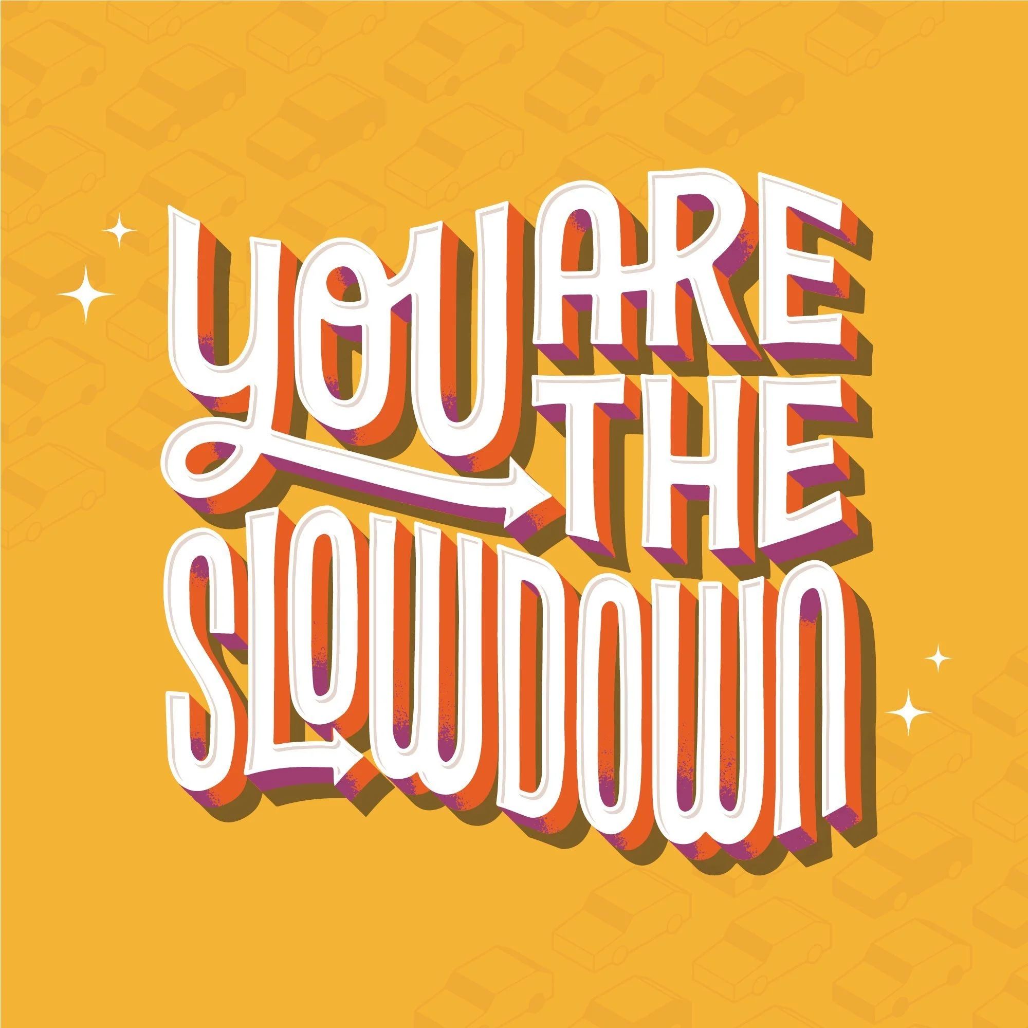

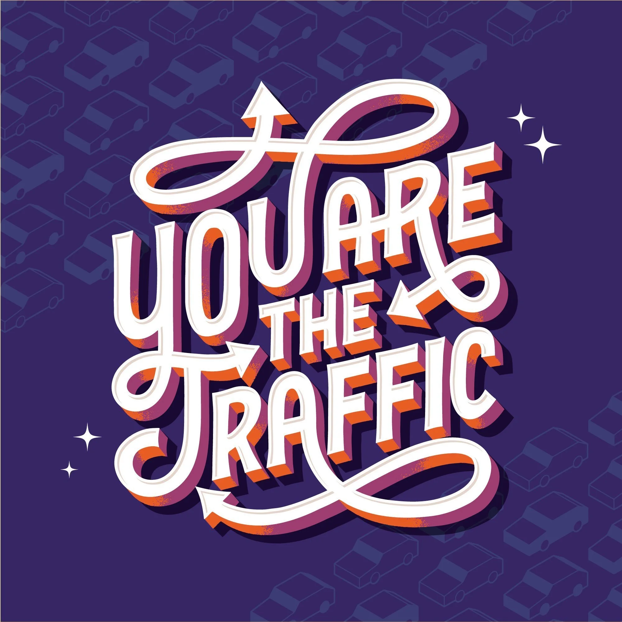
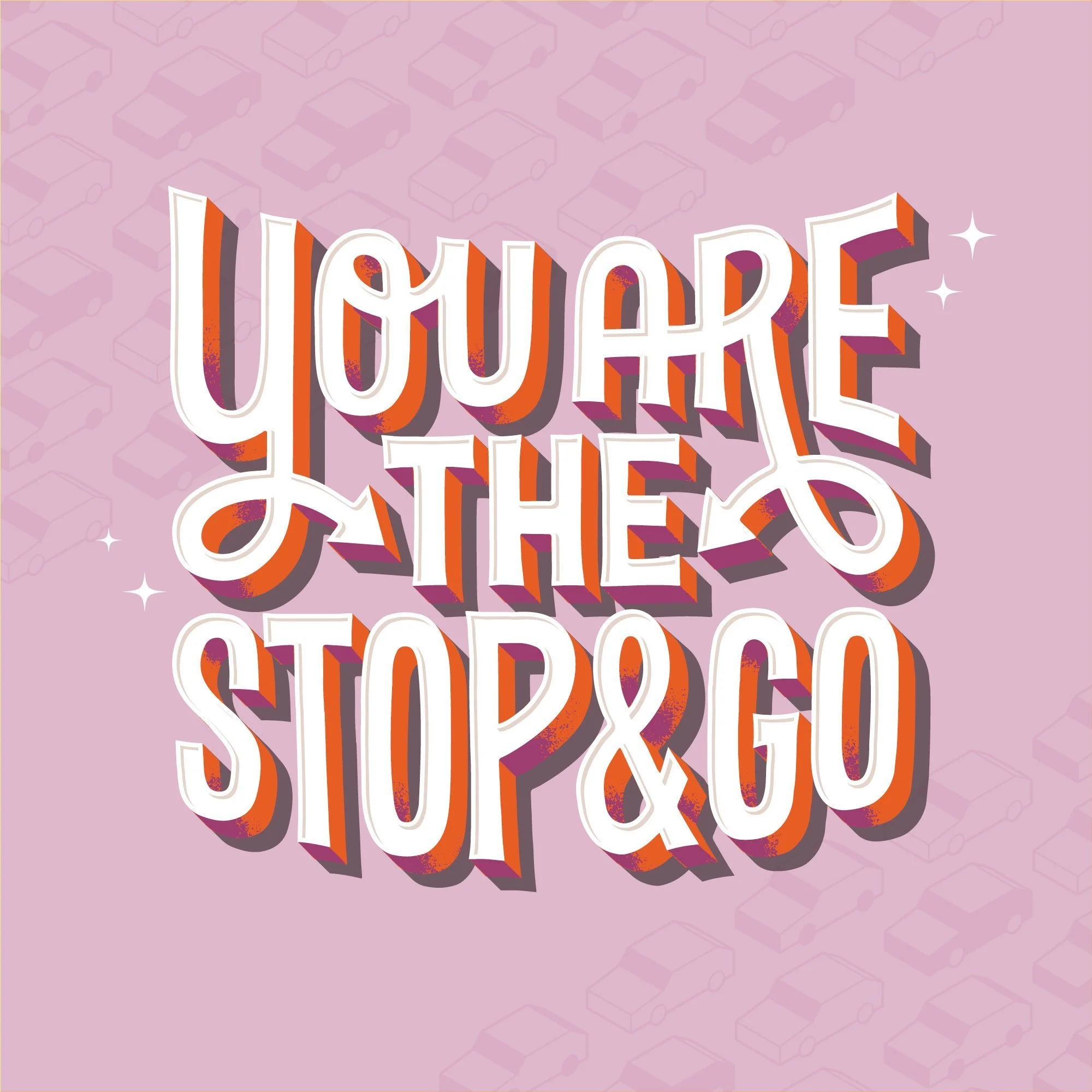
The Lettering
The final lettering style is a condensed and stable sans serif with a subtle wedge, allowing for a quick and easy read. The structured style drew inspiration from gridded city blocks, while the casual color palettes were a whimsical pop that prevented the advertisements from feeling overly negative. Each of the 4 lettering lockups needed to work efficiently across 3 different layouts: vertical, square, and horizontal.
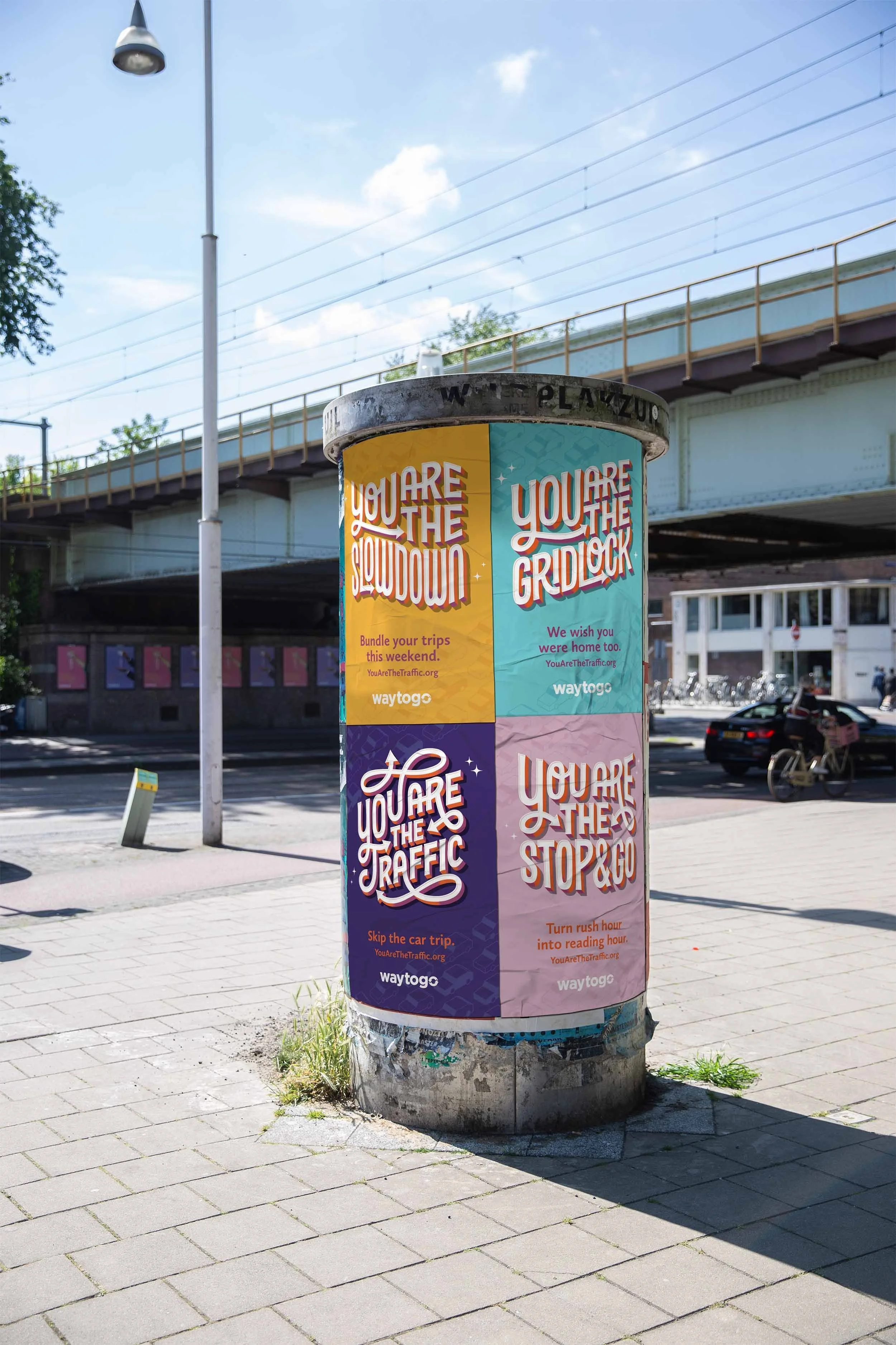
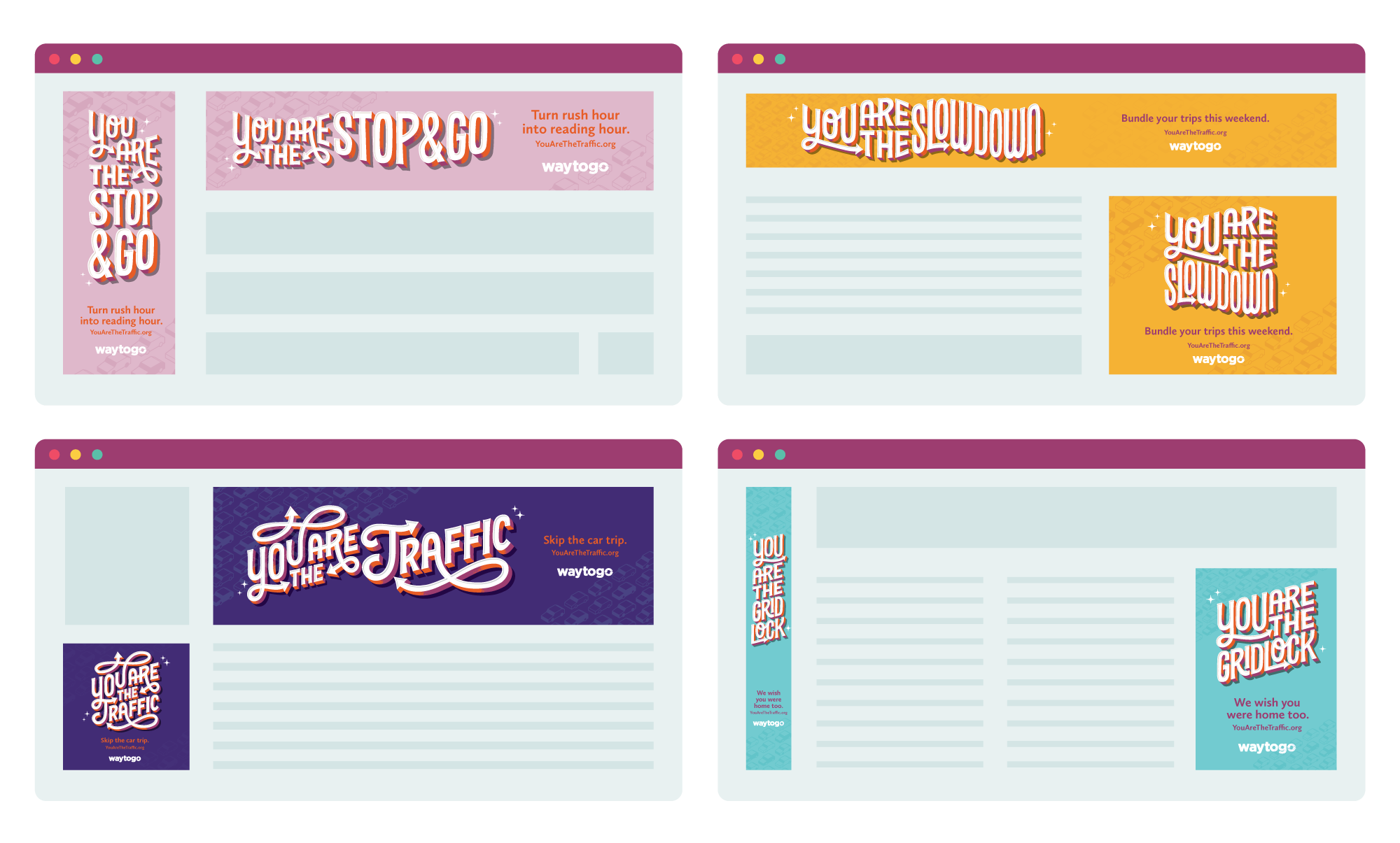
Squared, horizontal and vertical modular lettering applications


Want to see more?