Creating John Muir Sans: A typeface for the “Father of the National Parks”
Read MoreLooking for something specific?
Some blog posts do contain affiliate links will give me a very small commission at no extra cost for you — so, thanks in advance for your support!
Creating John Muir Sans: A typeface for the “Father of the National Parks”
Read MoreMonday Munch — Vol. 032
Read MoreMonday Munch — Vol. 031
Read MoreMonday Munch — Vol. 030
Read MoreMonday Munch — Vol. 028
Read MoreMonday Munch — Vol. 026
Read MoreMonday Munch — Vol. 24
Read MoreMonday Munch — Vol. 022
Read MoreMonday Munch — Vol. 020
Read MoreThe Monday Munch — Vol. 019
Read MoreThe Monday Munch — Vol. 017
Read MoreThe Monday Munch — Vol. 009
Read MoreThe Monday Munch — Vol. 008
Read MoreThe Monday Munch — Vol. 007
Read MoreThe Monday Munch — Vol. 004
Read MoreThe Monday Munch — Vol. 002
Read MoreThe Monday Munch — Vol. 001
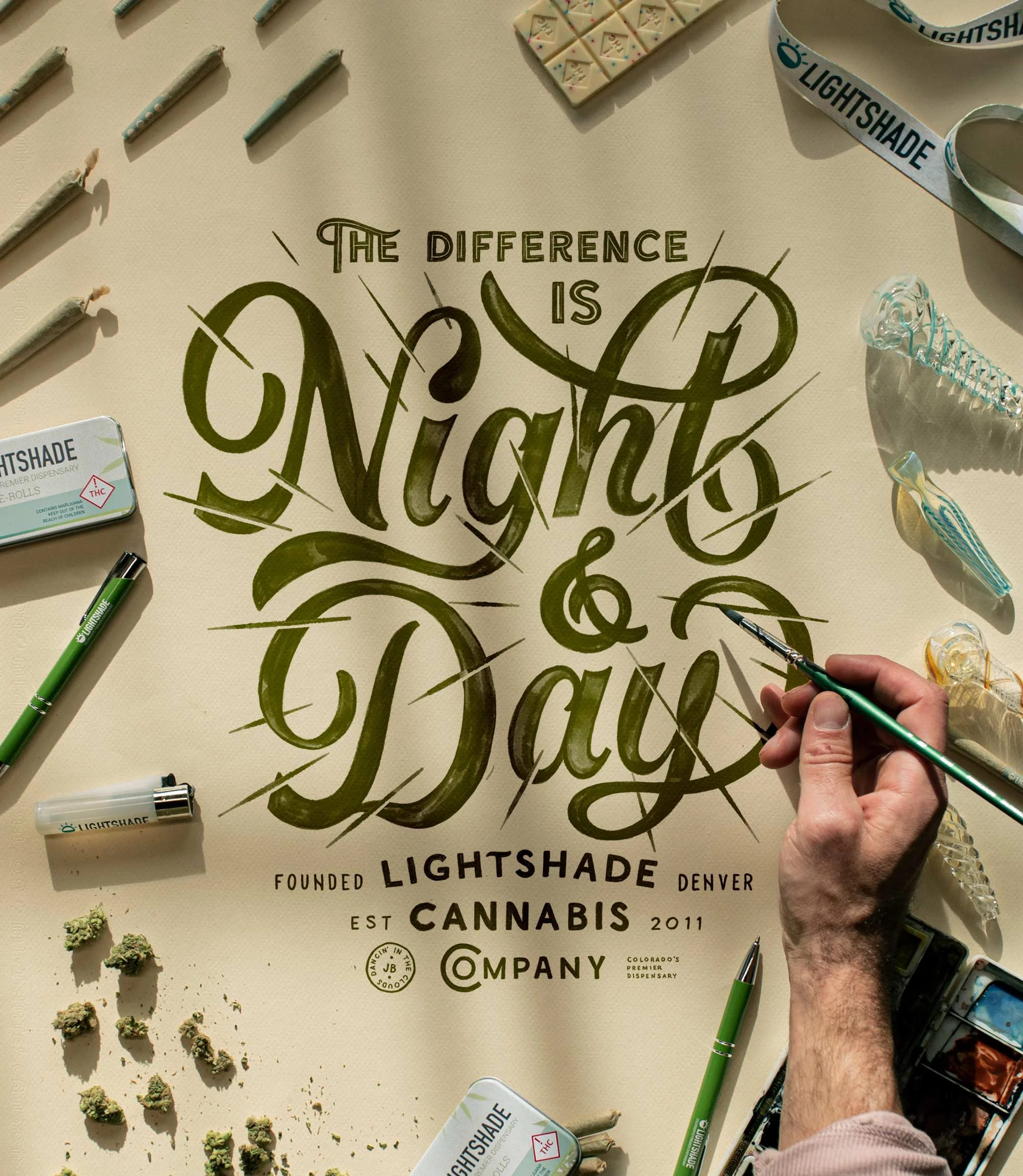
Read MoreHave you ever wanted to get into commercial client lettering, but didn’t really know how to start? The post below is intended to give you a high-level breakdown and a bit of insight on how I went about creating, presenting and refining this lettering piece for Lightshade Cannabis Company, a Colorado-based cannabis brand.
Read More