Creating John Muir Sans: A Typeface for the “Father of the National Parks”
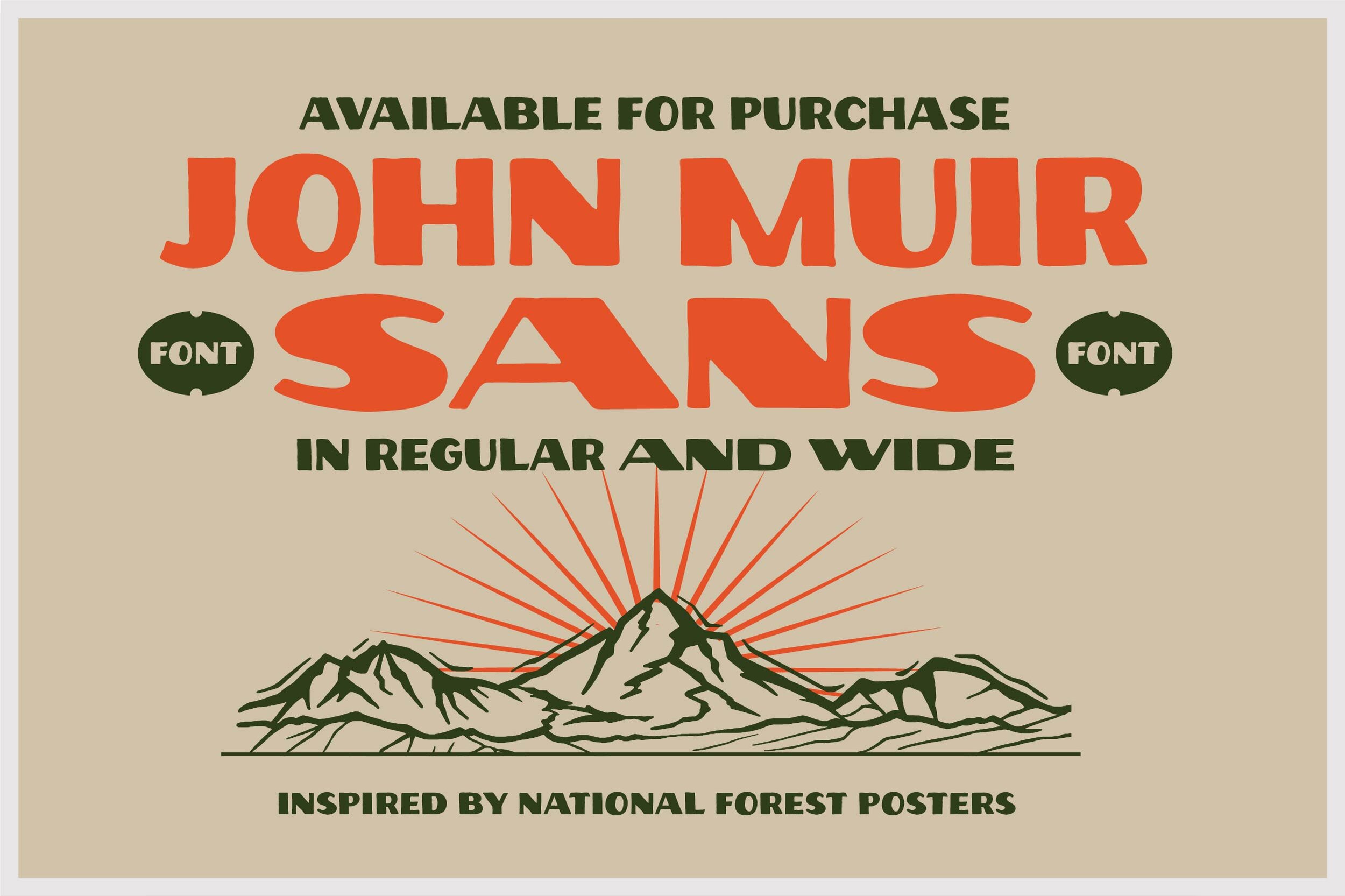
John Muir Sans: A National Park Typeface Inspired by WPA Posters
How we used inspiration from vintage National Park poster fonts to create Vicarel Studio’s first display font, John Muir Sans.

John Muir Sans, Vicarel Studios first publicly available typeface, is rooted in the history of vintage National Park poster fonts.
Everyone has heard the phrase, “The mountains are calling and I must go,” but not everyone is entirely familiar with who said it. If you fall into this category of the unfamiliar, let us introduce you to John Muir, also known as “John of the Mountains” and “Father of the National Parks.”
A profound author, environmental philosopher and first-moving advocate of wilderness preservation here in the U.S. (amongst many other things), Muir left an undying legacy.
With an undying love for the outdoors and all things “adventure” ourselves, it felt right that Vicarel Studios’ first typeface be not only inspired by vintage National Parks poster fonts, but aptly named: John Muir Sans.
Our goal was for this outdoorsy display font to feel just as rough, worn, and perfectly imperfect as the National Parks poster fonts from years past.
As a branding studio that specializes in hand drawn branding and hand drawn graphic design, creating this typeface came very naturally.


The hand drawn graphic design and branding work of Vicarel Studios’ creative director, Adam Vicarel, has always been heavily influenced by his experiences traveling, the spirit of adventure, and the freedom found in the outdoors. In the fall/summer of 2018, Adam had the opportunity to create series of hand drawn branding pieces consisting of various lettering, logo and illustration graphics for Zeal Optics, an adventure eyewear brand based in Boulder, Colorado.
Much of the stylistic and layout design inspiration for this project came directly from vintage National Park posters and fonts.
Using pieces of the hand drawn branding and lettering featured in image above as a starting point, the Vicarel Studios crew illustrated the remaining letters of the alphabet in this style.
Next, we used Adobe Illustrator to vectorize our hand drawn lettering. From there, with the help of our favorite plugin, Fontself, we created the .otf version of the typeface.
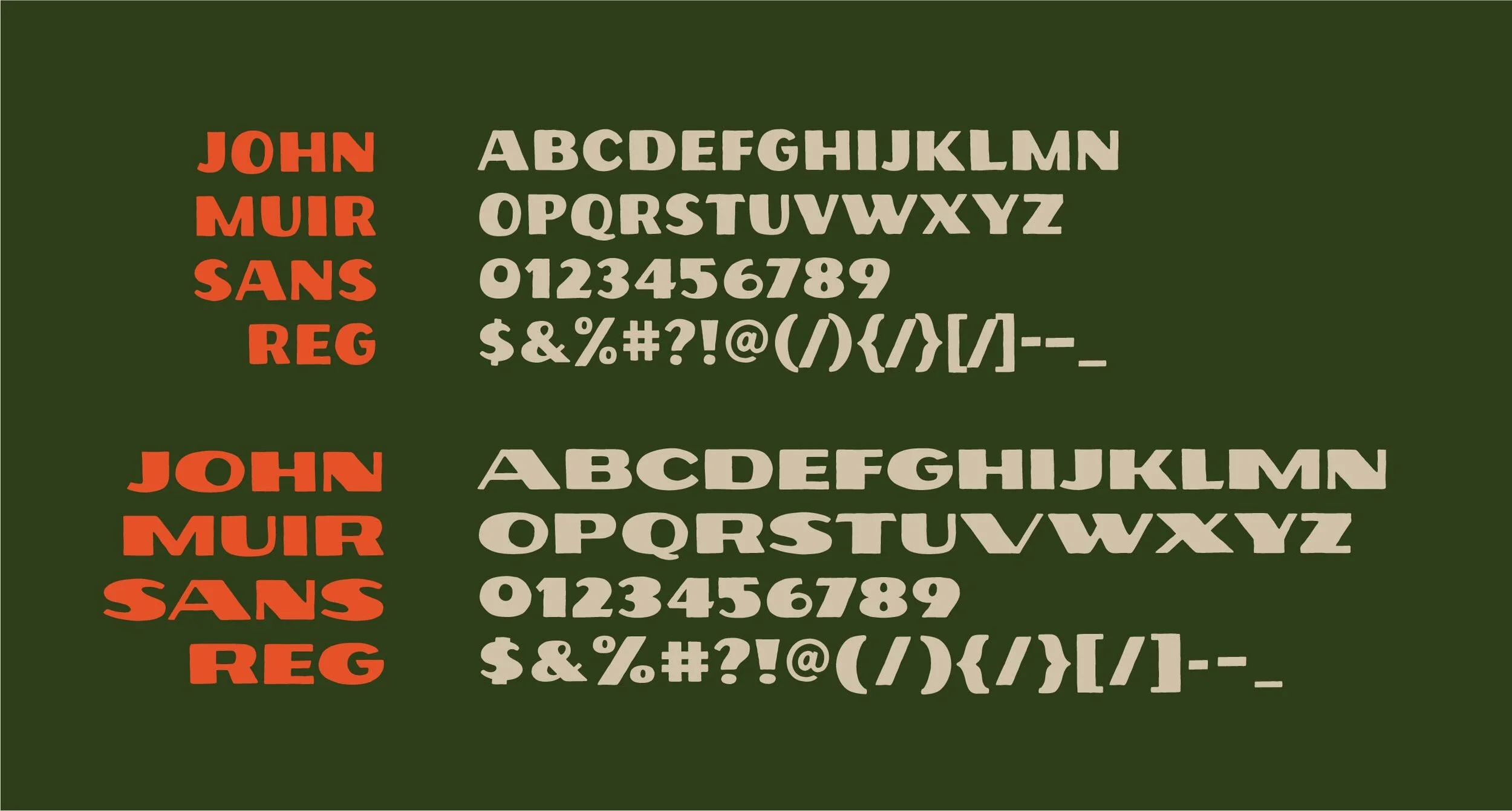
The result was a typeface that felt rough and worn: the perfect national park font. Our goal was to instantly teleports you from wherever you are, to the great outdoors. John Muir Sans is the perfect font for designers who specialize in hand drawn graphic design and branding to create instantly iconic logos and wordmarks, t-shirt and apparel design, and so much more.


This display sans is intentionally rough and worn. The individual letterforms do not strictly abide by all typographic rules; however, we did utilize processes such as the “circle test” to bring some visually consistency to this typeface to ensure legibility and readability. Perfectly imperfect: this hand drawn lettering is intended to capture the essence of the great outdoors, after all!


Frequently Asked Questions
What is John Muir Sans inspired by?
It’s based on vintage National Park posters and WPA design aesthetics. We made this font, based on lettering we created for for Zeal Optics in 2017 for designers who want a rugged, hand-crafted feel in their design work.
Can I use this font for commercial projects?
The standard purchase does not cover commercial projects; however, you can easily add a commercial license at the time of purchase (or, you can purchase it afterward). The commercial font license allows for commercial use in branding, packaging, design, and more.
Is this an all-caps font?
Yes, John Muir Sans is an all-caps display typeface with full punctuation and digits.
Who’s used this font?
Carhartt, L.L.Bean, The National Parks Foundation, Montana State Parks, and famous designers like Aaron Draplin, and several other prominent creative studios have used John Muir Sans in real-world branding and apparel projects.