John Muir Serif, A Typeface Inspired by National Park Poster Fonts
John Muir Serif: A Timeless National Park Poster Font
We're delighted to both introduce our newest display font, John Muir Serif, and dig into the actual typefaces (and some similar ones) used by the National Forest Service.

John Muir Serif was created in response to the warm receipt of Vicarel Studios’ most popular National Park poster font, John Muir Sans.
John Muir Serif is a hand-drawn slab serif font inspired by vintage national park poster fonts. We hope this rough and worn typeface inspires you to create beautiful, rustic logos, packaging designs, and apparel designs—the possibilities are endless!
This hand-drawn font pairs nicely with our other fonts in that it is perfectly imperfect. We’ve learned that our sweet spot in typeface creation is in making soft, approachable hand drawn fonts that are made for easy creation of logotypes, packaging design, and apparel design.
As we got ready to launch John Muir Serif, we uncovered a lot of fun information about the actual fonts used by the National Park Service.

National Park brand fonts
The National Park Service uses a few different fonts across their branding and marketing collateral.
A few of their exact fonts are available online, and there are also a plethora of typefaces that have been created to have a similar look and feel as what the National Parks use.
The two, primary typefaces used by National Park Service are Fruitiger and NPS Rawlinson.

National Park poster fonts
But, designers are often looking for typefaces inspired by National Park poster fonts, not necessarily just National Park brand fonts. The fonts used on these posters are a bit tougher to distinguish.
It appears possible that these posters didn’t actually use typefaces, but they used custom hand lettering.
However, in recent years, there have been a handful of designers and studios who have created fonts inspired by vintage national park poster fonts—Vicarel Studios being one of those studios!
The best National Park poster fonts:

VS John Muir Sans: Heavily influenced by the lettering found on vintage national park posters, John Muir Sans is one of the best National Park poster fonts out there!
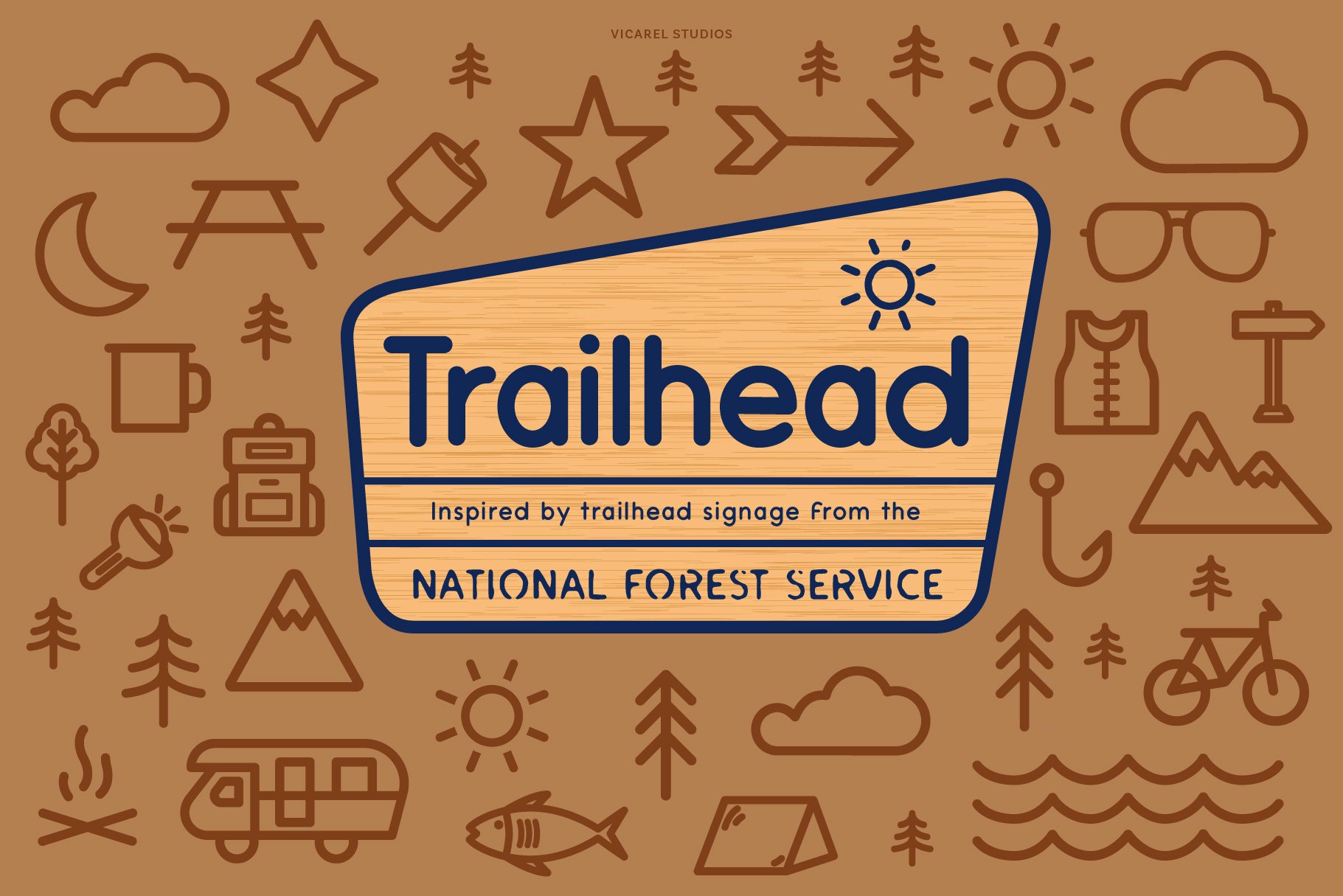
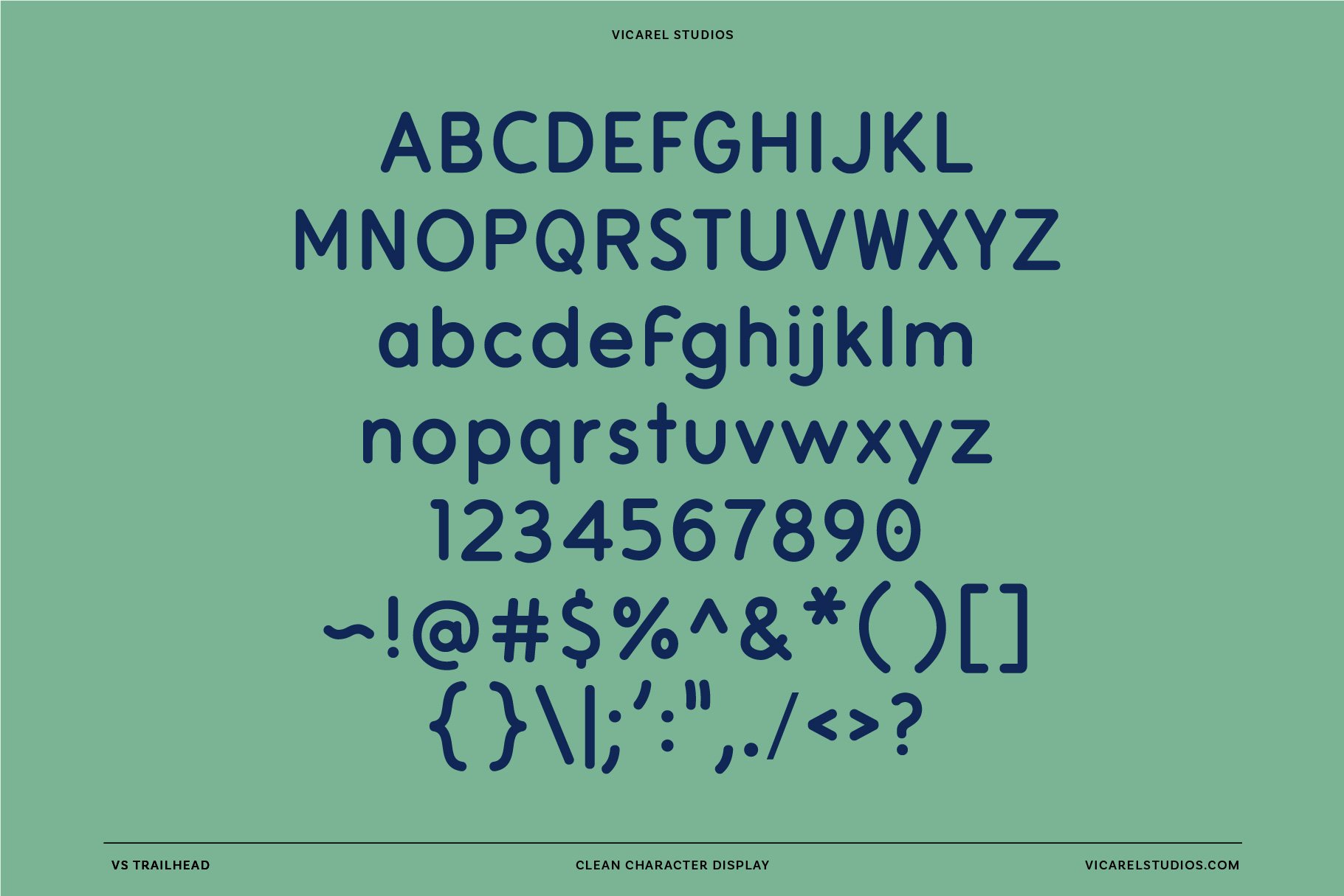
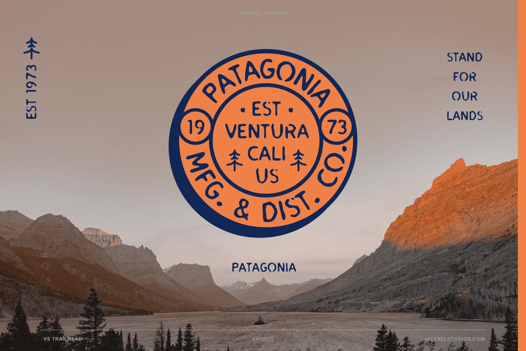
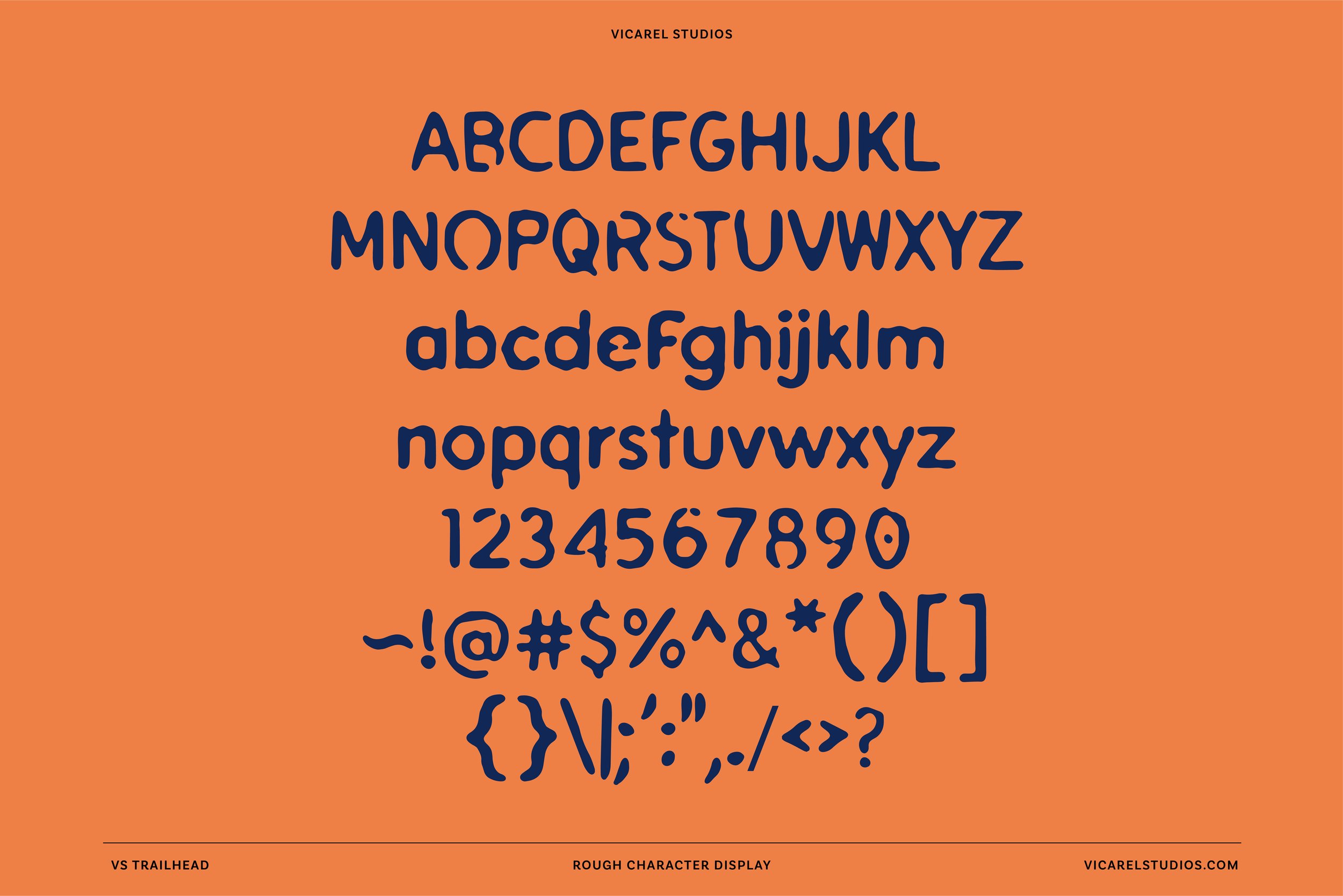
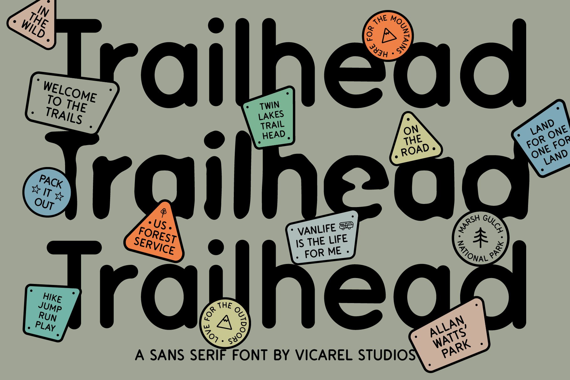
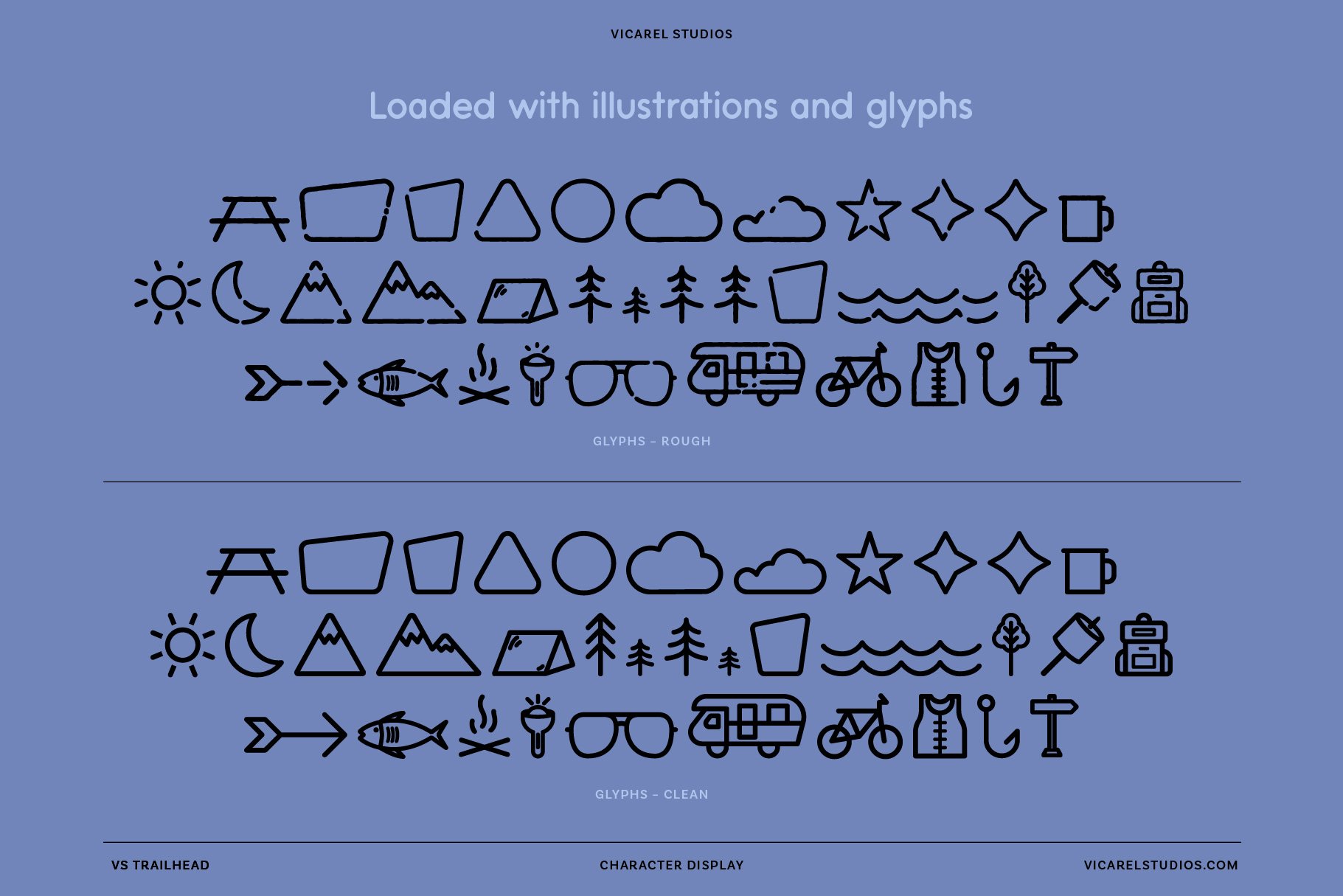
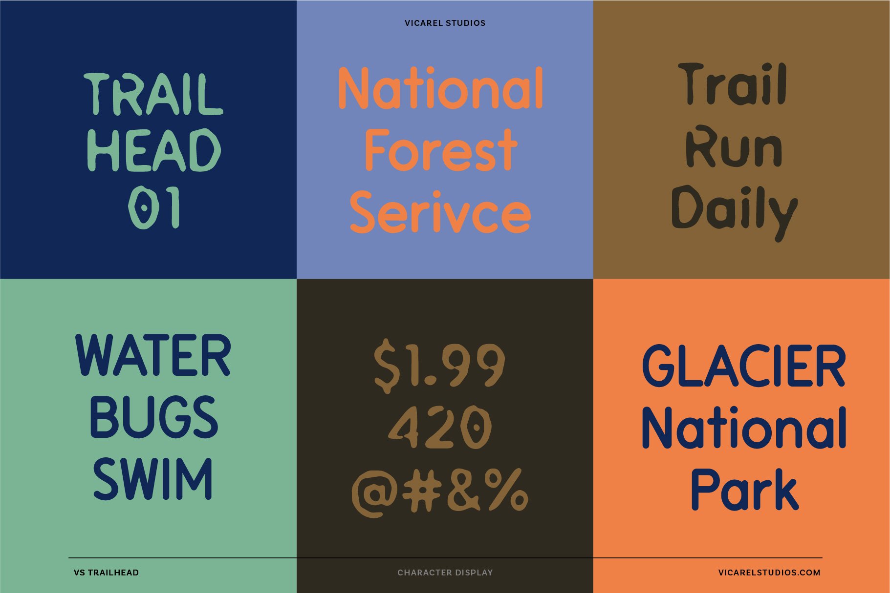
VS Trail Head: inspired by the sans serif fonts used on posters and signage by the National Park Service. These letters were actually created with a router carving the rounded sans serif letters into the wood. We created a clean version of this typeface as well as a “worn” version to appear as if it had been in the wilderness for a few years.

VS Outdoor Script: The National Forest Service logotype has a quirky, retro style and its natural imperfections add to its charm. This script font was inspired by their soft, rustic lettering to be used for branding, display, or marketing. Here again, not the original, but very similar.

VS Trailbum: A beautifully wonky, rustic and outdoorsy sans serif display font that was inspired by the old signage found in mountain towns like Breckenridge, Copper, Aspen and Vail.

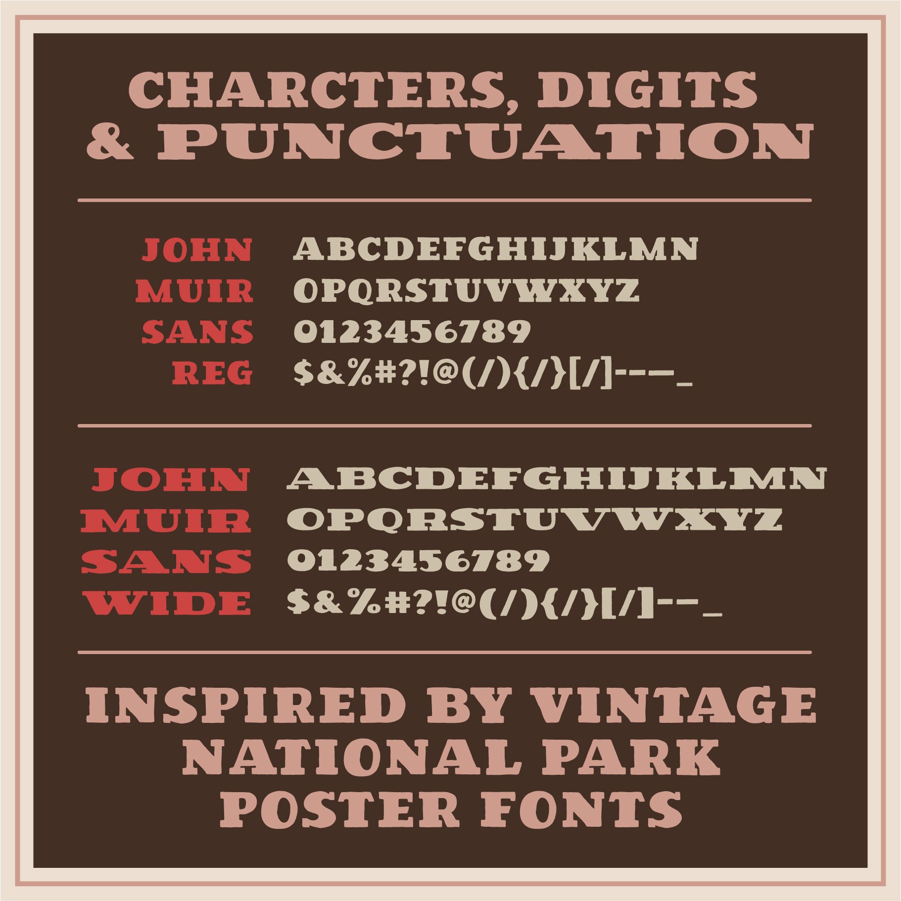
VS John Muir Serif: heavily inspired by John Muir Sans, VS John Muir Serif offers the opportunity to give a bit of contrast and stable slab serif weight to the letter forms.

Can’t decide? Grab them all 😊
The National Park Font Bundle: The five previously mentioned National Park poster fonts, all combined together in one bundle.
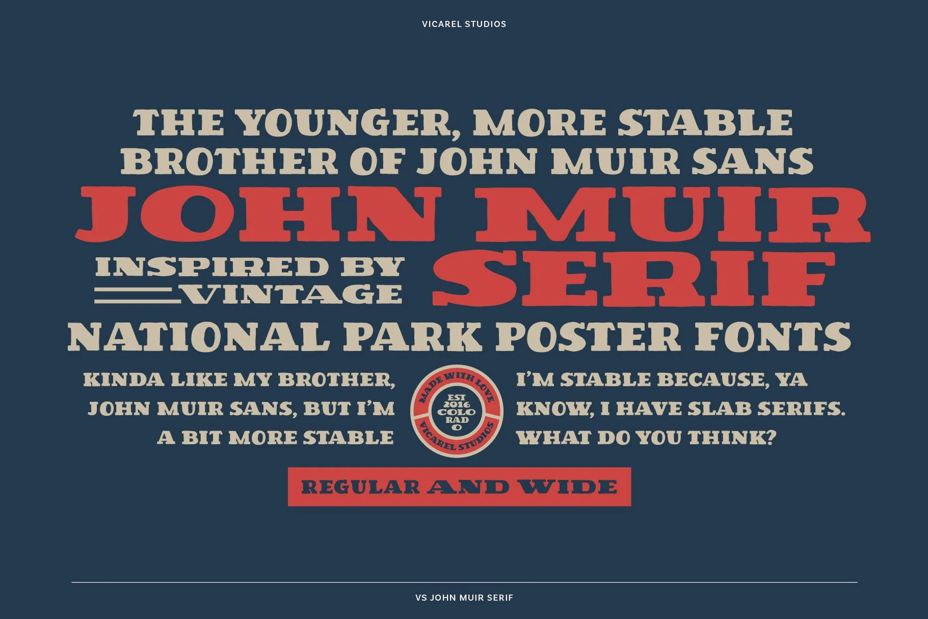


While John Muir serif takes inspiration from national park poster fonts, it has a unique quality that only appears in these some of their older posters. Large, heavy serifs weigh this font down, giving it a feeling of stability, timelessness, and structure.
We suggest using this font for bold brands that need a substantial, and outdoorsy aesthetic.
The fonts above can be combined for the perfect national park poster font look — be sure to tag us if you create anything so we can share your work!

Frequently Asked Questions
What is John Muir Serif inspired by?
This font is an evolution of our favorite font, John Muir Sans. This font draws on the hand-drawn and outdoorsy feel of vintage National Park materials and editorial design, with a slab serif flair. John Muir Sans was the perfect balance of heritage and outdoor industry, and we wanted to create a slab serif version for variety in visual application.
Can I use this font in commercial projects?
The standard purchase don’t not cover commercial projects; however, you can easily add a commercial license at the time of purchase (or, you can purchase afterwards). The commercial font license allows for commercial use in branding, packaging, and design and more.
How is it different from John Muir Sans?
While John Muir Sans is bold and all-caps, John Muir Serif brings in a traditional serif structure that’s great for body text and more refined branding.
Can I pair this font with others?
Definitely — it was designed to work seamlessly with other fonts in the bundle like John Muir Sans and Outdoor Script.
