So Delicious
So Delicious Oatmilk Lettering
Branding a new product line with memorable, approachable typography.
Client
So Delicious (Danone)
Services
Lettering
Credits
Art Direction: Kate Coslett
Lettering: Adam Vicarel
Support: Sara Buettmann
Illustration: Christina Drejenstam
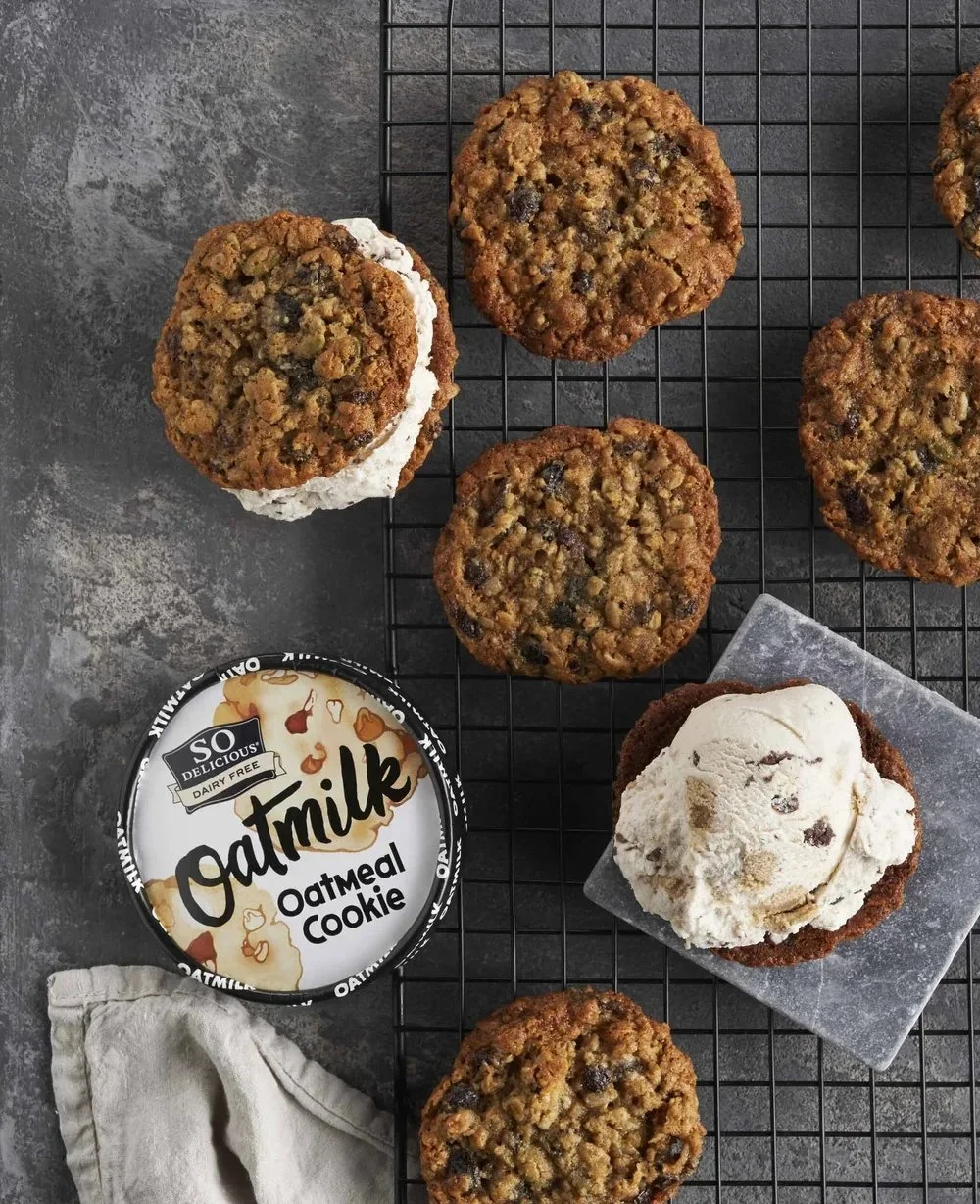
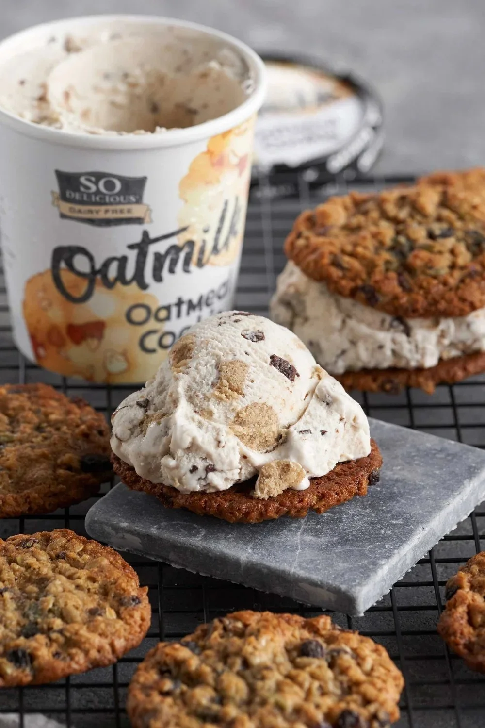
Photography: Noel Barnhurst Studio
Recipient of 2018 American Graphic Design Award
Design Approach
We were tasked with creating a logotype and a series of lettering compositions for So Delicious' new-to-market, oatmilk-based frozen dessert. Harnessing the imperfections and nuances of hand-drawn typography, this approach helped bridge the gap between So Delicious' target demographic, the artisan foodie, and these new products.
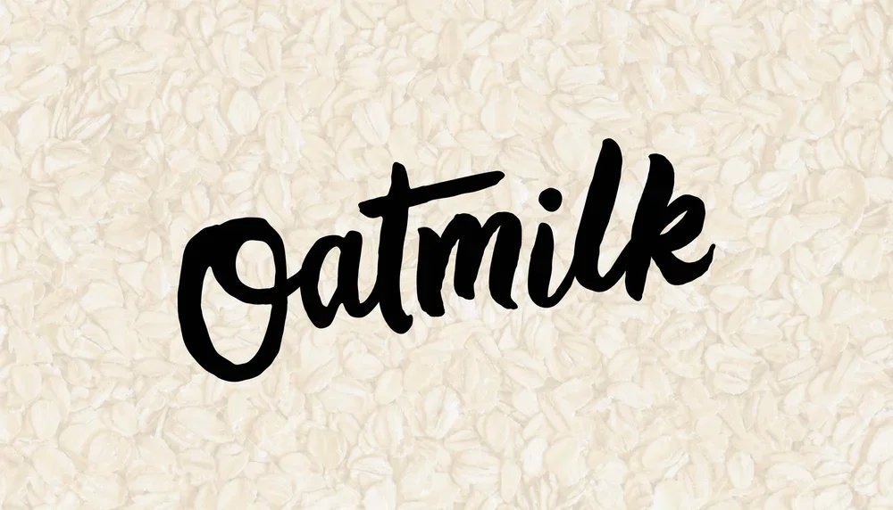
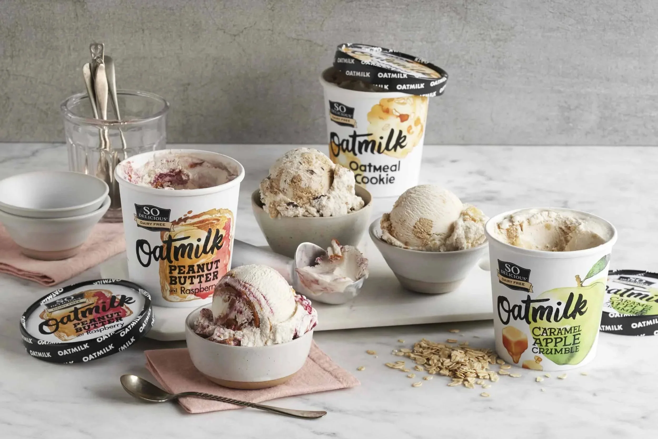
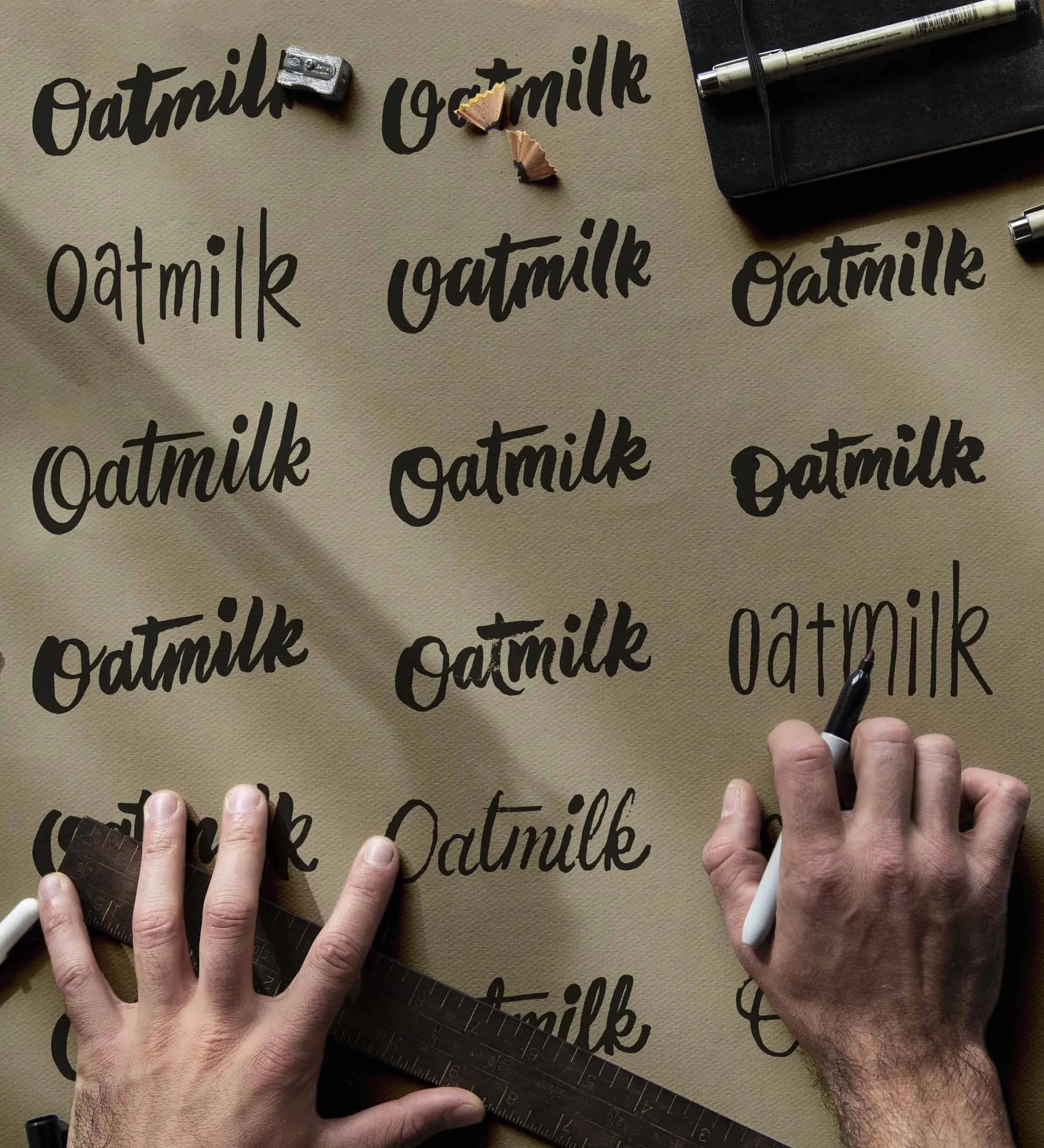
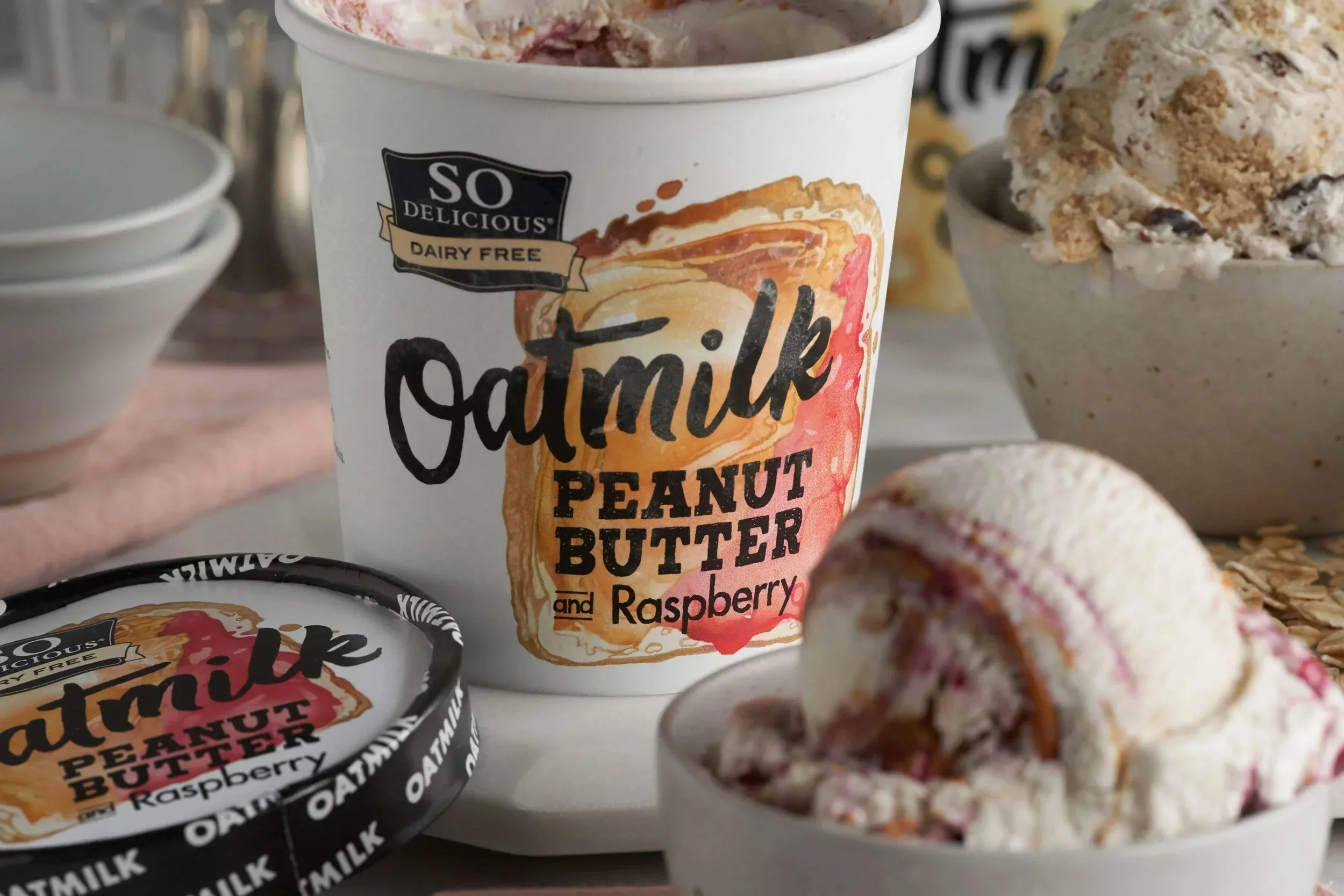
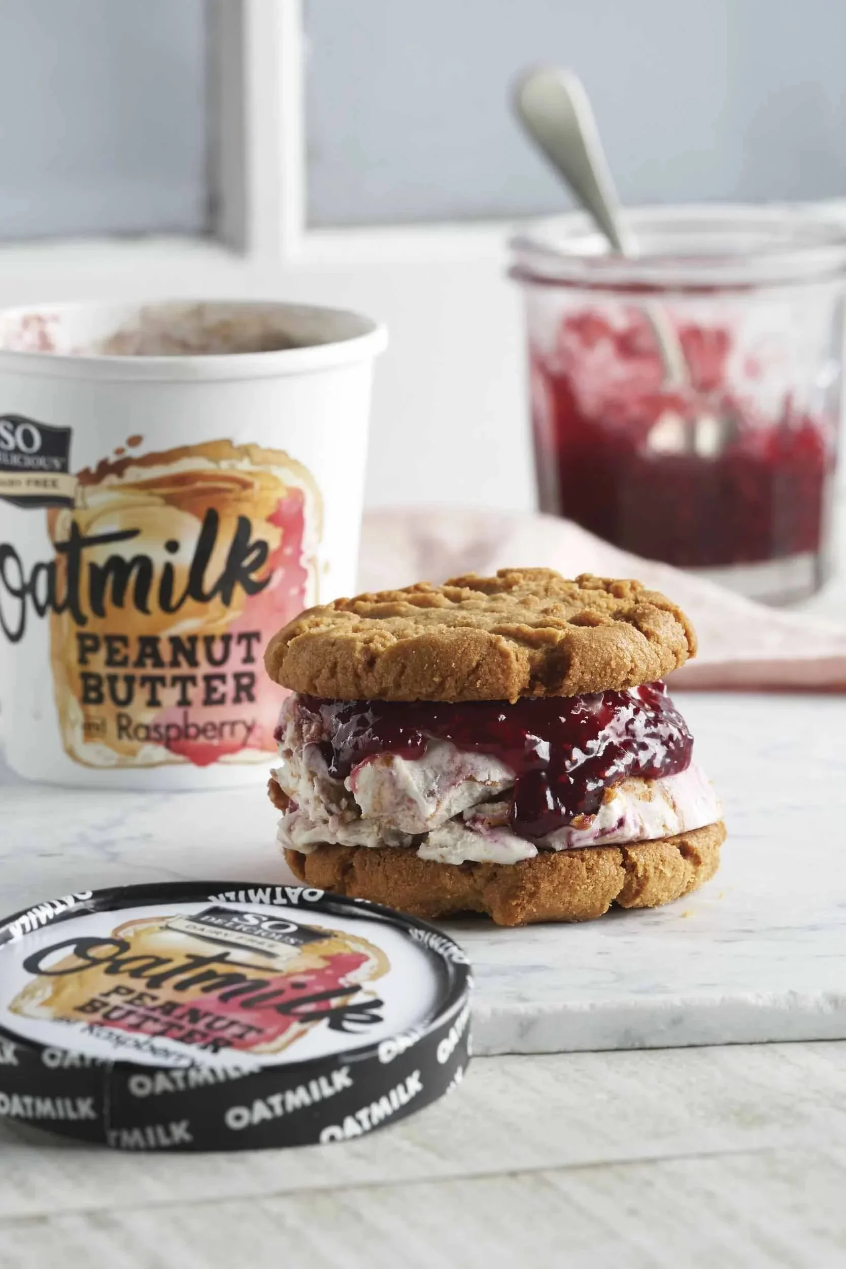
The Logotype
Our exploration and final iteration of the word "oatmilk" was unapologetically bold, chunky and irregular, mimicking imperfect qualities of oats themselves. While still retaining some flow with a disconnected script that emphasizes the word oat, we created a wordmark that was distinct, memorable, and representative.
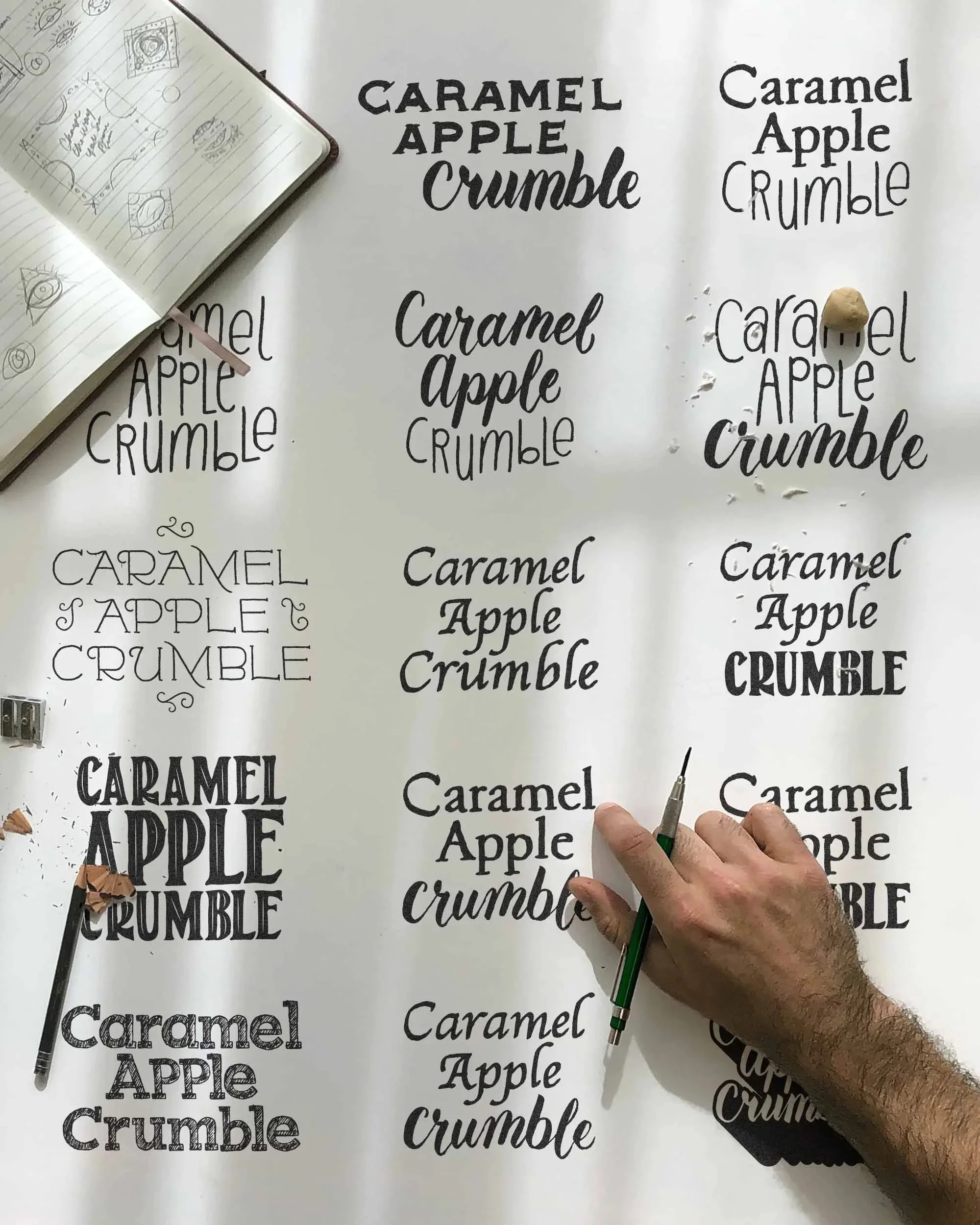
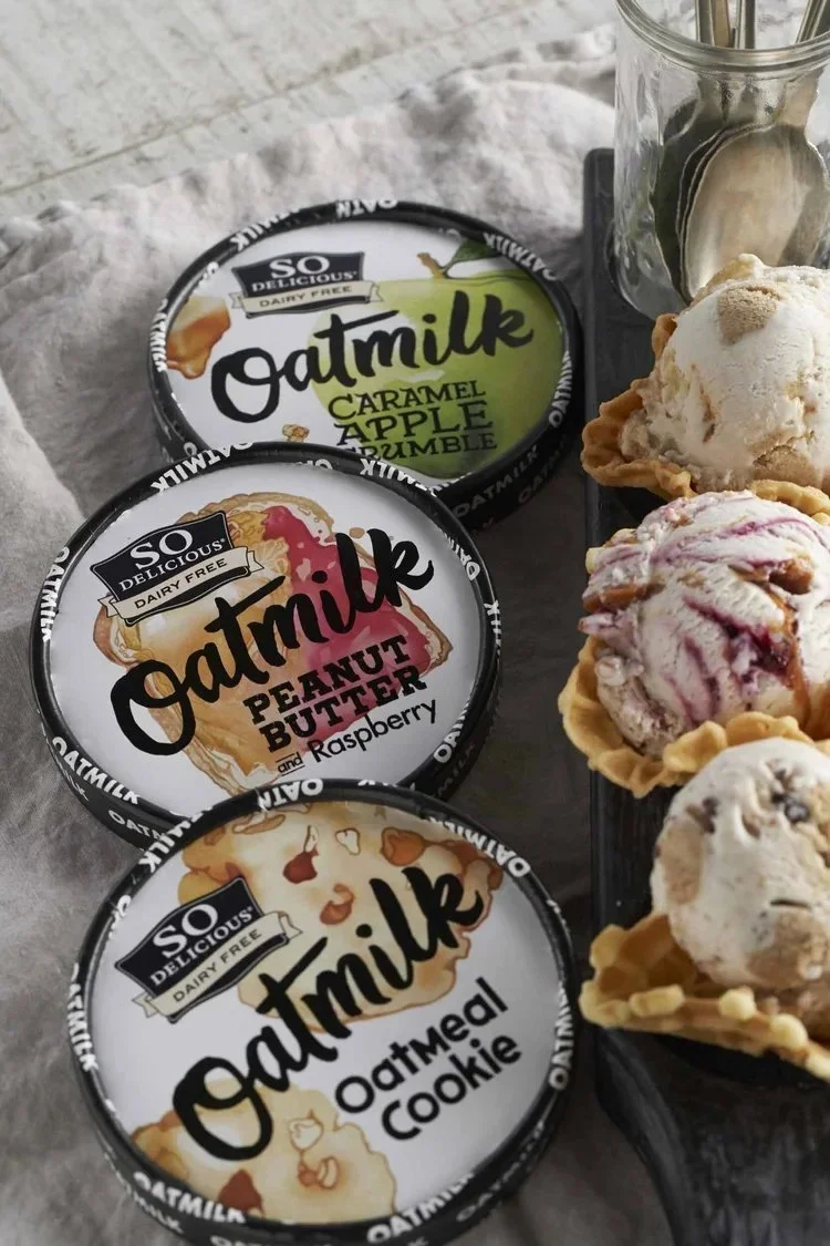
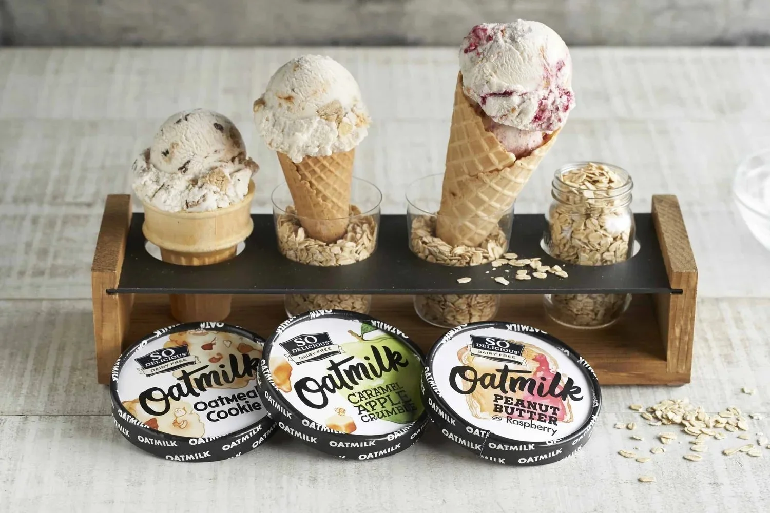
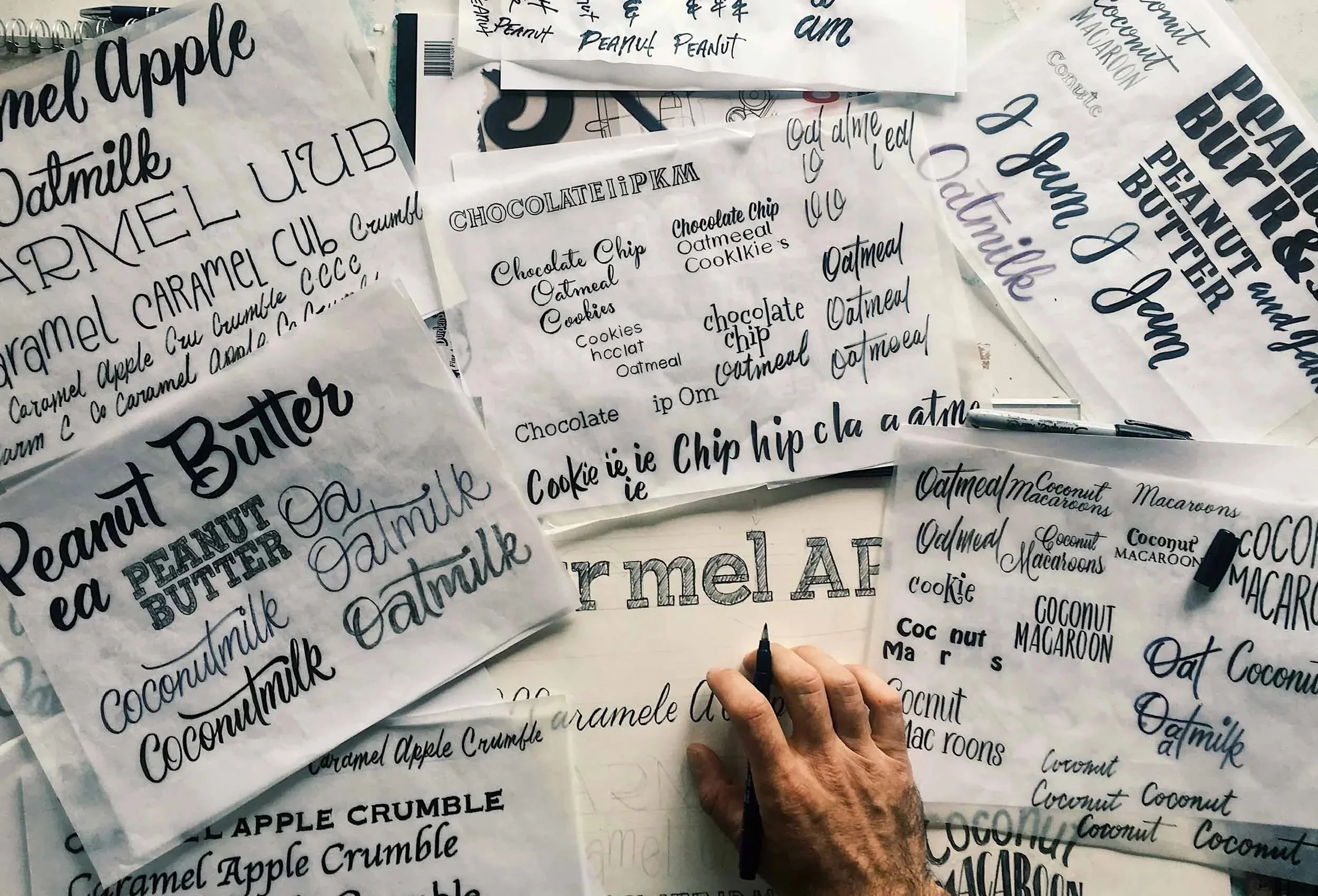
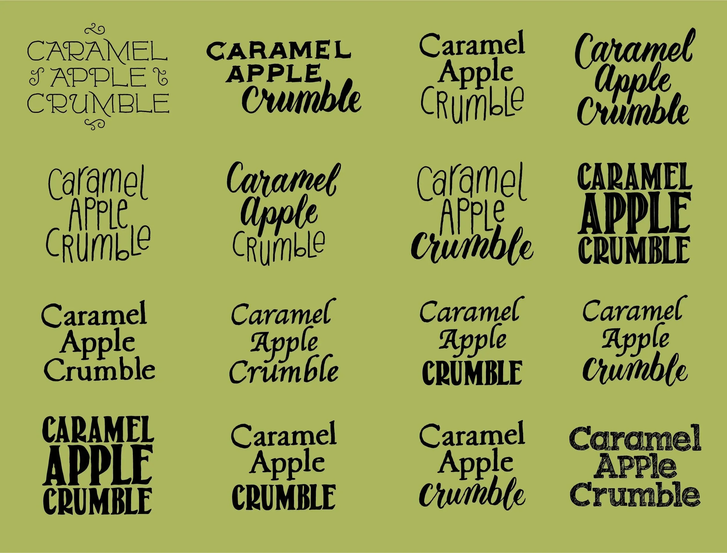
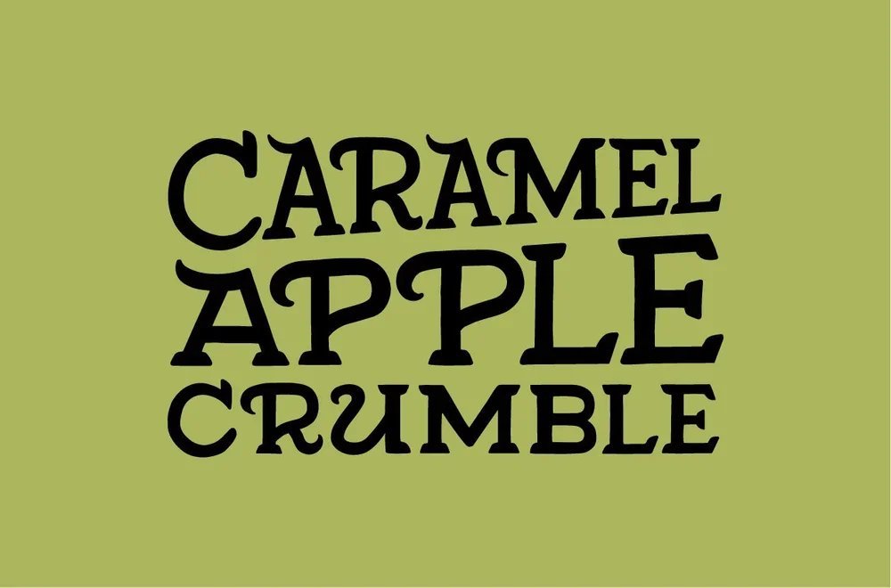
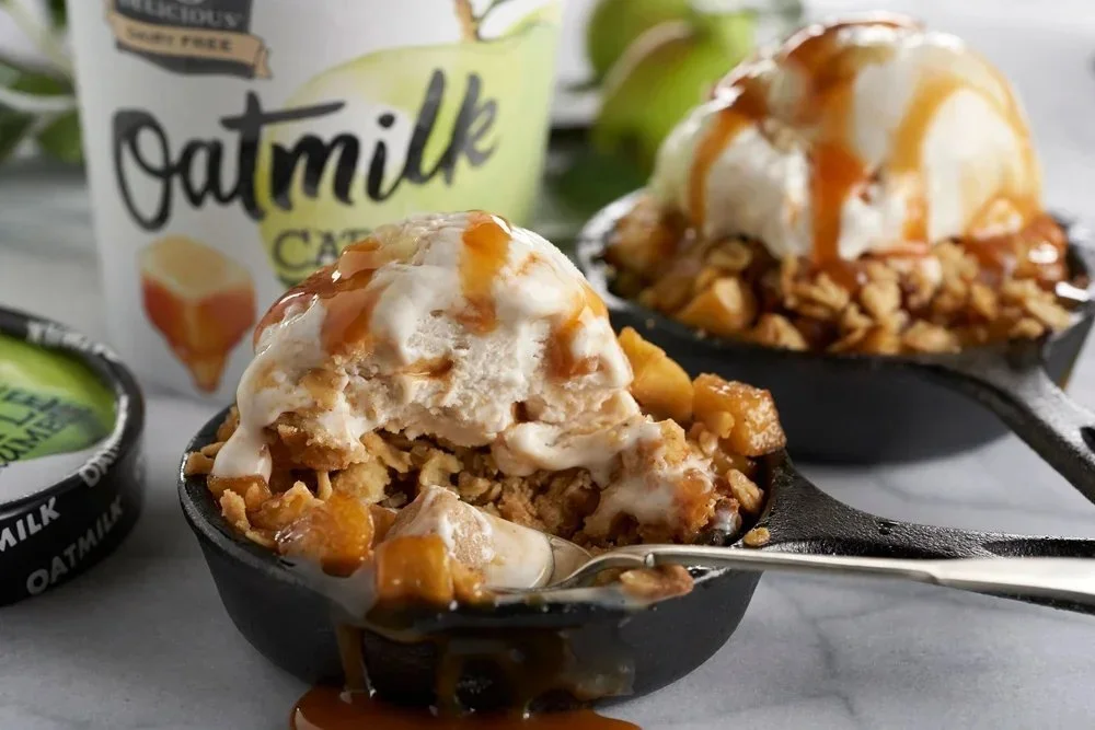
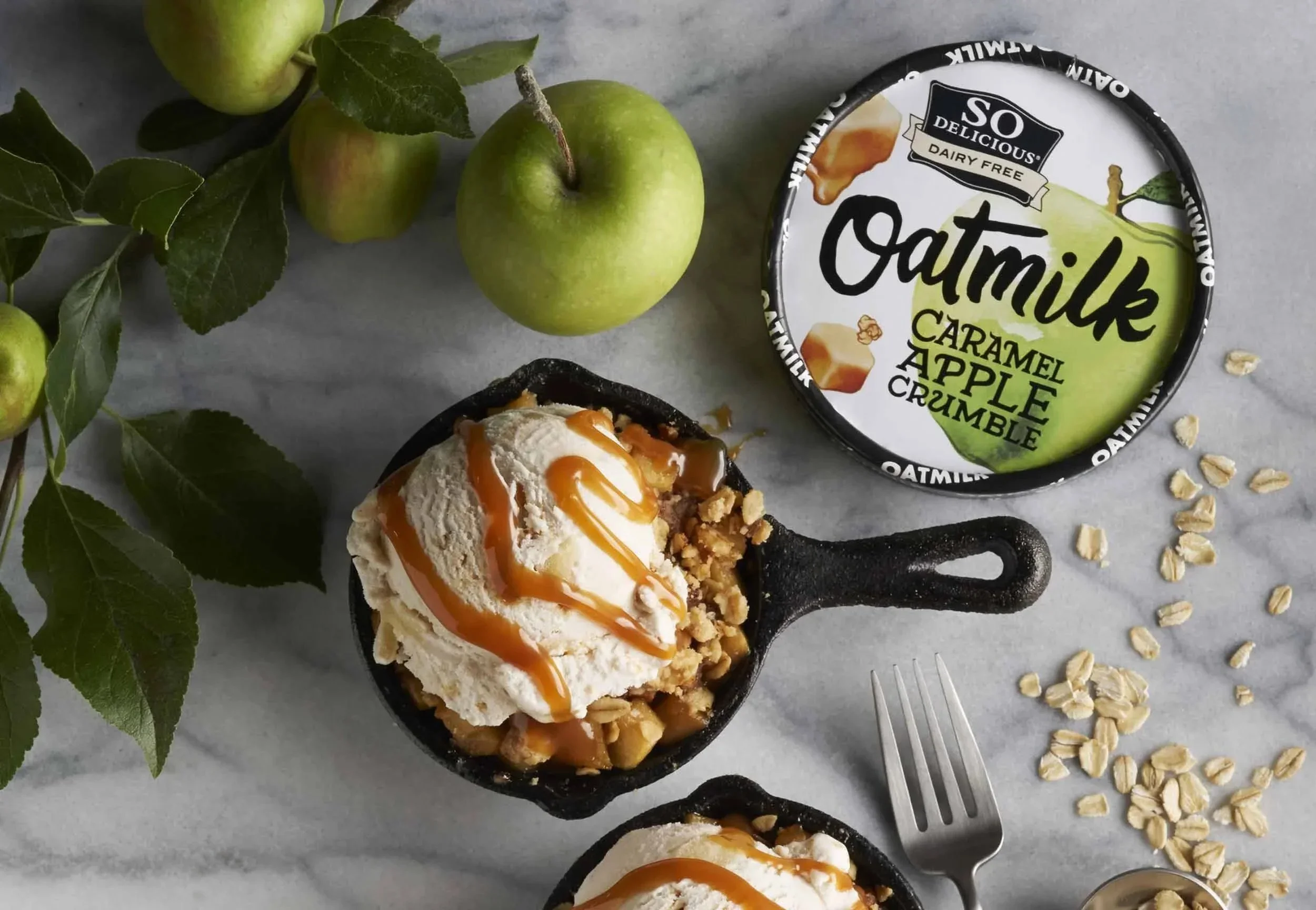
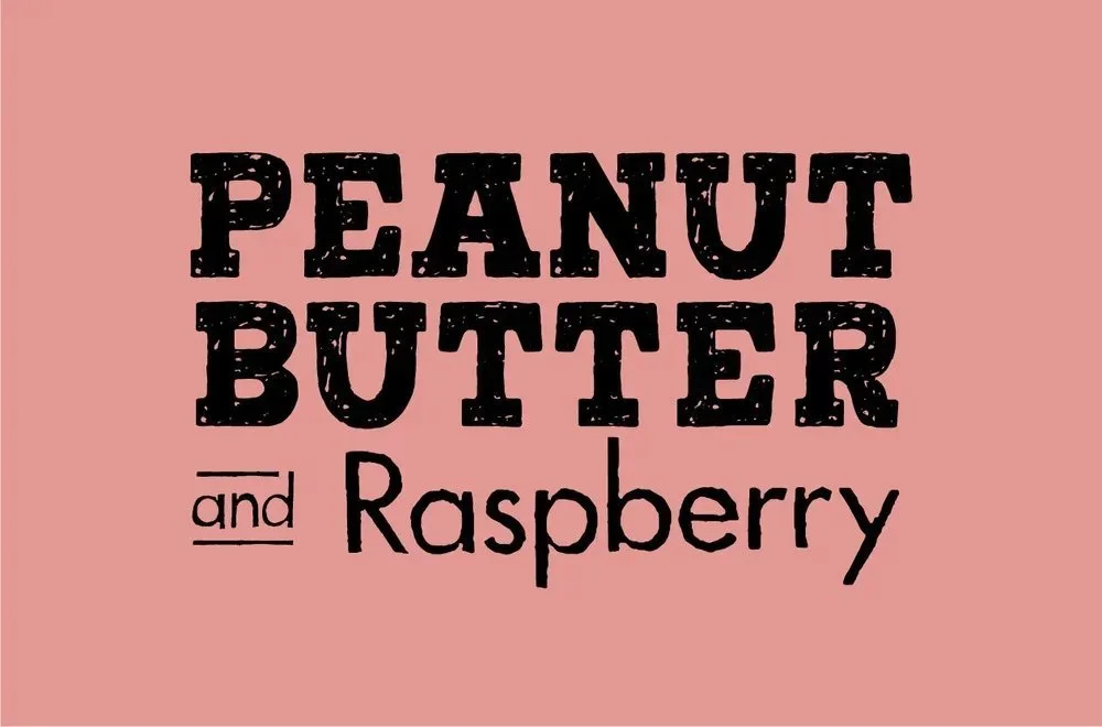
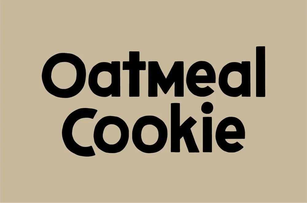
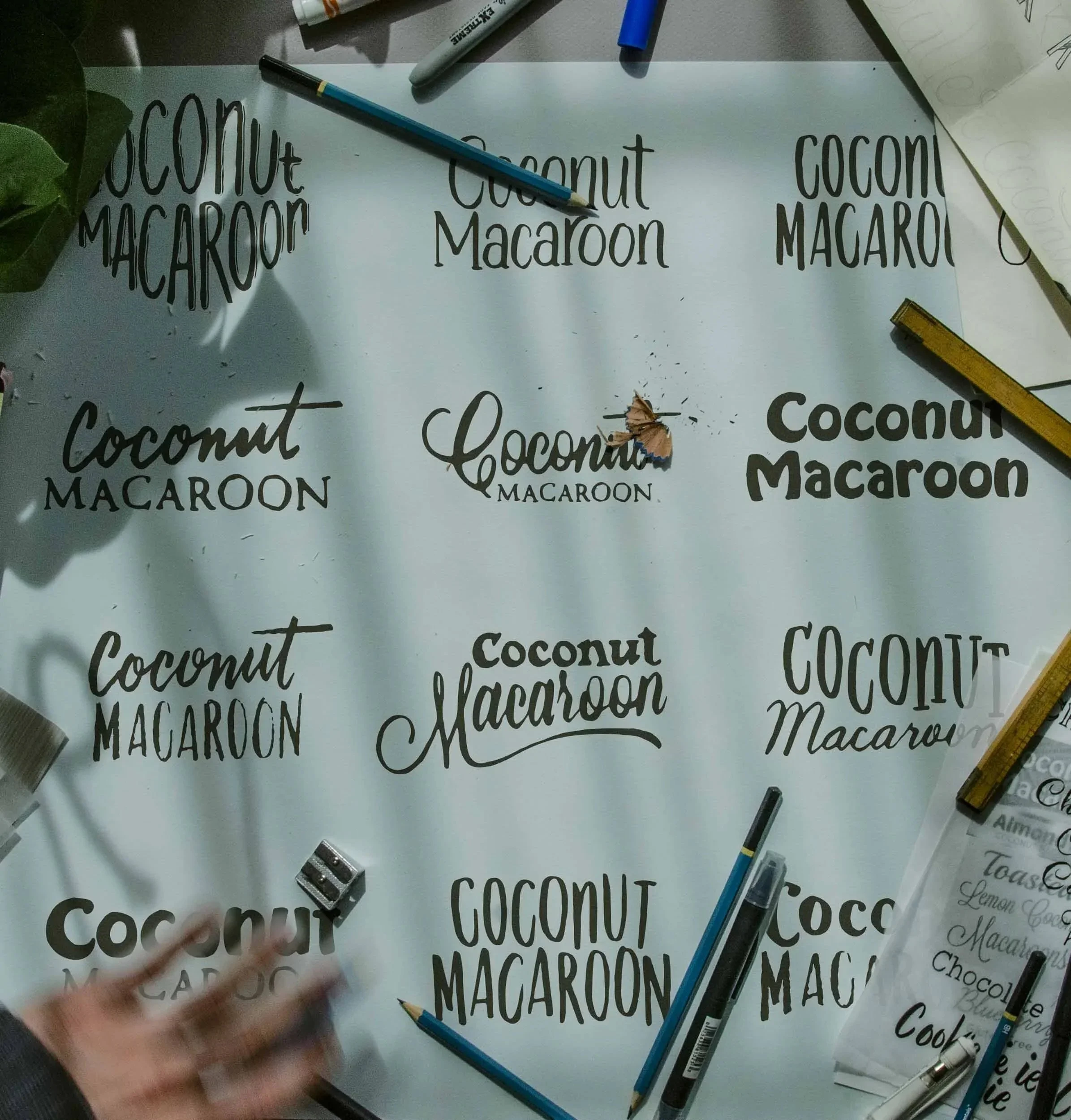
Flavor Lettering
Each individual flavor began with a robust exploratory process based on the feelings, flavors, and thoughts associated with each flavor. We explored and refined custom typographic representations of those nuanced associations, and also created a handful of lettering pieces for various marketing assets, signage, and CTAs.
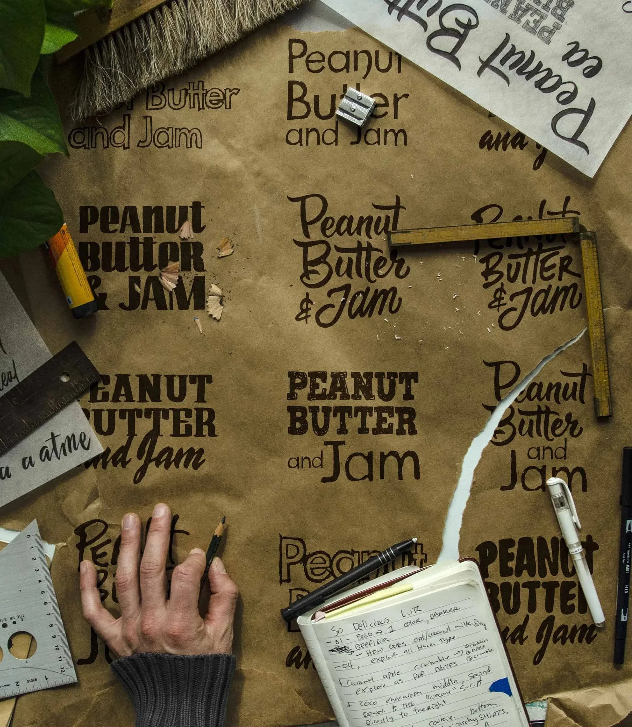
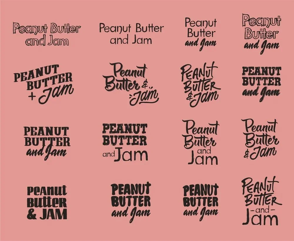
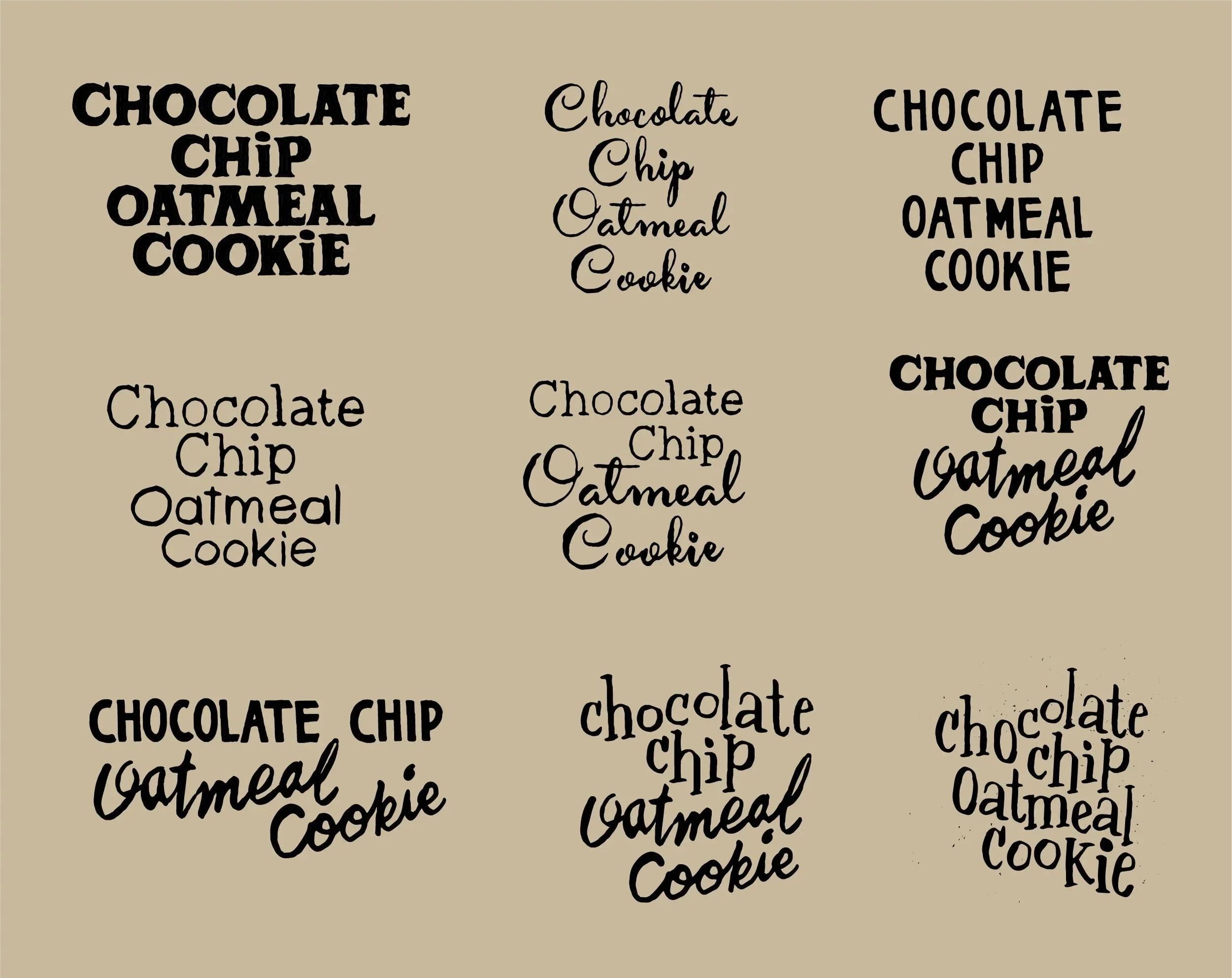
Because we were brought into the fold at the same time as flavor development, we created a handful of lettering concepts for flavors that either changed or were dropped completely.
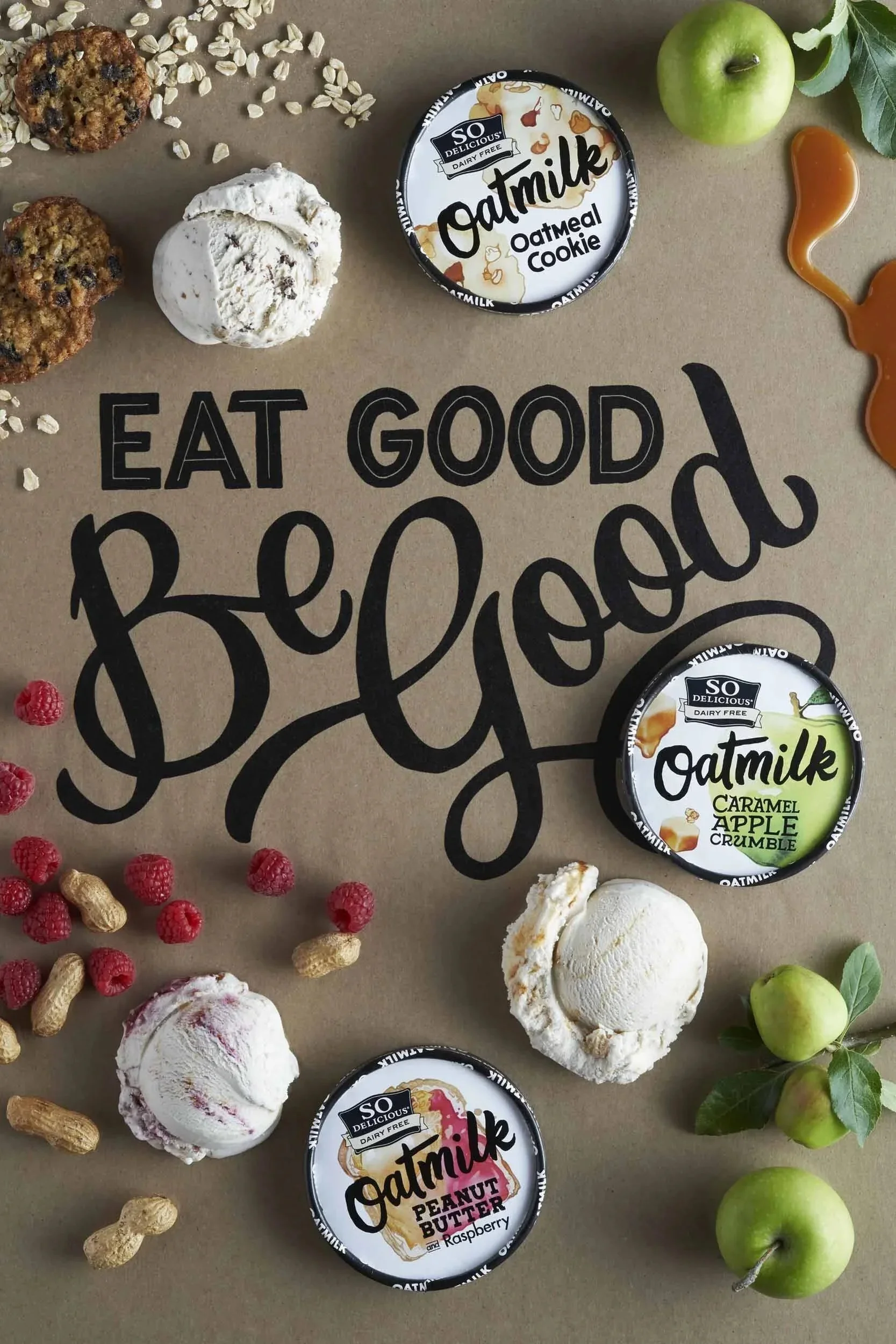
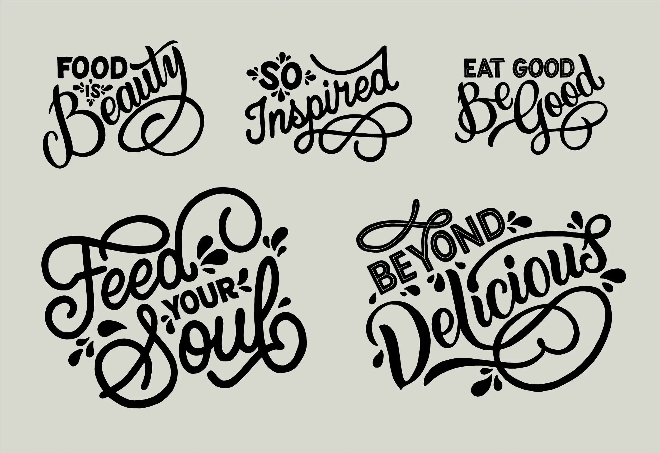
To complement the packaging typography were a handful of lettering pieces that were used for various marketing assets, signage and CTA’s that reiterated the target demographic — the artisanal foodie’s — inclinations.
Want to see more?