Mouma's
Mouma's Indian Staples Branding and Packaging Design
Bringing a taste of India to your kitchen.
Client
Mouma's
Services
Brand Refresh, Packaging Refresh, SKU iteration, Brand Positioning, Website Art Direction, Marketing Collateral Design
Credits
Art Direction & Design: Adam Vicarel
Lead Designer: Becca Reitz
Design, Production: Carly Salzman
The Opportunity
Indian cuisine can feel intimidating to many American shoppers, and the lentil category feels largely uninspired, consisting mostly of commodity packaging with little brand personality. Mouma's existing branding felt generic and chaotic, lacking the distinctiveness needed to attract the semi-adventurous, health-conscious customer they were after.
The Solution
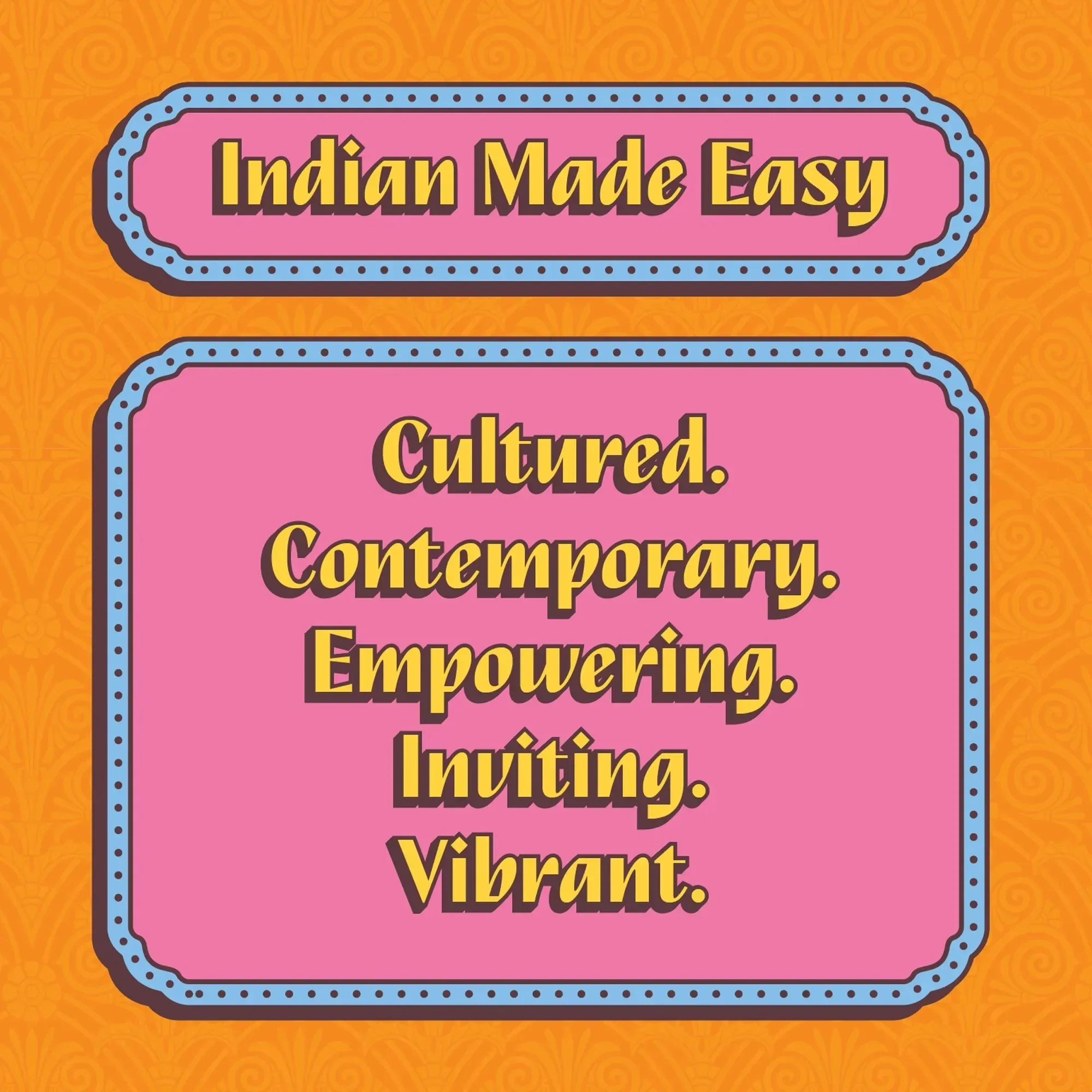
We identified a clear target audience and reimagined Mouma's as a bold, culturally rooted, and contemporary CPG brand. Through a full rebrand and packaging system update, we simplified communications and leaned into the colorful, personality-filled aesthetic of India. Clear front-of-pack callouts quickly communicate ease and health for the whole family.
Brand Strategy
The lentil category is largely commoditized, driven by function, muted design, and little emotional connection. Indian cuisine is often positioned as either overly traditional or overly simplified for Western audiences. Mouma's had the opportunity to redefine that middle ground in a contemporary way. Anchored in a clear strategic tension, the brand identity and packaging stand out on shelf while simultaneously communicating "culture" and "everyday staple" for health-conscious, young families.
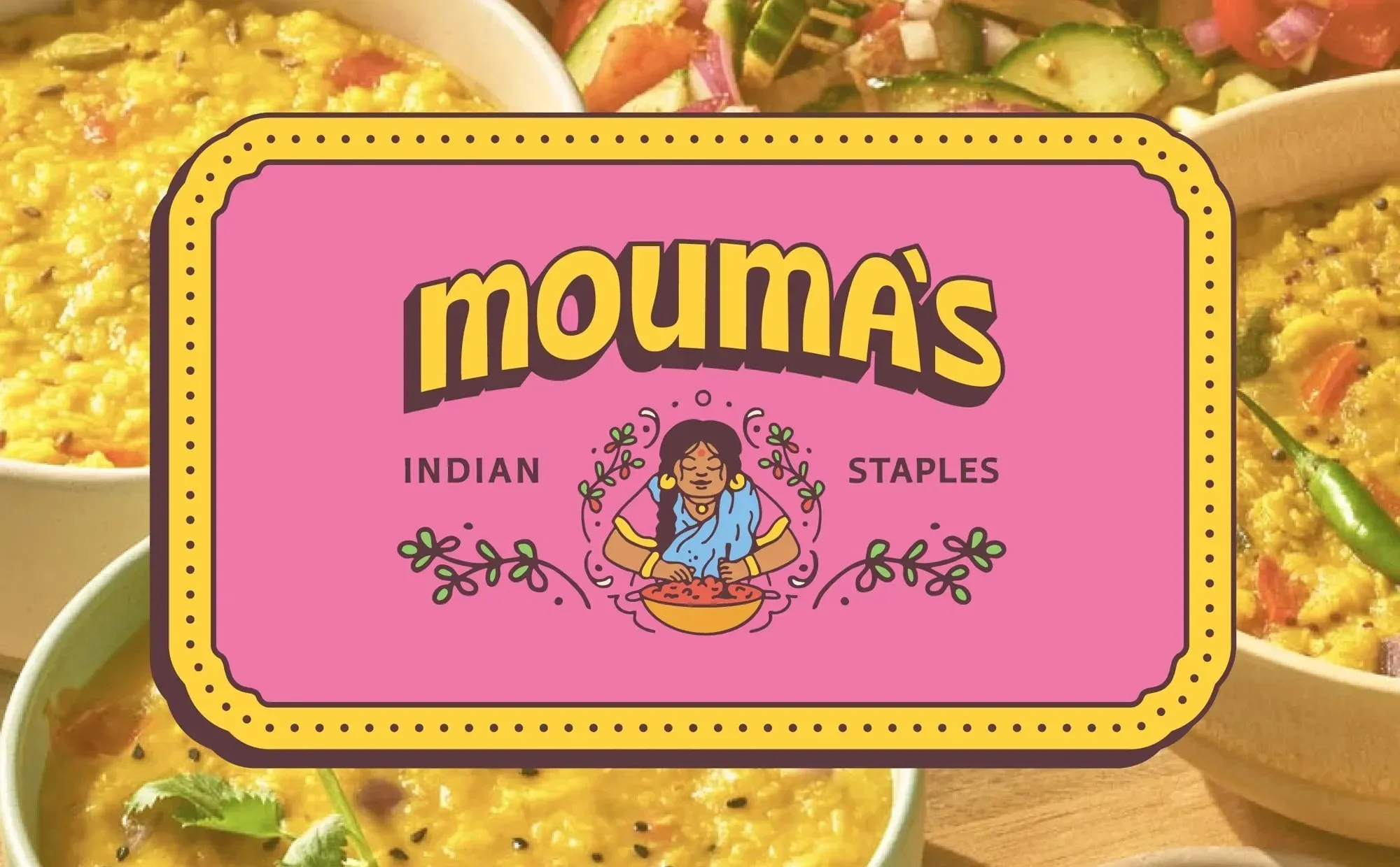
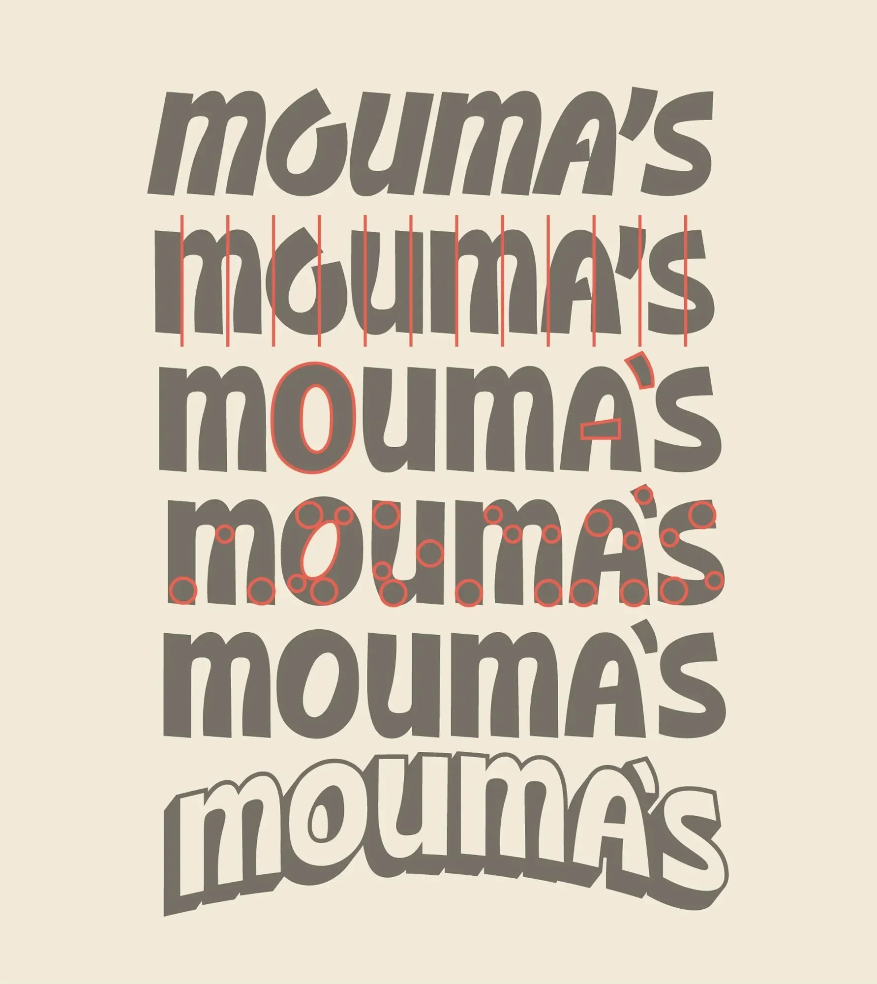
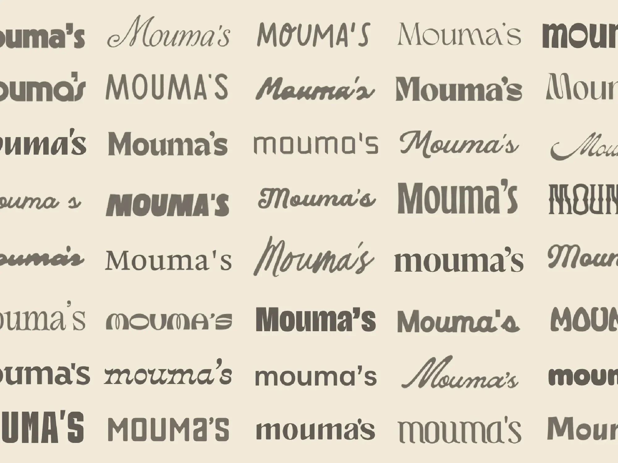
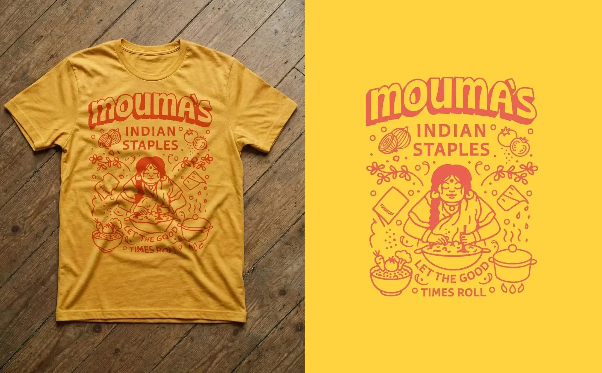
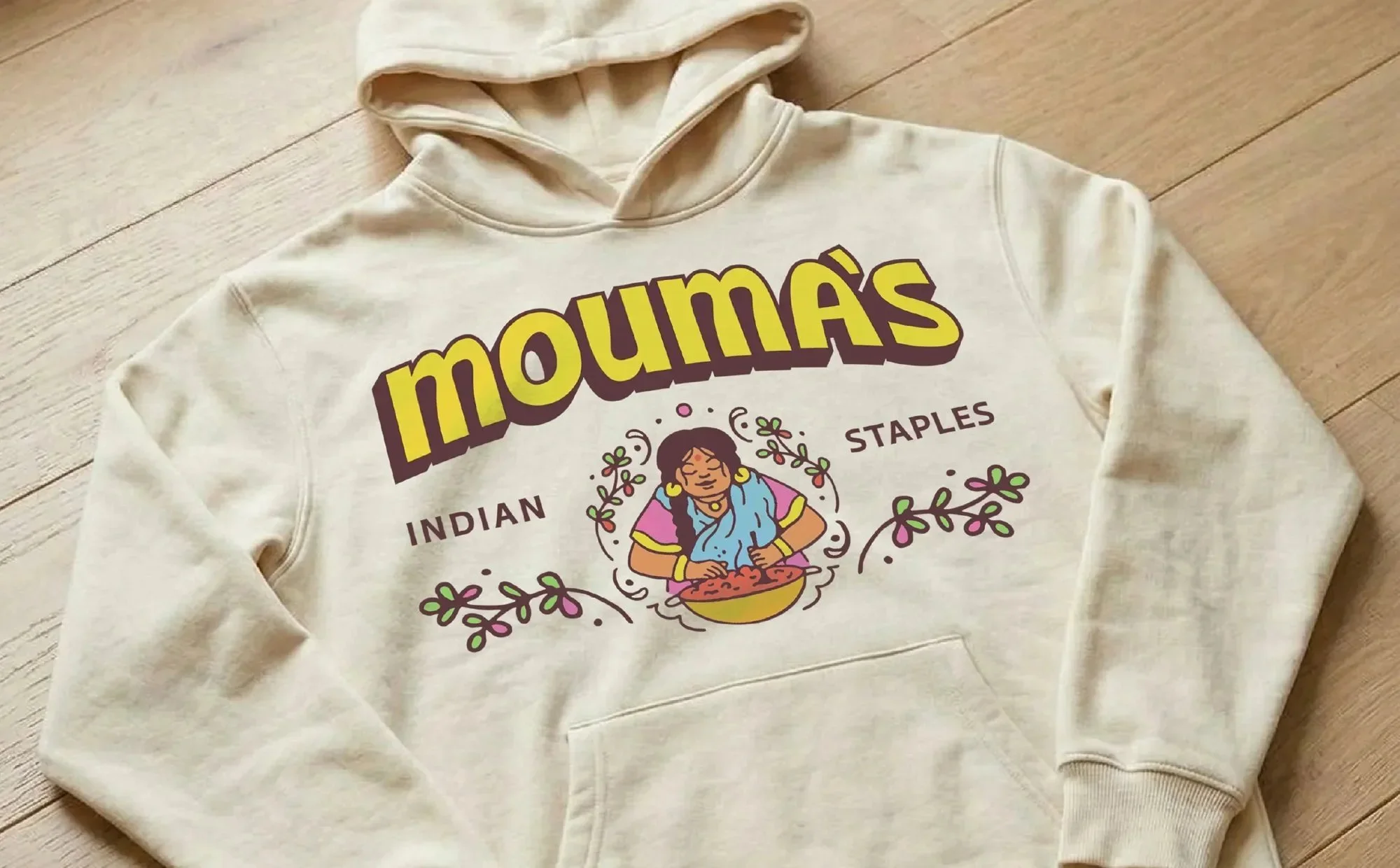
Logo Design
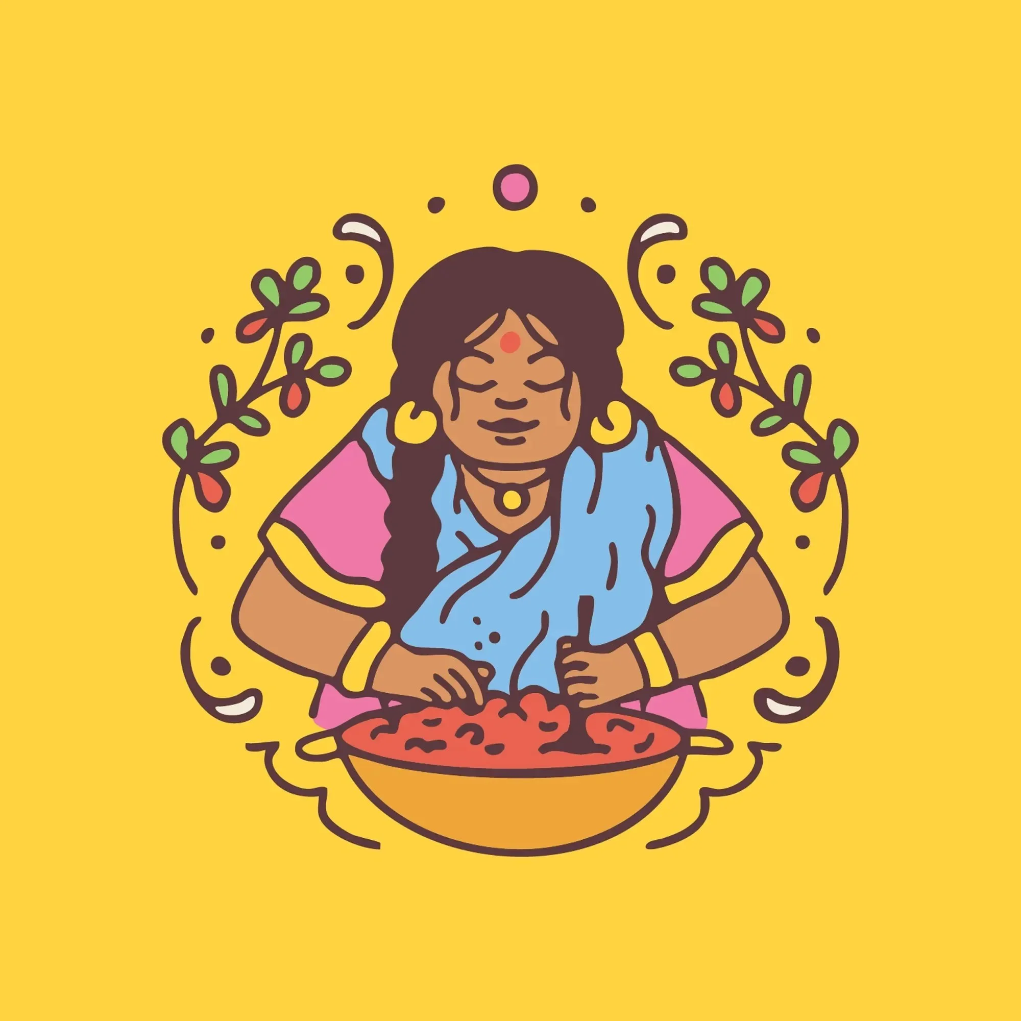
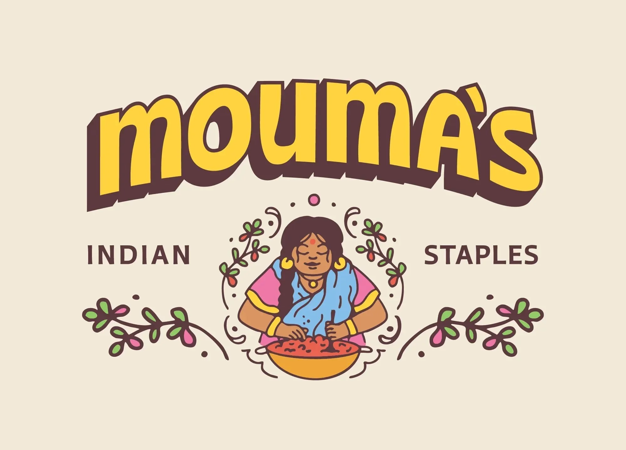
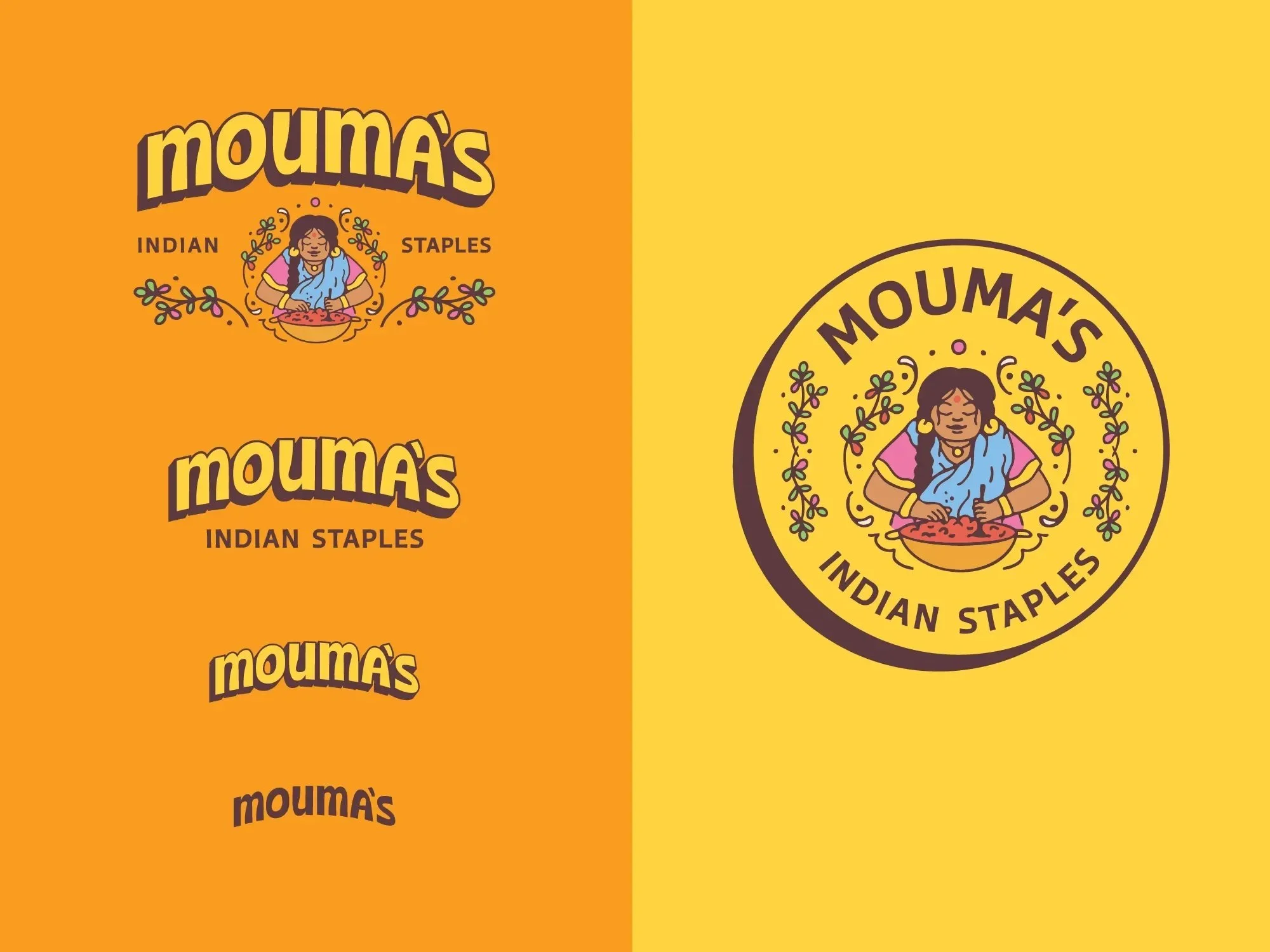
At the heart of Mouma's brand identity is Mouma herself: a tribute to the co-founder's grandmother and the family recipes that inspired the business. The illustrated mark features Mouma surrounded by flourishing lentil plants, preparing a bowl of lentils for her family. The wordmark is a customized version of Ohno Casual Variable, reworked for improved scalability. Together, the mark and wordmark balance tradition and contemporary design, feeling playful, confident, and ready for your pantry.
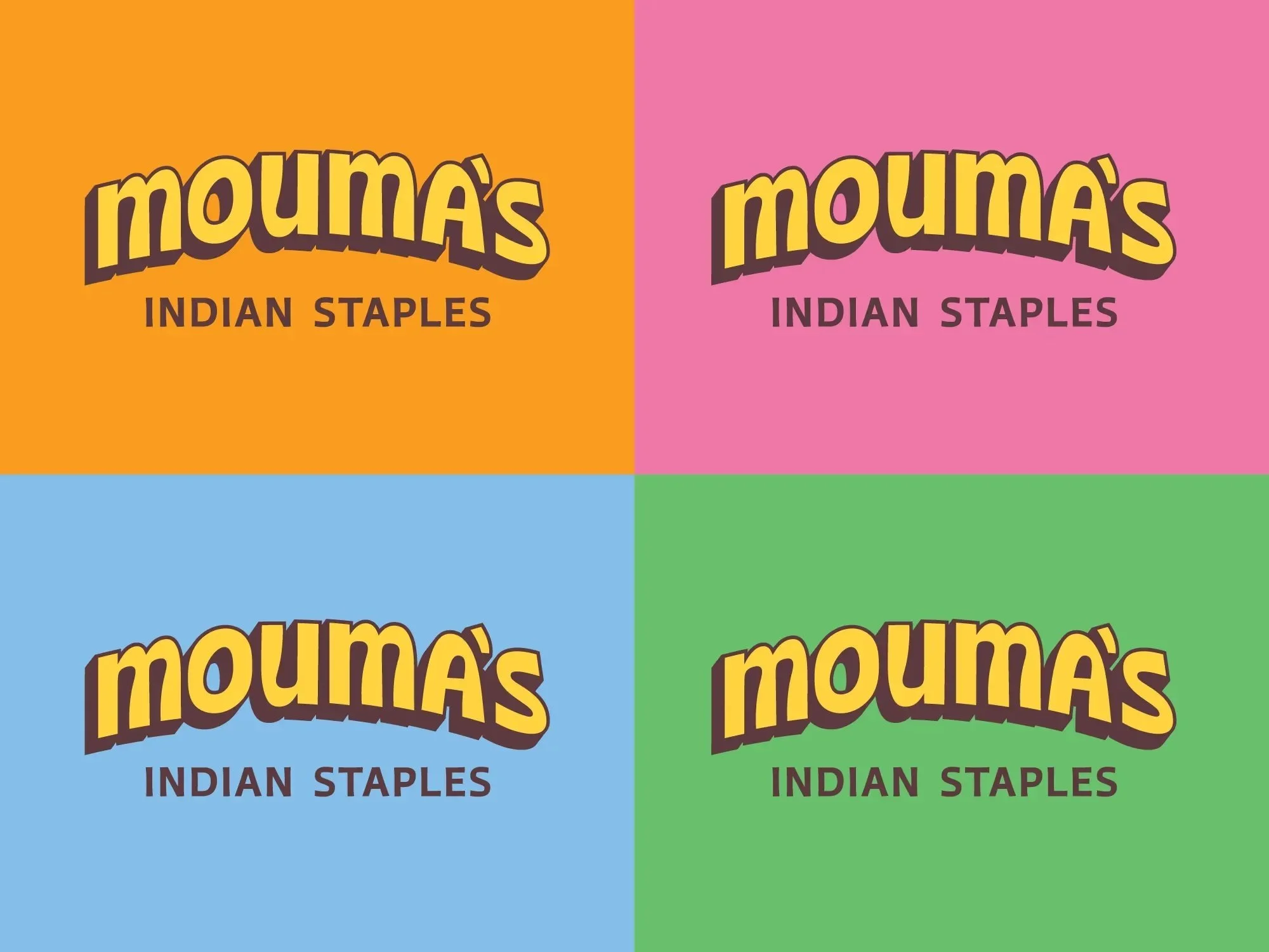
Visual Identity
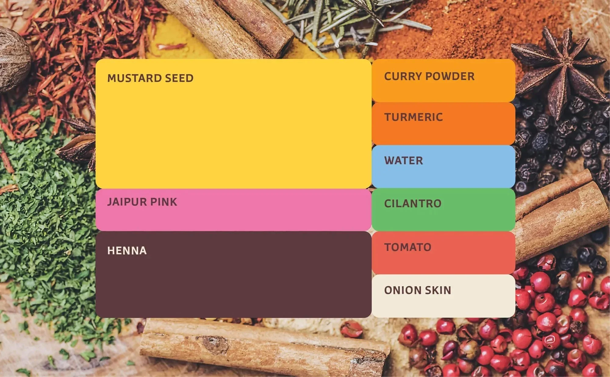
Mouma's visual identity is a contemporary take on Indian culture. With colors inspired by vibrant spices and container shapes inspired by architecture and textiles, we translated identifiable Indian moments into a bold and memorable identity system. Mustard Seed Yellow leads the palette, inspired by turmeric, lentils, and golden-hour light at the Taj Mahal, acting as the consistent visual anchor across the packaging design system.
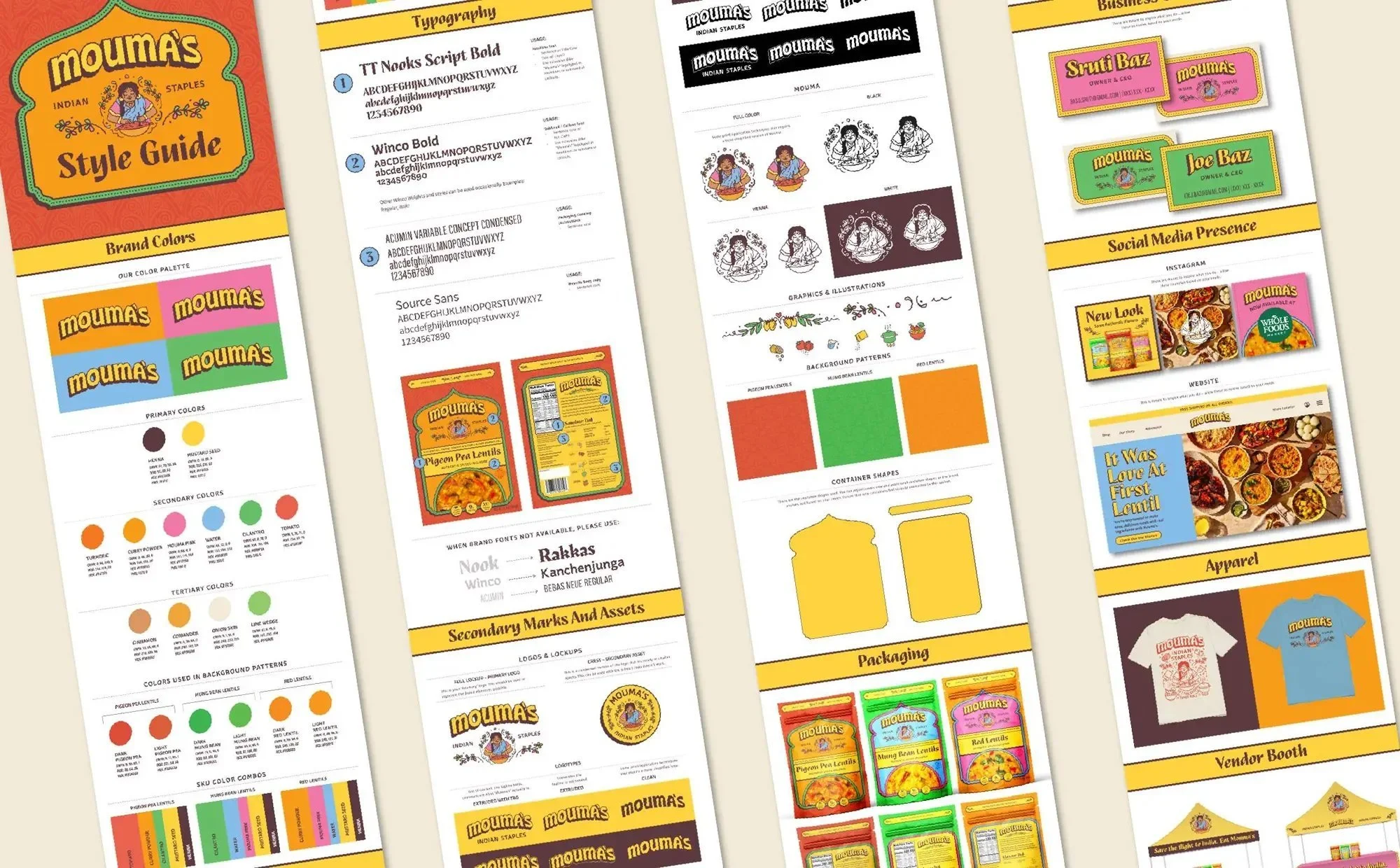


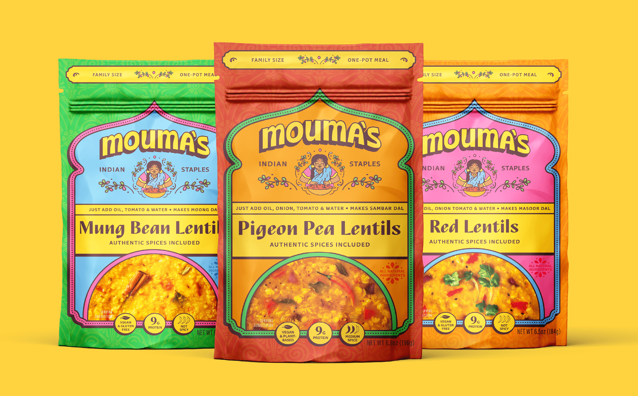
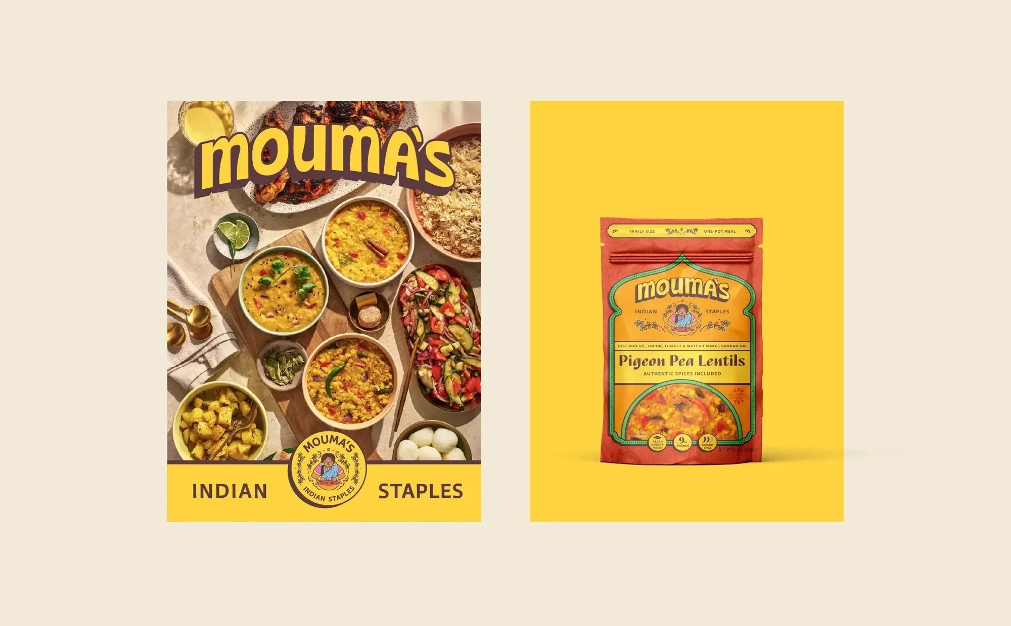
Packaging Design
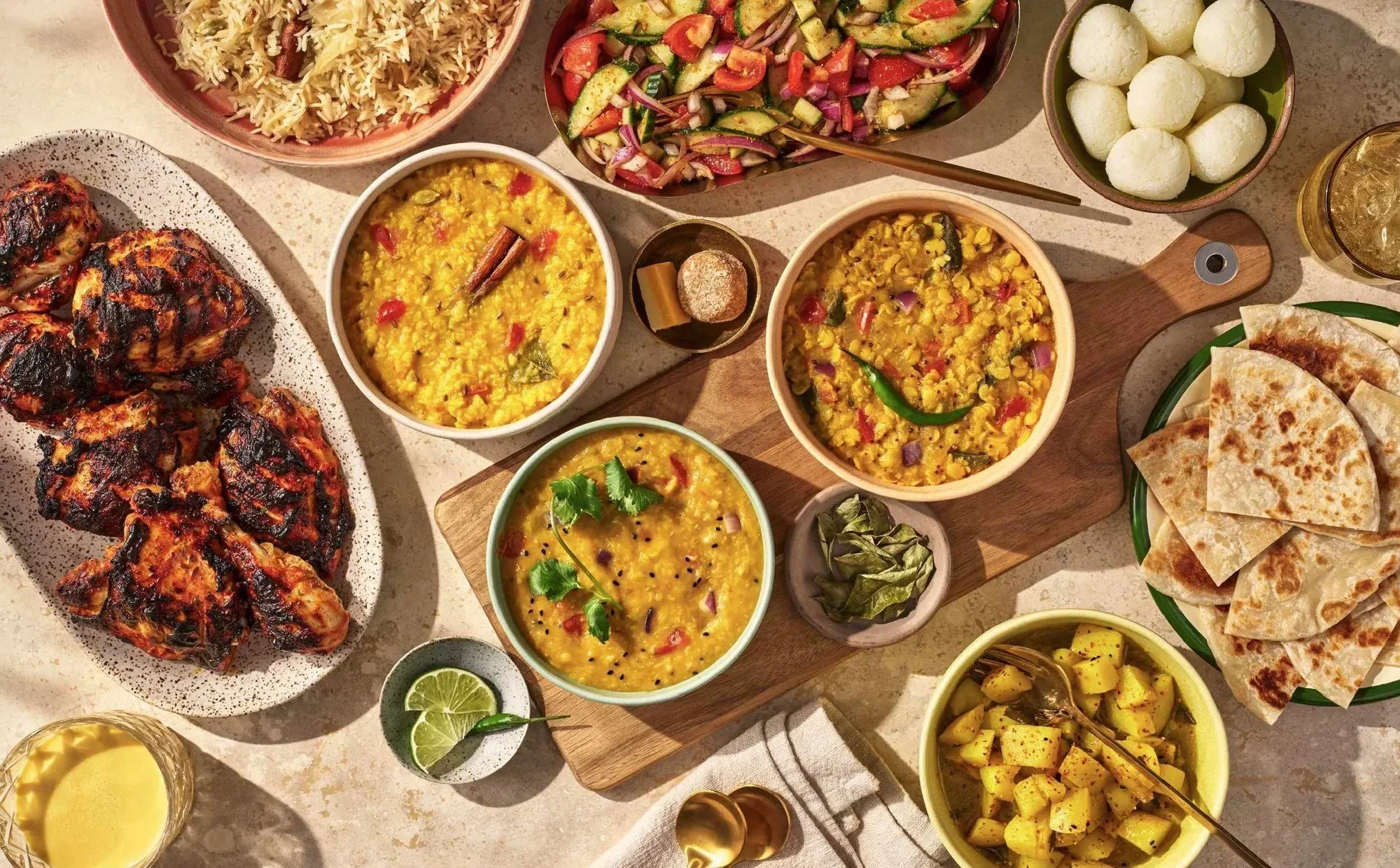
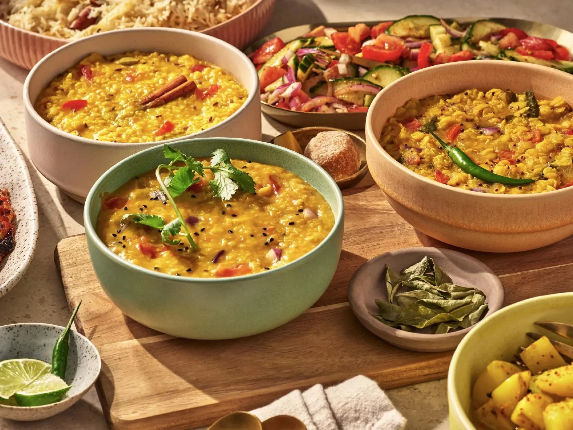
The front of pack information is contained in a graphic shape inspired by the Taj Mahal and traditional Indian archways. We updated the photography to focus on the finished meal, with decadent food photography showcasing the final dish. Color plays a critical strategic role: each SKU has its own color story while allowing the hero color to unify the system across headers, product bars, and callouts. Messaging was simplified and reorganized to prioritize clarity of product and benefit.

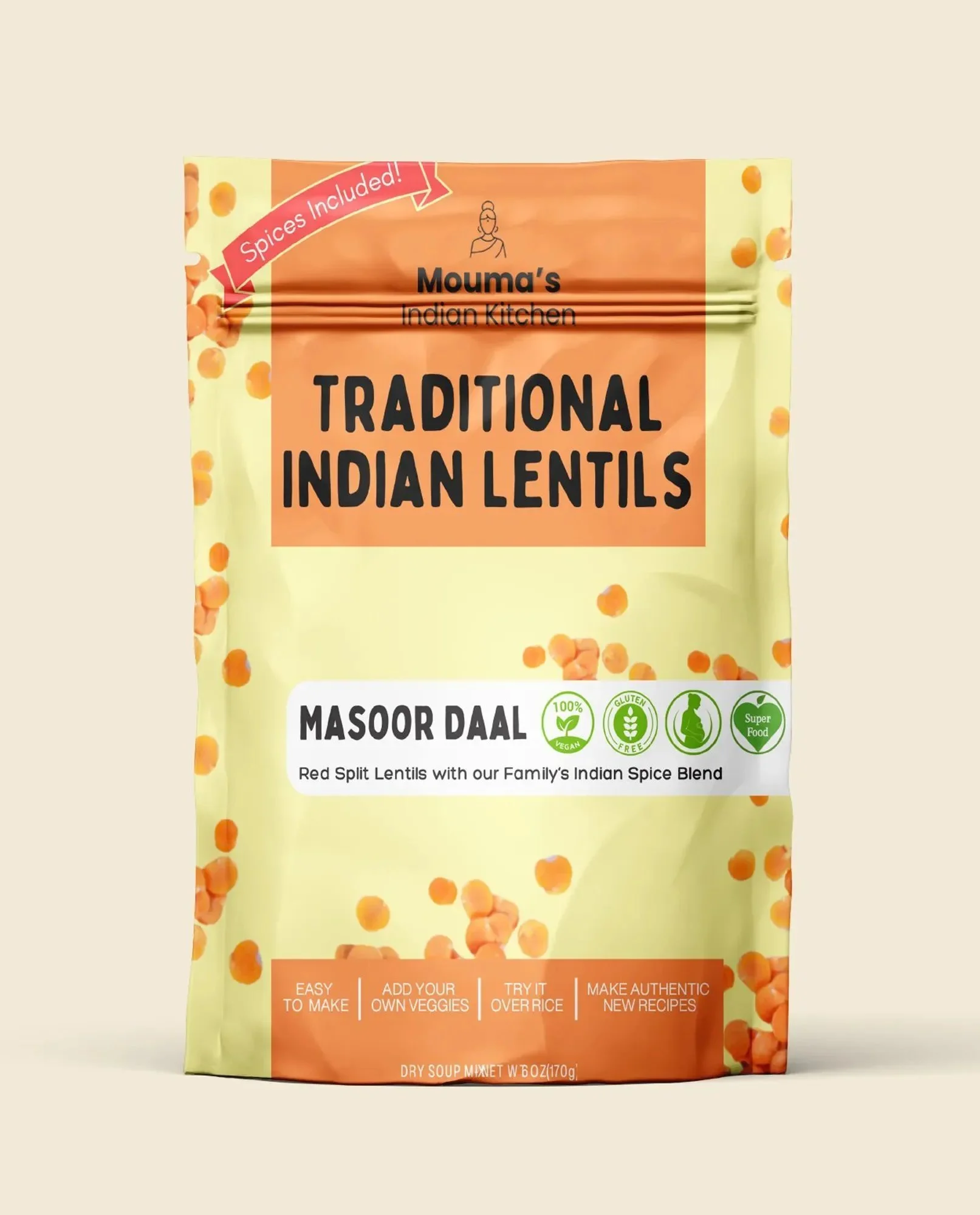
Before
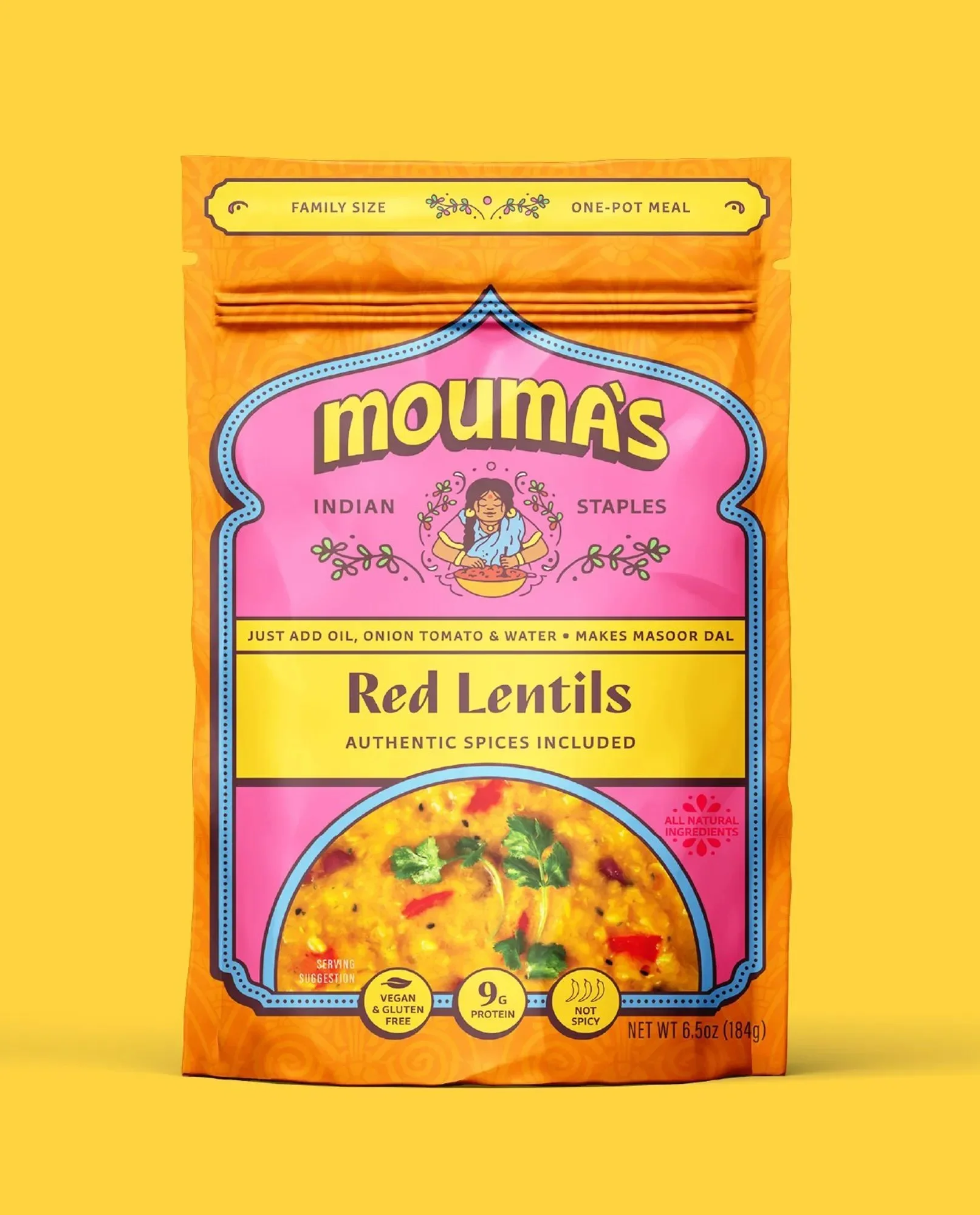
After
From the co-founder:
“We pitched to Walmart today and every single person from their team commented on the amazing packaging.
Working with you was hands down the best decision for us and our business. 🙏”
“Just pitched directly to Sprouts at their HQ. Their first comment was 'wow, you killed it with the packaging’ 😁🙏”


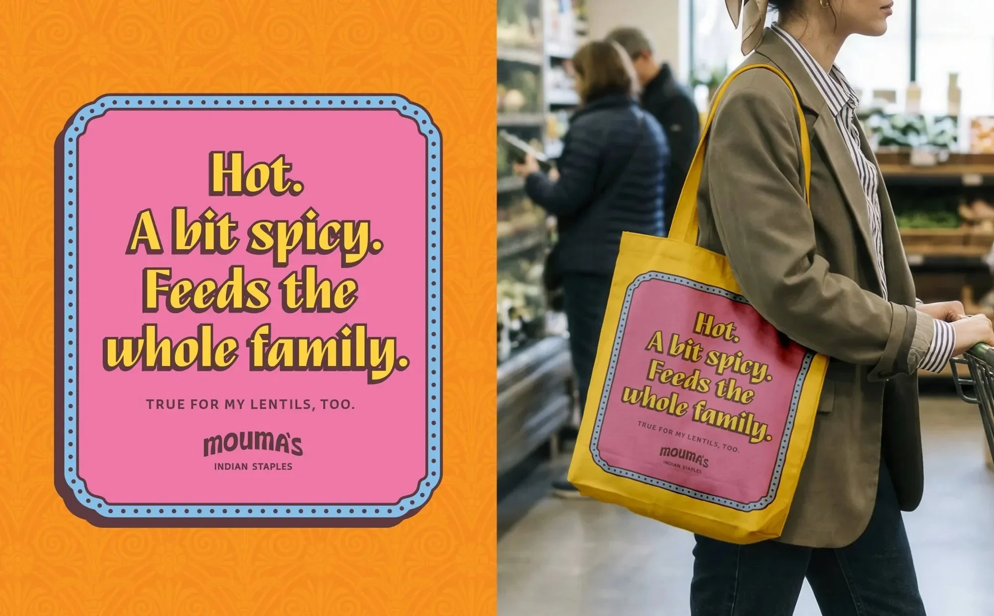
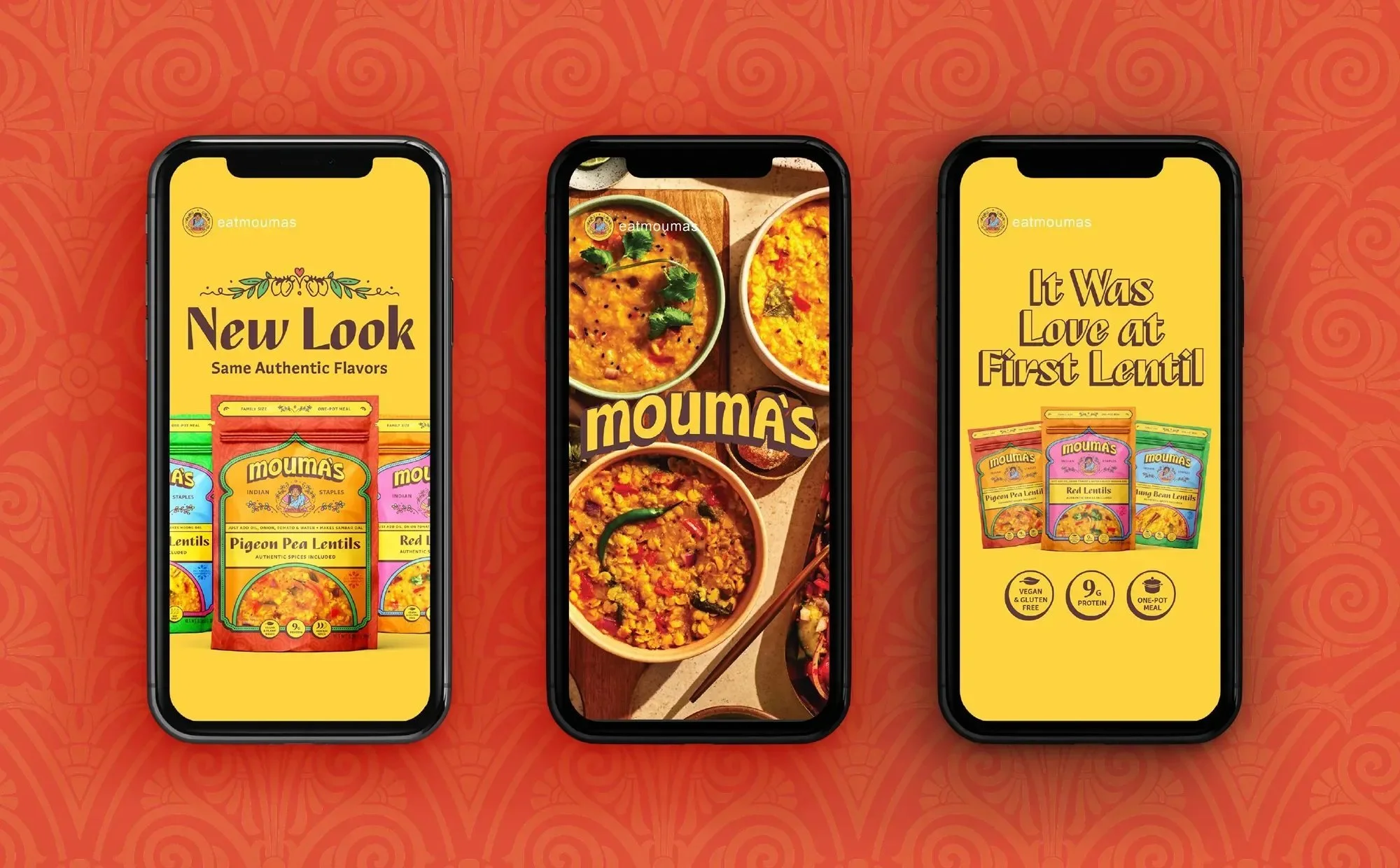
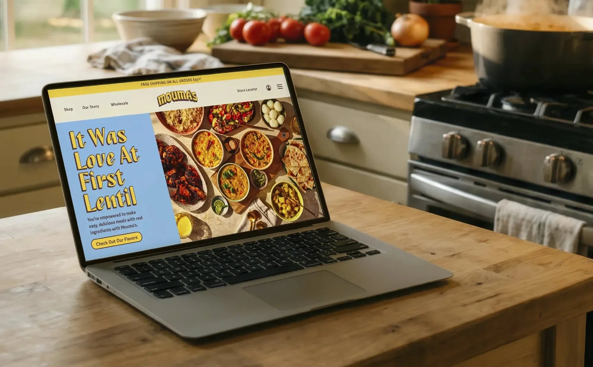
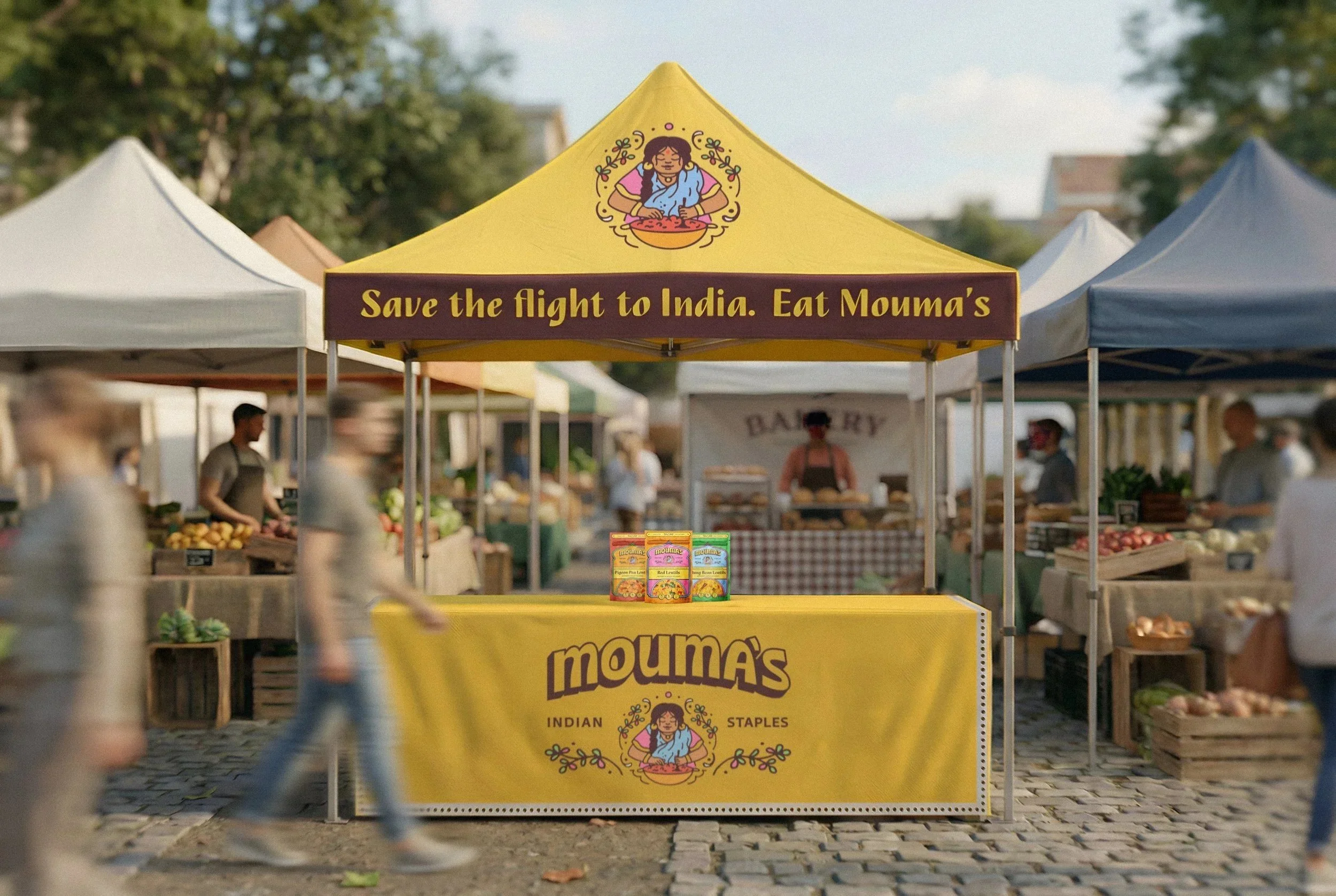
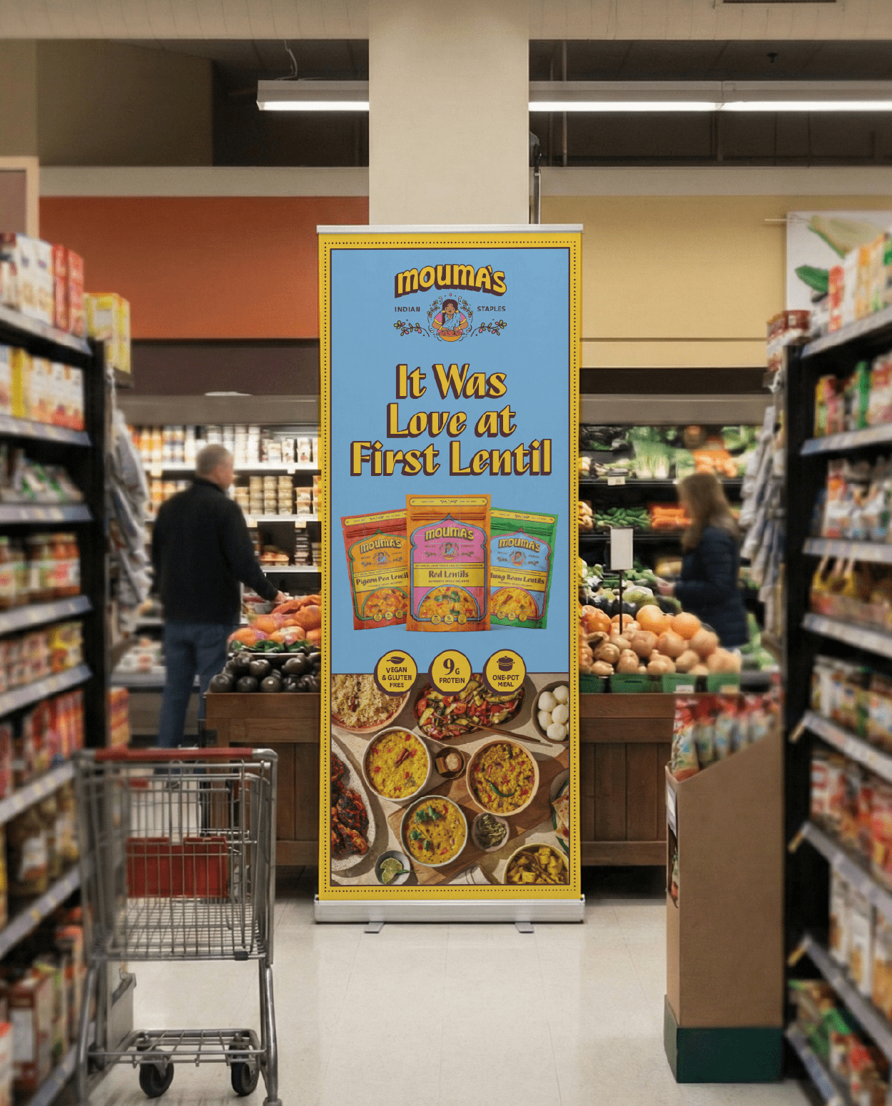
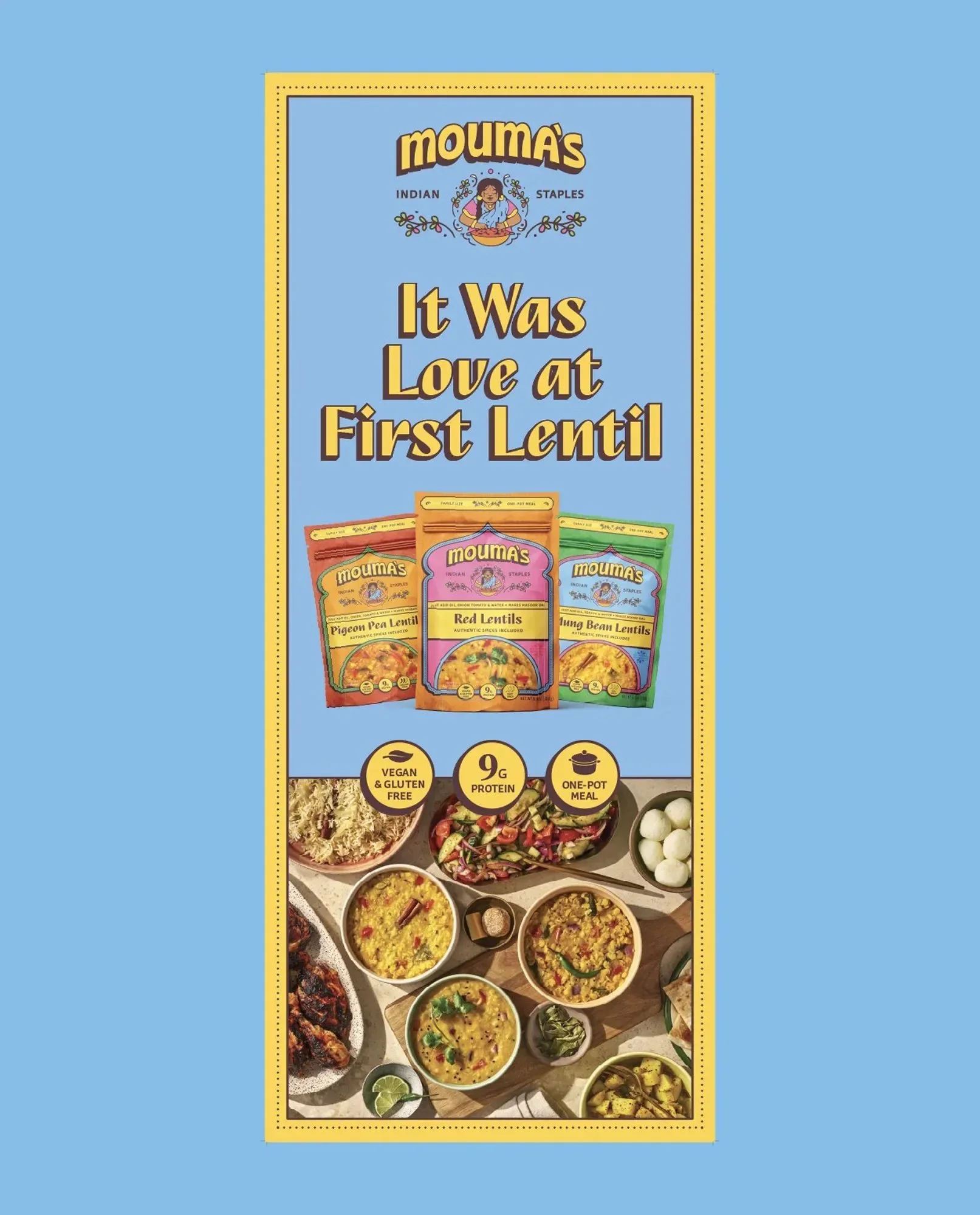
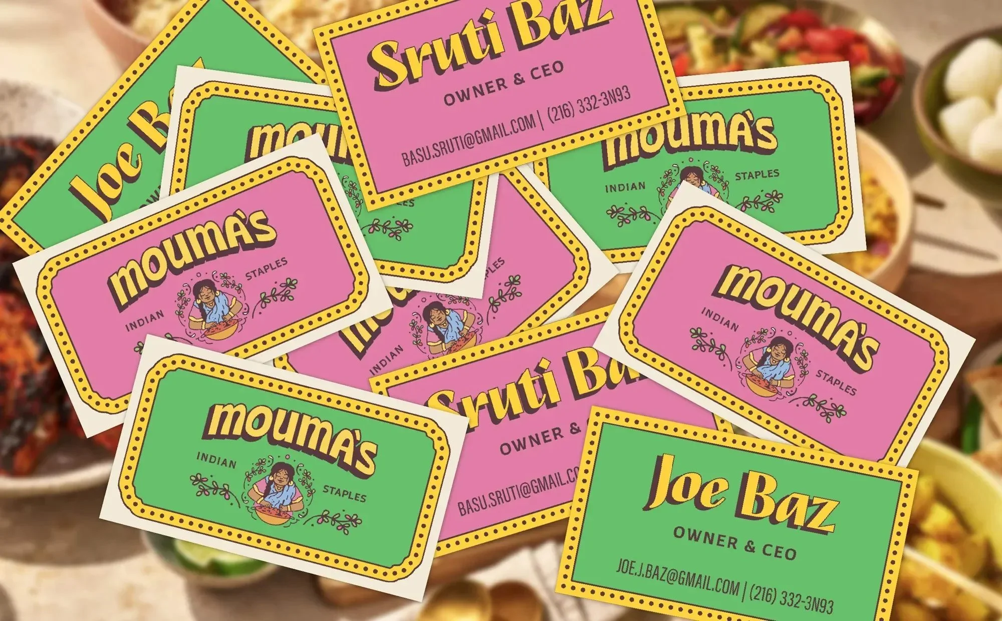
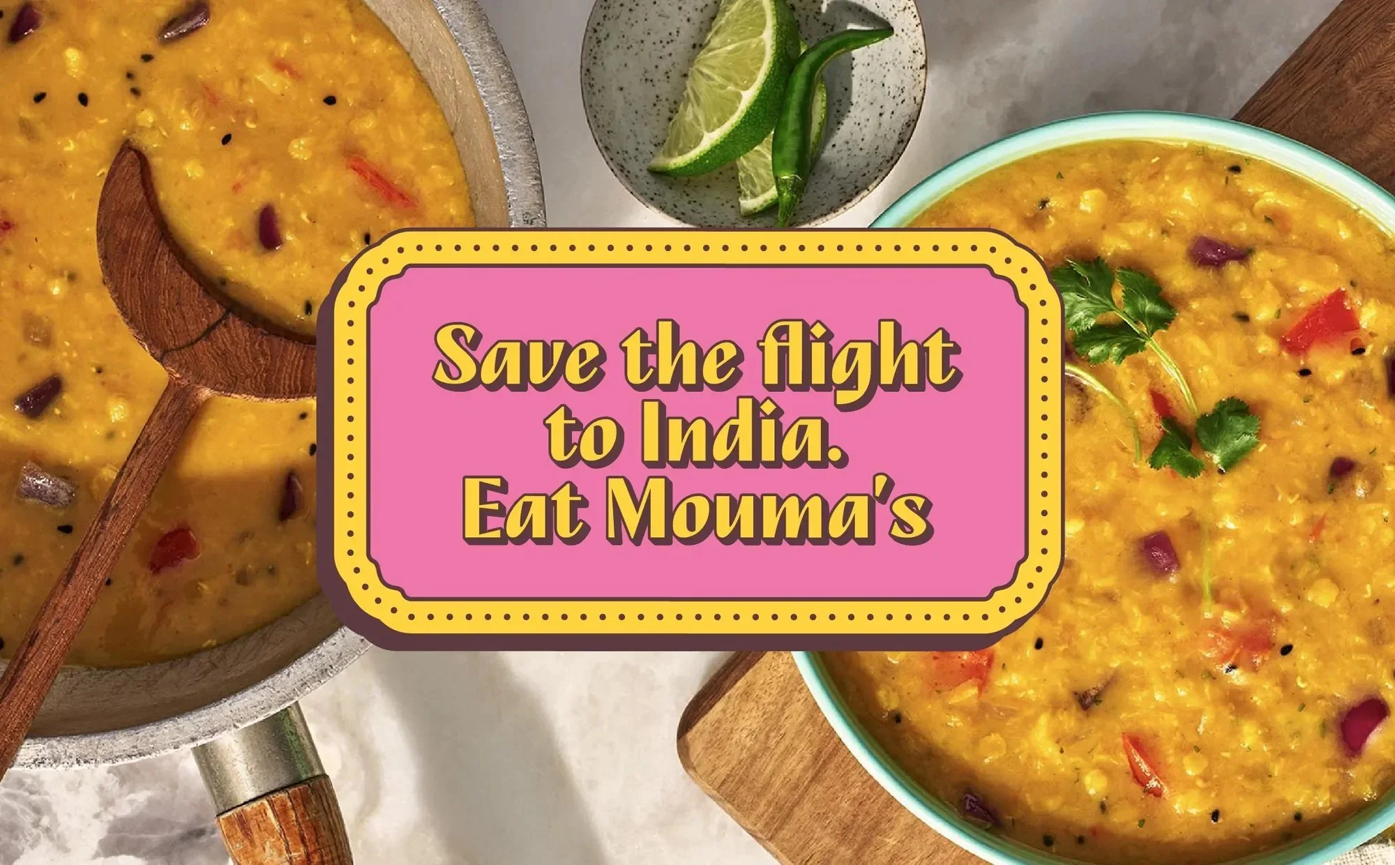
Collateral Design
The collateral elements showcase the brand extended across retail banners, pop-ups, event tents, and digital environments. Using bold headlines like "It Was Love at First Lentil" and "Save the Flight to India. Eat Mouma's," we continue to communicate easy, healthy Indian food made approachable.
Want to see more?