Marshall Goldman
Marshall Goldman Rebrand and Visual Identity Design
Refreshing the visual identity of America's longest standing luxury and exotic used car brand.
Client
Marshall Goldman Motor Sales
Services
Rebrand, Visual Identity Design, Collateral Design, Email Template Design, Website Art Direction, Merch
Credits
Art Direction & Principle Design: Adam Vicarel
Branding and Design Support: Matt Narca, Carly Salzman
The Opportunity
Marshall Goldman has been a fixture in the luxury and exotic car market since 1978. When the company was acquired by Magden Motors, leadership saw it as the right moment to close the gap between the brand they had built and the brand they had become. The existing identity was generic and undersold the company's reputation, projecting none of the luxury, exclusivity or authority their clientele came to know of Marshall Goldman. In any luxury category, there are visual expectations that build credibility and trust, and their dated logo and undefined brand art direction was both a strategic and aesthetic problem.
The Solution
The rebrand was built around a strategic tension: how do we elevate the system while maintaining some of the equity from the current brand? Vicarel Studios developed a complete visual identity system anchored by their brand red, a custom crest and a refined logotype. The decisions were informed by luxury and filtered through the lens of premium car and lifestyle brands. The positioning metric for success was ambitious, but straightforward: does the brand feel right when placed alongside the brands of most coveted vehicles on earth?
Brand Strategy & Exploration
Working from a brand platform developed by Hello LLC, Vicarel Studios further shaped and refined the strategic positioning to ensure the visual identity was firmly grounded in both the category's expectations and the client's vision for growth and evolution post-acquisition. The target audience is high-net-worth, investment-minded collectors drawn to cars as status, legacy, and an emotional experience. The brand platform established a clear promise: pairing extraordinary automobiles with owners of the same caliber. Every subsequent design decision was pressure-tested against that idea.
In addition to a thorough understanding of the category and ideal customer, we did a thorough audit of the previous Marshall Goldman and the the Magden Motors brands respectively. The client maintained that modernity should remain a key factor in our decision-making process as we continued to explore the brand refresh.
As always, our creative process started with us first going wide: exploring a plethora of crest, monogram and lockup compostions and logotype styles, and only then did we go deep.


Visual Identity
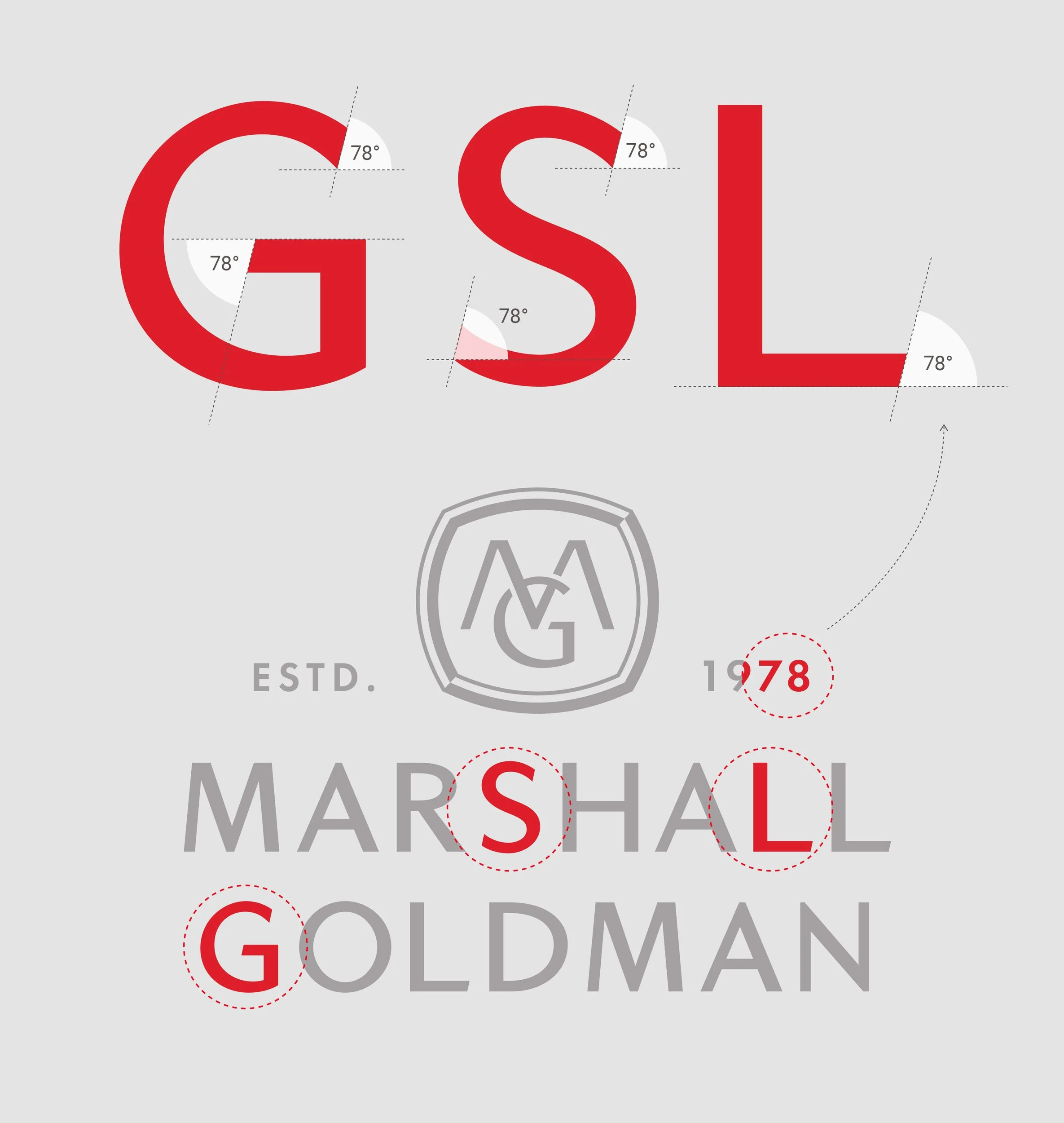
The centerpiece of the new identity is a custom MG monogram crest, built with a squared-oval badge that echoes the heritage of European automotive brands while still feeling entirely ownable. The logotype is set in a refined all-caps treatment with loose tracking. We added custom 78° angled terminals to relevant letterforms as an homage to the 1978 established year.
The complete logo system includes a stacked crest, inline crest, standalone logotypes and crests, a secondary stacked version, and a simplified version of the full system for small-scale fabrication applications or extruded signage.
The color palette was a subtle evolution from Marshall Goldman’s current palette, and it’s inspired by classic muscle cars. The color system is to be applied with restraint: red on white or black and white on red are the primary brand color expressions, and accents of the other colors are used when necessary.
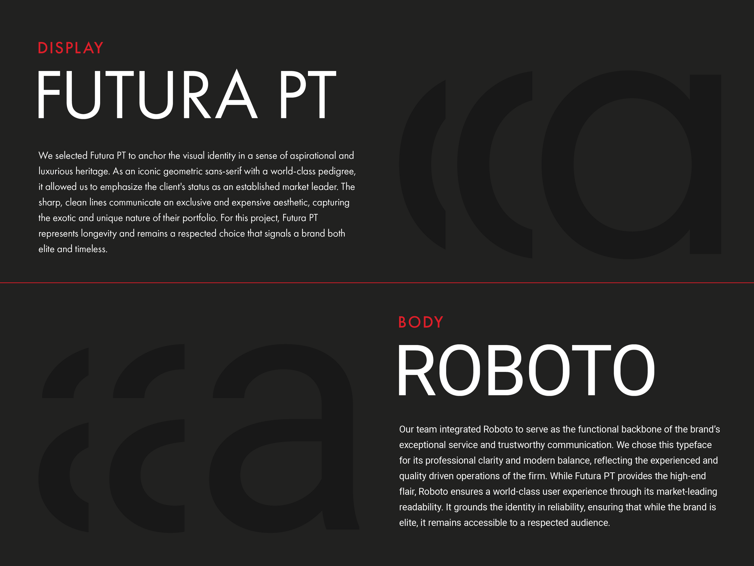
The type system uses Futura PT throughout, with distinct tracking rules for headlines and subheads, and we use Roboto for body copy. Pairing these two sans serifs doubles down on the brands desire for a modern position in their category.


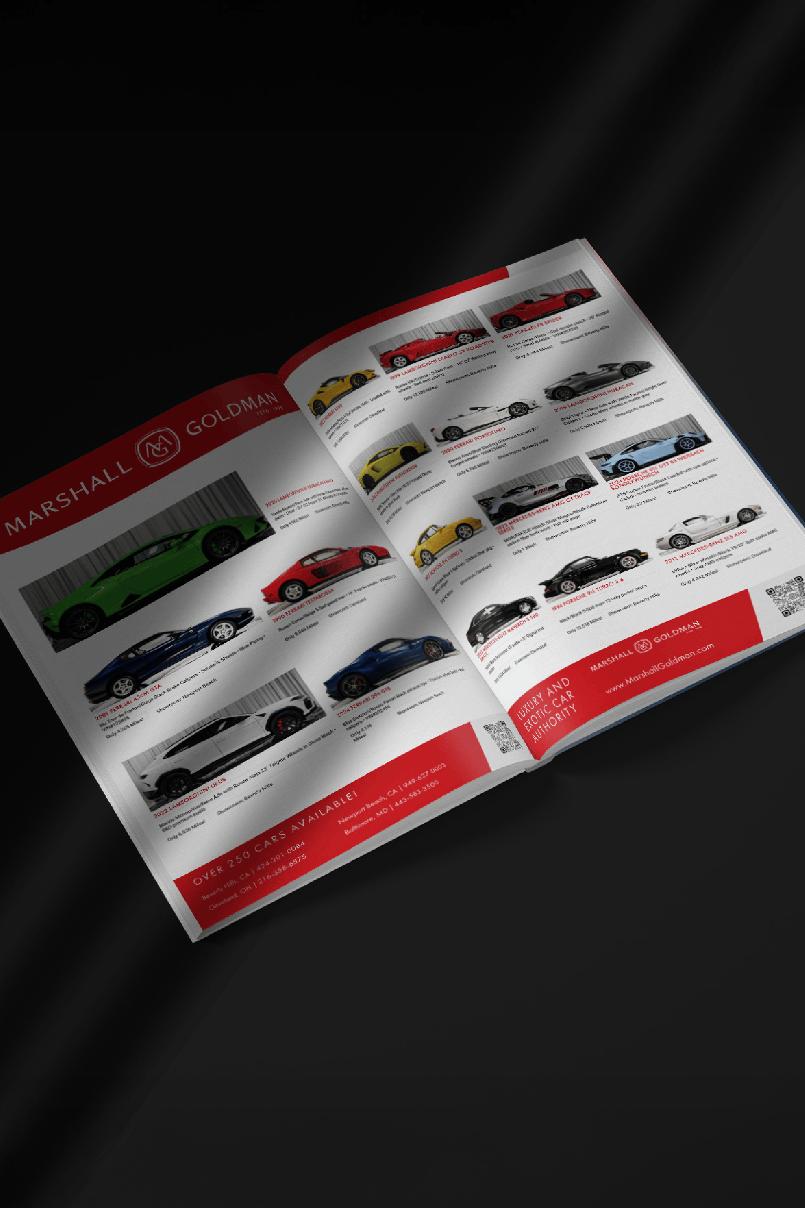


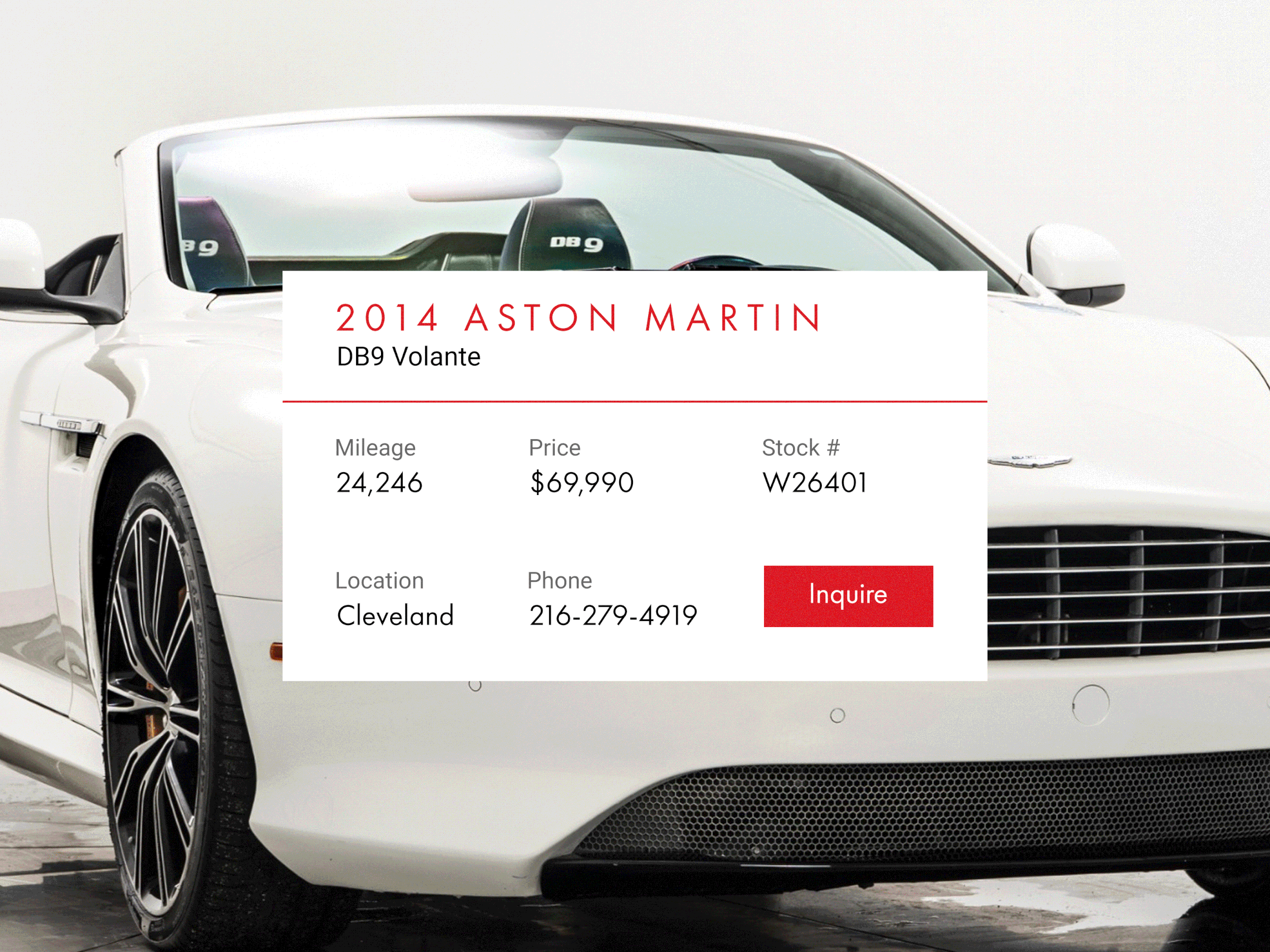
Physical and Digital Collateral Design and Art Direction
The collateral system created spans email templates, flyers, event tent design, multiple forms of signage, business cards, employee uniforms and website art direction. Each touchpoint was designed to hold the same sense of premium restraint with clean layouts, controlled use of red, and a consistent typographic voice.
The 78° angles show up as angular color fields that subtly nod back to the decisions made in the custom Marshall Goldman wordmark.


Still want to see more?