Summer West Bourbon
Client: Summer West
Services: Visual identity refresh, Creative Direction, Packaging Design, Copywriting
Credits: Creative Direction, Brand and Package Design, Production: Adam Vicarel
Brand and Package Design, Production: Carly Salzman
Images: Bahar’s Media
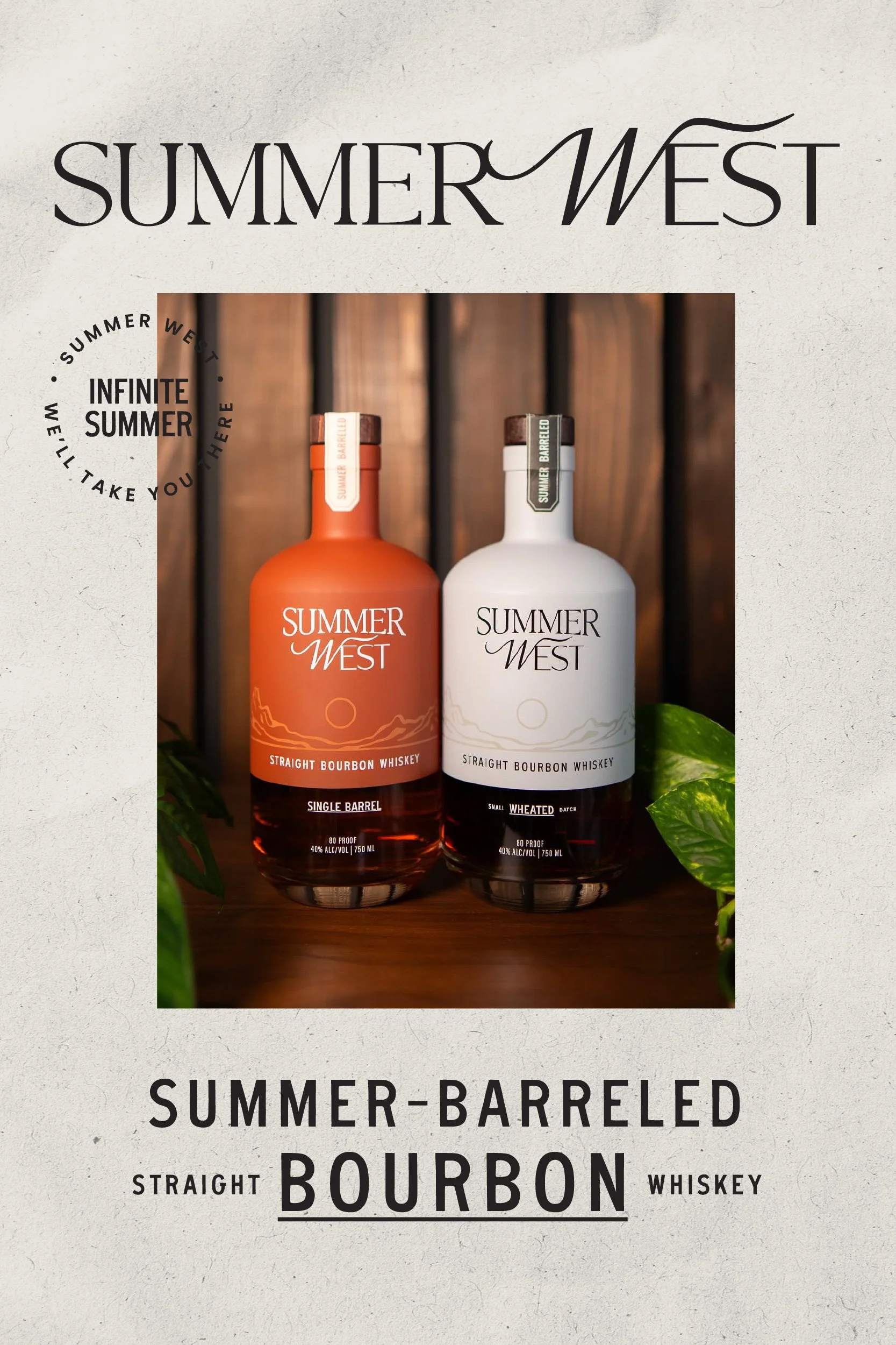
Rebranding a boutique bourbon with contemporary nostalgia.
THE OPPORTUNITY
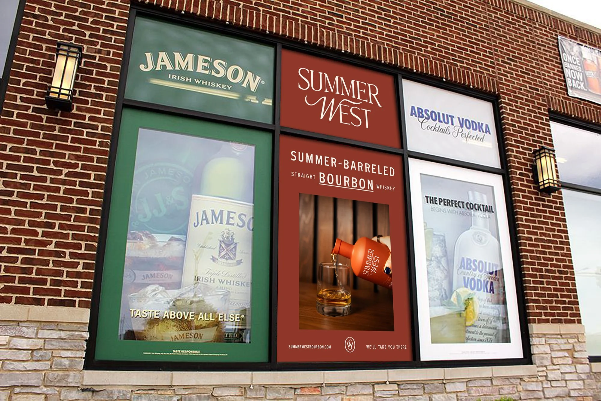
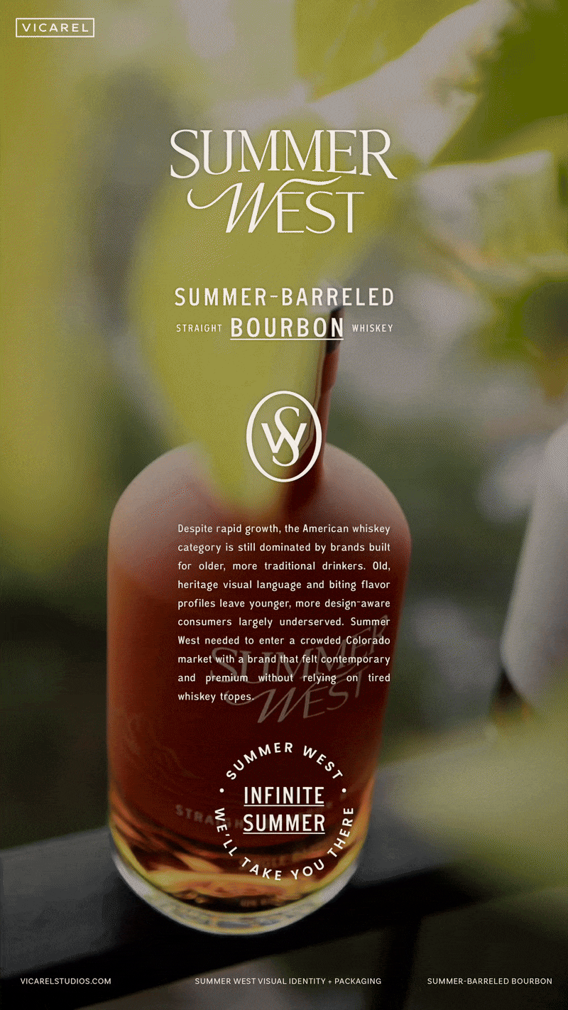
Despite rapid growth, the American whiskey category is still dominated by brands built for older, more traditional drinkers. Old, heritage visual language and biting flavor profiles leave younger, more design-aware consumers largely underserved. Summer West needed to enter a crowded Colorado market with a brand that felt contemporary and premium without relying on tired whiskey tropes.
THE SOLUTION
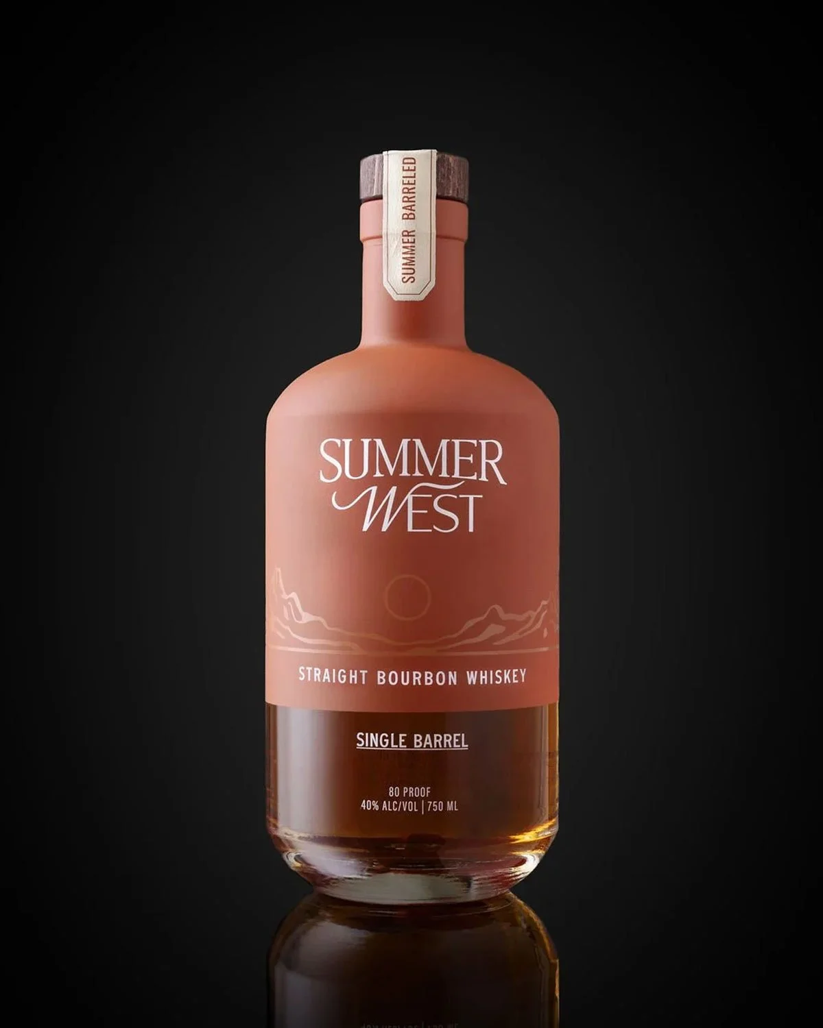
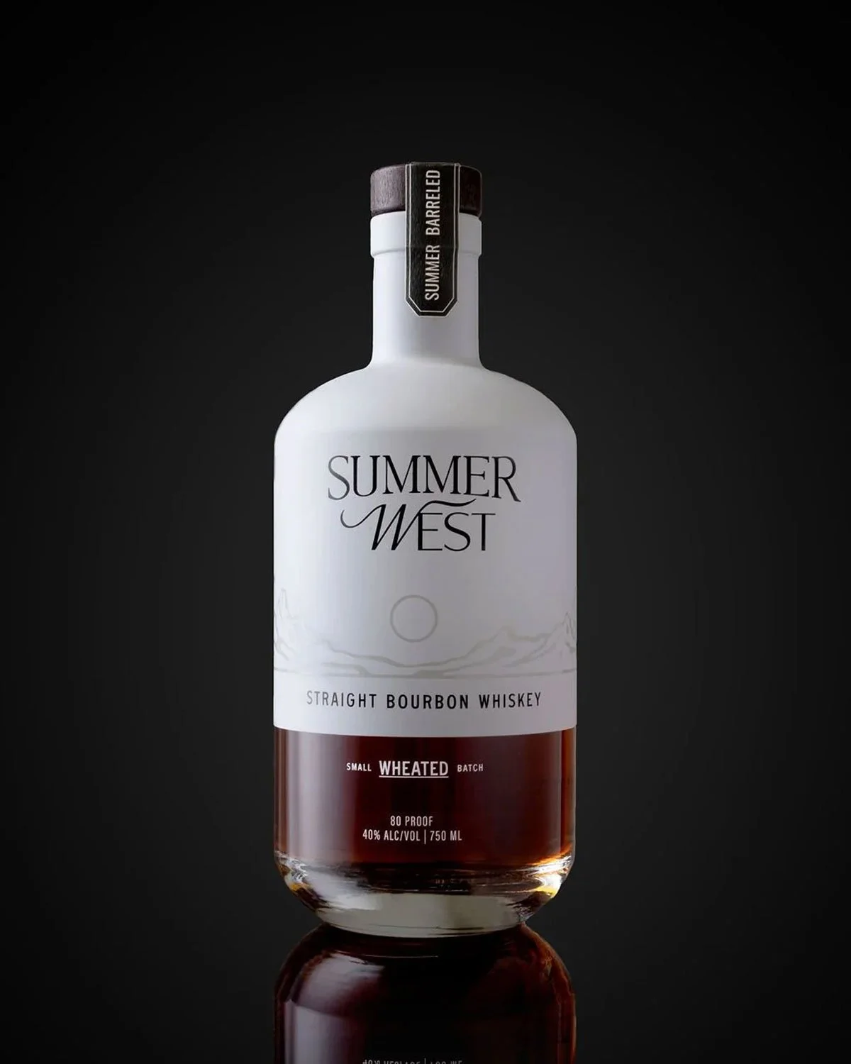
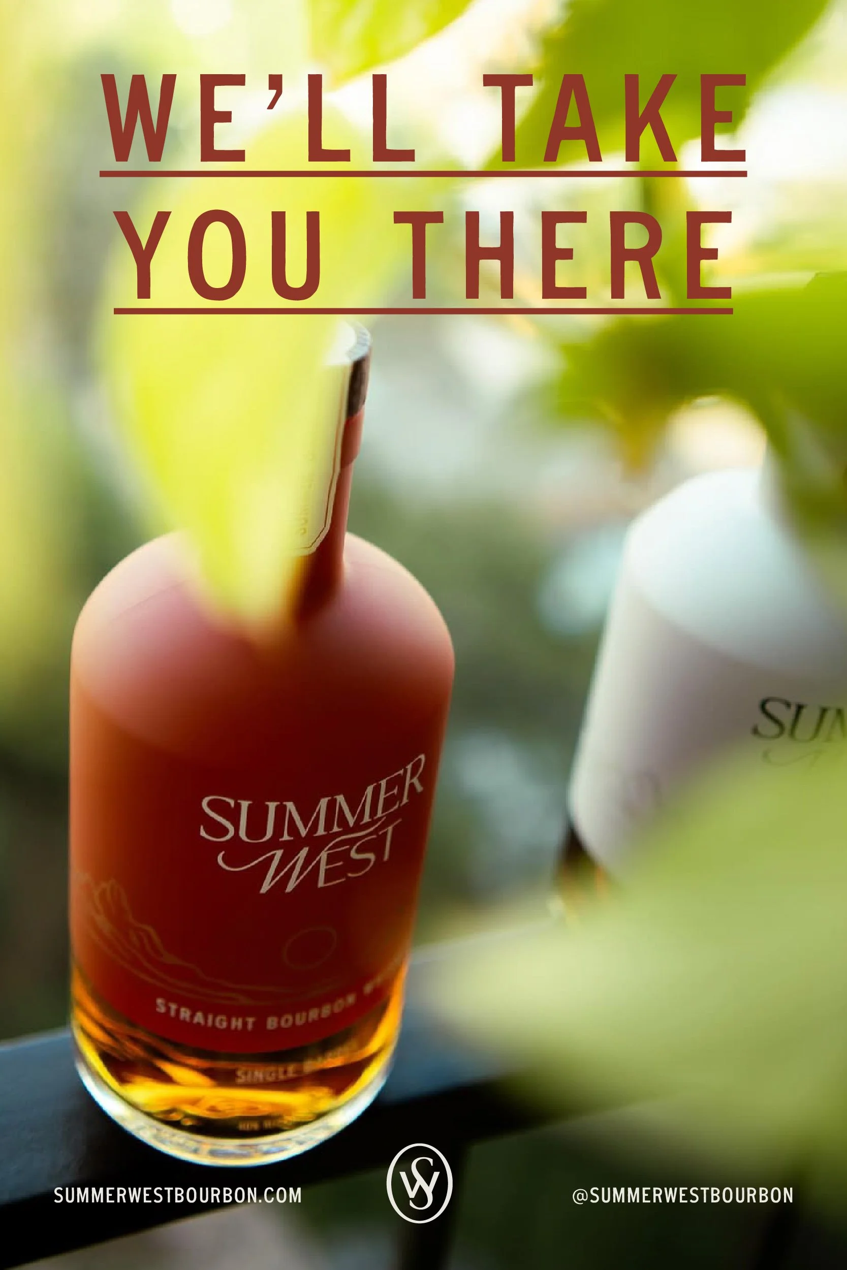
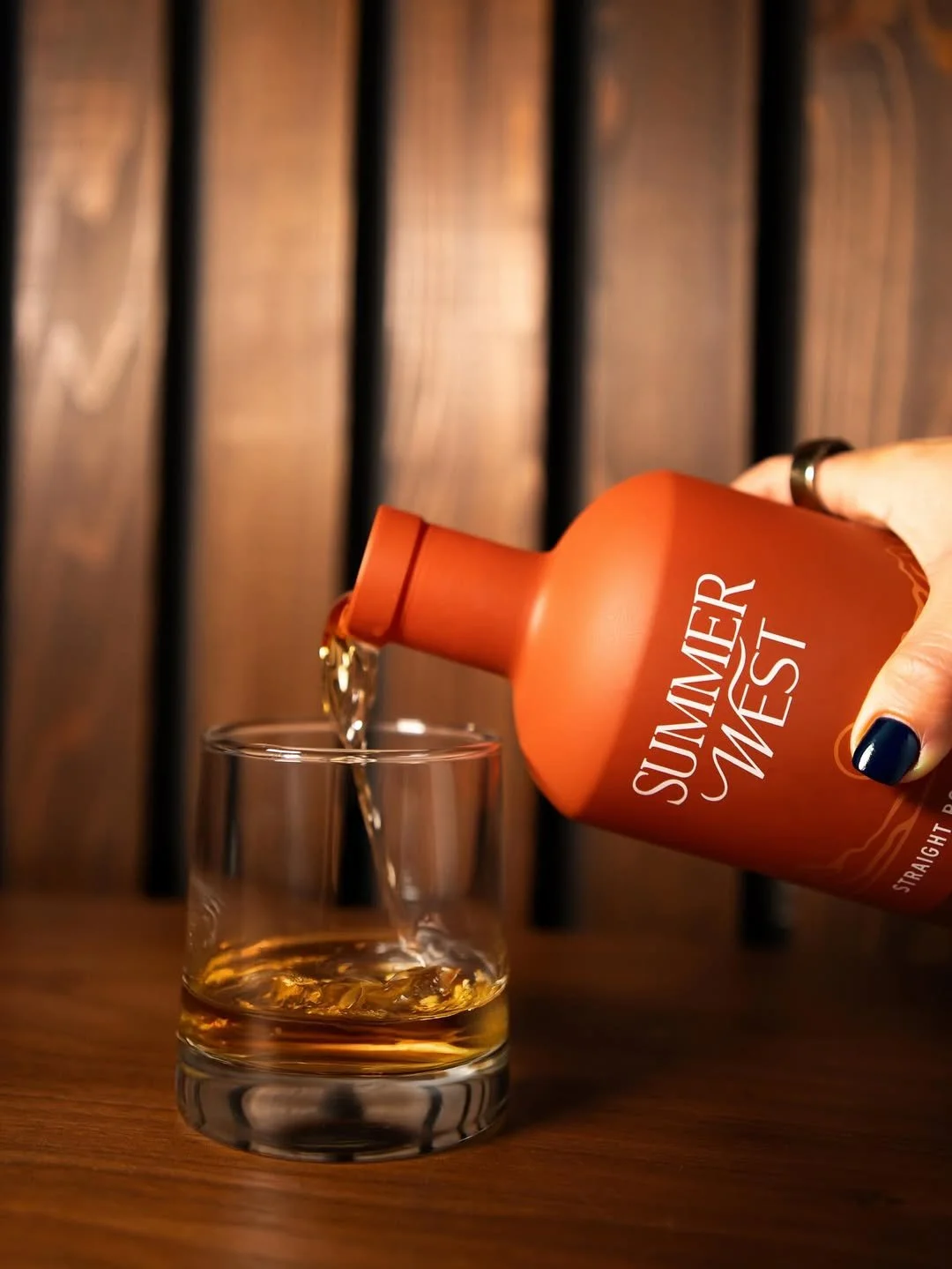
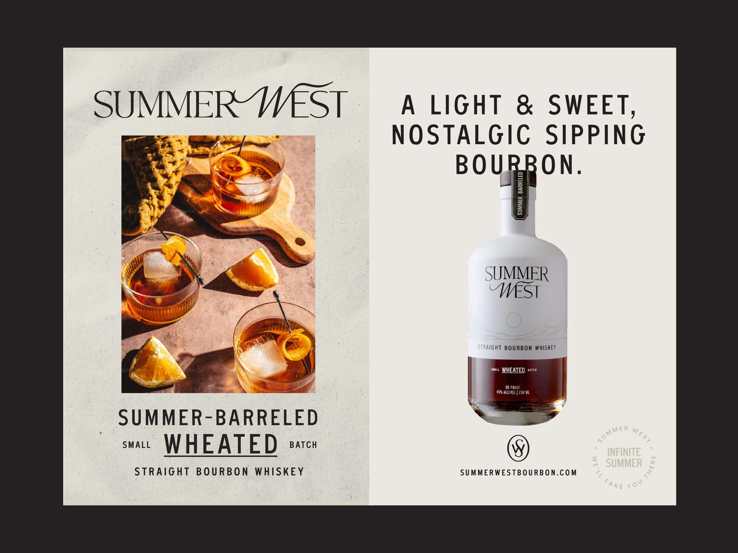
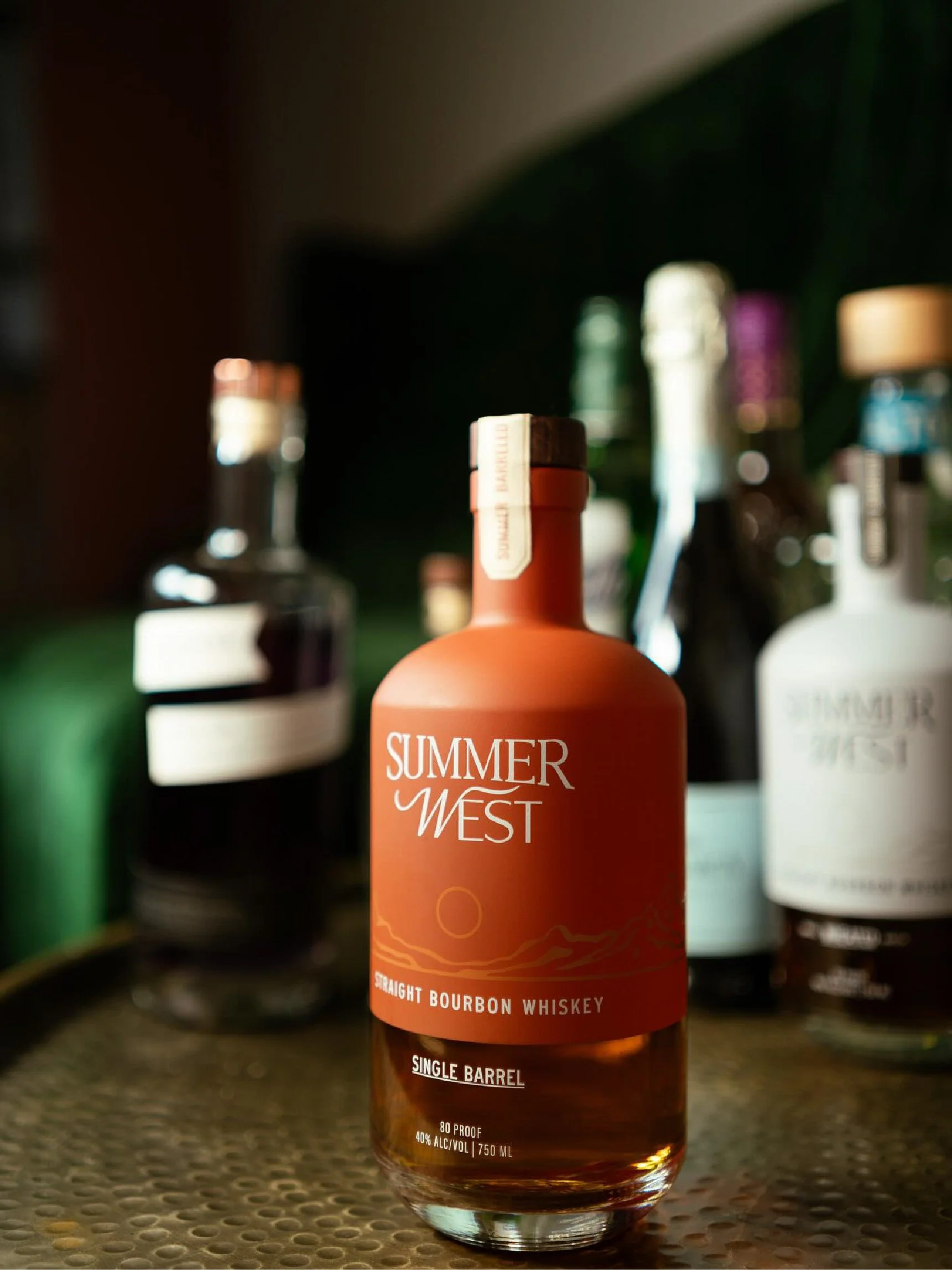
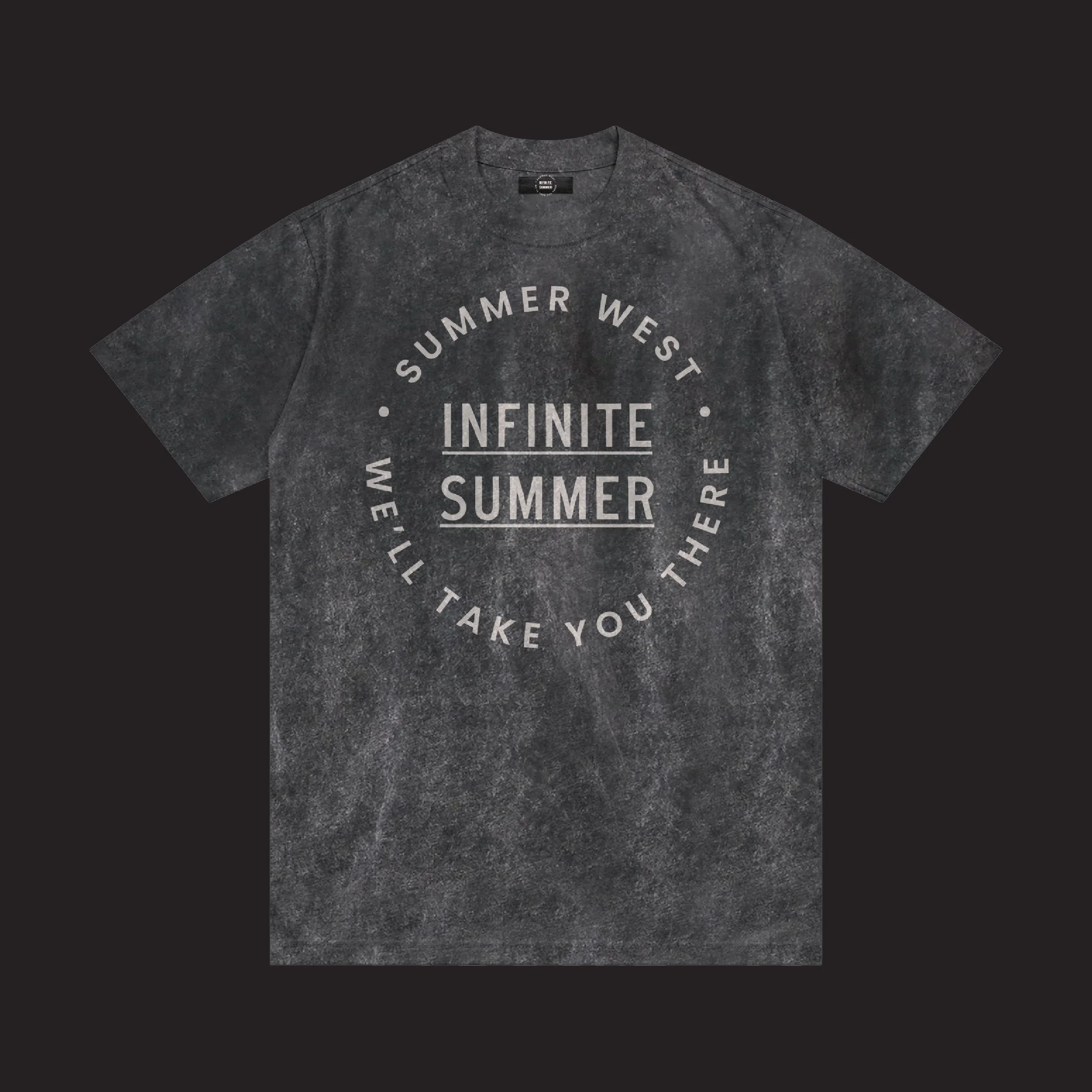
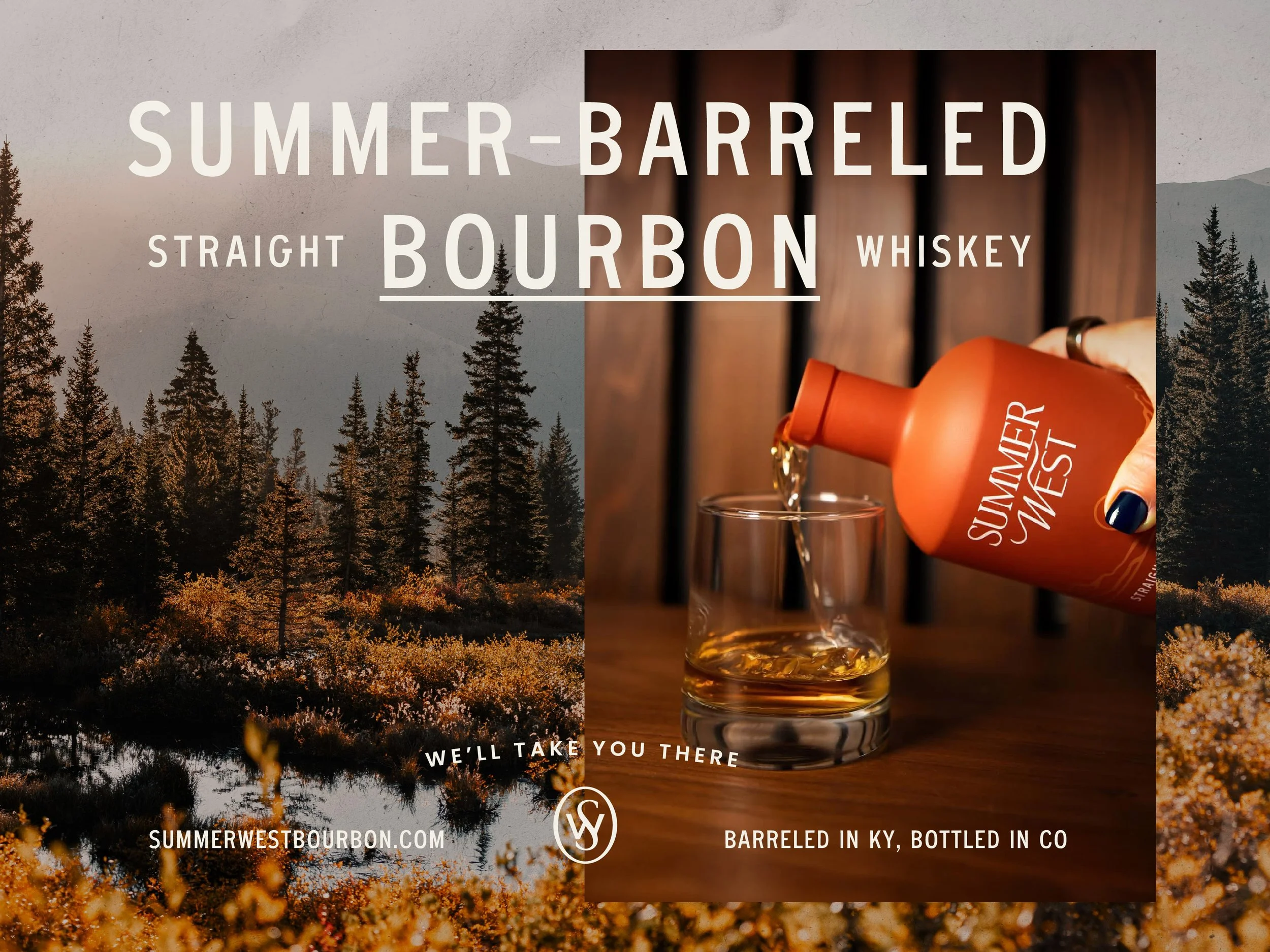
We partnered with Summer West to create a contemporary whiskey brand that stands out amongst the crowd while still being rooted in category understanding and consumer behavior. By studying shelf presence and competitive norms, we built a visual system that balances classic whiskey cues with a lighter, more approachable aesthetic. When paired with a light, smooth, and easy-drinking profile, the result is a brand that stands out on shelf and on palette. Summer West transports you to good times with good company, and celebrates those memories worth returning to.
Visual Identity
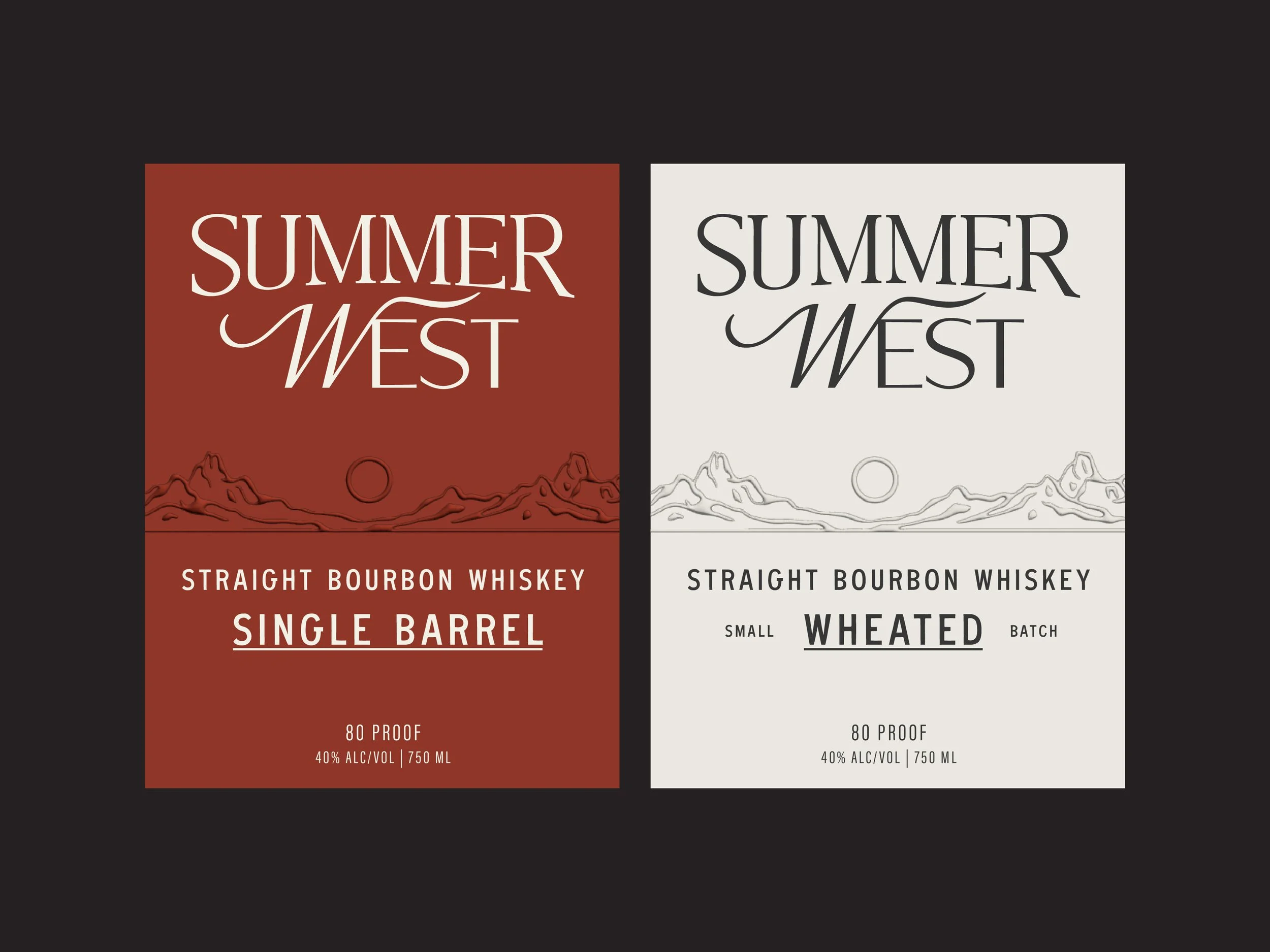
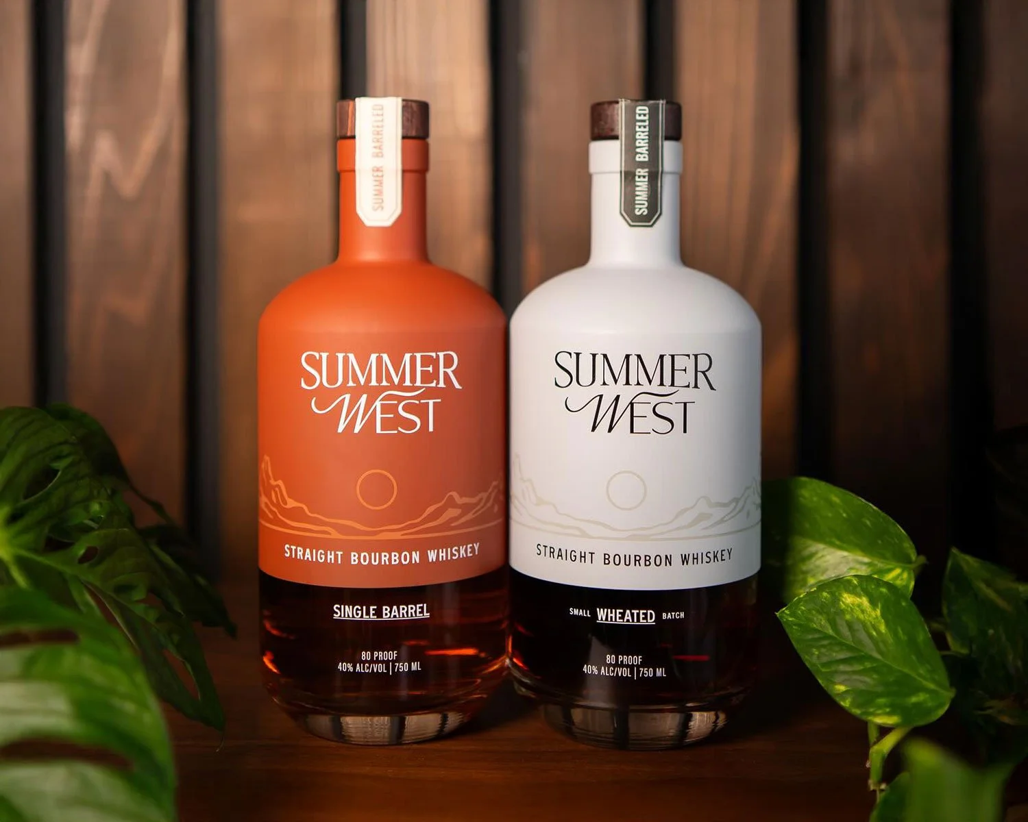
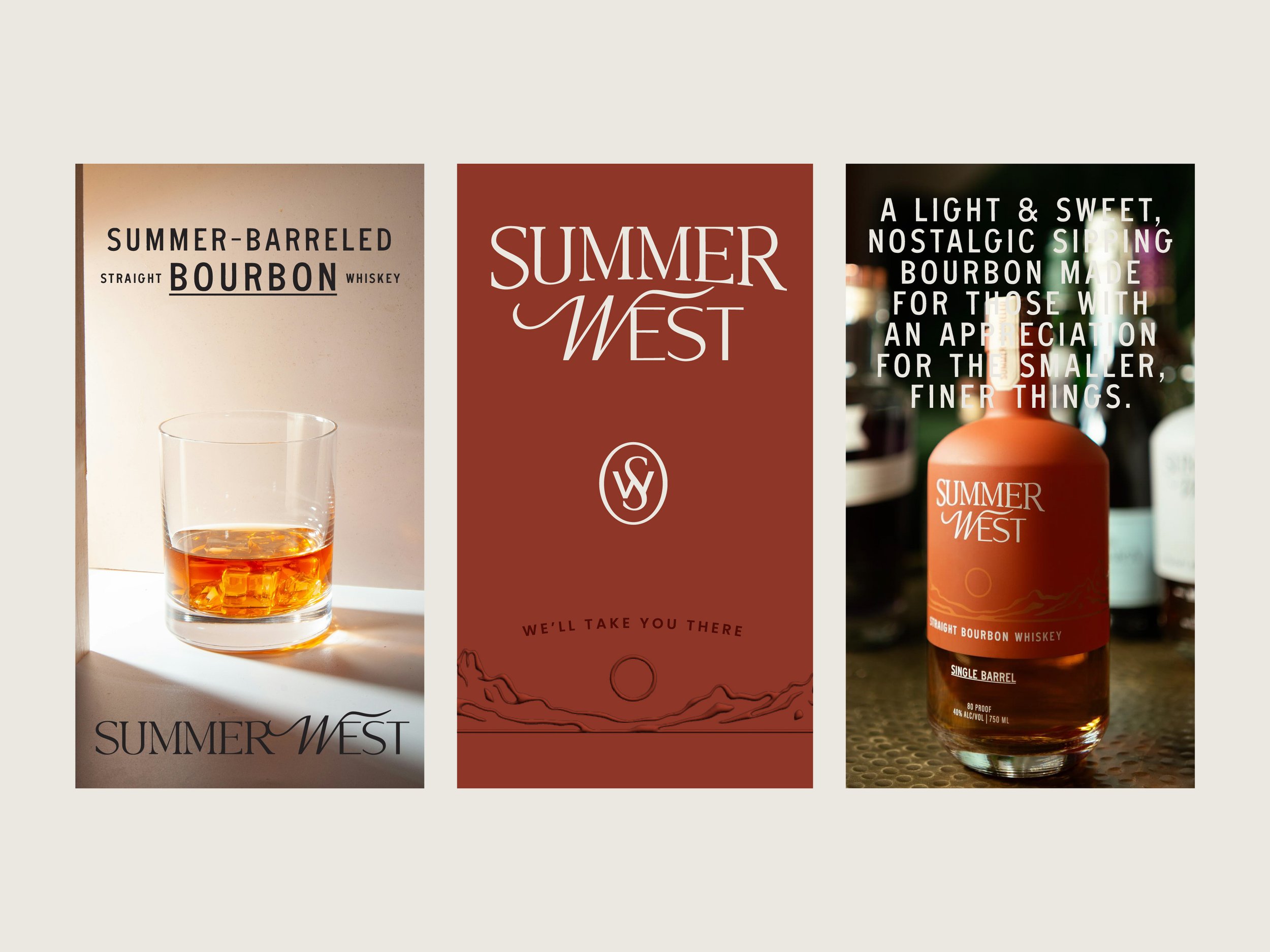
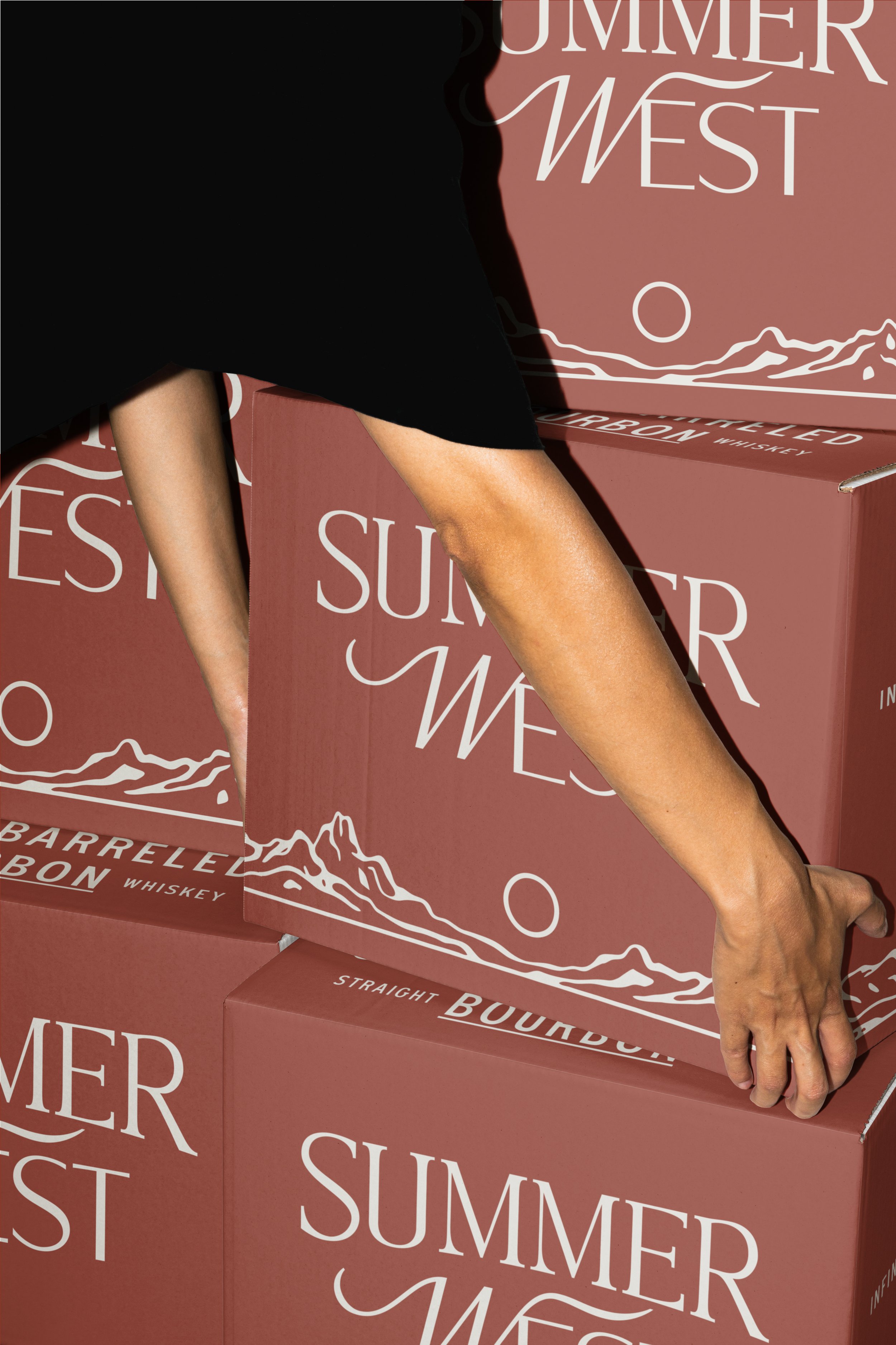
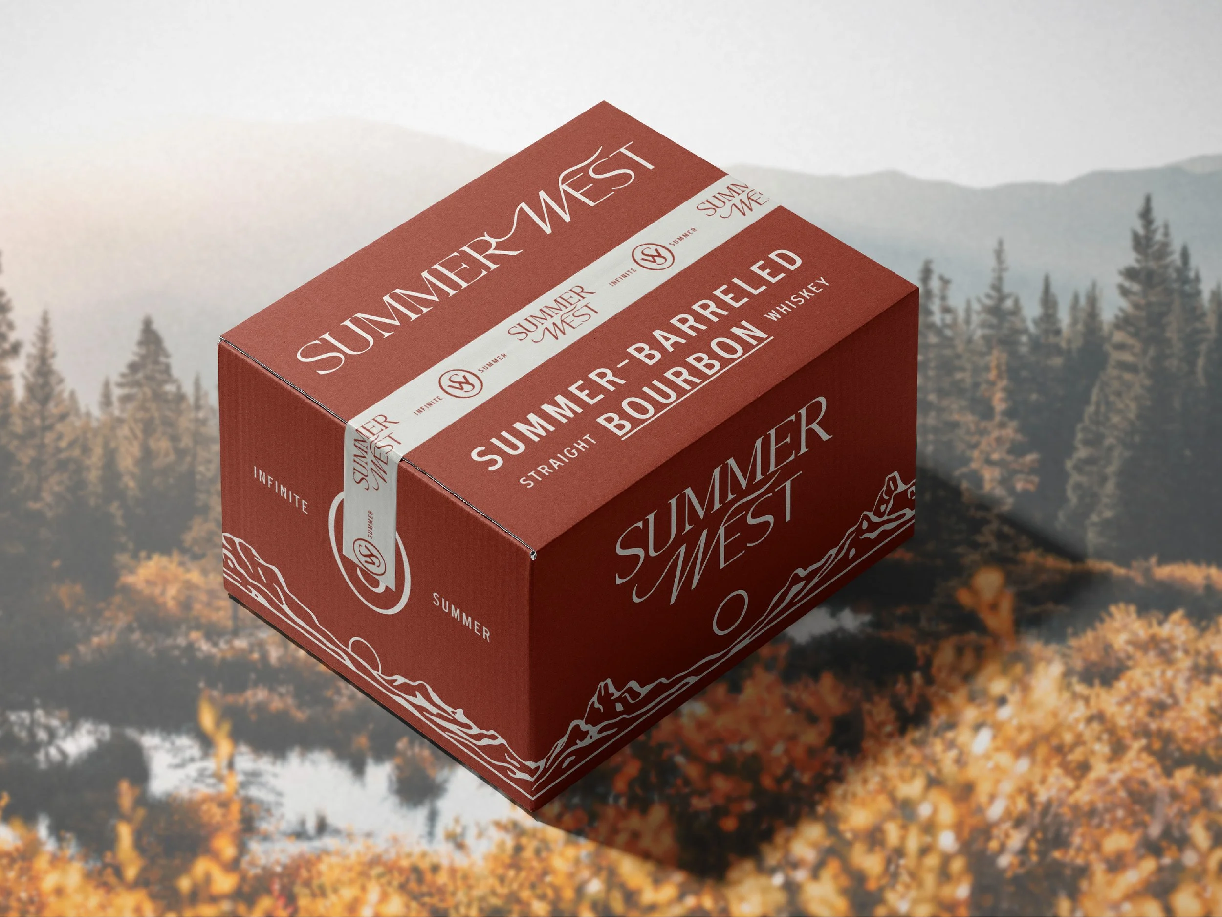
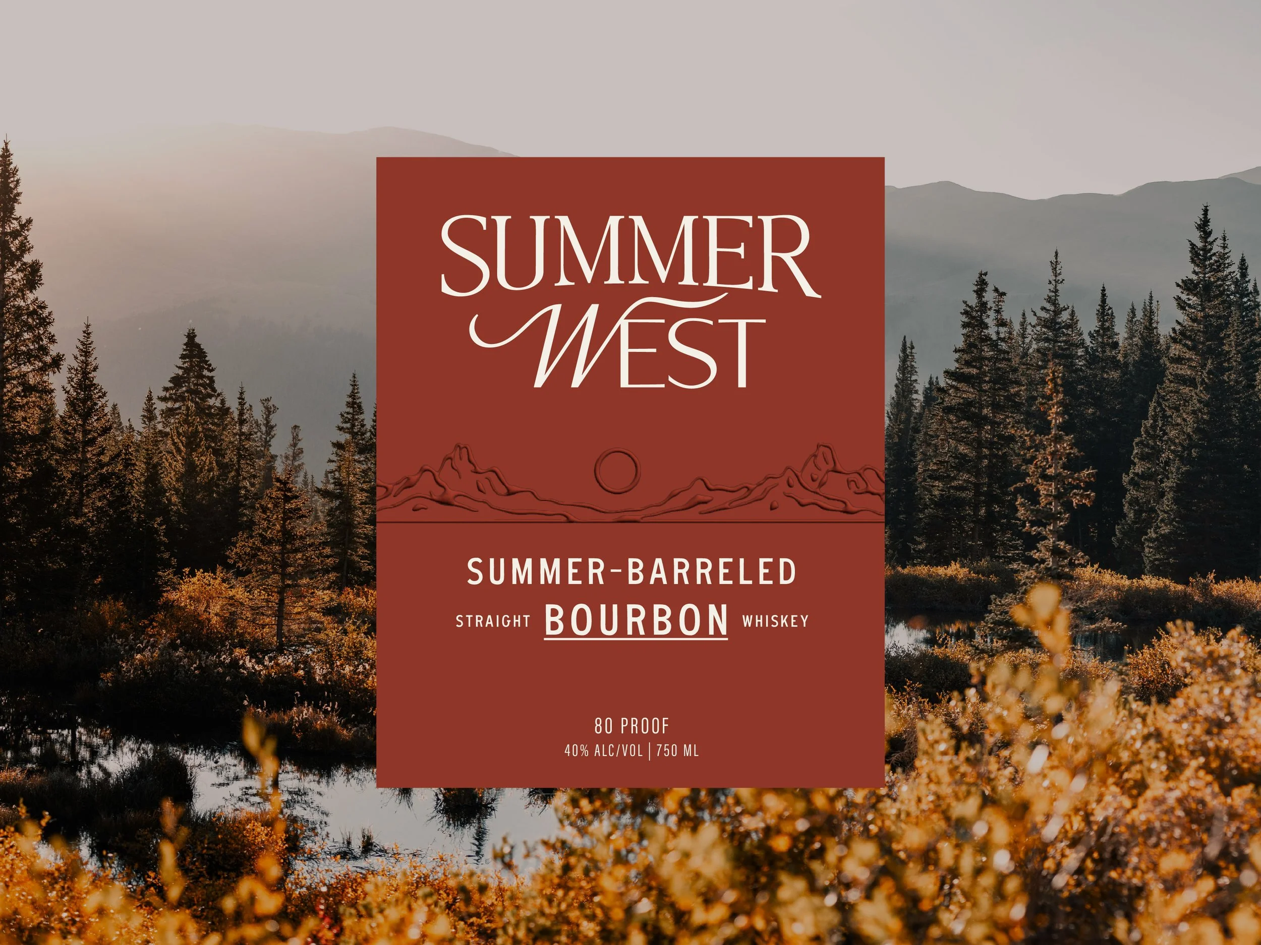
The visual identity for Summer West Bourbon references classic whiskey design language to establish credibility, then pushes select elements to feel more contemporary and create distinction.
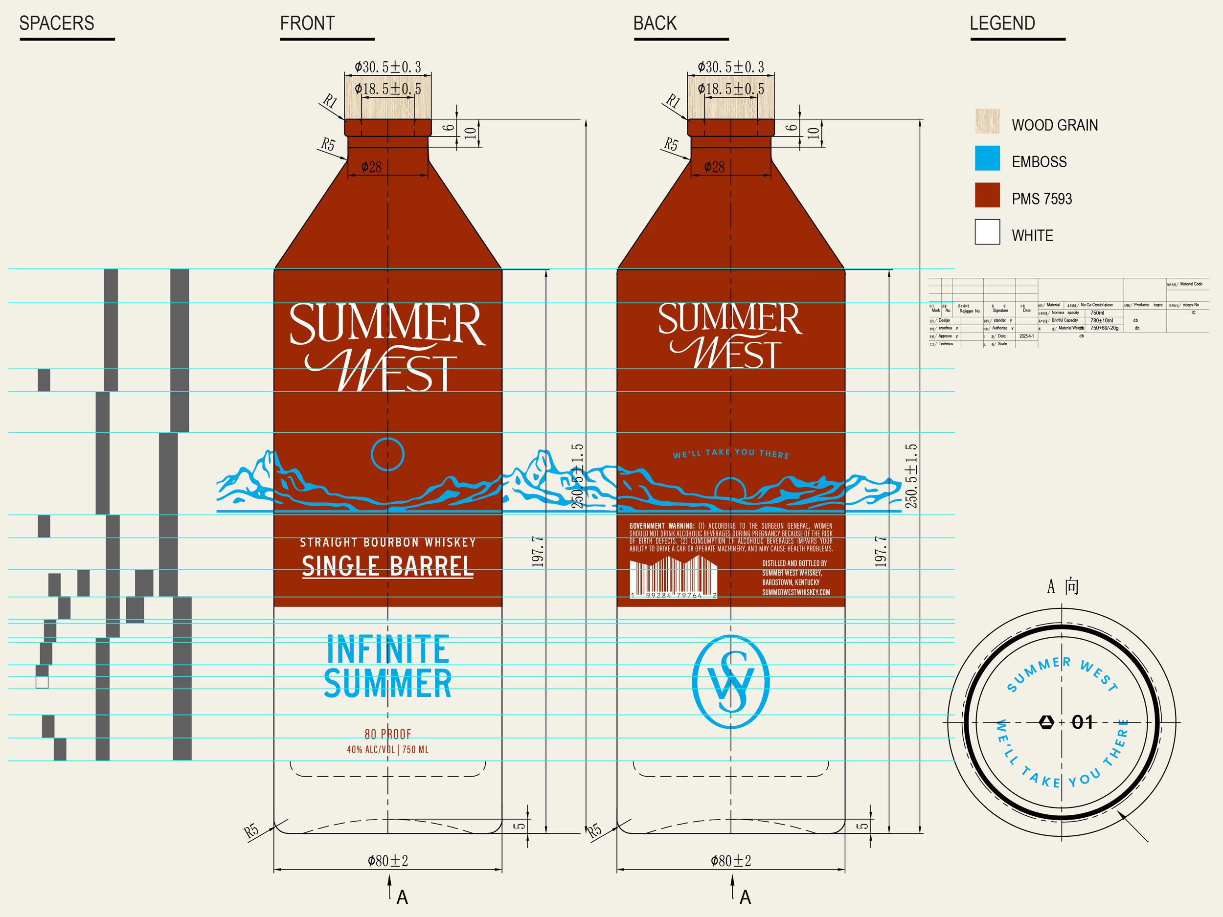
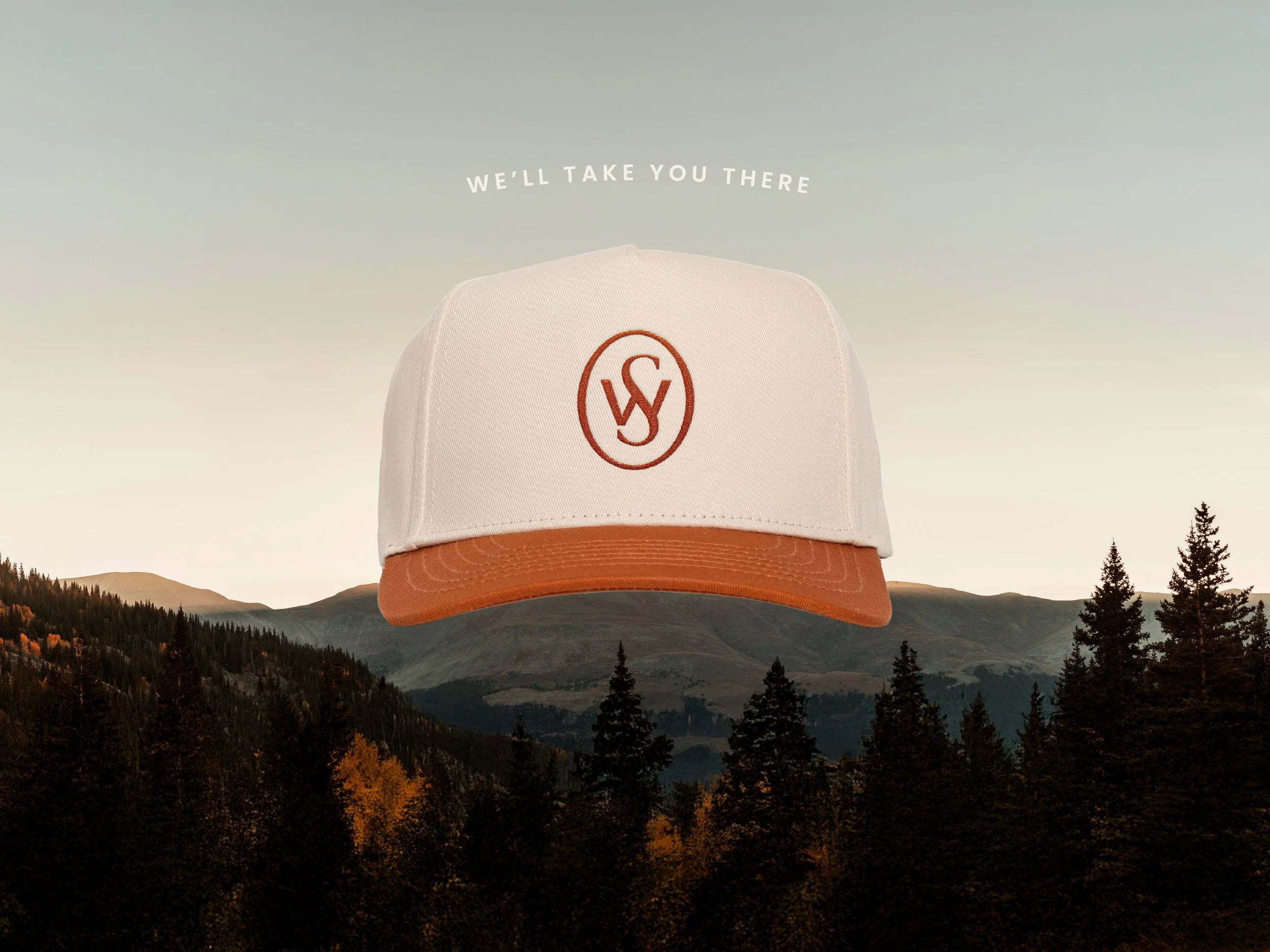
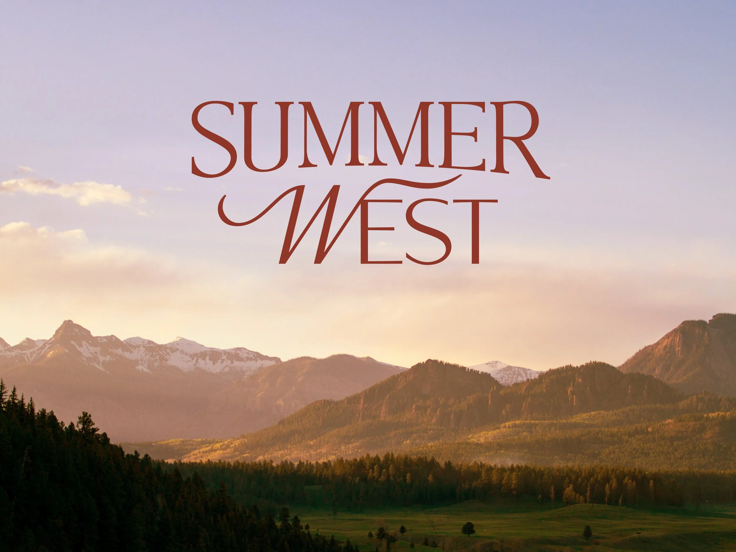
The logotype nods to traditional bourbon typography with a modern edge. The swashes on the “W” in West introduces a sense of movement, reflecting the fleeting nature of summer itself. A custom mountainscape illustration inspired by Fairplay, Colorado grounds the brand in place, evoking long summer days, setting suns, and the moments when bourbon is meant to be enjoyed.
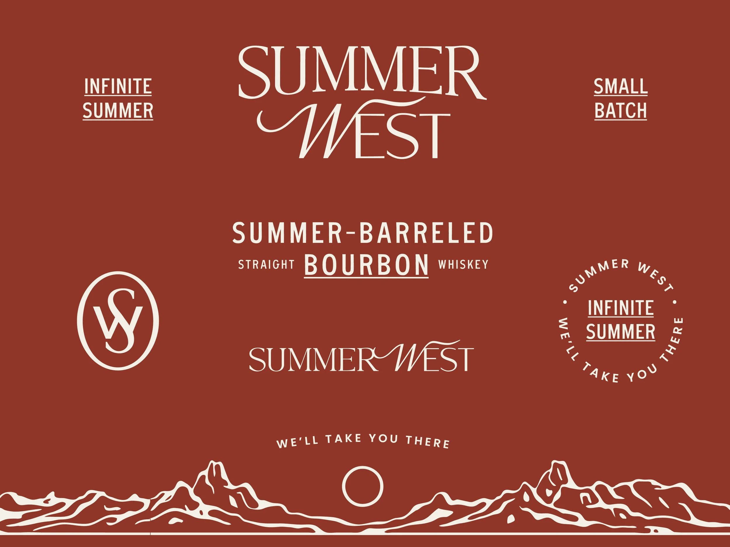
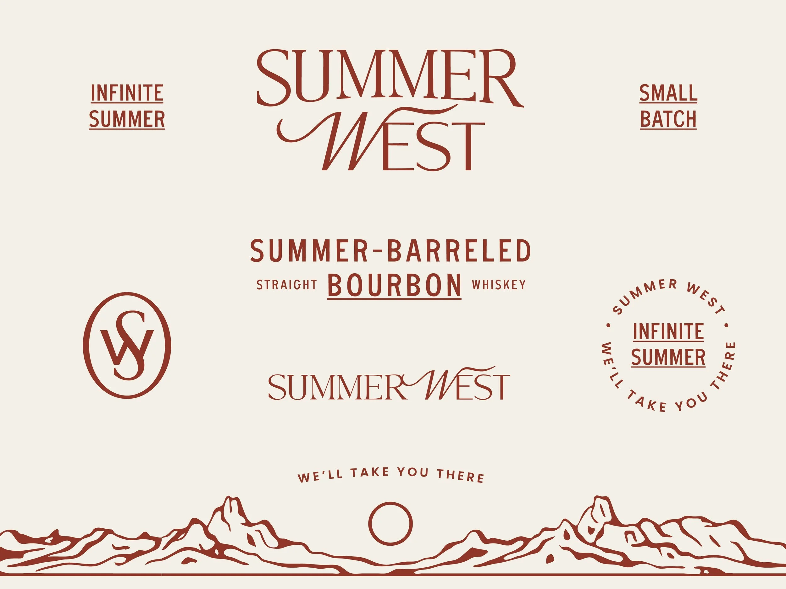
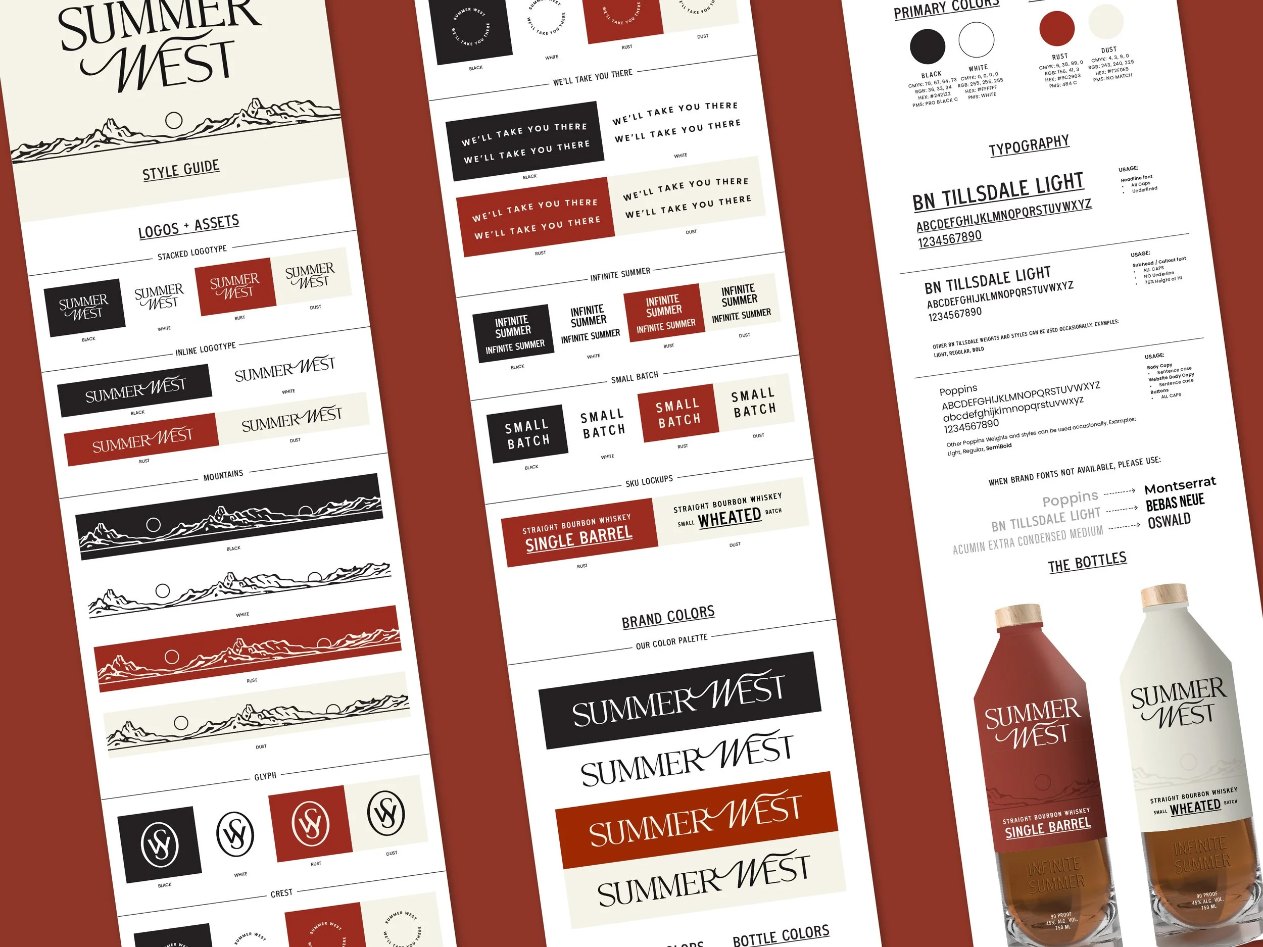
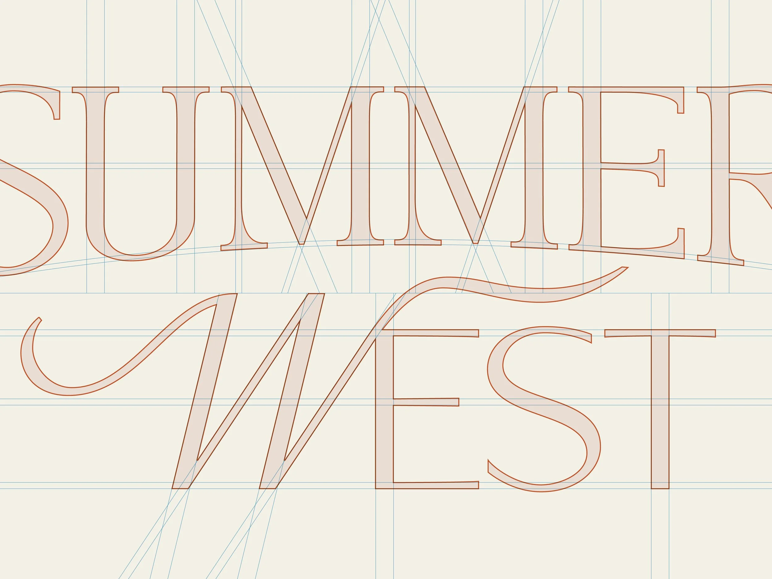
Logotype
The wordmark is a completely customized version of Pearl, by Tan Type Co.
The logotype’s evolution draws from classic whiskey typography and incorporates a contemporary sensibility. This grounds the brand in heritage while positioning it for a new generation of bourbon consumers.