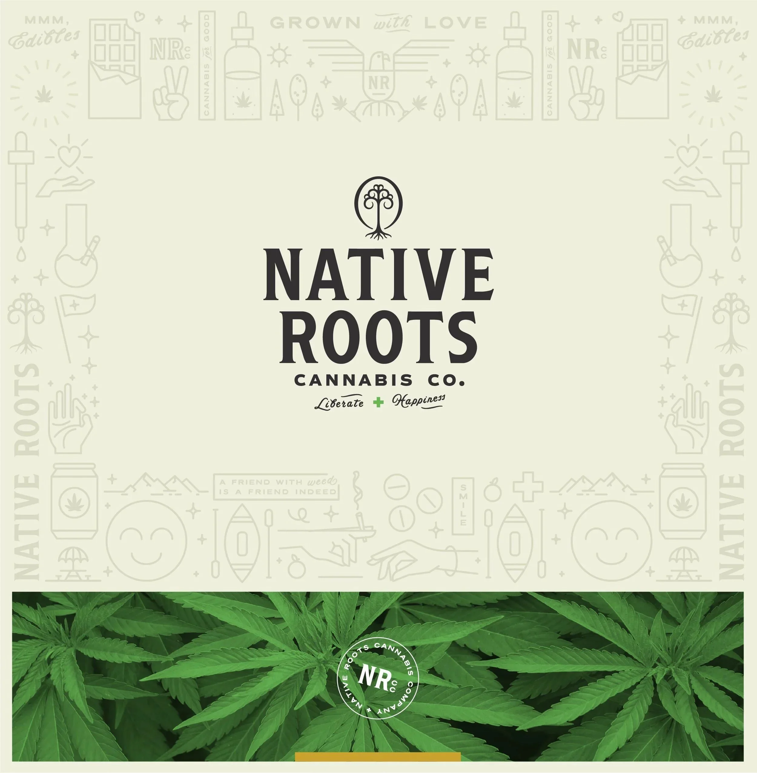
Native Roots Cannabis Company
Native Roots Cannabis Company
Rebranding and repositioning Colorado's largest cannabis dispensary.
Client
Native Roots Cannabis Company
Services
Art Direction, Logo and Brand Design, Identity and Collateral Design, Illustration
Credits
Art Direction & Principle Designer: Adam Vicarel
Design: Becca Reitz
Animation: Greg D'Amico
Photography: Jason Siegel, Justin Walker
The Opportunity
Native Roots, the largest dispensary in Colorado, acknowledged that their target audience was evolving. The brand was catered to a consumer base of rebels and pot heads, but they saw a need to capture more of the light/occasional audience, someone who would have been turned off by Native Roots' previously aggressive and fragmented brand.
The Solution
By taking the most iconic elements of this brand and rethinking their application, appearance, and strategy, we helped leverage established brand equity while repositioning Native Roots as a refined, timeless, and knowledgable brand with a whimsical nod.
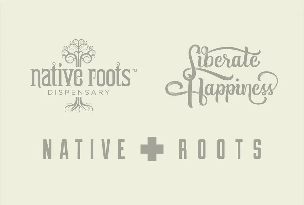
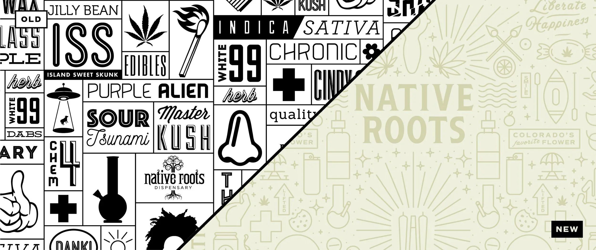
Before: the brand was using two different logos and an illustrative tagline
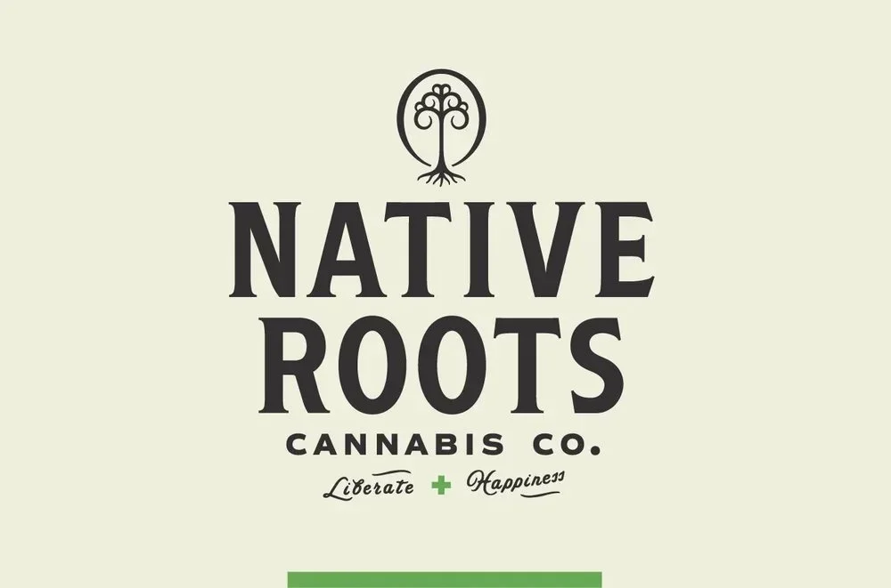
After
Many key stakeholders and employees had a strong affinity for the old brand, so we created a before/after video to show that not only were their opinions heard, but that the updates we made were a clear evolution that was rooted in the history of the brand.
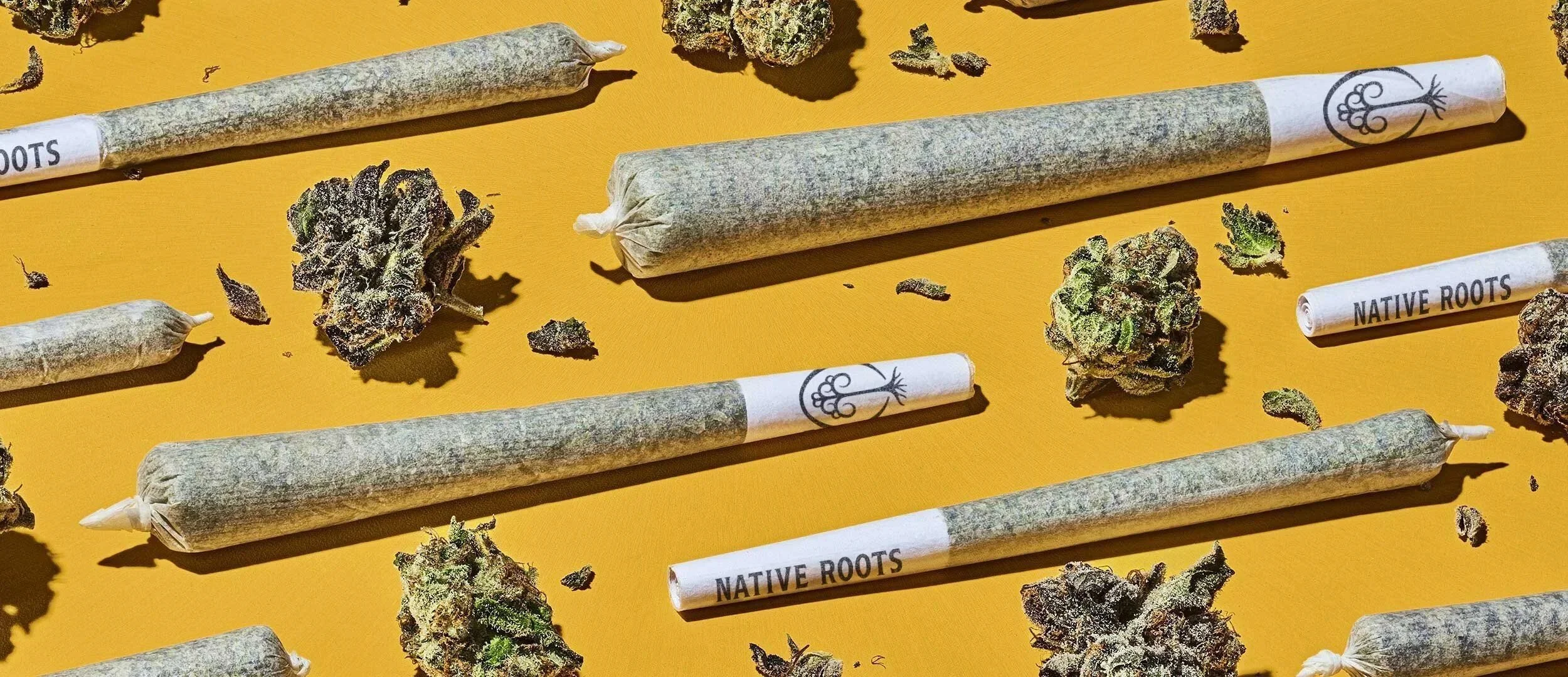
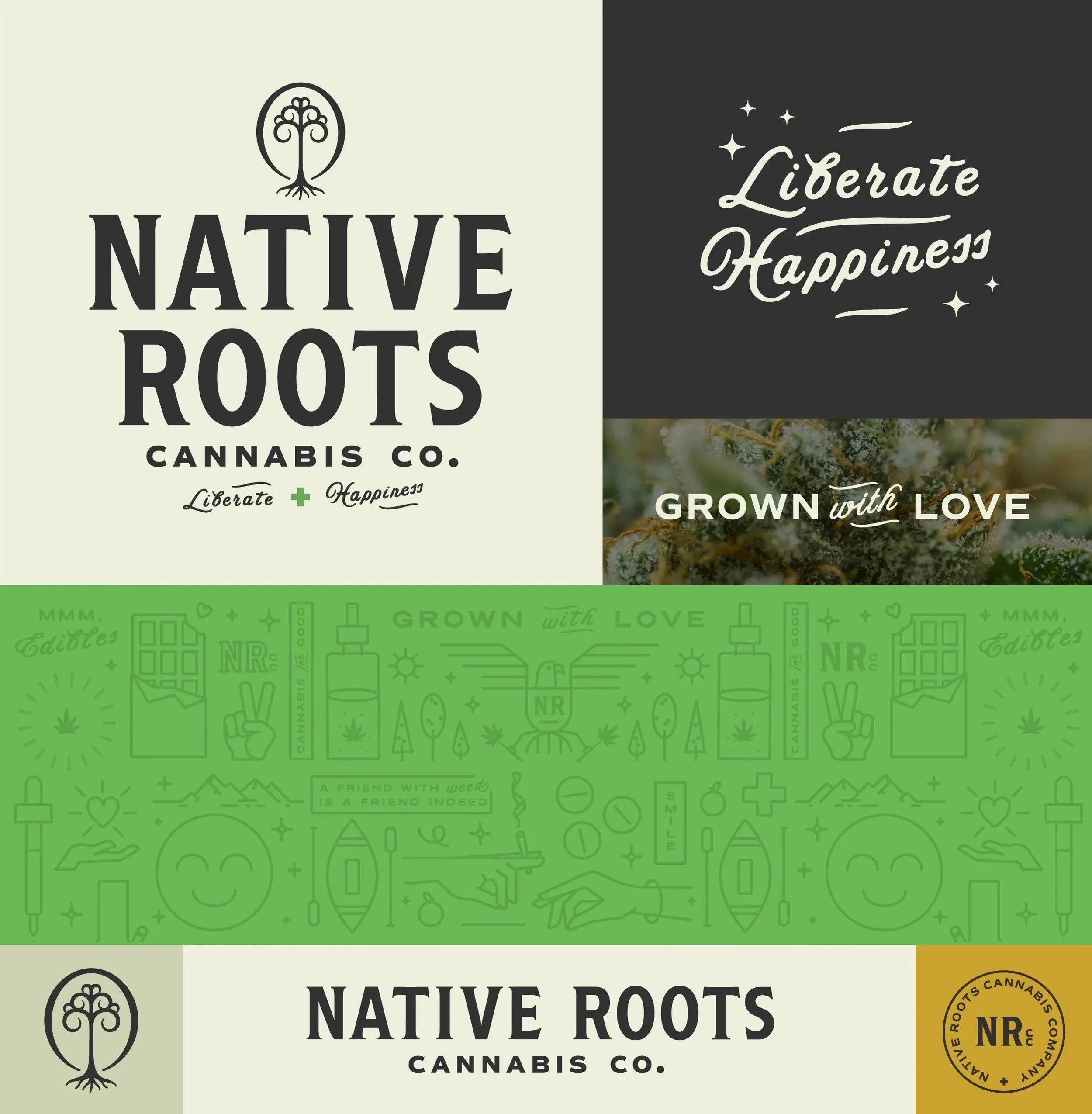
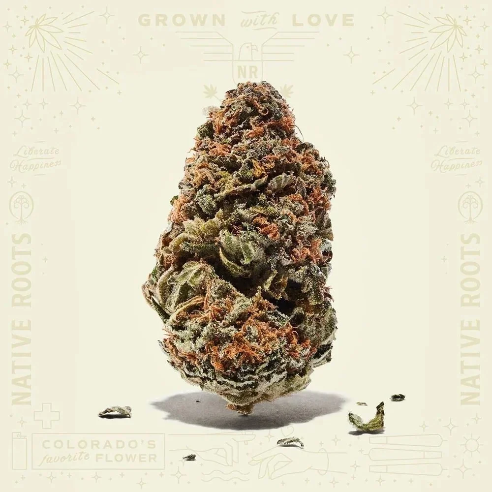
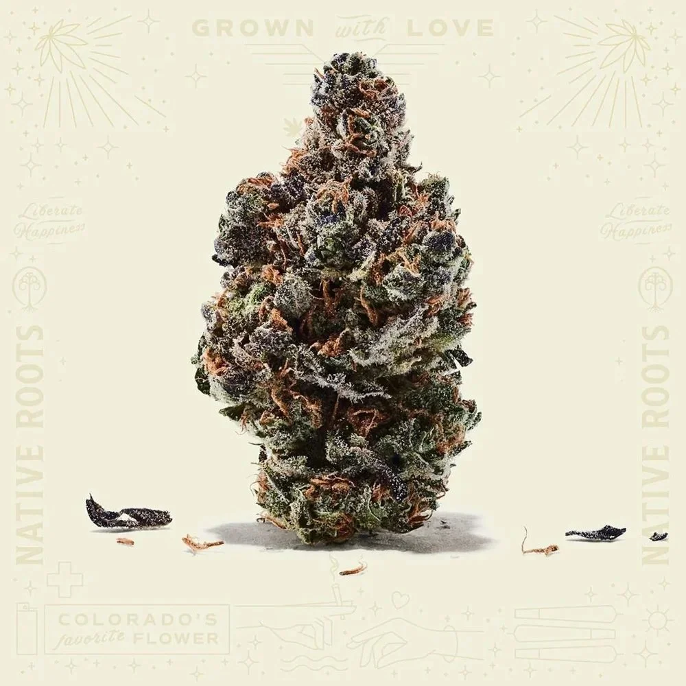
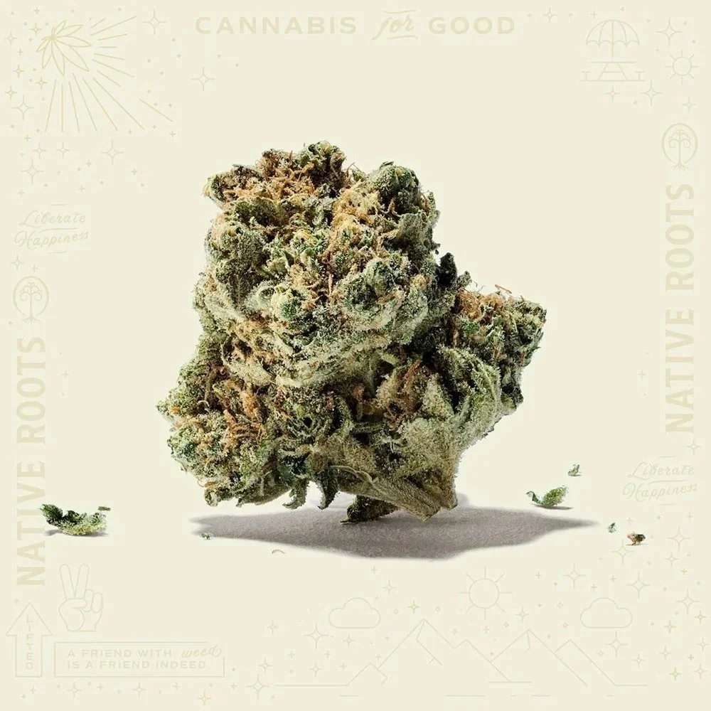
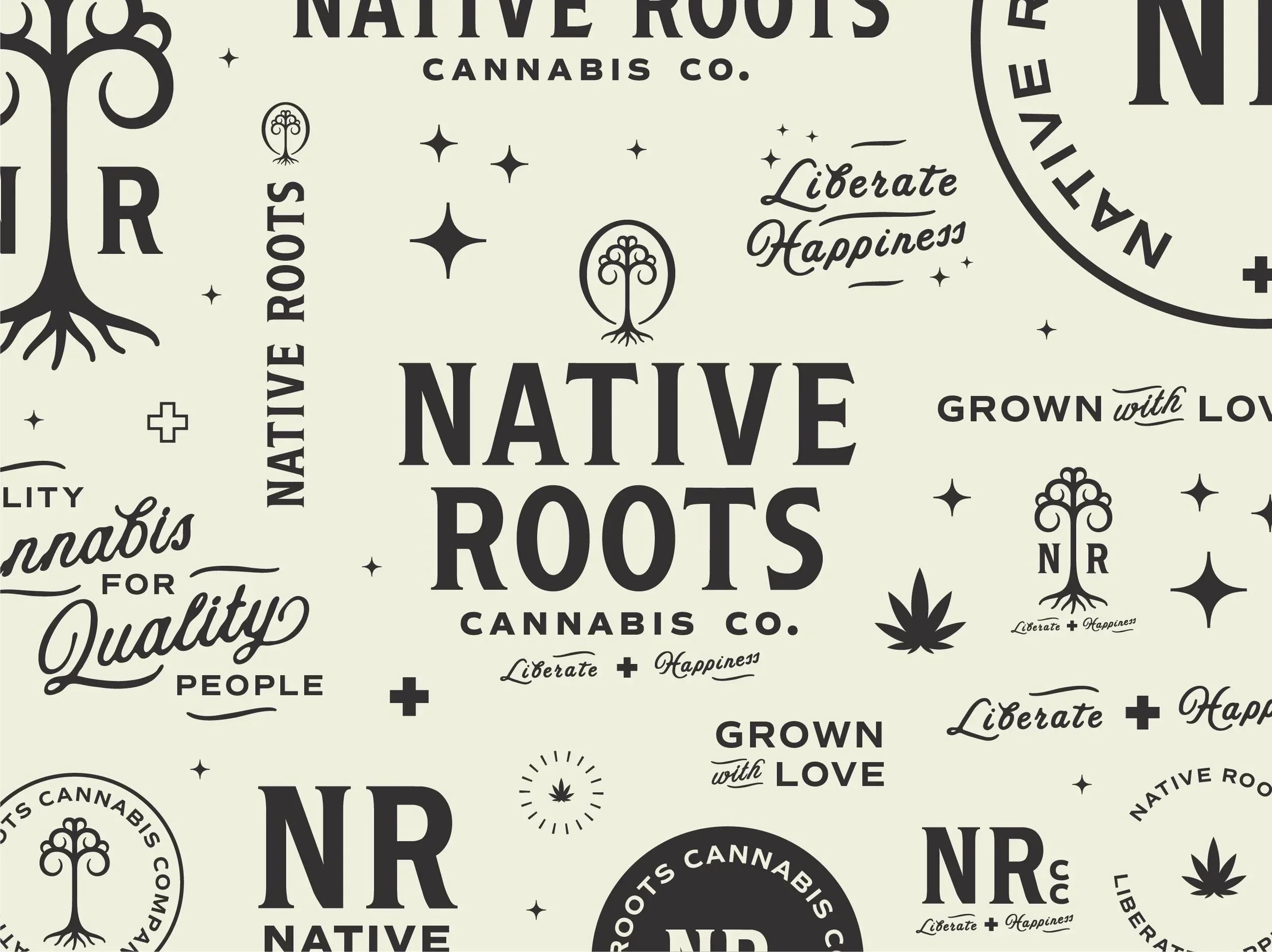
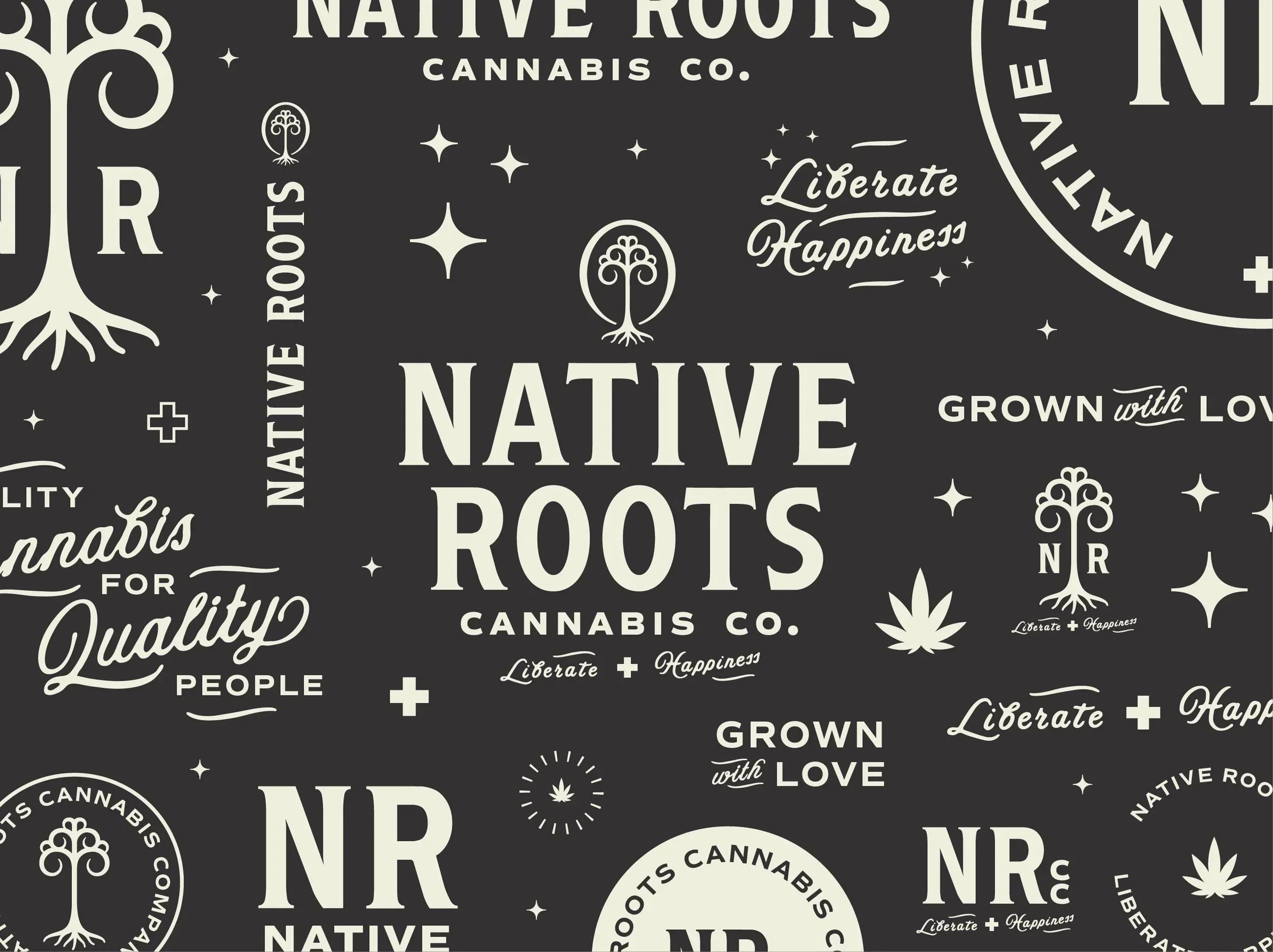
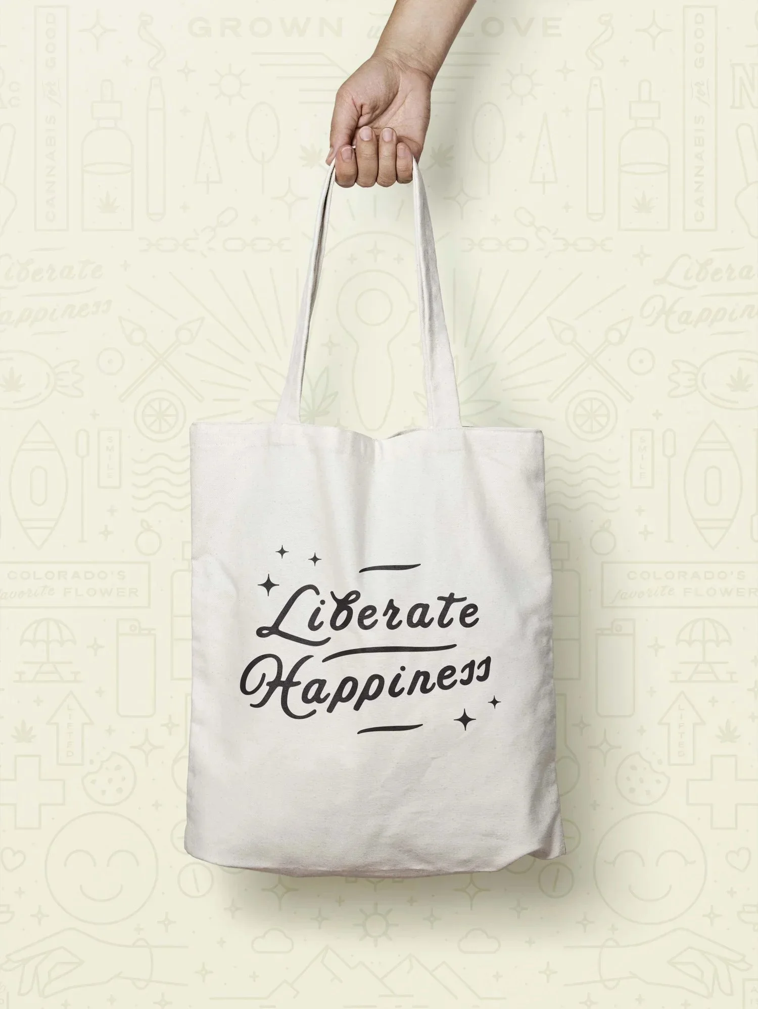
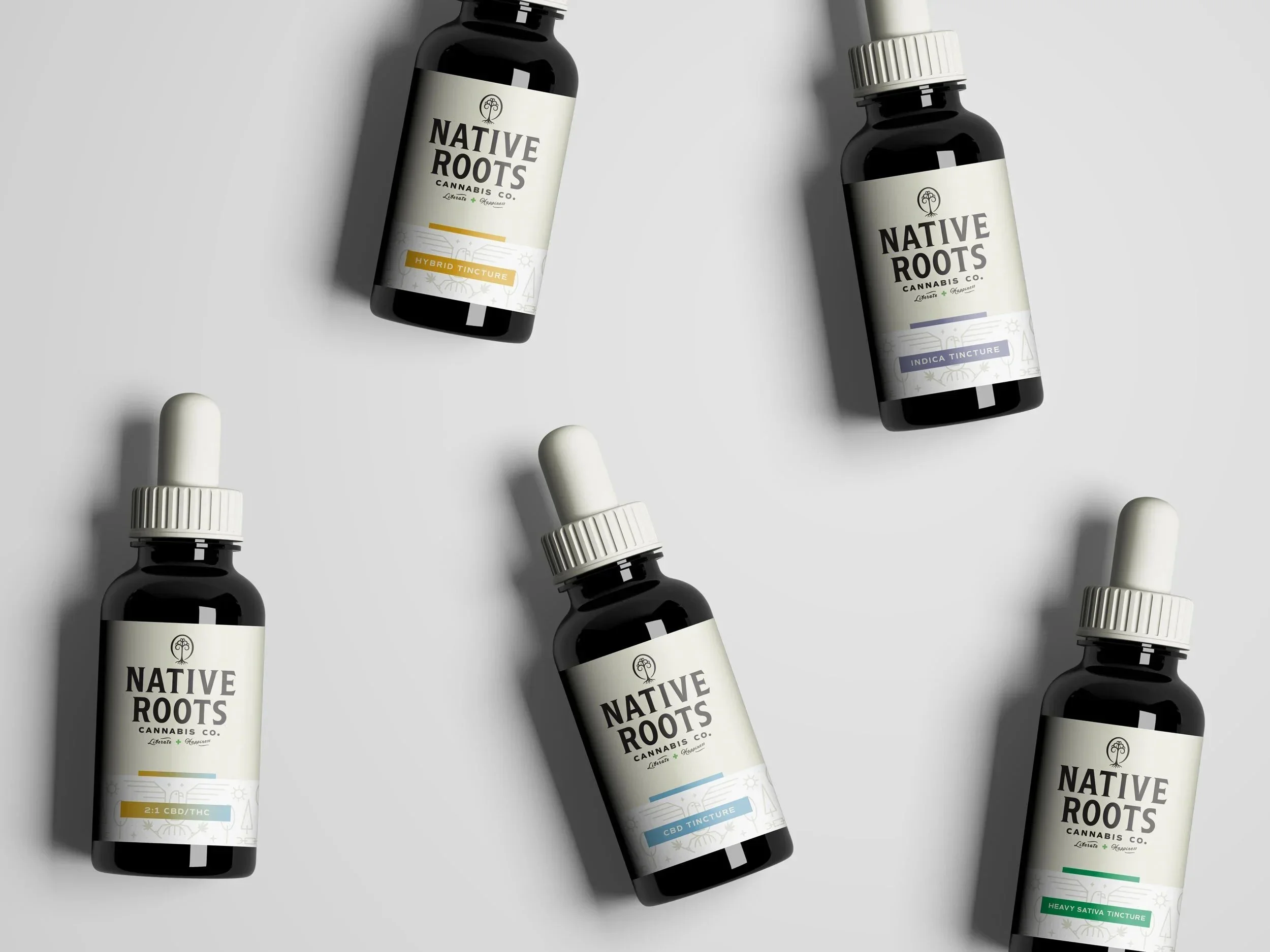
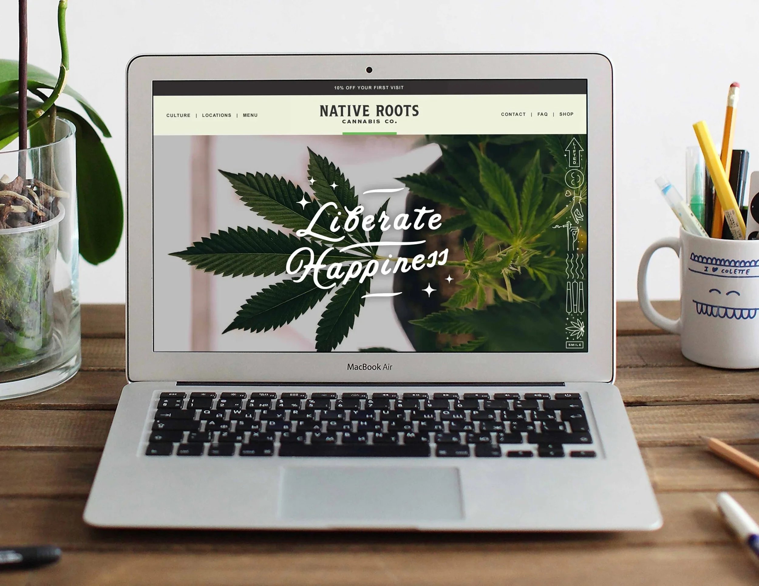
Visual Identity
Strategically rethinking and reworking the logos, word marks, and illustrations to find consistency, simplicity, and relevance helped add new layers of depth, cohesion, and sophistication to the Native Roots visual identity. This approach helped unify the formerly disparate brand elements and allowed Native Roots to lean into current brand equity while making significant strides towards reaching a larger, growing market.

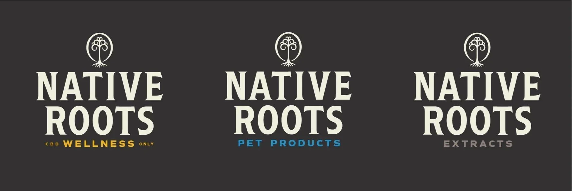
Responsive Branding
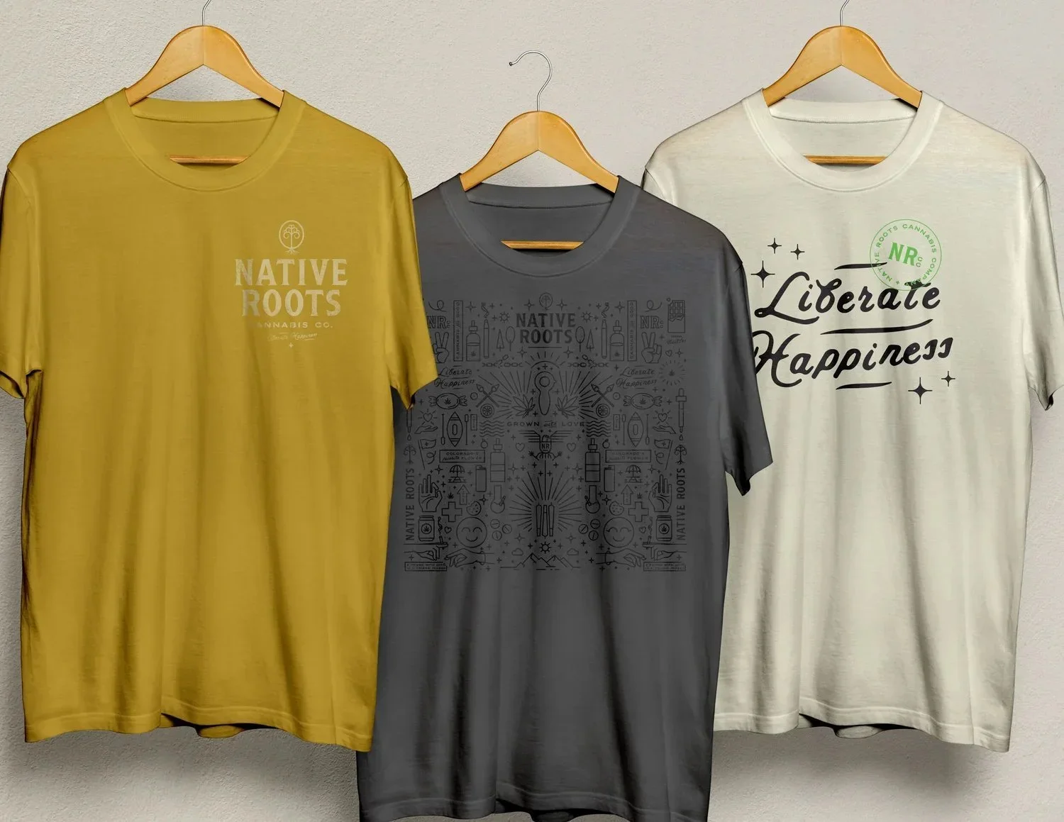
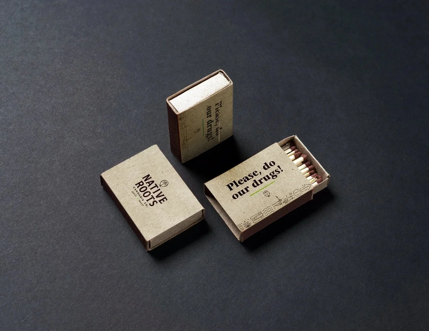
We developed a "visual toolbox" of assets that enables the Native Roots brand to be as elastic, flexible, and adaptive as the cannabis industry itself. This expansive brand system is used across all touchpoints, both print and digital, and enables the brand to remain adaptive in this ever-evolving industry.
Our Approach
We started with a rigorous discovery phase that consisted of dozens of stakeholder interviews, in-depth audits of marketing research materials, and a deep dive into the history of the brand and various design artifacts. Our design solution provided an identity that not only paid homage to the heritage of the brand, but also offered a solution for where the brand needs to go in the future.
“Their ace design team was deeply embedded and collaborated with dozens of internal stakeholders, but also brought a completely fresh perspective and ‘beginners eyes’ that allowed our business to achieve a true quantum leap in our branding and communications.”
— Chris Znerold / CMO of Native Roots
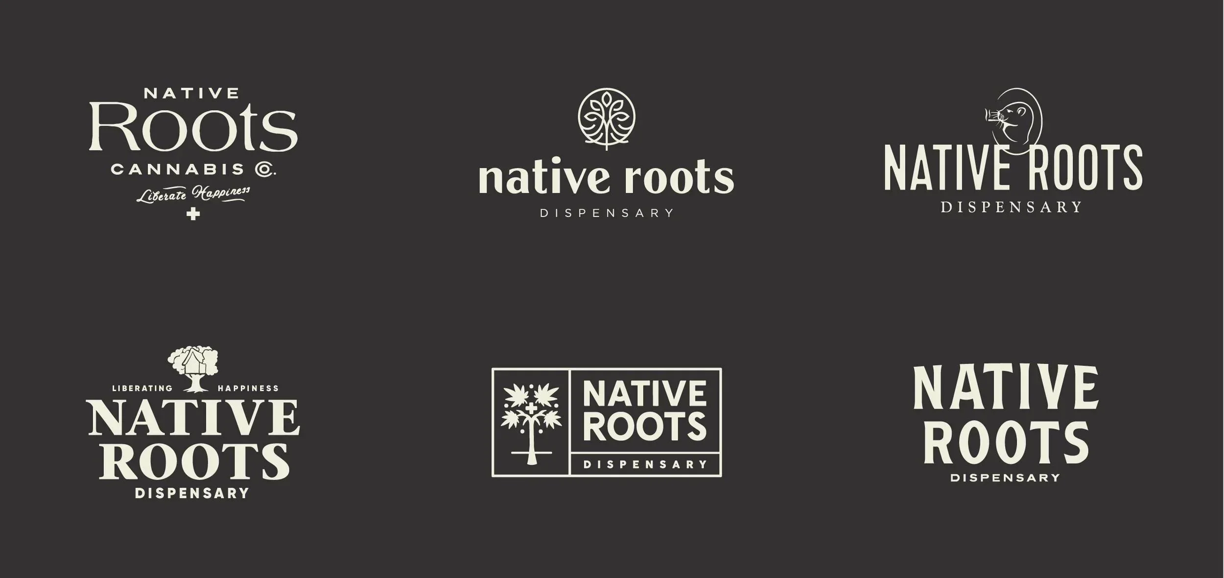
Process
The tree had built up a good deal of brand equity, and it was the physical embodiment of the company’s “roots” — where they had come from. With that known, we knew the solution was unlikely to loose the tree completely, so we explored countless new iterations of the tree to ensure that the decided solution was founded in exploration.
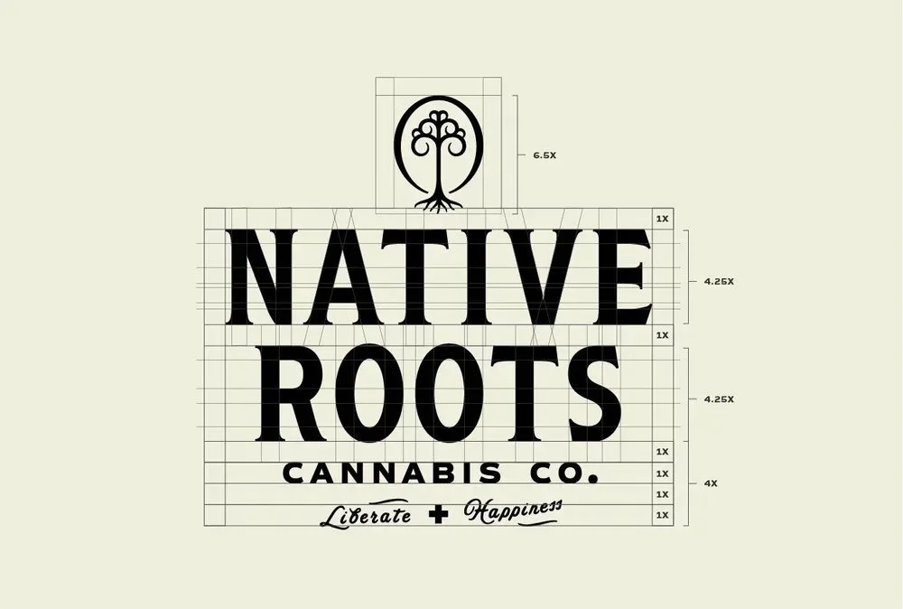
Additionally, the logotype was an evolution of their two previous logotypes. The gaudy, gothic serifs were reduced to a copper-plate style serif that carries qualities of trustworthiness and timelessness, and the tall, condensed forms took inspiration from their sans serif logotype which had a clean, modern, approachable look.
Each of the additional elements were considered and reworked as to best fit the updated brand positioning of Native Roots
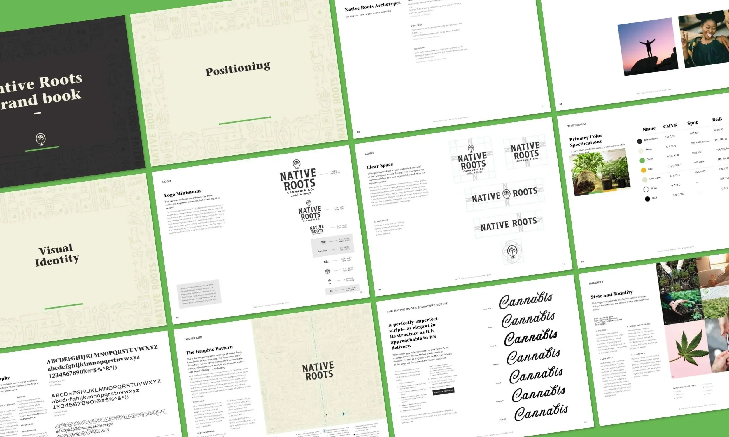

A comprehensive 63-page brand standards document was created to ensure a smooth handoff from our team to the Native Roots implementation team without fear of compromising the integrity of the design system created.

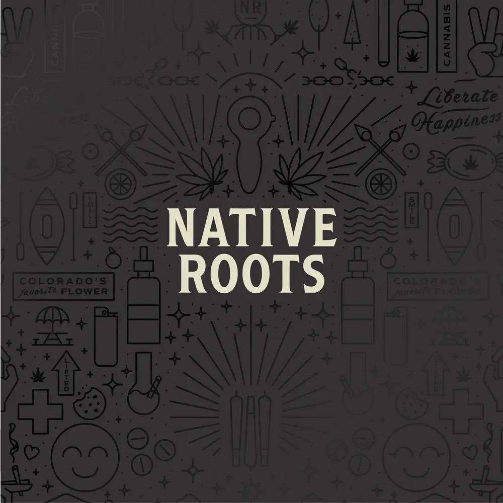
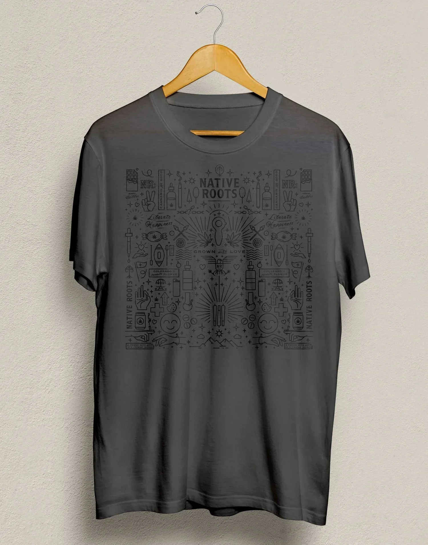

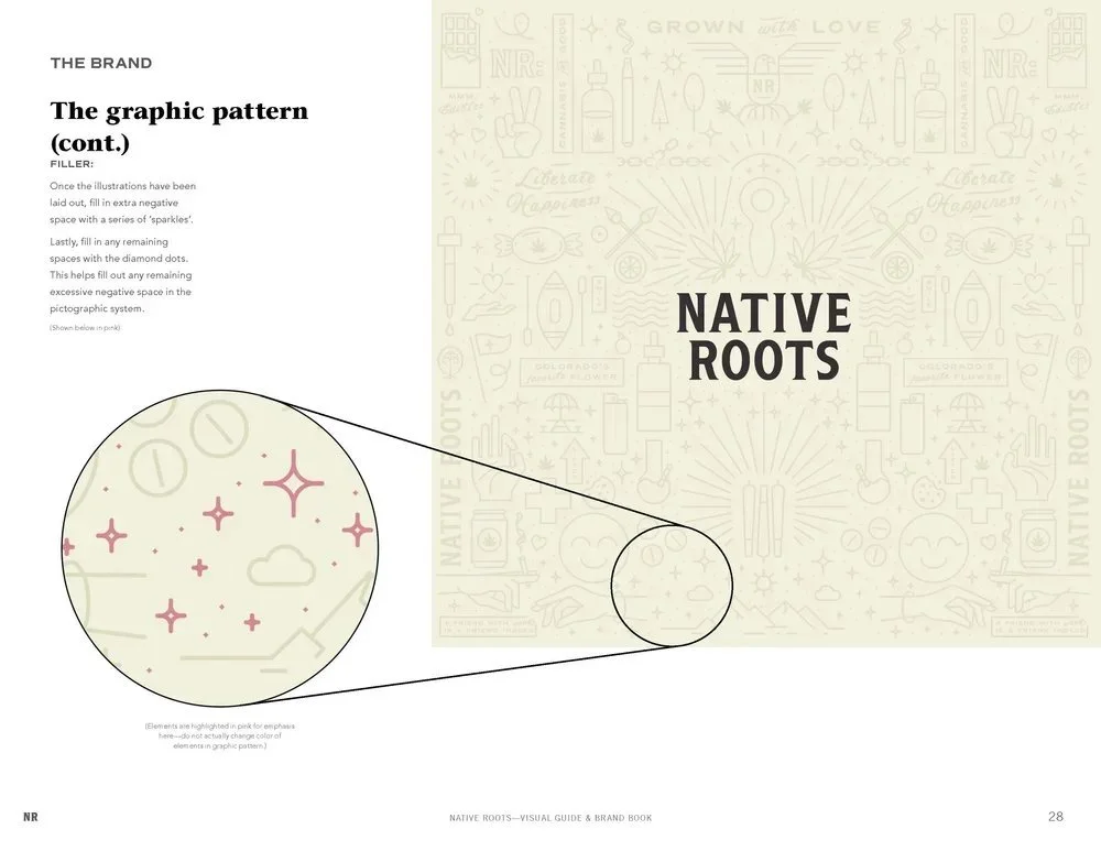
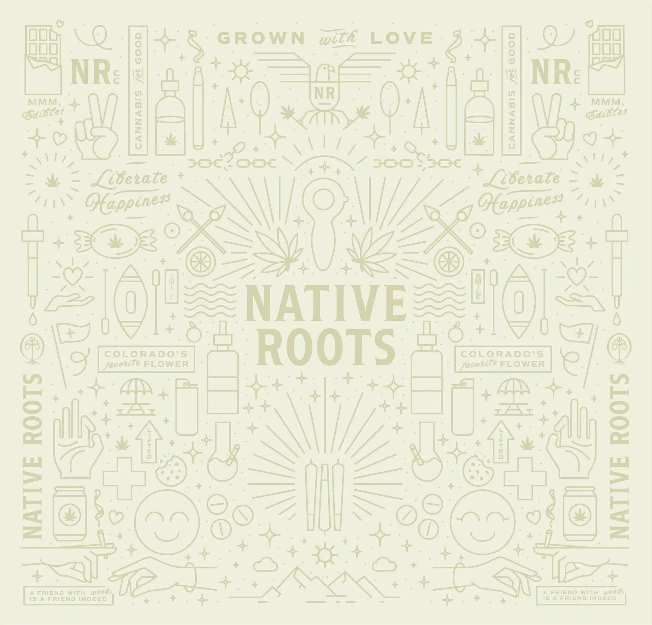
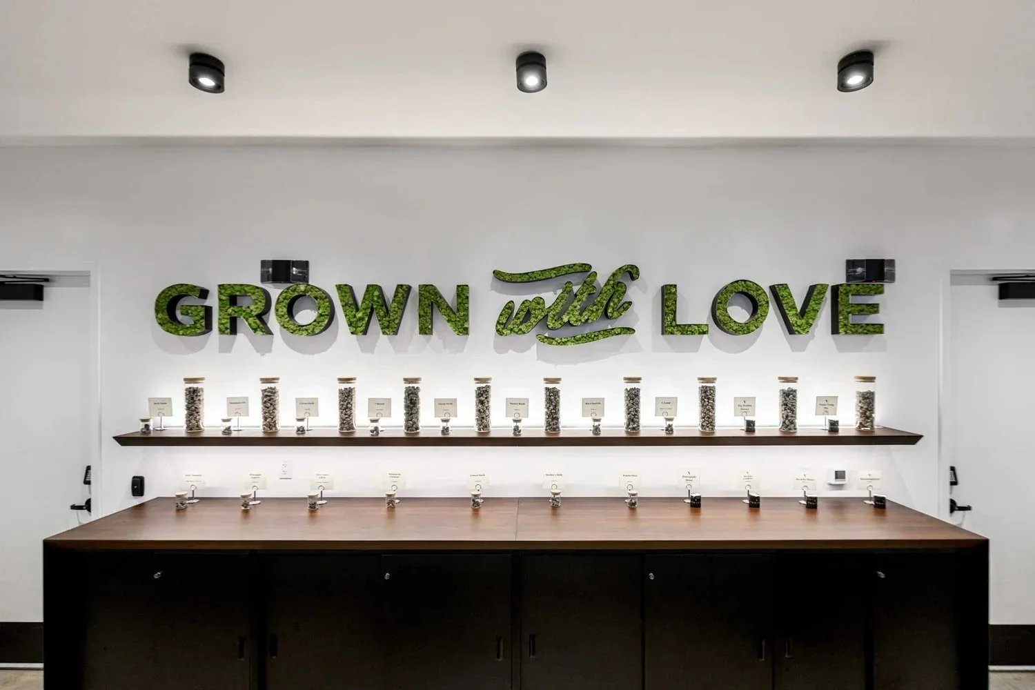
The Wallpaper Pattern
The updated system of icons is an intentional amalgamation of brand, product, and experience-based communications. Intended to constantly evolve and change with both the business and the industry, these were created in an easy-to-replicate mono-line style. The warmer, tone-on-tone application makes for a significantly more approachable wallpaper and brand pattern.

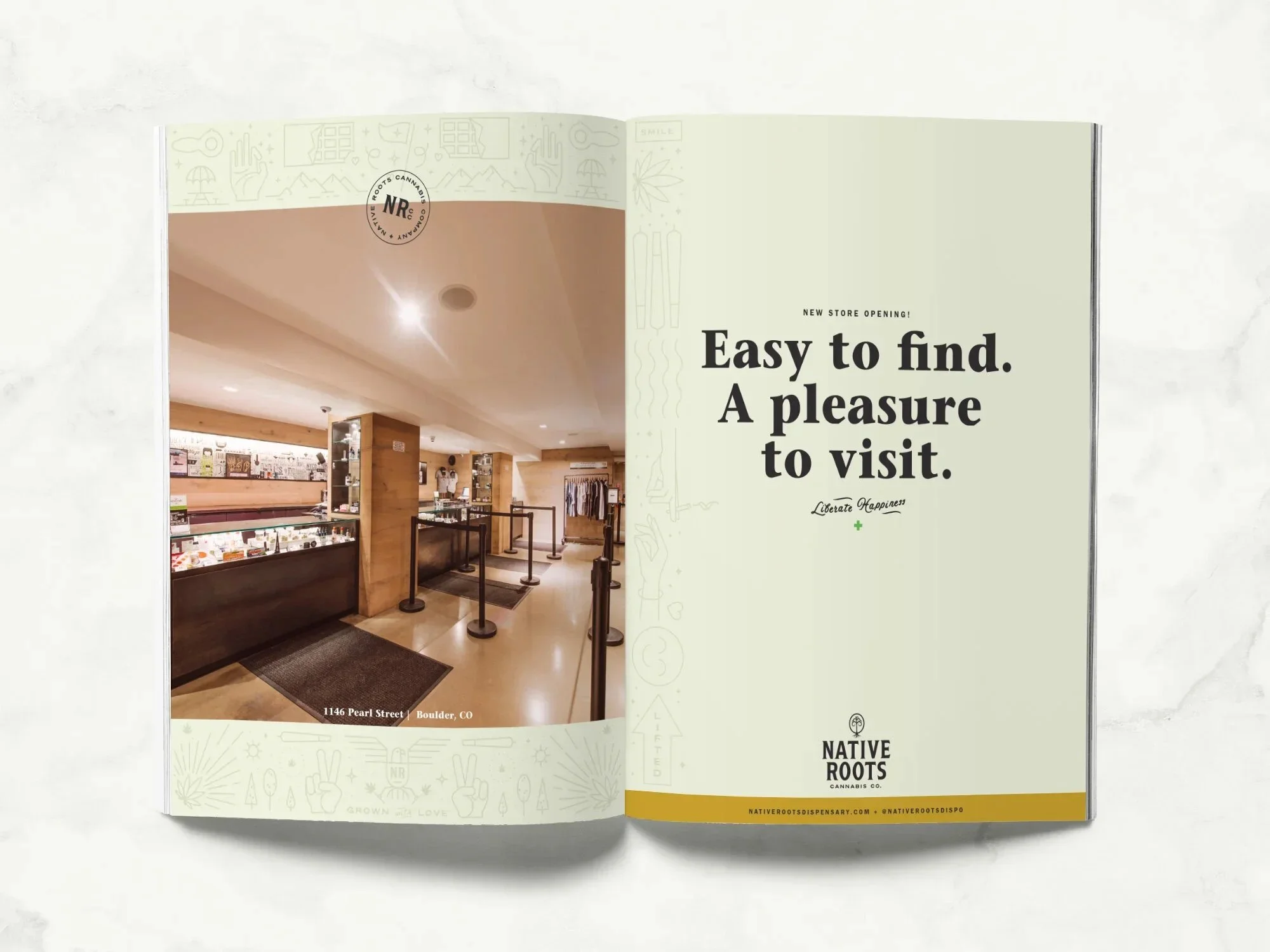
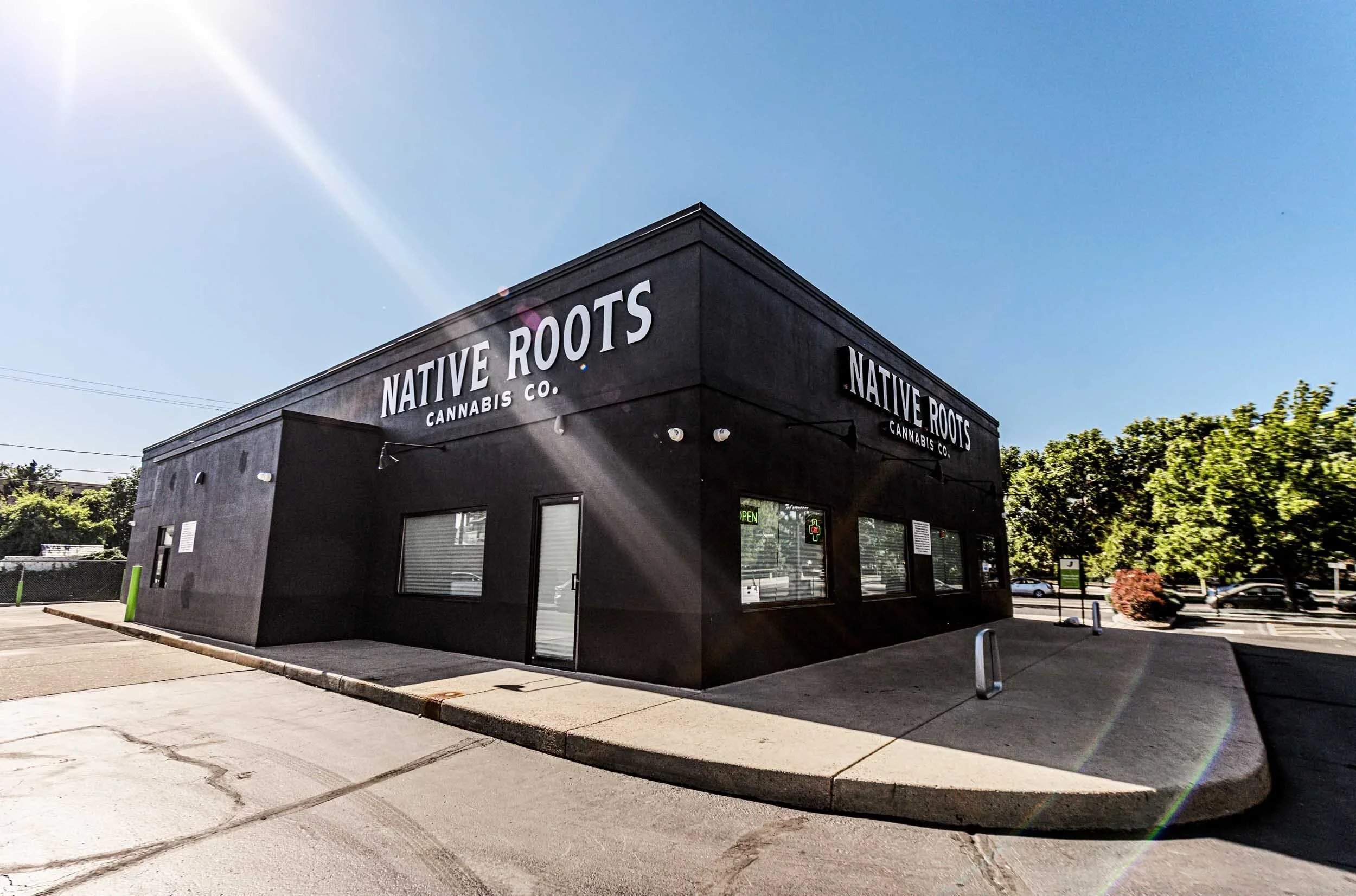
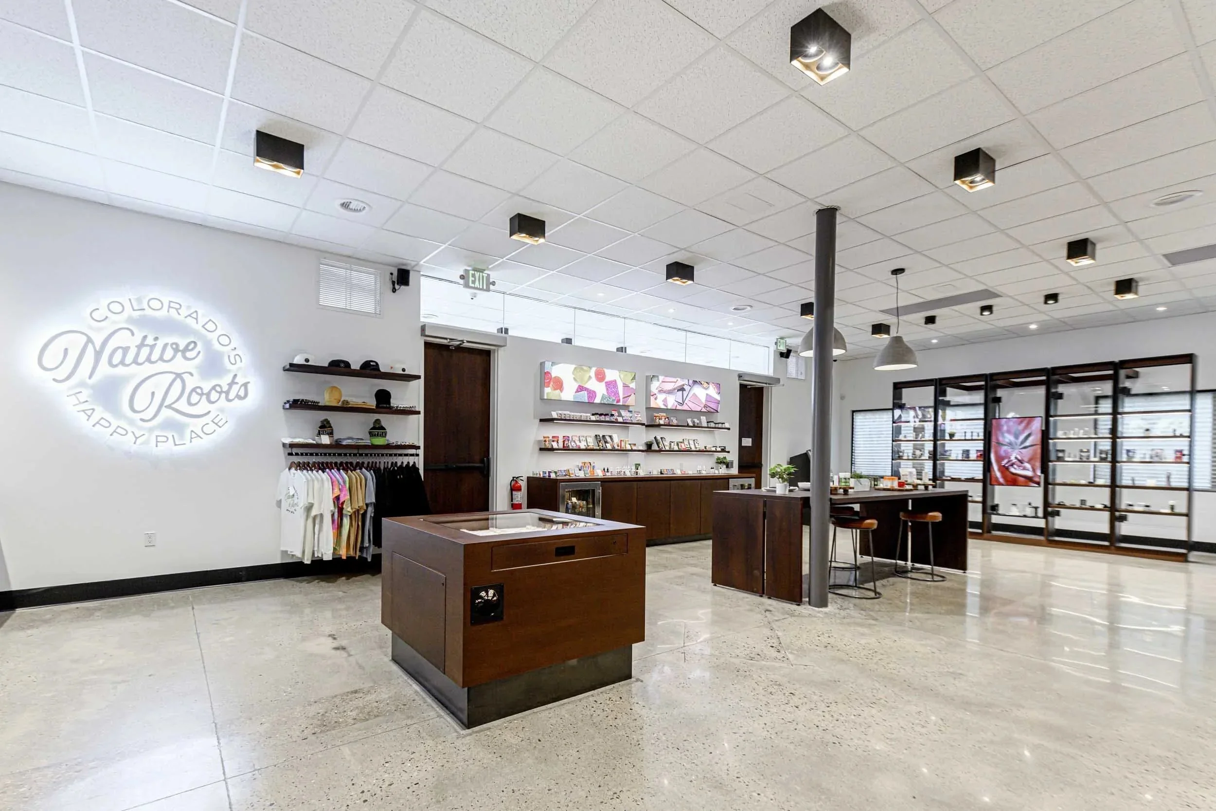
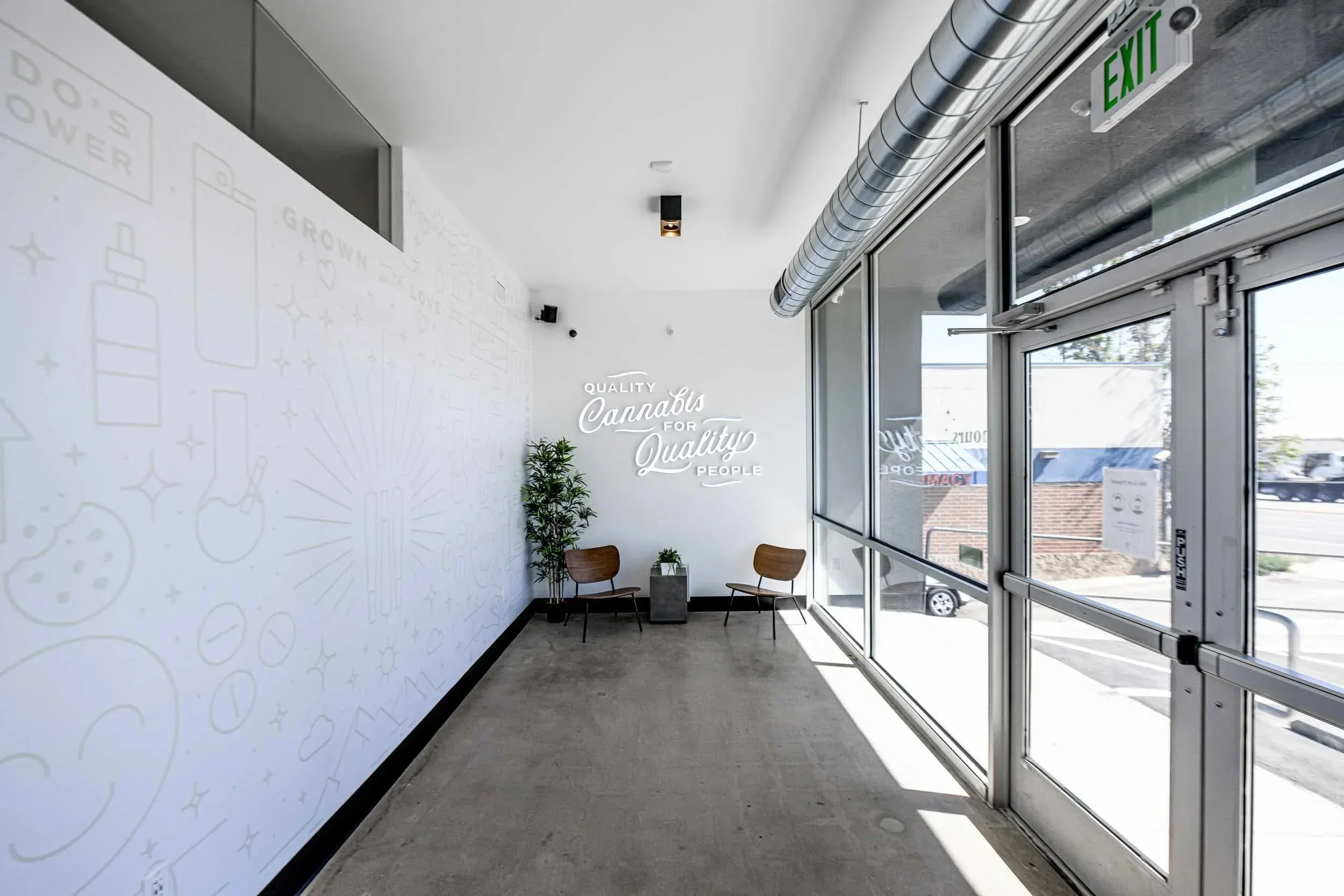
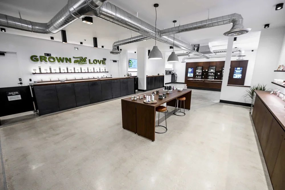
Interior and Exterior Signage
Utilizing the new brand assets created, the interior and exterior signage strikes a balance between premium and approachability. Ranging from extruded, back-lit signs to hollowed out letterforms filled with "grass", the signage used was yet another design element that Native Roots did not overlook.

The Results
Not only was the brand refresh warmly received by the internal team, but when faced with market testing, the results overwhelmingly showed that our brand refresh was a leap in the right direction:
78% found the refreshed interior more appealing and approachable.
62% found the refreshed brand more distinctive.
76% found the refreshed brand more visually appealing.
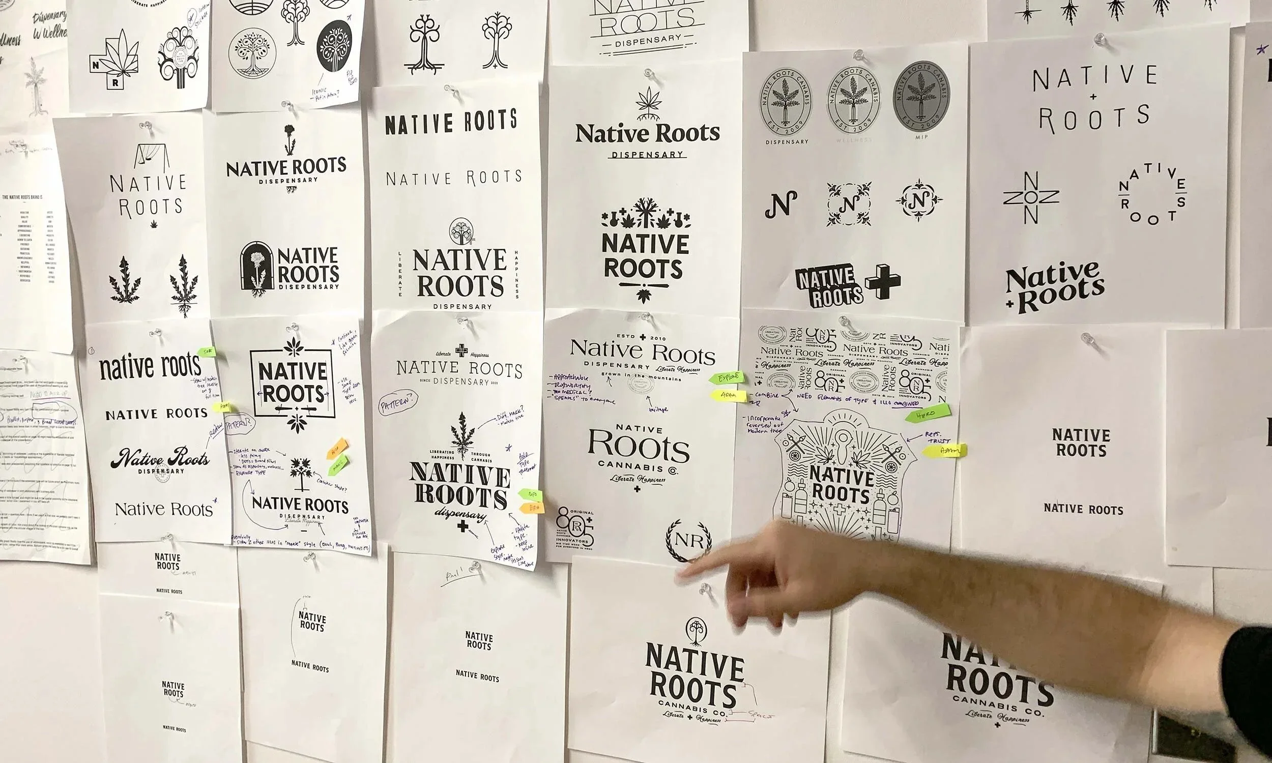
Early Exploration
Some of the preliminary brand exploration and unused concepts:

Want to see more?