Mouma’s Indian Lentil Branding and Packaging Design
Client: Mouma’s
Services: Brand Refresh, Packaging Refresh, SKU iteration, Website Art Direction, Marketing Collateral Design
Credits: Art Direction, Design: Adam Vicarel
Lead Designer: Becca Reitz
Design, Production: Carly Salzman
Bringing a taste of India to your kitchen.
The Opportunity:
Industry: Indian cuisine can feel intimidating to many American shoppers, and the lentil category feels especially uninspired, largely consisting of clear plastic bags stacked flat. The category is driven by commodity packaging rather than strong brands.
Brand: Mouma’s existing branding felt generic and chaotic, and they needed more personality to attract the semi-adventurous, health-conscious customer they were after. The brand lacked the distinctiveness and clarity needed for a contemporary CPG brand to thrive.
Mouma’s had the opportunity to reposition lentils as a vibrant, healthy, easy-to-make staple the whole family was excited to see come to the table.
The Solution:
We identified a clear target audience, and we reimagined Mouma’s as a bold, culturally rooted, and contemporary CPG brand. Through a full rebrand and packaging system update, we simplified the communications and leaned into the colorful, personality-filled aesthetic of India.
Knowing that women are ~80% of household shoppers, the design system kept them in mind. Clear front-of-pack callouts like protein, one-pot meal, and authentic spices quickly communicate ease and health for the whole family.
Brand Strategy
The lentil category is largely commoditized, driven by function, muted design, and little emotional connection. From a packaging design standpoint, lentils are treated as ingredients rather than brands.
Indian cuisine is often positioned as either overly traditional or overly simplified for Western audiences. Mouma’s had the opportunity to redefine that middle ground in a contemporary way.
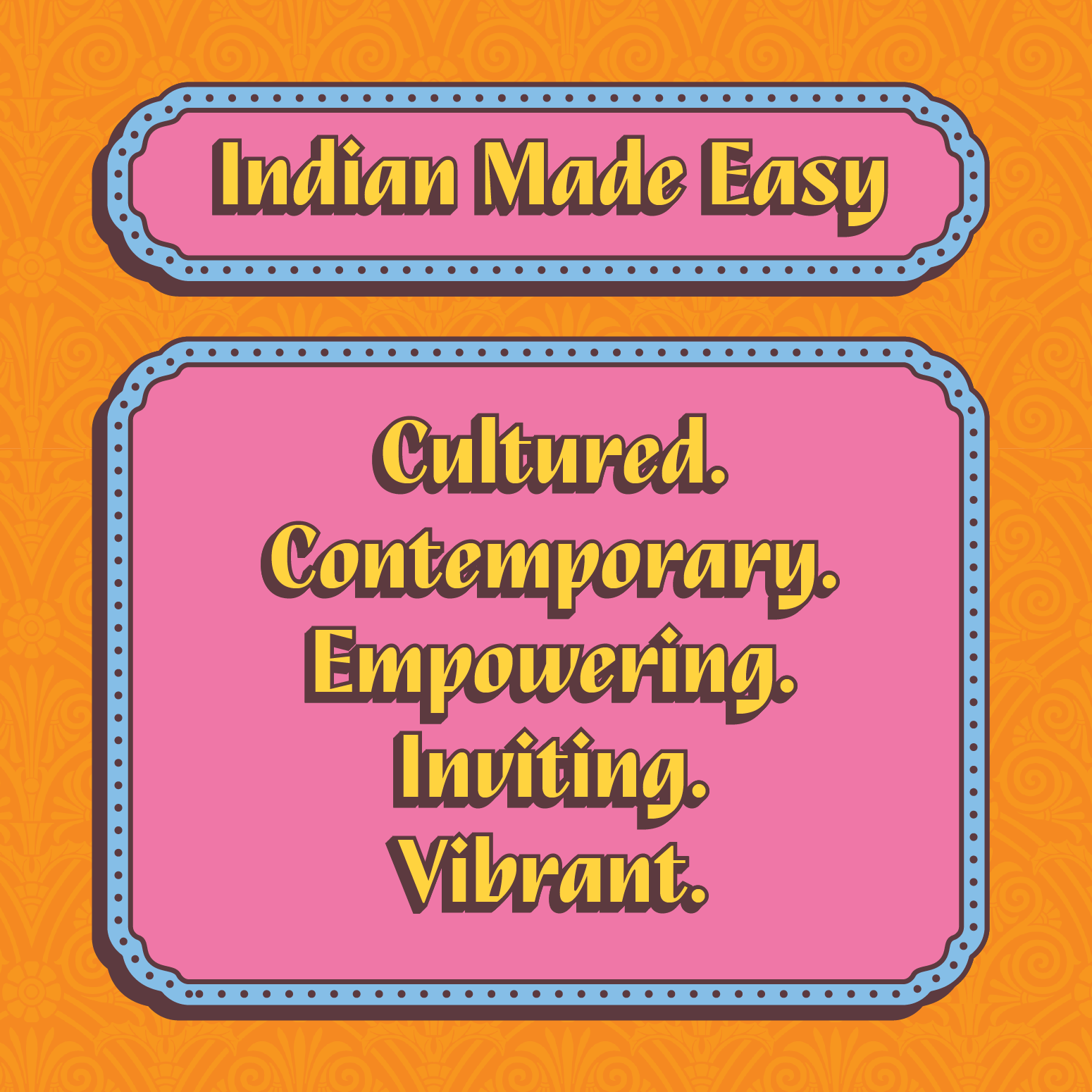
Anchored in a clear strategic tension, the Mouma’s brand identity and packaging design system stand out on shelf while simultaneously communicating “culture” and “everyday staple” for health-conscious, young families.
Logo Design
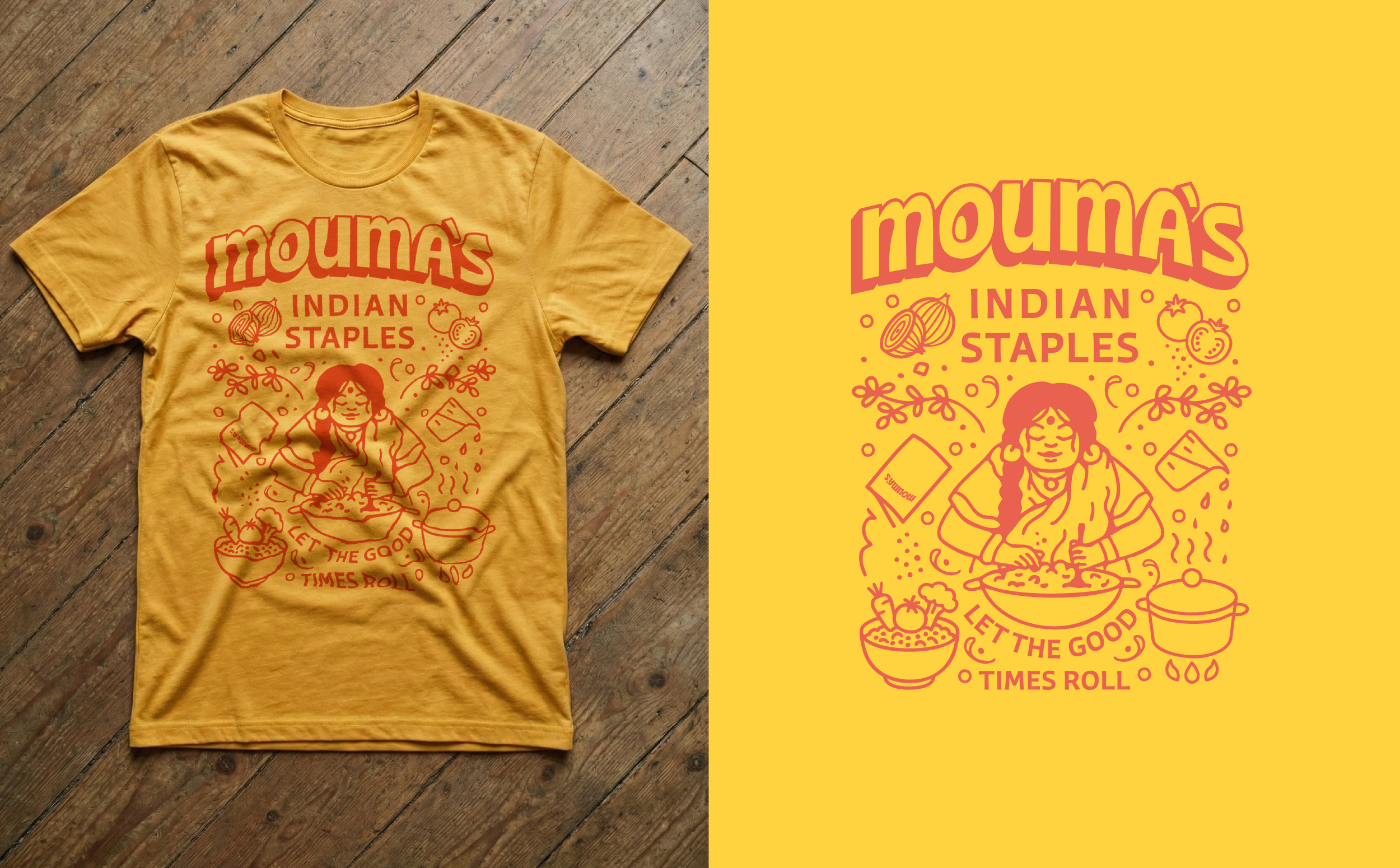
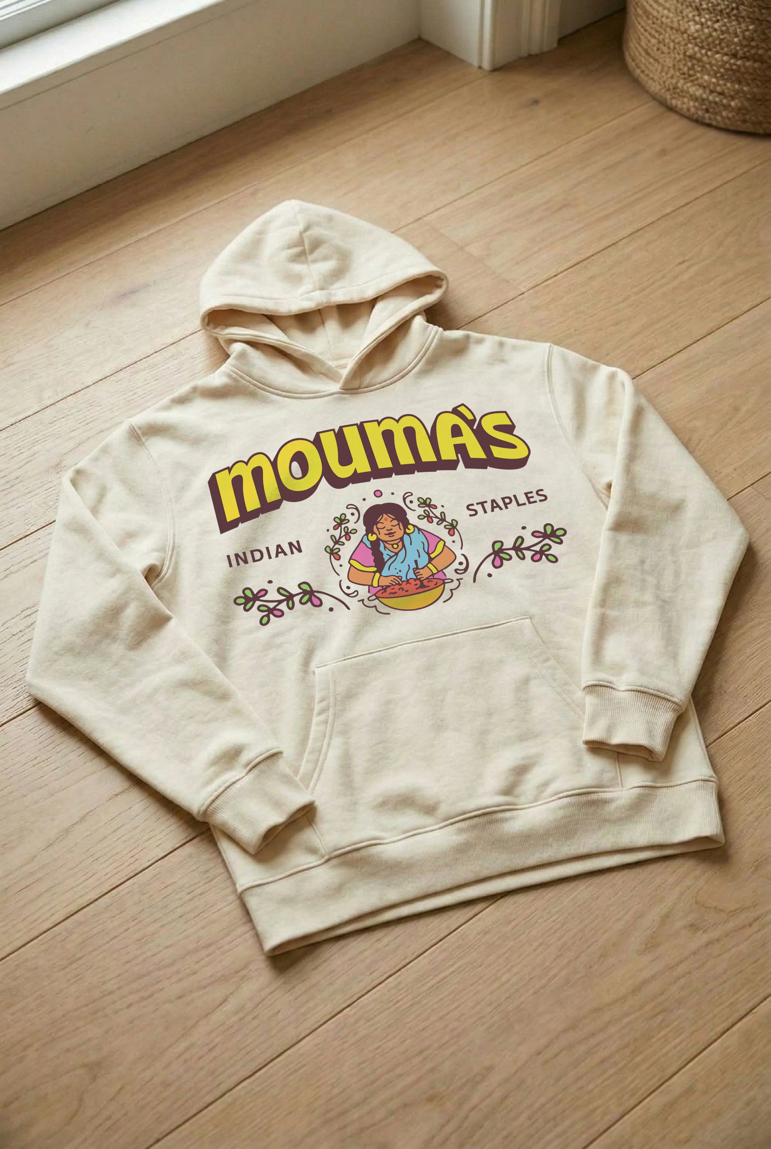
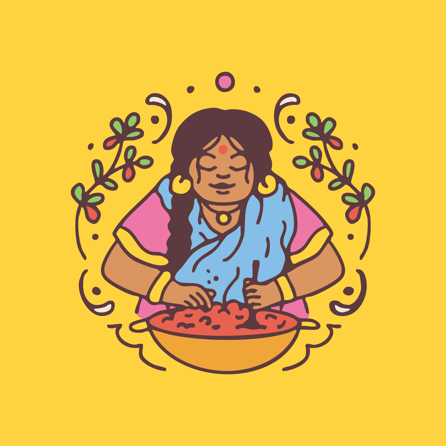
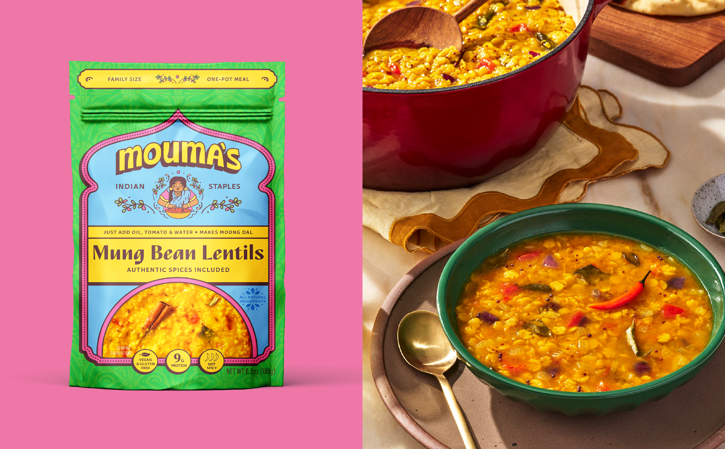
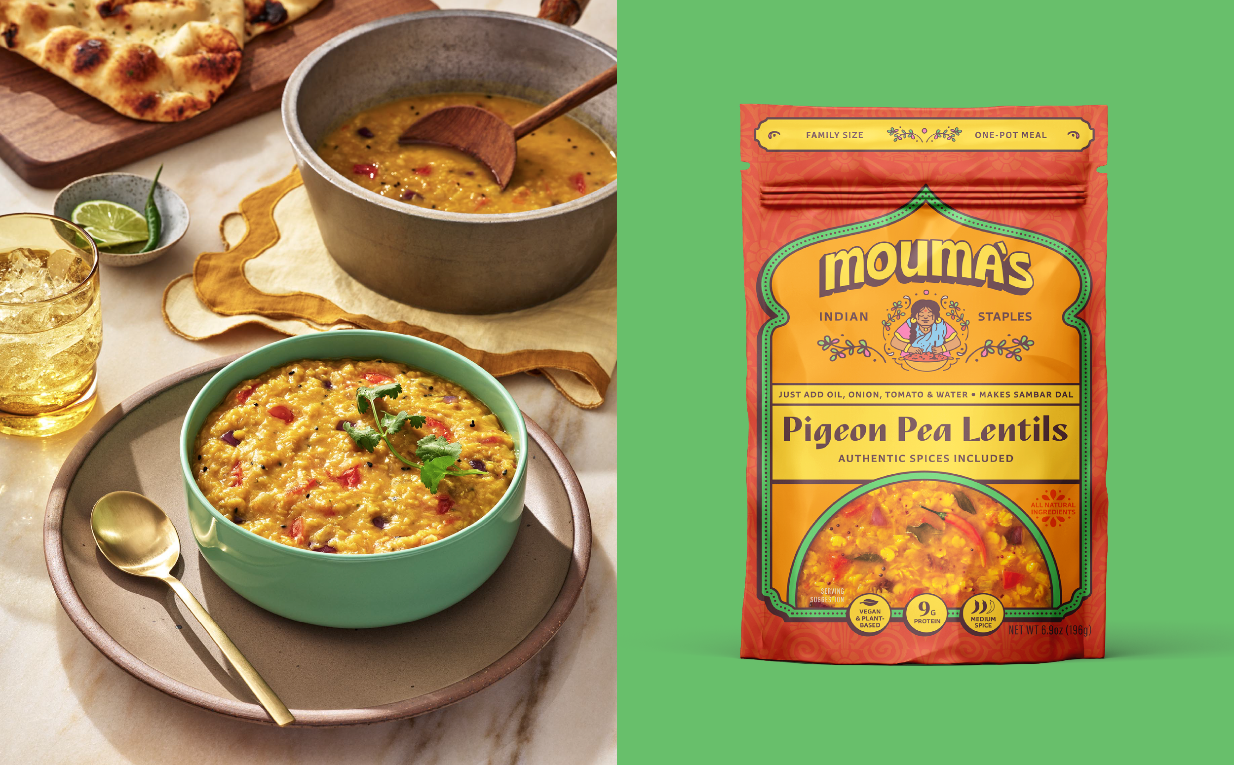
At the heart of Mouma’s brand identity is Mouma herself: a tribute to the co-founder’s grandmother and the family recipes that inspired the business. The illustrated mark features Mouma, surrounded by flourishing lentil plants, preparing a bowl of lentils for her family. Mouma is a symbol of generational knowledge passed down through food.
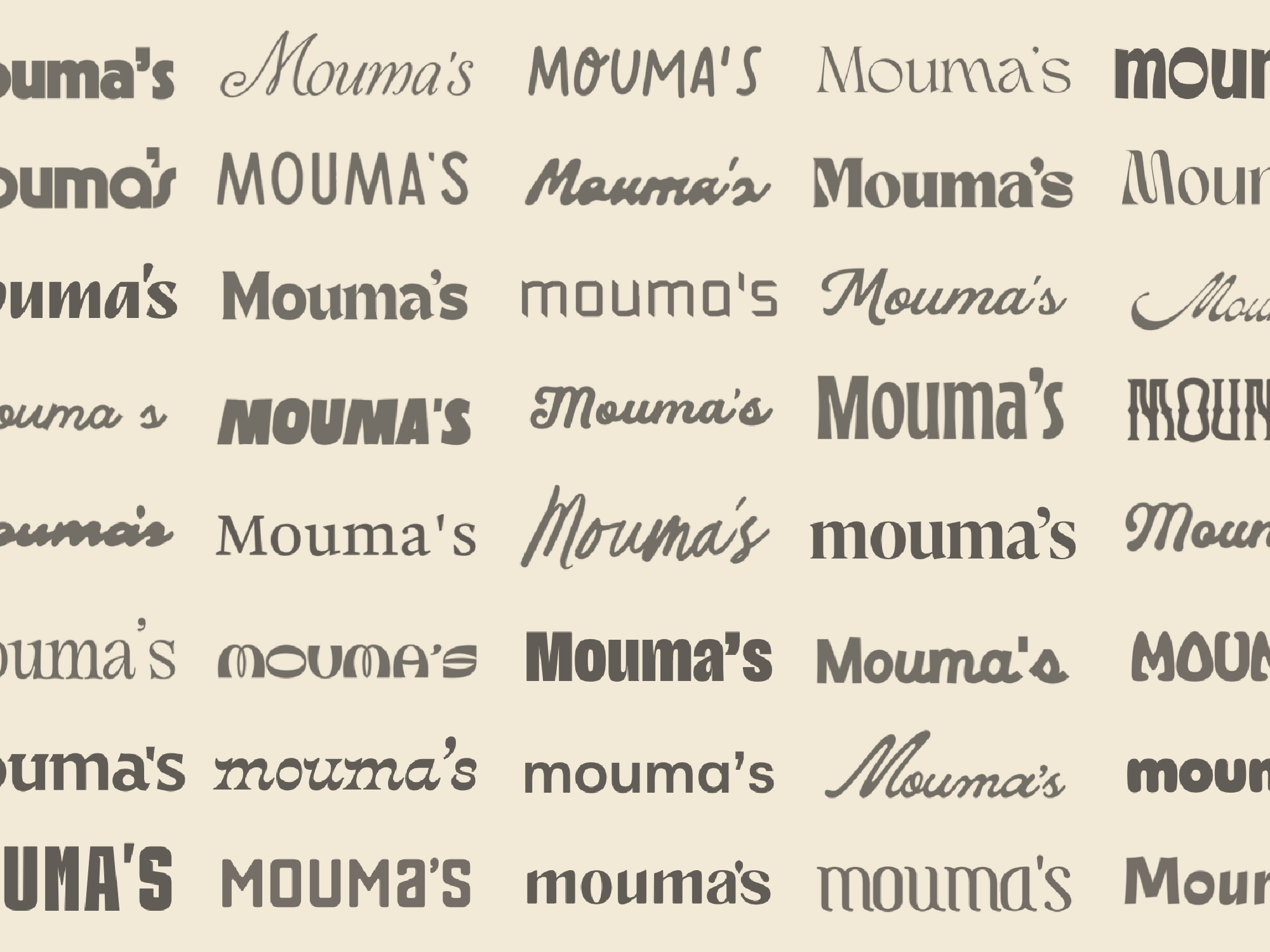
The wordmark is a customized version of Ohno Casual Variable by OH no Type Co., reworked for improved scalability across packaging and brand applications. Its arched treatment feels welcoming, grand, and architectural.
Together, the mark and wordmark balance tradition and contemporary design, feeling playful, confident, and ready for your pantry.
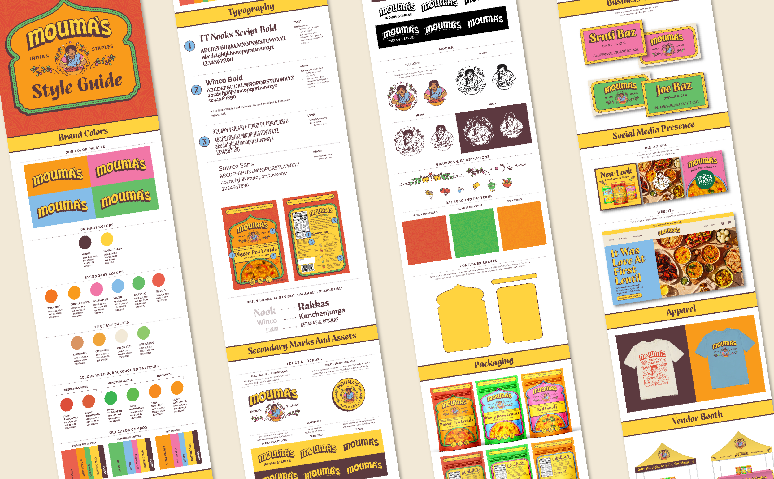
Visual Identity
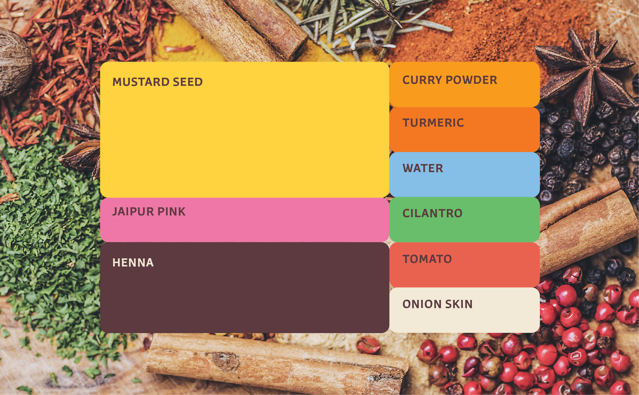
Mouma’s visual identity is a contemporary take on Indian culture. With colors inspired by vibrant spices and container shapes and backgrounds inspired by architecture and textiles, we translated identifiable Indian moments into a visual identity system that feels bold and memorable.
Mustard Seed Yellow leads the palette, inspired by turmeric, lentils, and golden-hour light at the Taj Mahal. This color is a consistent anchor across the packaging design system, ensuring key brand communications maintain strong shelf recognition while still allowing each SKU to have its own color palette and personality.
The typography system uses TT Nooks Script to bring an expressive personality with subtle structural nods to Hindi writing, while the humanist sans, Winco, provides contrast with easy-to-read call outs.
Every element works toward the goal of making lentils feel approachable, easy and fun, making Mouma’s feels like the obvious choice on shelf.

Packaging: Before & After
The previous packaging lacked clarity, personality, and a clear value proposition. The system over-communicated without saying anything meaningful.
We rebuilt the lentil packaging design system with the goal of communicating that Mouma’s is easy, healthy and fun Indian food.
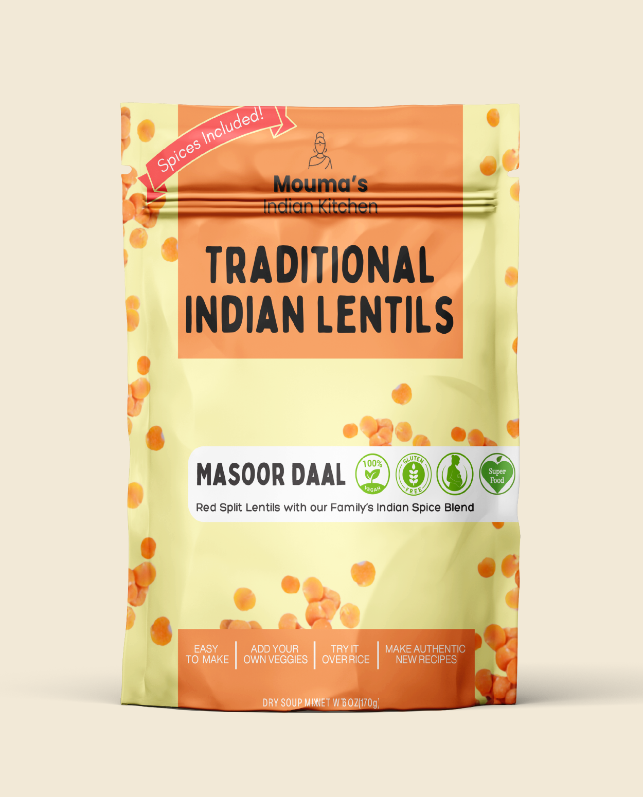
BEFORE
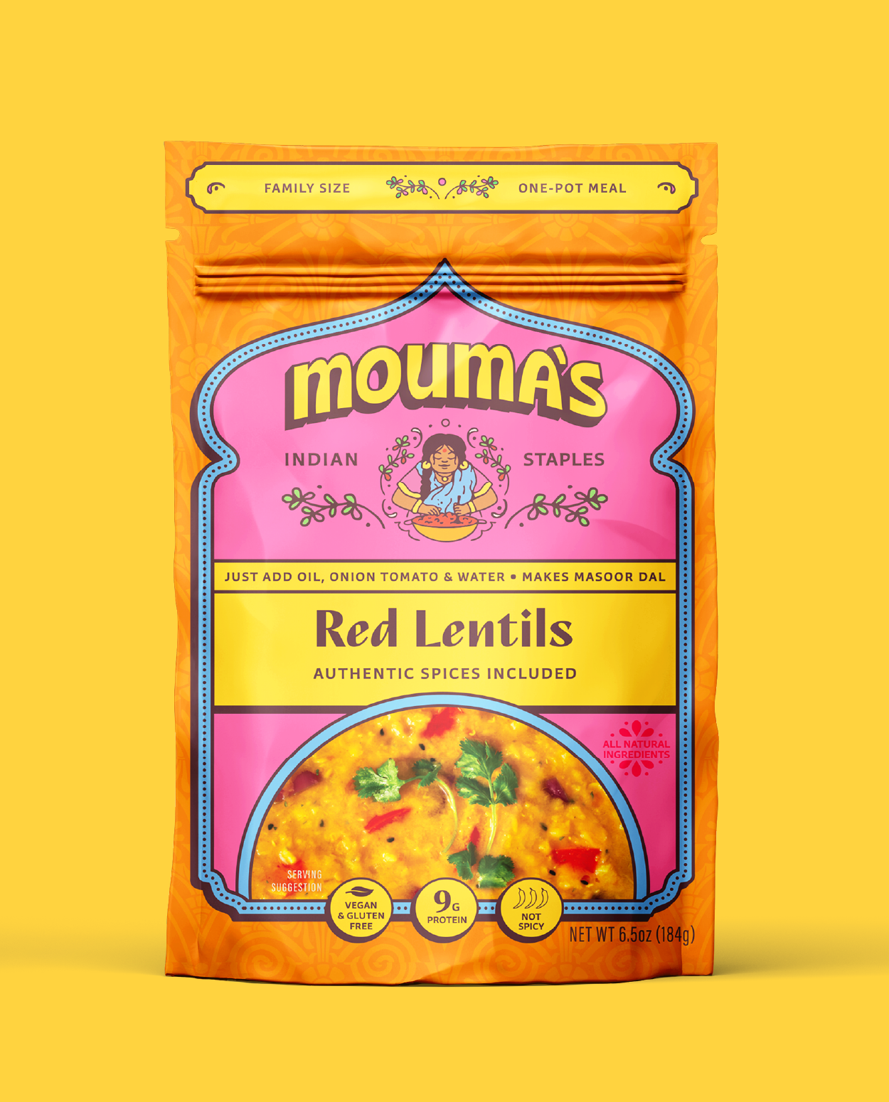
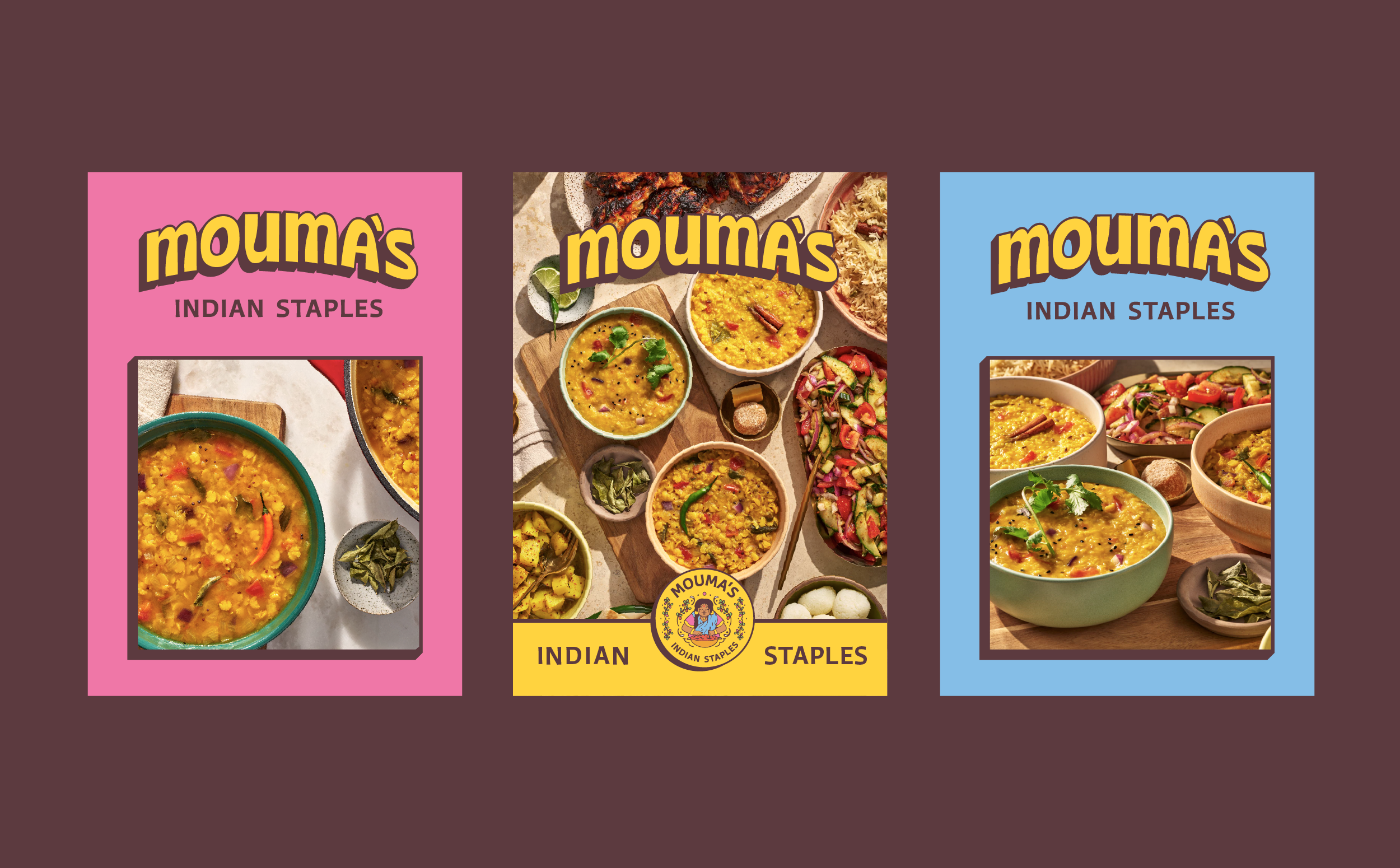
AFTER
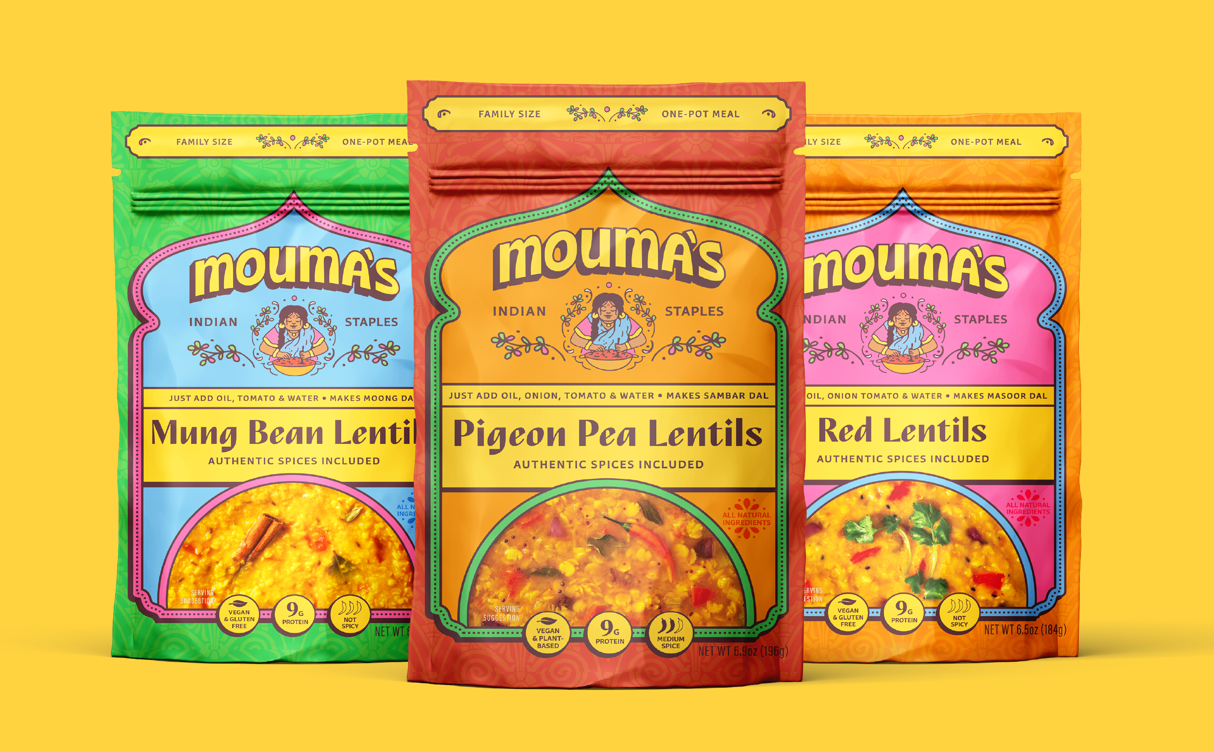
Packaging Design
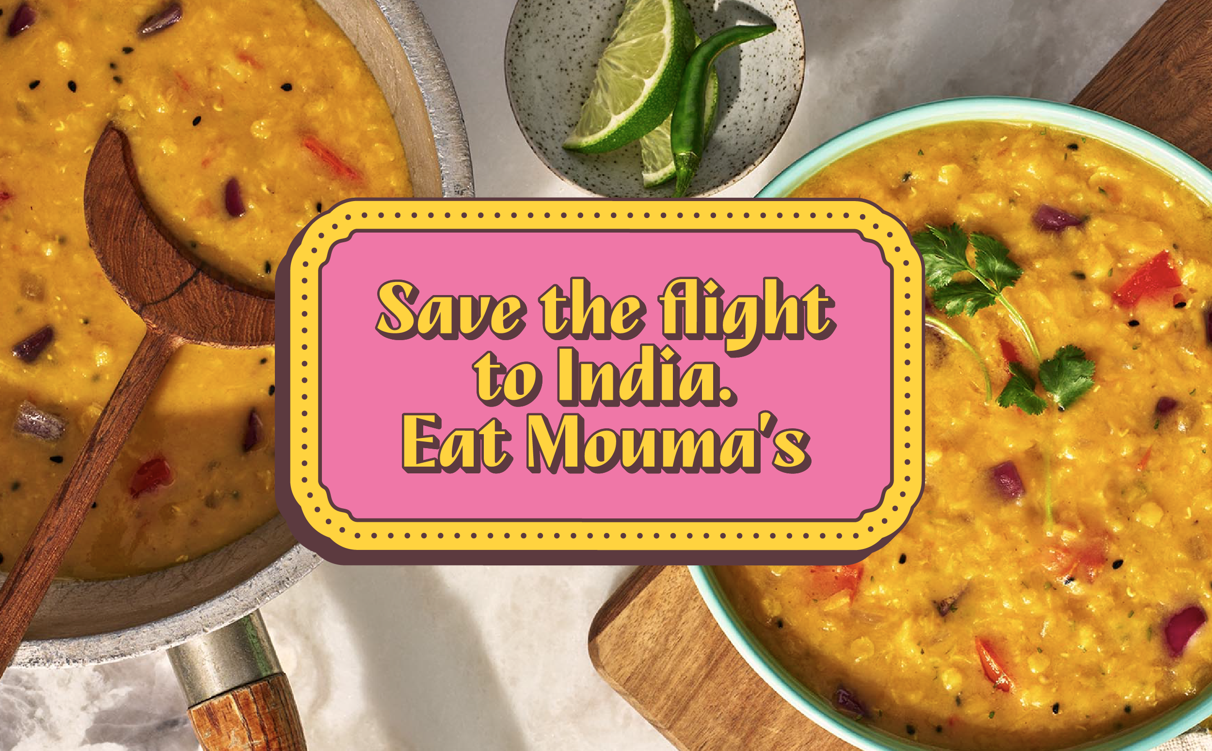
The front of pack information is contained in a graphic shape inspired by the Taj Mahal and traditional Indian archways. While this visual reference is commonly used, the brand doesn’t hinge on this element alone, and it acts as a familiar invitation to “escape to India” without leaving your kitchen.
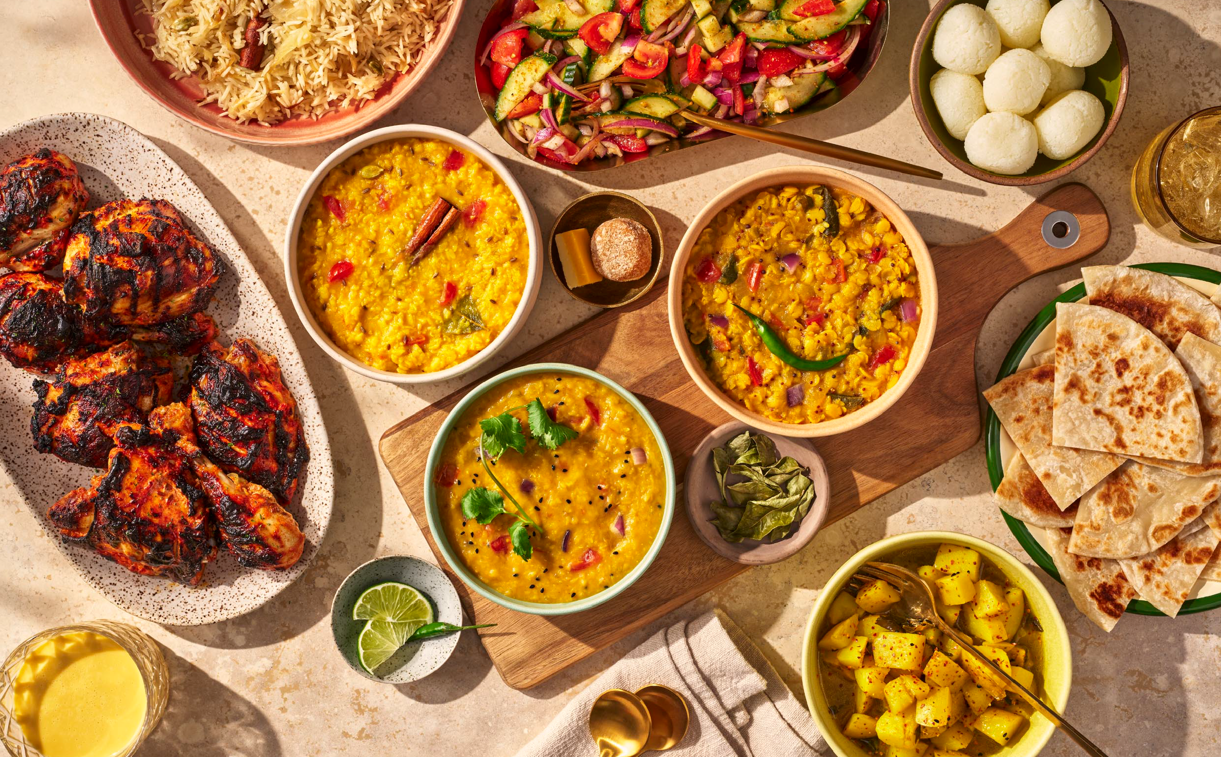
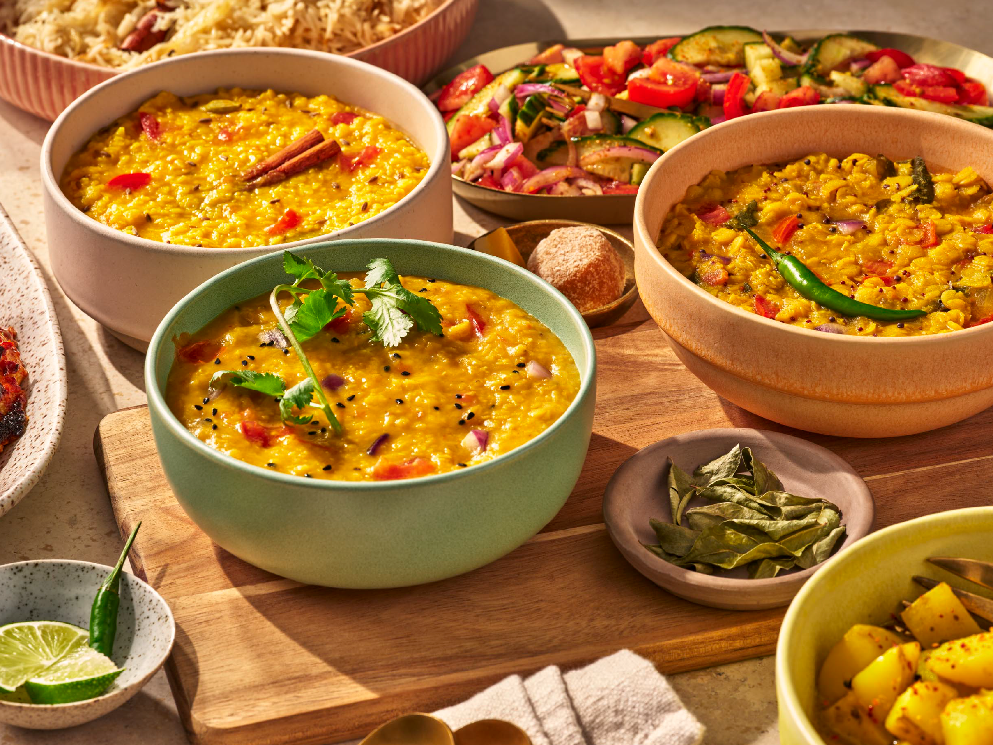
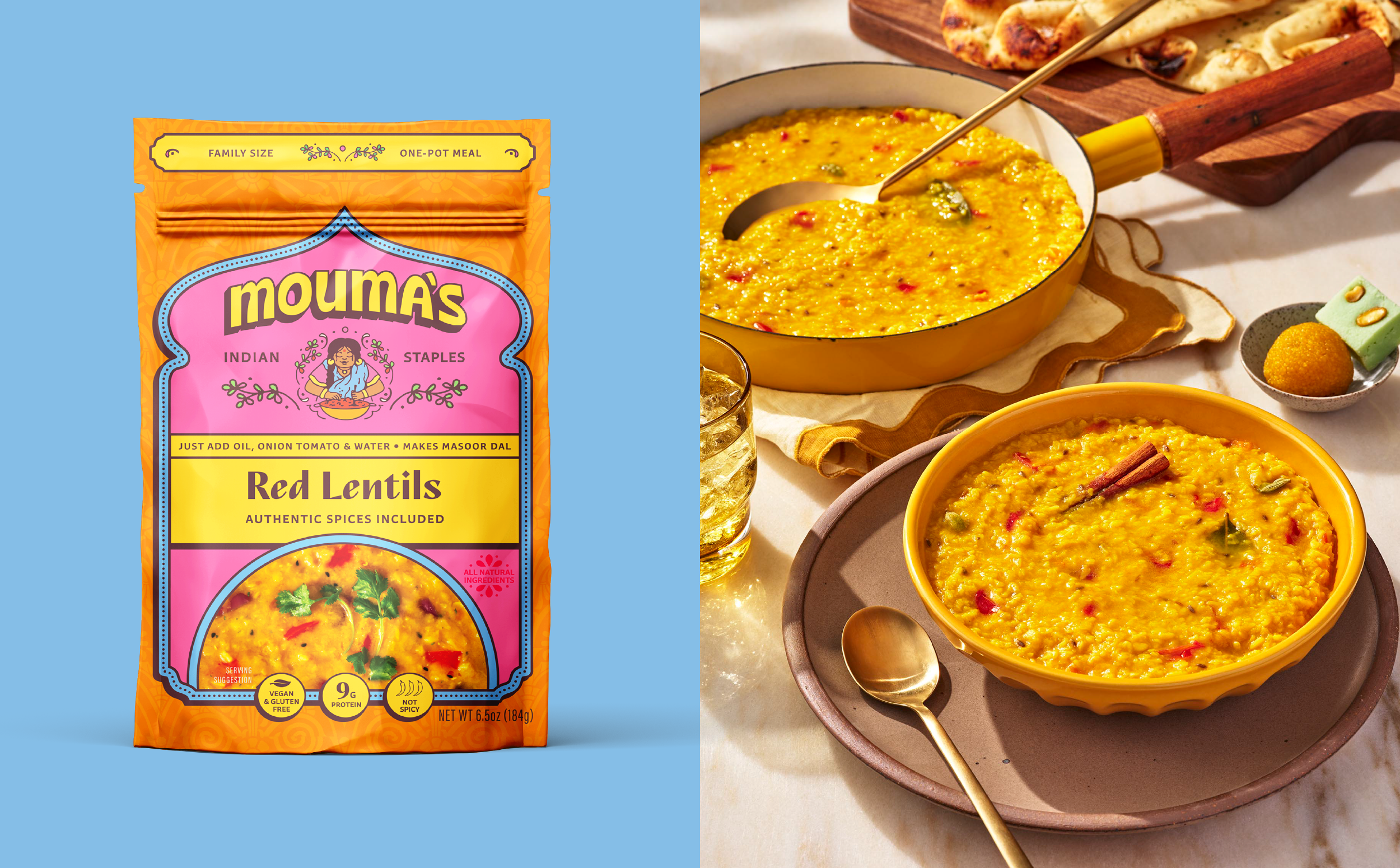
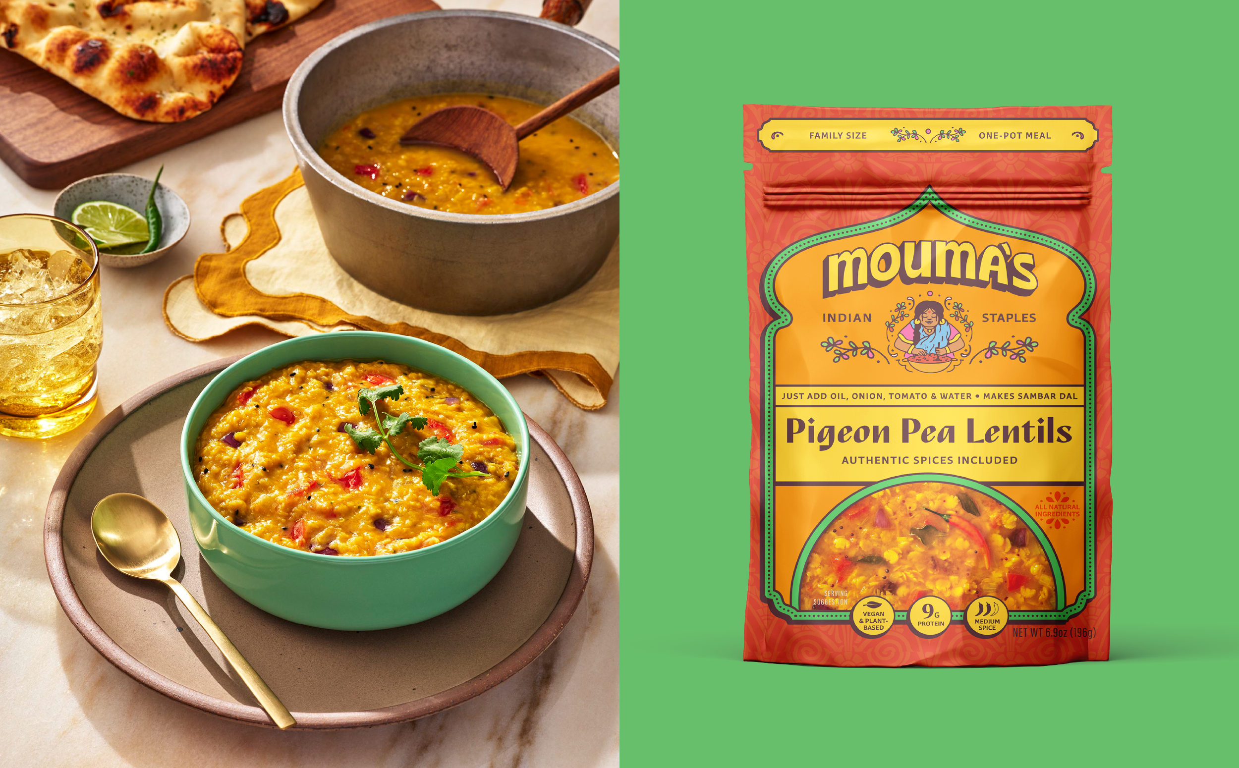
Uncooked lentils are visually underwhelming, so we updated the photography to focus on the finished meal. Decadent, vibrant food photography shot by BurkleHagen showcases the final dish. The meal becomes the hero, helping demystify a cuisine that can otherwise feel intimidating to cook with an unknown final output.
Color plays a critical strategic role in CPG packaging design, and each SKU has its own color story while allowing the hero color, Mustard Seed Yellow, to unify the system across headers, product bars, and callouts, ensuring visual cohesion on shelf.
Messaging on pack was simplified and reorganized to prioritize clarity of product and benefit. We leveraged trend data and search behavior to inform naming decisions (for example choosing “dal” over “daal”) to reinforce clarity and improve SEO.
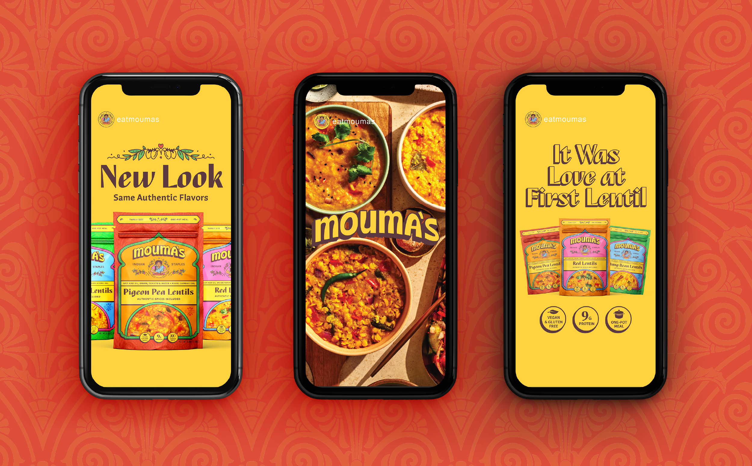
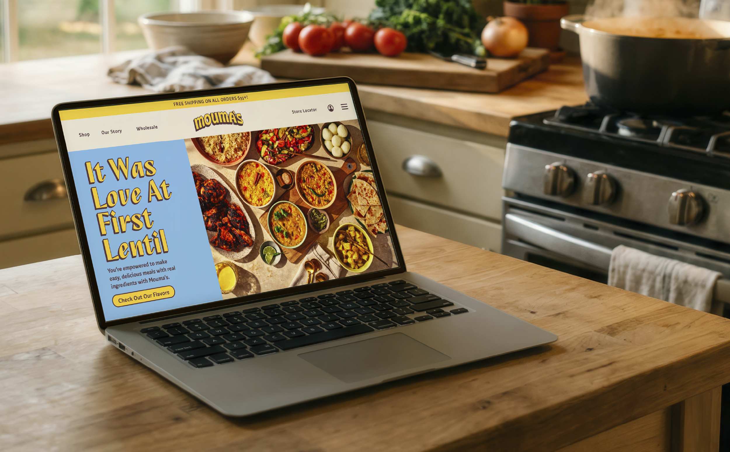
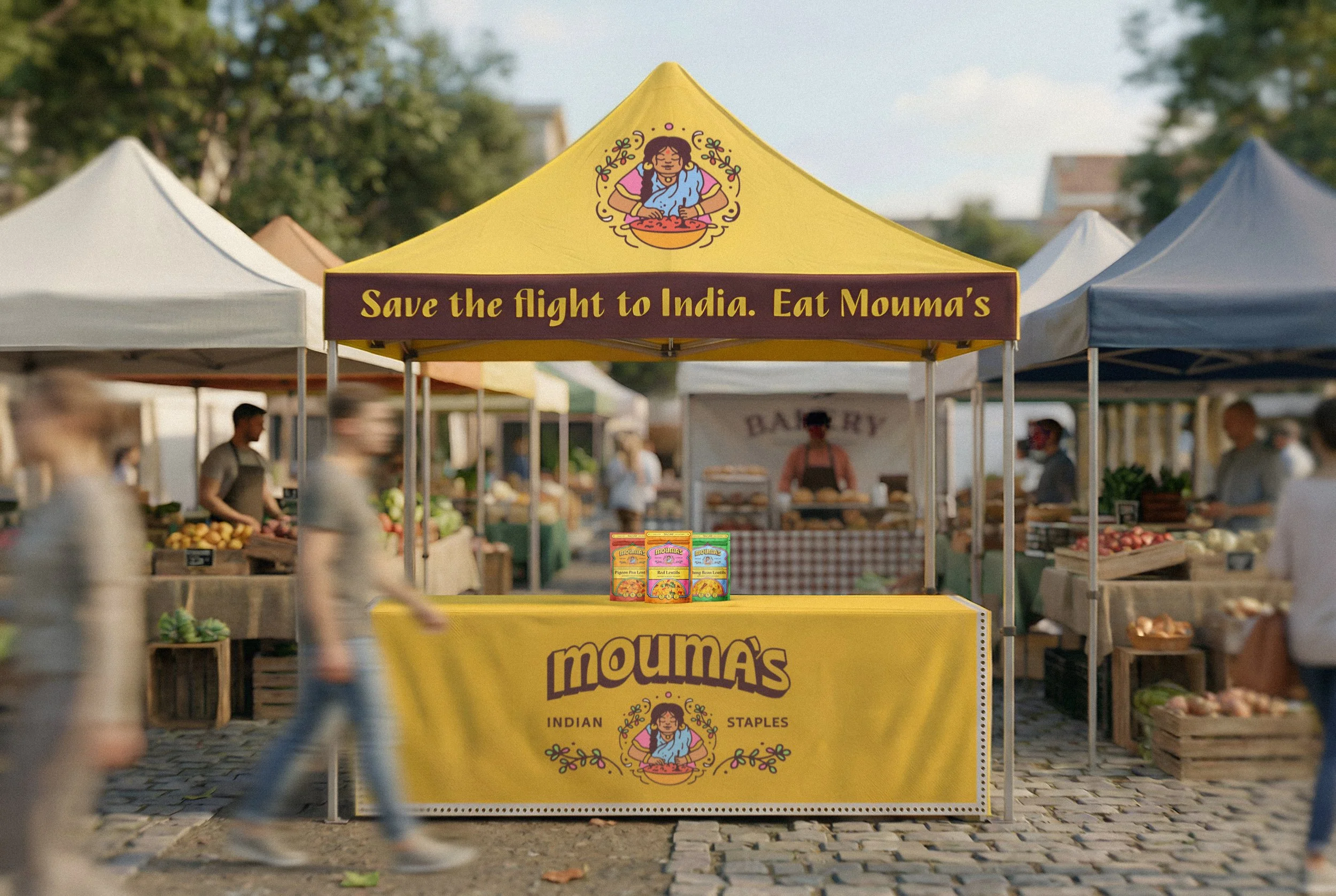
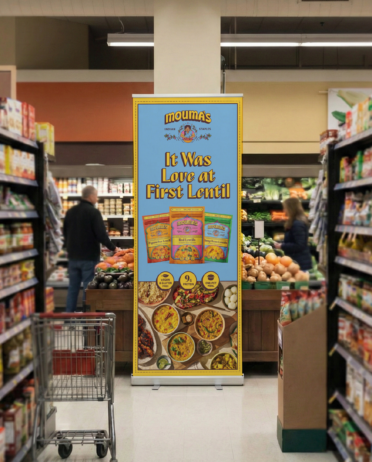
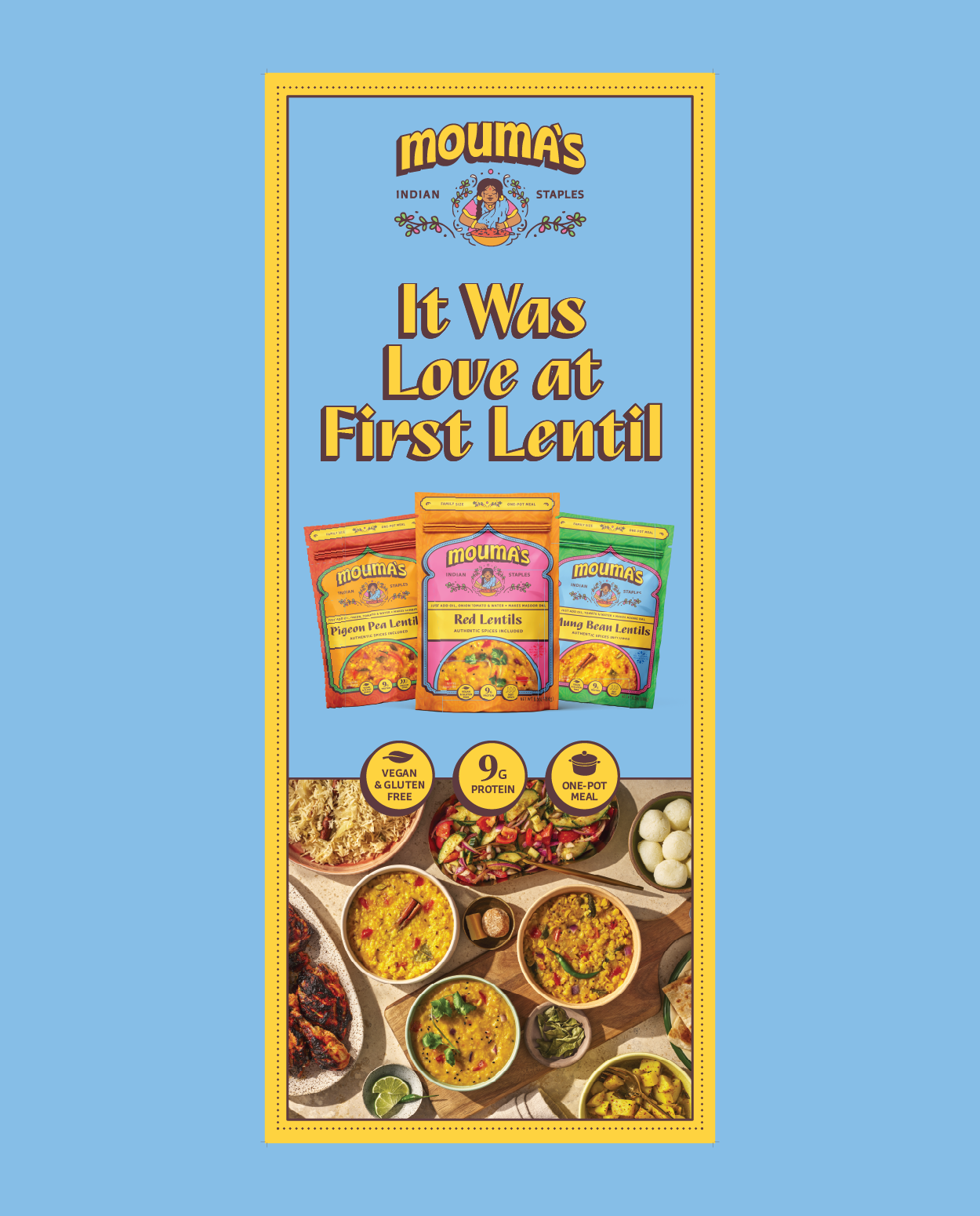
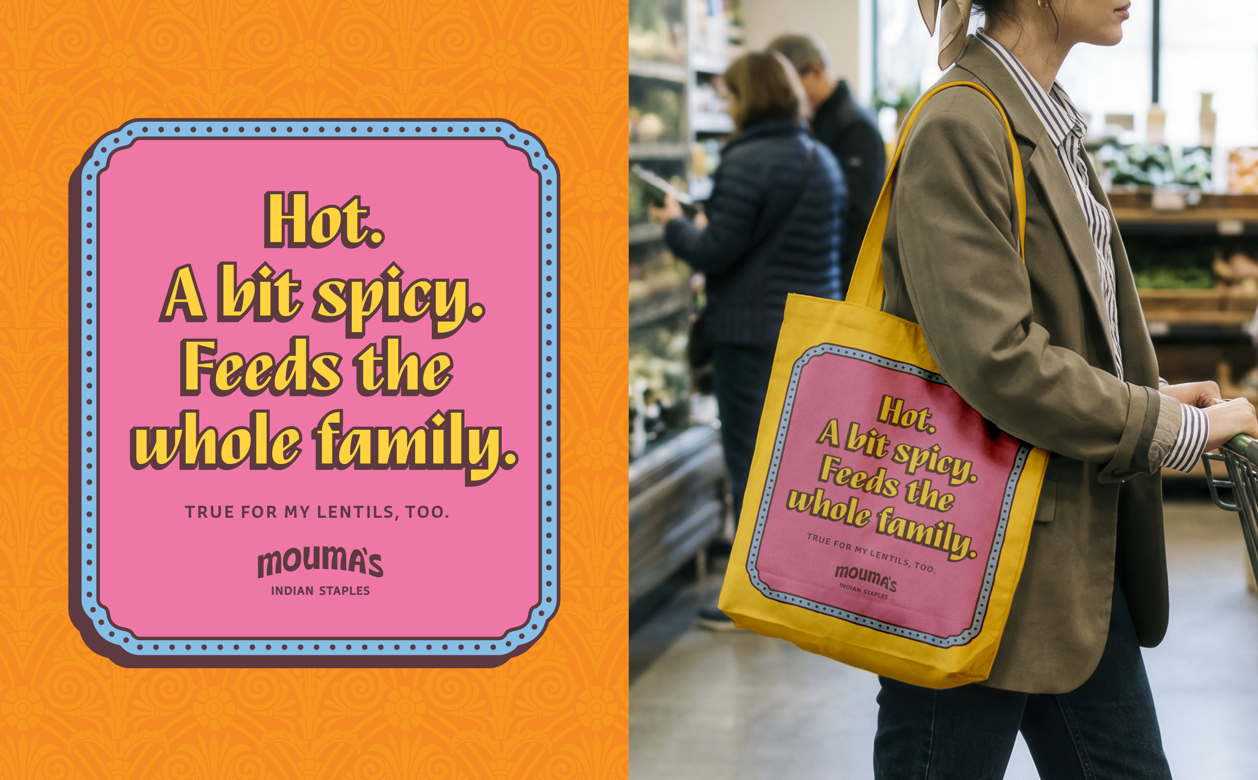
Collateral Design
The collateral elements showcase the brand extended across retail banners, pop-ups, event tents, and digital environments.
Using bold headlines like: “It Was Love at First Lentil”, “Save the Flight to India. Eat Mouma’s.”, “Hot. A Bit Spicy. Feeds the Whole Family.”, we continue to communicate easy, healthy Indian food made approachable.