Furniture Row
Client: Furniture Row
Services: Logo Design, Art Direction, Package Design, Collateral Design
Support: Sara Butteman
Reasserting trustworthiness with a dedicated customer-base.
Furniture Row is one of the largest mid-market furniture chains in the nation. Their in-house line of fabric and surface cleaner, AllAway, is top of the line. However, the packaging was rather dated and unconsidered.
Through an updated and refined design aesthetic, it was our goal to adjust the consumer’s perception of AllAway and reposition the product as more premium and trustworthy. We leveraged relevant brand equity where possible, and the remainder of the brand and packaging received a welcomed update.

I was hired towards the end of 2019 to rebrand and redesign Furniture Row's in-house fabric and surface cleaner, AllAway. For more details on the project check out: www.vicarelstudios.com/furniture-row.
.
Animation: Diego Peña.
Logo Animation
BEFORE

AFTER

BEFORE

AFTER
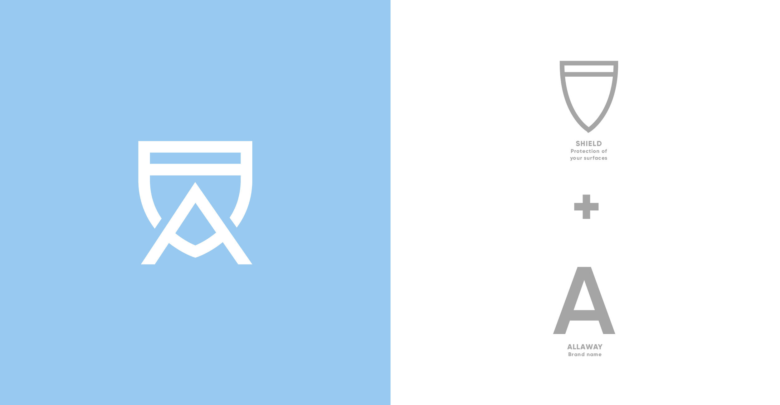
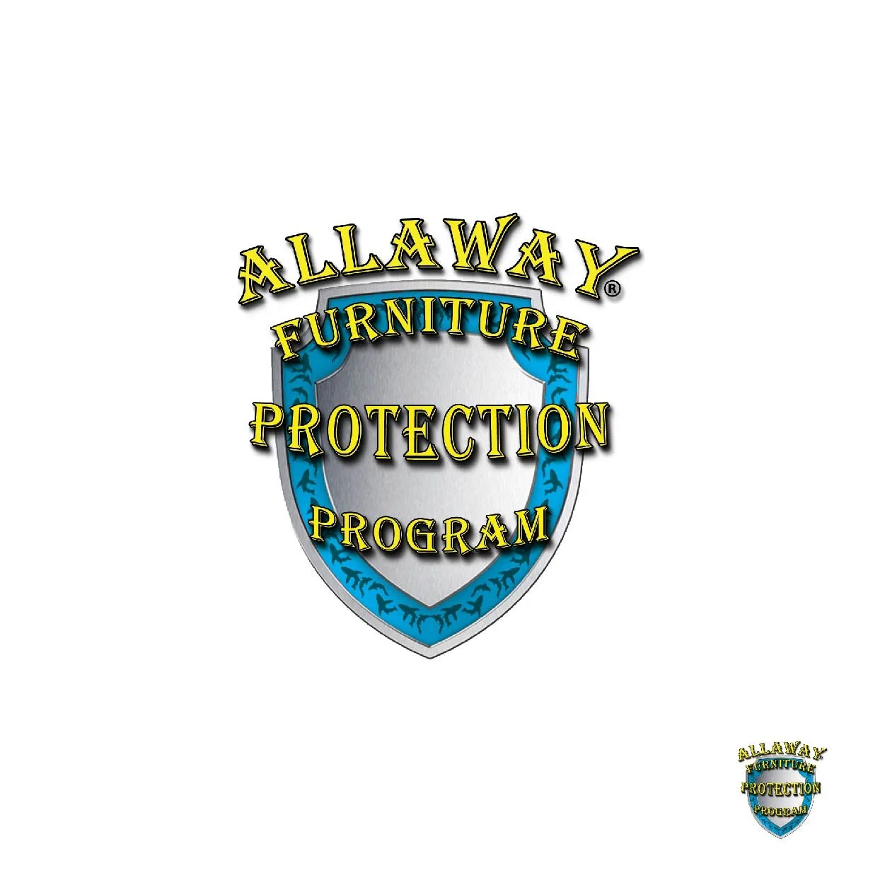
The old logo was outdated: the typography was unconsidered, the drop shadows and gradients were dated, the sharks inside the badge boarder were irrelevant, and as seen above, the logo was not scalable.
Our brand and packaging updates repositioned AllAway as a trustworthy, refined brand and considering scalability with a timeless aesthetic.
The new packaging solution made individual product names a priority of information, the hierarchy of the packaging information was more heavily considered, and color was used more heavily, thus furthering the ease of product differentiation.

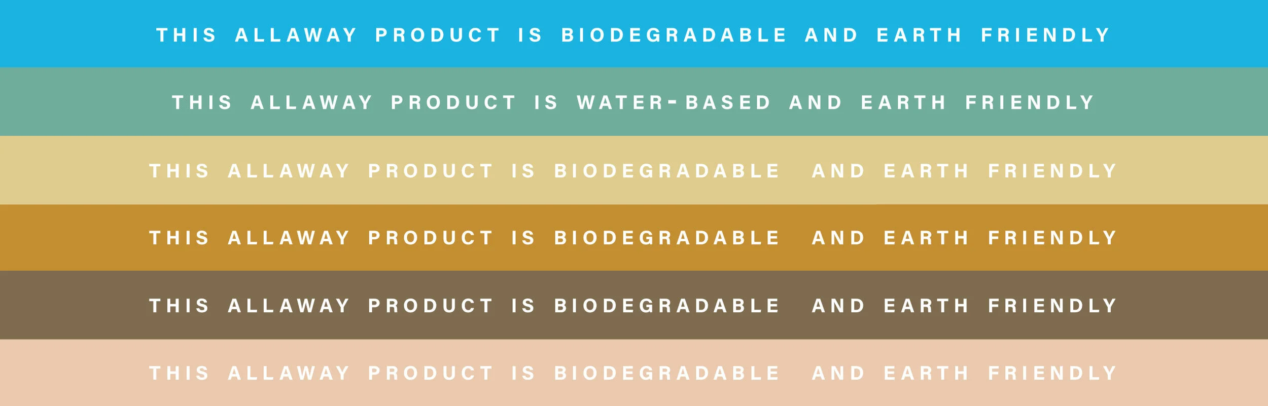
Focused on bettering the environment, AllAway products are earth friendly, biodegradable and/or water-based. We worked to highlight that messaging on both the front of the bottle as well as the label wrap around.


Our rebrand considered a number of factors:
The product purpose took precedence. The name was placed at the top of the label where it could be more easily read.
Color was more boldly and intentionally incorporated, aiding in product recognition.
Fabric textures were incorporated into the color, further establishing intended surface usage.
The logo placement shows a division of the surface it’s intended to clean and a pristine white space, representing the cleanliness achieved through using the product.


