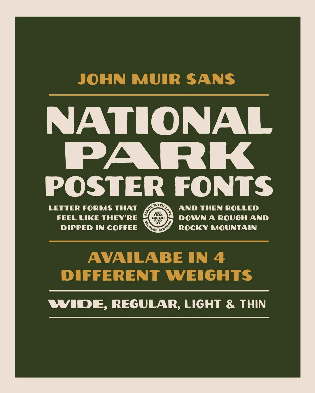
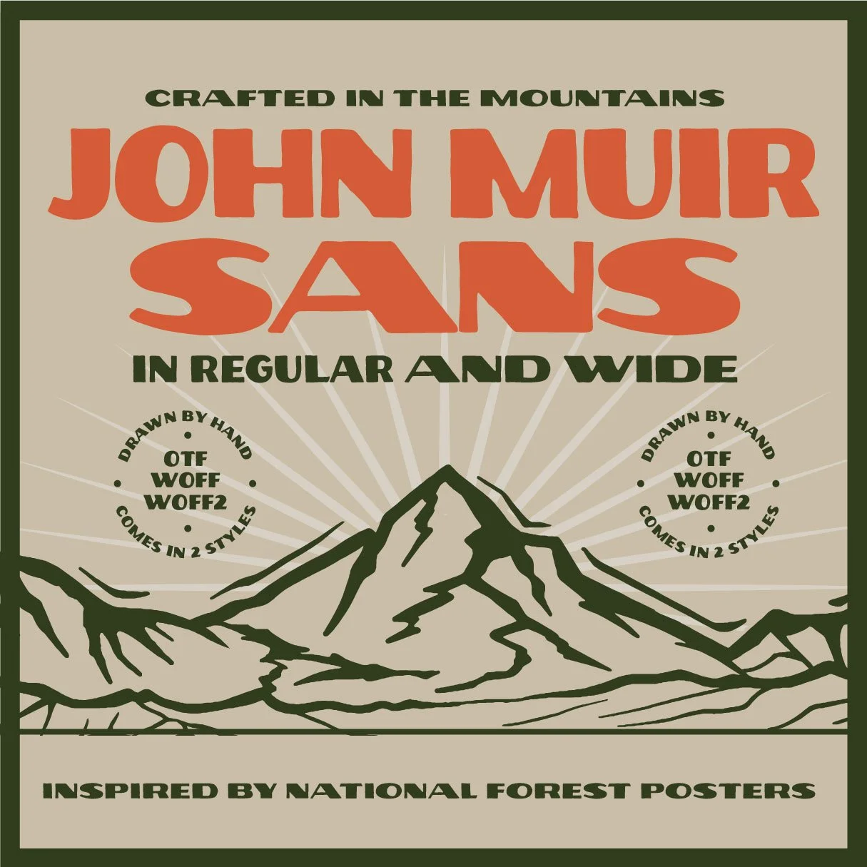
John Muir Sans: The Perfect National Parks Poster Font
John Muir Sans, a Typeface Inspired by National Park Posters and the WPA Era
John Muir Sans is Sans Serif Display Font Inspired By Vintage National Park Poster fonts.
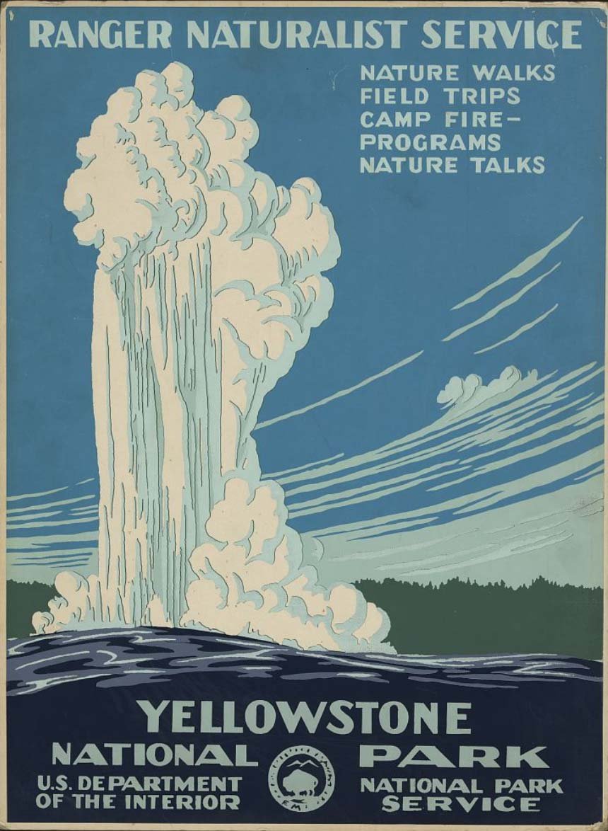
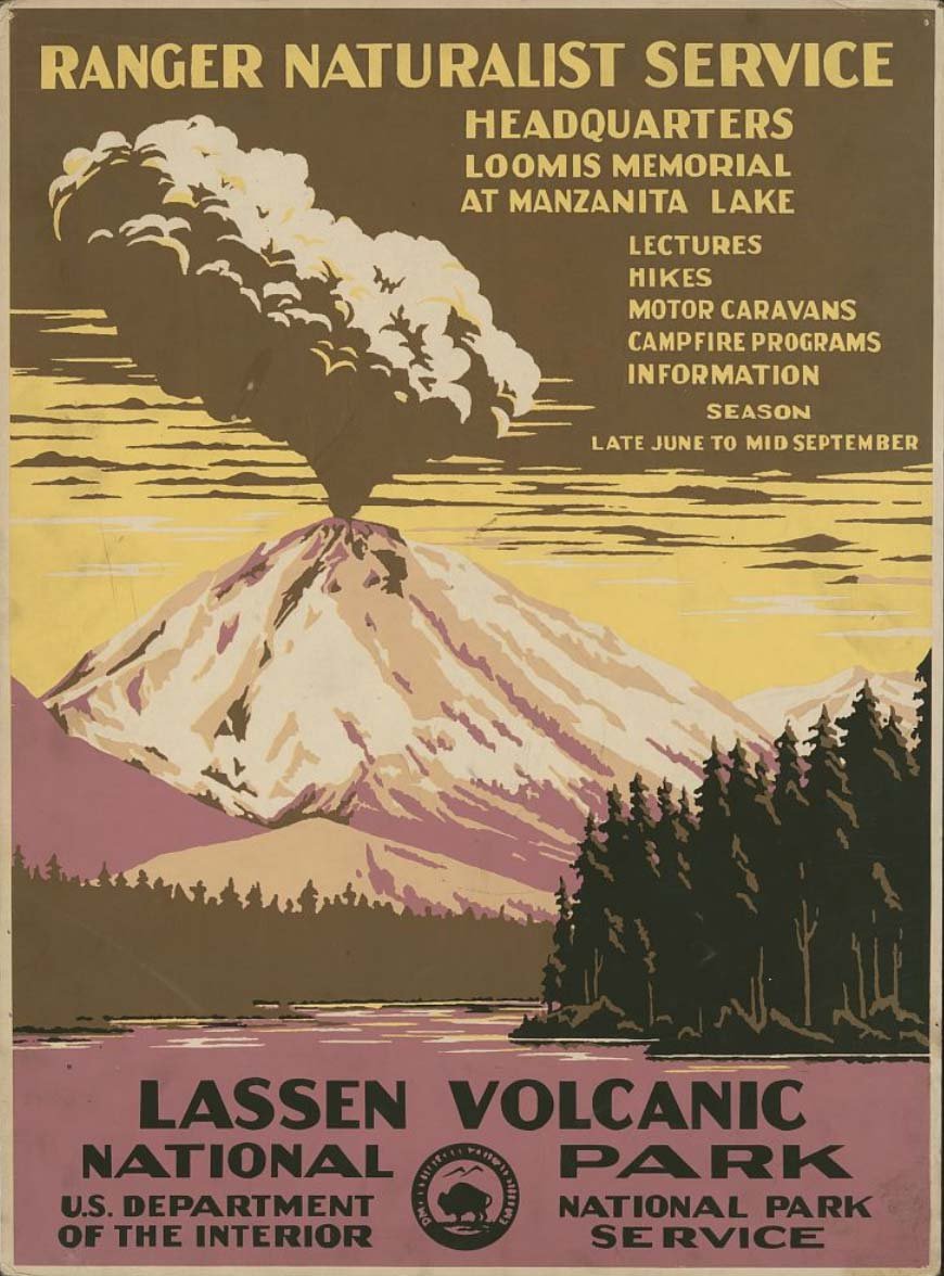
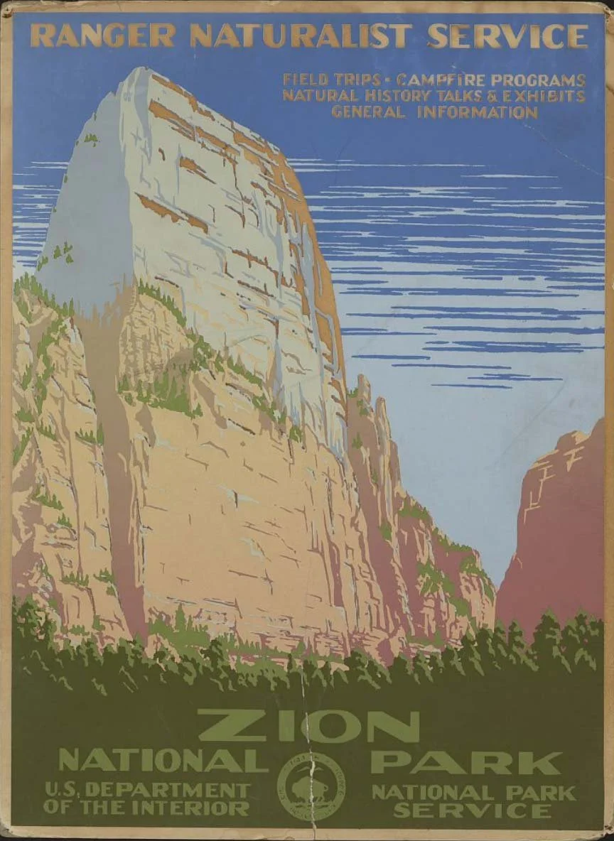
The National Parks have always been a source of inspiration for creatives. The beauty of nature and the sense of adventure that the parks represent can be felt in the artwork created to promote them, and these posters are an iconic representation of what it means to be “adventurous.”
As an avid outdoorsman myself, this is why I decided to create a font inspired by vintage National Park poster fonts: John Muir Sans, a font created to honor of the “Father of the National Parks.”
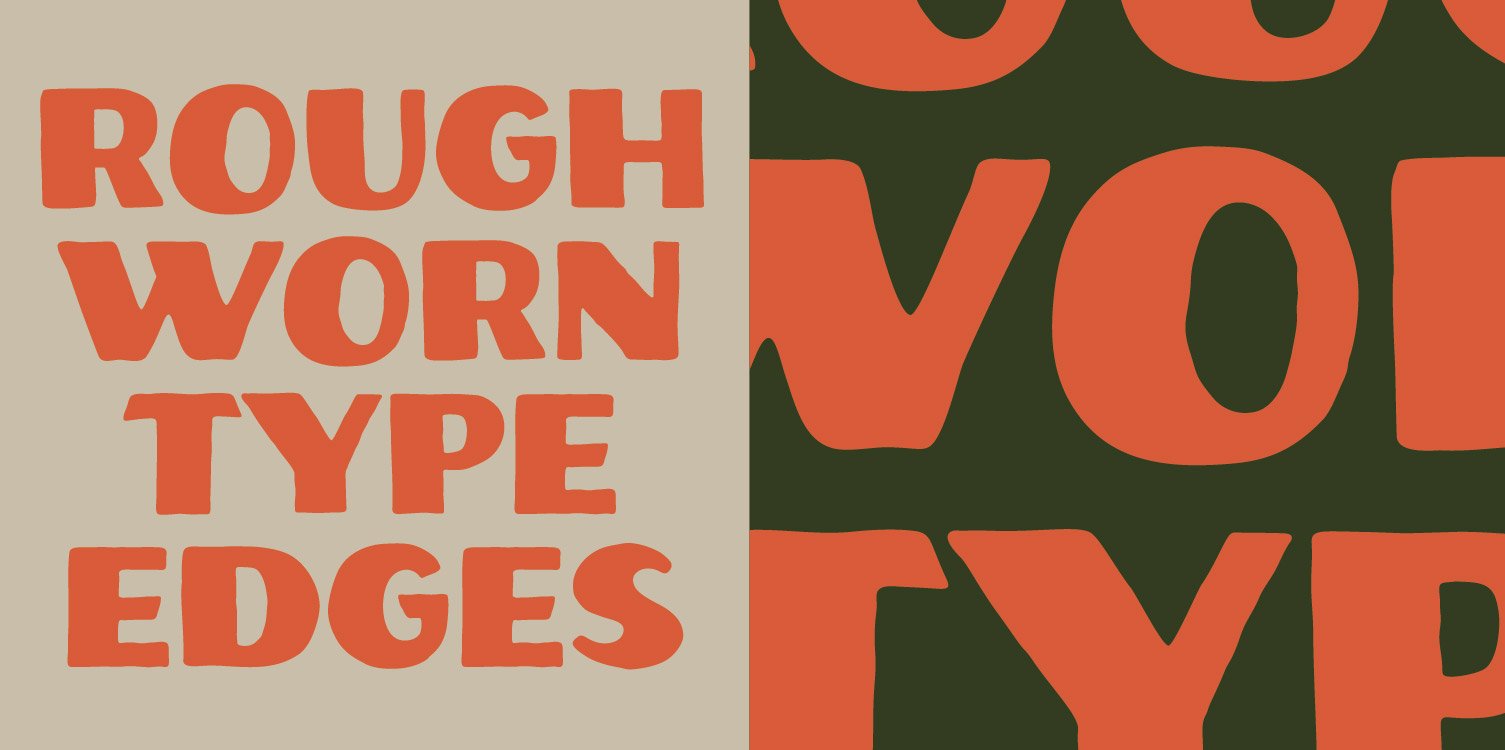
John Muir Sans is a display font that perfectly captures the essence of the hand drawn lettering on the National Park posters. It is rough, worn, and perfectly imperfect. The individual letterforms do not strictly abide by all typographic rules, but this intentional imperfection adds to its charm. This typeface feels as if it was drawn by hand, just like the hand lettering in the vintage National Park posters.


The original lettering that we created for “Zeal Optics” that inspired the John Muir Sans font.
Like the National Park poster fonts, John Muir Sans started out as a small piece of lettering that we did for Zeal Optics a few years back.
We loved the lettering created for Zeal, and felt that it deserved an opportunity to live as more than just a one off piece. We used the letters of the hand-drawn branding as a starting point, and we then illustrated the remaining letters of the alphabet in the same style, all while referencing National Park poster fonts for accuracy of letterform creation. We wanted our typeface to be inspired by the posters, not a hard copy.
After we had the alphabet drawn in the desired style, we used Adobe Illustrator to vectorize our hand-drawn lettering. From there, we focused on kerning and spacing as we created the .otf version of the typeface using Fontself. The result was a typeface that felt like it was drawn by hand. John Muir Sans is rough, worn, and is the perfect font for logotypes, apparel design, branding and packaging design. John Muir Sans is a perfect font for designers who specialize in hand-drawn graphic design and branding, but are looking for resources to help expedite their process.
John Muir Sans is the perfect National Parks poster font. It captures the essence of vintage National Park posters and fonts, and with two styles (regular and wide) it is versatile enough to be used in a variety of design projects.
Frequently Asked Questions
What makes your fonts inspired by national park poster font?
These are fonts inspired by the bold, handmade lettering used in WPA-era National Park posters. They are designed to feel timeless, rugged, and distinctly vintage-American.
Can I use these fonts in commercial projects?
The standard purchase does not cover commercial projects; however, you can easily add a commercial license at the time of purchase (or, you can purchase it afterward). The commercial font license allows for commercial use in branding, packaging, design, and more.
Are these fonts the actual WPA fonts, or are these recreations?
All of our fonts are recreations and evolutions of designs we’re inspired by. Our original fonts channel the tone and construction of WPA poster type, created with our own flair, and built for modern use.
Do I need to credit the designer?
No credit is required, but it’s always appreciated. License details are included with purchase.
